Last Updated on February 29, 2024
In the last few years, the Internet has become very competitive. Because of competition, there is no more room left for “ok” or “so-so” looking websites. When you visit a poorly designed website, I’m sure you’re not flattered by what you see. Personally I don’t trust or like to do business with companies who have sketchy looking websites.
I’ve mentioned this before and will mention it again. Visual appearance does matter on the web, but looks don’t really concern me. What if the website is ugly? So what, maybe their service or products are outstanding. That’s a good theory as well, however what really concerns me is the fact that the company half-assed their website. If a red flag doesn’t pop-up in your head, then you’re not really thinking hard enough.
Throwing up some ugly website just for the sake of “being” online, isn’t too flattering. Think about it this way, if that particular business has that sort of attitude towards setting up their digital presence, you can bet they might also treat their product or service the same way. I would much rather trust a company who pays attention to detail.
Now I may catch some slack for this, but I believe my outlook on this sort of thing is basically common sense. There are exceptions to this. I know many local businesses who do a fine job at servicing their customer, but their website is ugly as sin. If they have steady cash flow, and are not in the red. I don’t quite comprehend why they don’t hire a professional web designer and improve their overall appearance.
People always judge others by their looks. Is it sad? Yes. I wish more people would get out of that box, and perhaps have an open mind. But the harsh reality is that we’ve been socially trained to judge people, products, and other things by their looks. It’s important not to be too quick to judge, however there is nothing wrong with looking good either. That’s why design is so important.
Today we will take a look at web design mistakes that are costing you money. Without further ado, let’s jump in.
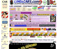
Unprofessional Look
![3rd-ugliest-website[1]](http://inspirationfeeed.files.wordpress.com/2013/10/3rd-ugliest-website1.jpg)
One of the most common mistakes of web design is making an unprofessional-looking website. First let’s define what’s unprofessional. It means that your website looks like it is made by a newbie or was made in a hurry. The website looks awful – meaning it doesn’t have the right color scheme, the navigation is hard to use, and it’s too much for one set of eyes to handle. In short, not much effort was put into making the website.
The best thing to do to avoid this mistake is using ONE theme for the whole website. You should use a premium theme, to see a vast variety of different themes, check out the following articles.
You must also simplify things, use only a few colors that go well with each other, make your website clean, and be minimal in everything that you put in your website. Always remember that making a professional-looking website will cost you time and money. Or you can be cheap and look like the other businesses I mentioned in the intro.
Bad Header
Another common mistake with many of today’s websites is the use of bad or inappropriate headers. People often forget that the header of a website represents the website as a whole. So having bad header text or header design equates to a bad overall website. Moreover, this mistake would not only cost you money, it would also mean that your website will get low traffic performance because search engines place a great deal of importance on a great and optimized header.
One way of avoiding this mistake is the use of a header that represents your website, your brand or YOU. It means that you have to design your header to look presentable and you have to use the appropriate text so that at a glance visitors will know what your website is about or get the idea that your site has something that they are looking for.
Too Many Ads
Ads are very important to any website. They are a great source of revenue and drive web activity. But having too many of them makes a website look spammy, messy and unprofessional. Additionally, ads cost you money because they redirect the traffic that was supposed to be on your website.
It would be wise for you to only place ads if your website relies on ads for revenue. But if your website is selling a service or a product, it would be best NOT to place any ads. As already mentioned, ads drive away traffic, so your service or product will be ignored if visitors tend to click on ads on your website.
You have to remember that having more ads doesn’t equate to generating more revenue, so you have to be minimal in placing ads. You just have to put them where appropriate. You should also remember to NEVER place large ad banners in between text because it makes the text hard to read and makes the page look cluttered.
Overcrowded Sidebar
One of the most annoying things to experience is visiting a website that has a longer sidebar than the text of the info on the page. It gives a very unprofessional impression to see a very small scrollbar because the sidebar extends one kilometer below the main text. Of course, it’s just exaggeration, but this designer’s mistake is sometimes way out of line.
It is crucial to keep your sidebar shorter than your main text simply because it is more presentable and organized. You have to consolidate the things that end up in your sidebar so that it does not end up getting longer and longer over time. You also have to put as few ads as possible in the sidebar in order to eliminate the chance of it looking spammy and messy.