
Last Updated on March 2, 2024
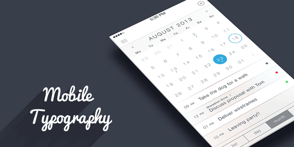
The advent of responsive web design and designing for small mobile screens presents new challenges to typographers. Choosing the wrong typeface for a website causes problems with readability and comprehension on even the largest desktop monitor. The same errors on a mobile screen display as a jumbled mess.
The science and art of mobile typography is in its infancy. Initially, designers were limited to a small selection of bitmap fonts, much as they were with early computers. As mobile technology advances, we’re getting access to more sophisticated fonts, but the multiple screen dilemmas remain.
Fortunately, major players outside of the design industry understand the importance of mobile typography. Companies like Nike and Coca-Cola, with their almost universally recognized symbology, insist on a level of complexity in their typography, which encourages the rapid development of new mobile fonts. At the moment, however, well the field’s a bit of a mess.
Choosing a readable mobile font
A number of elements determine the best fonts for small screens. Lowercase x-height (the height of individual characters) should be relatively high. Fonts with large open counters — the white space within letters — also increase readability on the small screen.
When possible, avoid typeface with strong contrast in individual character design. The pixel range of most small screens cannot display the contrast properly, reducing the effectiveness of the type. Moderate contrast works much better on small screens.
Keep it simple and safe
Part of the problem, of course, is the cornucopia of screen sizes currently in use. The mobile market has no standards for screen size or graphic quality. Your best bet is to stick with the manufacturer’s system fonts, but even here you have a problem: Android, Blackberry and iPhone have different system font lists.
Fortunately, a small set of fonts can be found in almost any mobile manufacturer’s font list. This group includes such fonts as:
- Arial/Helvetica,
- Courier/Courier New,
- Georgia,
- Times/Times New Roman,
- Trebuchet MS,
- Verdana.
Boring but readable
These fonts will be readable, which is of primary importance, whether you’re designing a gaming app, or fog light selling mobile website. But oh, they make the creative web designer moan with despair. These are not fun fonts. These are not creative, beautiful fonts. These are ubiquitous fonts, the solid, reliable workhorses of the typographical world.
In short, these are boring fonts. But they are some of the few that are readable on all screen sizes.
Customized fonts
Customized typeface sold from online font services offer an alternative to the fonts listed above, but come with an important consideration. You cannot guarantee a customized font will work across all devices.
As such, it’s best to restrict the use of custom fonts to headers, subheadings and large typographic layouts. For your text body, however, it’s best to stick with universally readable fonts. They may not stir your creative soul, but at least they provide a clear and readable page.
Thanks for reading! What’s your favorite font for mobile?