Last Updated on March 3, 2024
Having a killer landing page with large and prominent CTAs is the key to increasing your conversion rate, gaining more customers, and increasing sign-ups. You want your landing page to incorporate enough information that you potential customers know who you are and what you do, without overwhelming them with information.
Today, we’re bringing you 10 examples of websites that have killer landing pages. These sites all incorporate some of the same features, each with their own unique features that make them optimized for their market and potential customer base.
1. Kissmetrics
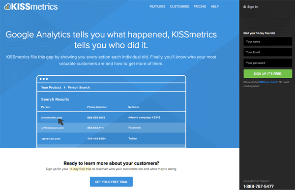
Kissmetrics has numerous CTAs present on their landing page. On the lefthand side as well as the bottom you’ll see prominent buttons encouraging you to sign up, and they even offer incentives like a free trial period to hook you into using their service. Their landing page also features a partially animated design to show just how their service can be used, and what’s great is they don’t provide you with TOO much information, just enough to get where you need to go and links to contact pages and more information.
2. Upworthy
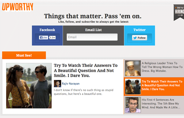
Upworthy is one of the fastest growing sites out there right now, and this is partly because of their ability to have CTAs that empower and motivate people to socially share the content on their site, as well as sign up for their newsletter. This website understands the importance of social sharing for their product to thrive, so that’s why the banner at the top of their site is dedicated to social. You have to determine what’s important to making your business succeed, is it social sharing, signups, or something else?
3. Dealotto
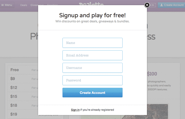

Dealotto does an amazing job of popping a modal up the first time you visit, encouraging you to sign up for notifications when they release new products. The layout of the landing page is also crisp and clean, with big CTAs that tell you to sign up or buy. I really like the idea of a modal popping the first time a new user happens upon your landing page. You can put whatever is important to you there, whether it be signing up, following you on Twitter, or downloading a free item.
4. Optimizely
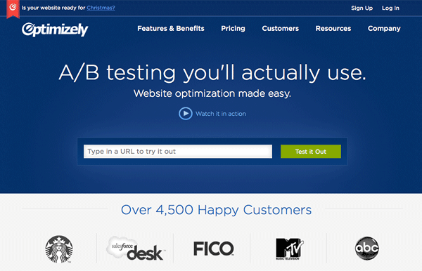
Optimizely has a simple yet sophisticated landing page that actually lets potential customers test drive their product. They’ve done a great job showing potential customers what they can actually offer. In addition, they have a killer landing page because they have simple dropdown menus that can help people find exactly what they’re looking for, and they highlight the fact that they are a reputable brand by showcasing clients they’ve worked with. Massive props to Optimizely for also preparing for Christmas in September. These guys are smart and know that people need to get ready for the holiday season starting now if they want their website properly optimized.
5. Hired

Hired, dedicated to finding talented people jobs with the best companies out there, recently launched their new site. Not only does the site look fantastic, but it has a massive and bold CTA inviting you to apply to either find a job or find a new hire. You aren’t bombarded with excessive information, just the facts plain and simple.
6. Crazy Egg
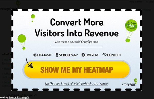
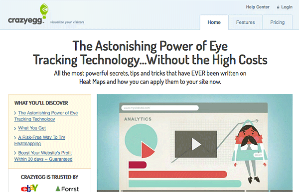
Crazy Egg is another smart site that pops up a modal for first time visitors to the site, or anyone that’s not signed up. They do a great job with their copy to convince you to sign up rather than simply exiting out. Once you’re on the landing page itself, there are multiple elements that make it optimized for conversions. The site features compelling copy, handwritten CTAs to draw your attention, an interesting video, and they prove they are trustworthy by showing reputable companies that use their services. The best part is that they demo their services on a site of your choosing to help you see how their product actually works.
7. Creative Market
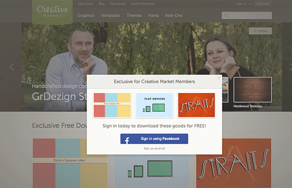
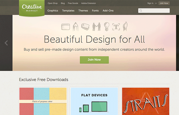
Every week Creative Market offers three new designs resources for free download to their users. It’s a great incentive that draws people in as new users. When you land on their webpage for the first time a modal pops showing you the latest free goods of the week, and then once you’ve exited that window there’s a bold CTA encouraging you to sign up to receive some awesome free goods as well as discover the other resources on Creative Market.
8. Build Zoom
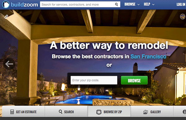
Build Zoom has a sleek and simple landing page that actually figures out where you are in the world, and with the click of a button let’s you search in your area for contractors. They make it incredibly easy to use their site and don’t overwhelm you with information. Their landing page is basically one big CTA encouraging you to search your area for people to aid you in remodeling projects.
9. Goldbely
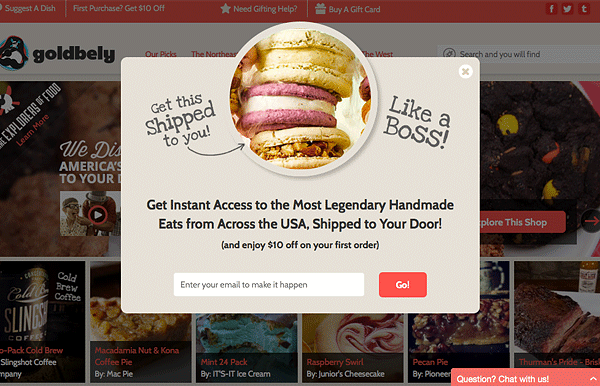
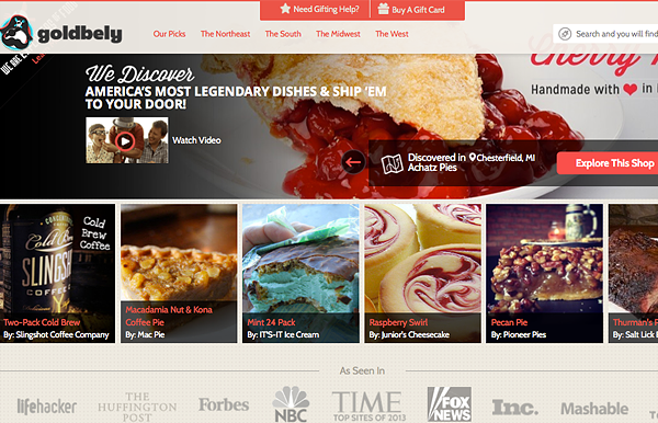
Goldbely is probably my favorite new site. Immediately when you land on their page, having never been there before, a modal pops encouraging you to sign up and receive info from there. Plus, they are super smart in offering you $10 on your next order by signing up as an incentive. Needless to say, I signed up. Besides having a modal pop right when you land on their page, their homepage prominently displays yummy looking food, a search bar, and a support kiosk. They do a great job helping you get where you need to go on their site.
10. CodeAcademy
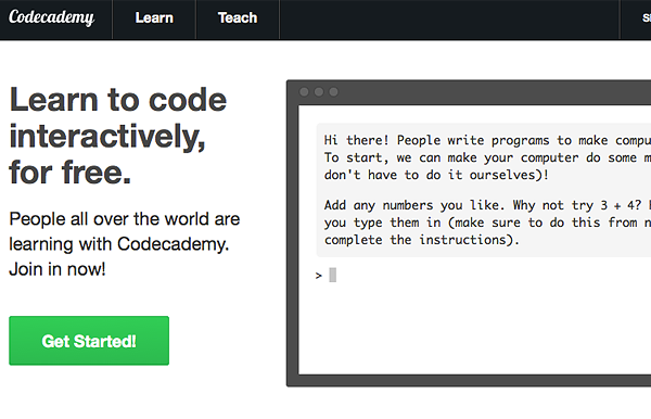
CodeAcademy helps people learn to code, and their website’s landing page couldn’t be simpler! They have an interactive modal that allows you to experience how their learning system works as well as a bold CTA. The modal walks you through a quick tutorial to see just how easy it is to use their product, it couldn’t be simpler!
Interested in learning more about landing pages that convert? Check out 4 Tips to Creating a Successful Landing Page.