Last Updated on March 3, 2024
Theurel & Thomas by Anagrama
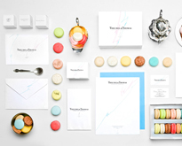
Theurel & Thomas is the first patisserie in Mexico specialized in French macarons, the most popular dessert of the French pastries. For this project it was very important to create an imposing brand that would emphasize the unique value, elegance and detail of this delicate dessert.
“White was our primary tool for design. As a result of this the attention was fully oriented to the colorful macarons. We placed two lines in our design in cyan and magenta, as a relation with a modern French flag to inject a vanguard vision to the identity. We selected Didot (created by Firmin and Pierre Didot), a French typography that would present the brand with sophistication.”


Check out our previous articles!
- 40 Clever Minimal Logo Designs
- Words as Images by Ji Lee
- 30 Cool Food Logo Design Ideas
- 20 Fictional Logo Designs for Your Inspiration
- 30 Memorable Logo Identities by Gert Van Duinen
Did you enjoy this article? We would love to hear your thoughts, so don’t be shy and comment below! Please don’t forget to subscribe to our RSS-feed or follow Inspirationfeed on Twitter, Google+, and Facebook! If you enjoyed the following article we humbly ask you to comment, and help us spread the word!