
Last Updated on February 29, 2024
Nothing or nobody is perfect. The same goes for websites. Every single website on the web could always use some sort of improvements.
Today we will showcase great redesigns of popular websites and apps by great designers from Dribbble, Forrst, deviantArt, and Behance. The designers behind these redesigns took this massive challenge to improve their skills, gain recognition among the design community, and of course beef up their portfolio.
The results are bound to catch your eyes. Personally, I’m in love with the Amazon redesign. Fingers crossed Jeff Bezos checks it out.
It’s always a treat to see another designer’s take on a famous website. More often than not, their concepts turn into interesting ideas. Okay, enough blabbing. We hope you’ll appreciate these redesign concepts. Enjoy!
Note: For more awesome redesigns concepts, be sure to check out Redsgned.com.
1. IMDb
![imdb[1]](http://inspirationfeeed.files.wordpress.com/2013/07/imdb1.png)
IMDb is the International Movie Database and is used by many to track actors, TV shows, movies, and more. A redesign of IMDb was warranted, because it has retained the same layout for years. IMDb may be a little confusing to use because it has a lot of links all over the page. For a new user, this can be frustrating. The redesign of IMDb by Flip Slovà?ek makes the site a lot easier to use. Slovà?ek’s redesign makes IMDb look like a web app. It has several panels, each of which are scrollable. Dividing the page into panels like this makes it easier for the user to interpret information upon loading the page.
2. Amazon
![amazon-redesign[1]](http://inspirationfeeed.files.wordpress.com/2013/07/amazon-redesign1.jpg)
Amazon is one of the most popular online shopping websites. You can buy nearly anything you could need on Amazon, from a coffee mug to a fork lift. Amazon’s design has been successful in that it is easy enough to use and aesthetically appealing, however, it is a little boring. Yanis Markin’s redesign of Amazon fixes this problem. Markin makes Amazon look more modern by representing similar products and related items in grids above and below an product. Overall, Markin’s redesign is more intuitive and simpler.
3. Facebook
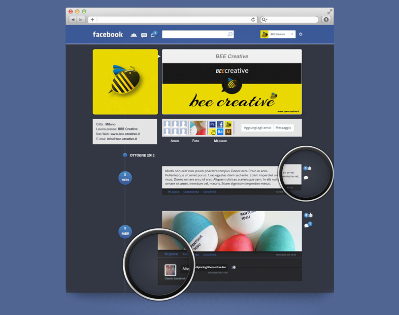
Facebook is the largest social media website, so it has seen a lot of redesigns. However, one redesign that particularly stuck out was by Claudio Sabatinelli. With more and more Facebook updates, many users feel that the site is becoming more challenging to use. Sabatinelli reduces the clutter that Facebook currently has and makes the site look more like Path or Tumblr. This would be a blessing for many of the less tech-savvy Facebook users, since Sabatinelli’s redesign is much easier to use.
4. Spotify Mobile
![spotify_preview[1]](http://inspirationfeeed.files.wordpress.com/2013/07/spotify_preview1.jpg)
Spotify is a mobile app that lets users listen to millions of songs. Since it’s so heavily used, some users think a redesign could save them time. Robin Kenell’s redesign of the mobile app makes the app match its desktop version. This would make it easier for users to use, since they would only have to learn how to use one layout. Many users would appreciate being able to share the same experience across platforms. Kenelll’s redesign brings back the shuffle and repeat buttons from the ‘more’ tab to the main screen.
5. WhatsApp
![redsgned_dora[1]](http://inspirationfeeed.files.wordpress.com/2013/07/redsgned_dora1.jpg)
WhatsApp is an instant messaging mobile app that allows users to send messages and pictures to their friends with their data plan, rather than via SMS and MMS. This allows users to save on other phone charges. The app is currently designed well, although it’s a little bland. Dora Szabo’s redesign of WhatsApp gives the app a friendlier interface that is also more intuitive and engaging. Szabo focuses on keeping the app simple but with a little more spice. Extra emphasis was placed on keeping the app homogeneous, so users don’t get lost trying to message their friends.
6. Steam
![Steam-Website[1]](http://inspirationfeeed.files.wordpress.com/2013/07/steam-website1.png)
Computer gamers use steam heavily as a game marketplace. Their website has always seemed to be a little dated. Josh Collie redesigned Steam so that it would display well on mid- to high-range computers, since many computer gamers have powerful machines. Collie focuses on making the Steam client a joy to look at by making it more modern and clean. Collie swapped the fonts in the client for more legible fonts. This redesign will be more appealing to gamers, and although it places emphasis on creating a nice display for more expensive computers, it will still display well on lower-end computers.
7. Google+ App for iPhone
![iphone_pre[1]](http://inspirationfeeed.files.wordpress.com/2013/07/iphone_pre1.png)
Google+ is an alternative to Facebook, just without nearly as many users. The Google+ iOS app is already designed well, but designer Zahir Ramos felt that it could use an update. Google’s app for Google+ offers a pleasant experience to users, as it is similar to Flipboard in some ways. Zahir plays this up and adds stylistic changes to some elements that were previously easy to ignore. Zahir also perfects the icons. Possibly, if this beautiful redesign were implemented, Google+ would gain more users, since the app would be a joy to use.
8. Pixar
![pixar-redesign-full[1]](http://inspirationfeeed.files.wordpress.com/2013/07/pixar-redesign-full1.png)
You would think that Pixar, a company that creates some of the top animated movies and shows, would have an awe-inspiring website. However, this was not the case. Instead, Pixar’s website was a huge disappointment. As such, Pixar’s website needed a redesign. Phil Stringfellow’s redesign of Pixar has an interesting concept – letting Pixar’s famous characters tell Pixar’s story.
Stringfellow makes this possible by featuring well-known characters, textures, and colors immediately to users just loading the site. The site has a background based on the wallpaper from Andy’s room in Toy Story. Pixar fans are bound to be satisfied with this redesign, as it quickly reminds them of their favorite Pixar works.