Last Updated on March 5, 2024
Designing a great portfolio is tougher than it seems. There are so many creative disciplines from photography to UI to painting and writing, all of which need to present work differently.
I want to share some practical design tips for anyone looking to launch their own portfolio online.
There is no single “best” design style since it often comes down to preference. But there are many UX strategies that work across the board and they should be applied to your portfolio site no matter what creative work you do.
Great Portfolio UX
The best user experience caters directly to the user. This shouldn’t be a surprise since that’s who you’re designing for.
But your portfolio is your window out to the world. It’s how potential clients find your work and it’s generally their first impression of your work.
You always want to make a great first impression and the best way to do that is with a solid user experience(and some great work too).
These are key features I look for in the best UX portfolios:
- Clearly showing what/who the portfolio is for
- Easily accessible navigation links to access all content
- Obvious way to contact the person or agency team
- Work samples prominently on display
Check out the portfolio site of Bob Galmarini for one design style with a solid user experience.
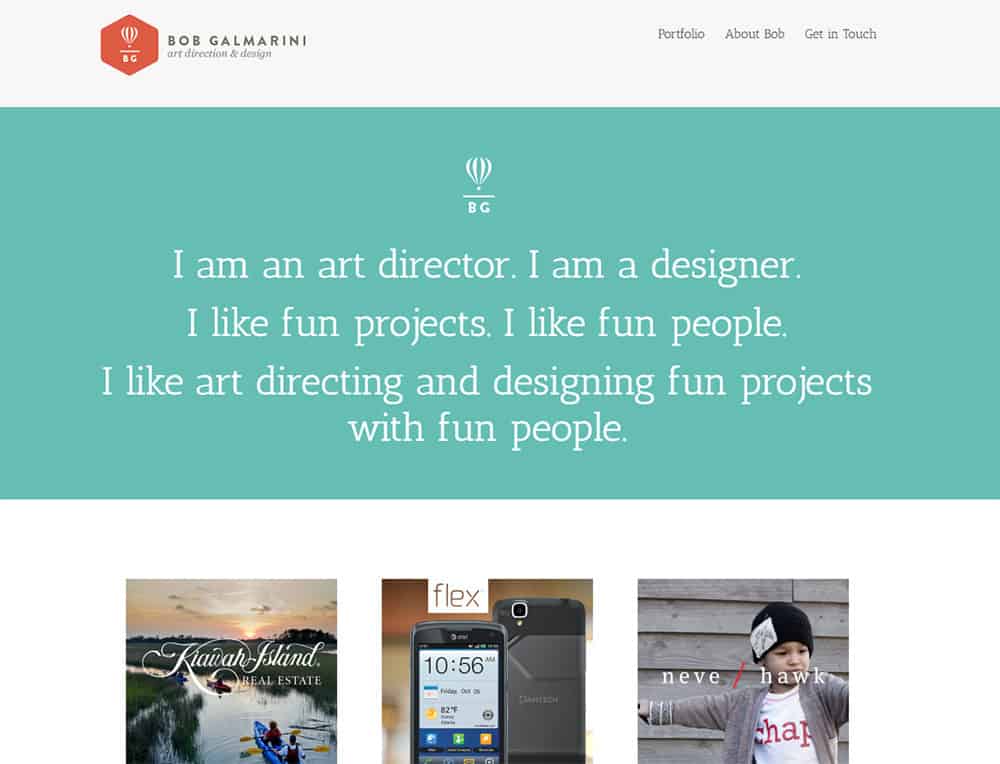
This site tells you exactly who the site is for with a large logo attached to the navigation. Plus there’s supersized text above the fold telling you the kind of work Bob does.
If you scroll a bit you’ll find samples of his work along with thumbnail previews for different projects.
It’s always smart to incorporate both visuals and text into a portfolio. That way you break up the monotony of text and the vagueness of images.
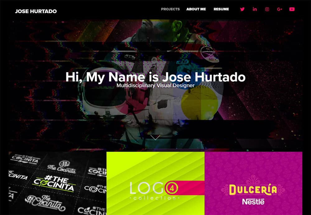
The main site for Jose Hurtado is also a fine example of user experience done right.
His design incorporates a dark background with very light text which naturally boosts contrast and makes reading easier.
Don’t shy away from a dark website just because it’s not the norm. In fact, dark designs can work incredibly well for all creatives because the dark feels like a natural background.
I’ll share more examples later on different types of portfolios but always be on the lookout for UX patterns when browsing the Internet.
The more you study other websites the more you’ll notice and pick up to use in your own design work.
How To Design For Performance
Aside from a great experience you also want a website that gets you results.
It’s not just about having a usable portfolio site. You need one that’s usable and that gets you work. That likely means landing you more clients or more potential clients who show interest in your work.
You can accomplish this in two ways: one is to push your work on every page so people can’t ignore it. The other way is to encourage visitors to contact you with easily accessible contact details or email forms.
Tiffany Jiang’s site follows this strategy with massive project preview images from her portfolio right on the homepage.
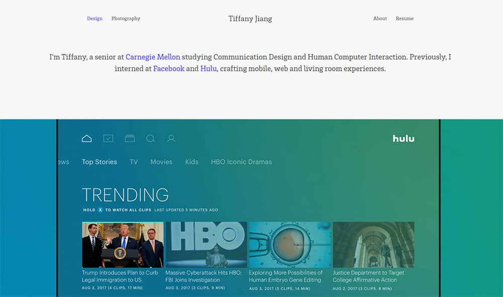
This technique works well if you follow a grid-style design where the images fit into a series of thumbnail grid items.
Visitors should have an easy time browsing through her work and stumbling onto cool projects. But without easy contact details that may not amount to anything.
Another site with this same technique is Delisa Lopez’s portfolio. It features just two simple navigation links: “portfolio” and “about”.
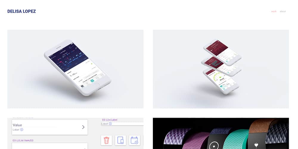
There are some dynamic page animations to grab your attention too.
But if you click the “about” link you’ll find a strong CTA button encouraging the reader to send a contact message.
That’s what you want for a portfolio that actually produces results. Get readers taking action and you’re sure to gather more work over the long term.
Just keep in mind that your site’s design should be elegant and usable, but also give you results as a freelancer looking for work.
Creative Portfolio Design Tips
To cover some unique designs in more detail let’s look into the many different types of creative portfolios.
I’ll share some of my favorites across many different creative disciplines just to outline the techniques you can apply to your site. Keep in mind these aren’t all the possibilities for a creative portfolio design, but these should get you thinking on the right track.
Photographers
I typically find that dark portfolio sites work a lot better for the average photographer. I see this on personal sites and with agencies too.
Eolo Perfido Photography uses strong text and a dark background to grab your attention fast.
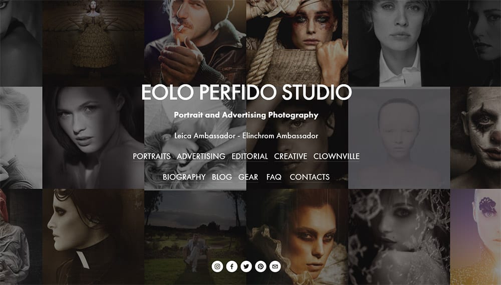
The background slowly fades with a collage of different headshots of portraits too.
It’s a brilliant effect that gets people interested and shows the photo quality. Not to mention the strong header text clearly describes the type of work offered(portrait & advertising photos).
But moving towards the lighter side we have the portfolio site of Denis Olivier.
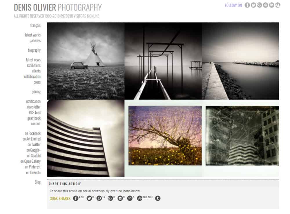
Clean logo, fixed side navigation, and a homepage featuring plenty of works to dig into.
This places a heavy focus on the user experience while keeping everything clearly in view. When it comes to photography portfolios I always recommend going minimalist.
The photographs should speak for themselves and I rarely see photo-oriented sites that need much else on the page.
If you want to add some colors or icons you can do that through page sections or the main logo. That’s what you see on Reflexion’s wedding photo site.
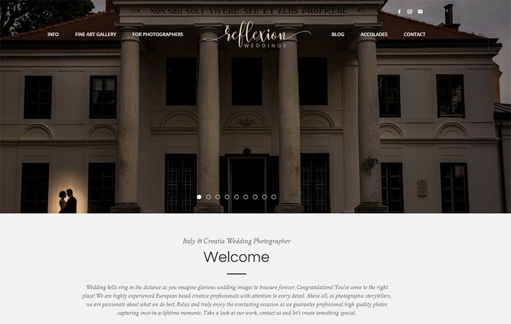
The overall page composition feels “lighter” with more space between page elements. You can do the same if you add light backgrounds into different sections between your content.
I do like the main sliding header with alternating photographs but I’m also glad there’s a gallery of work on the homepage too.
In fact there’s good reason to avoid carousels because they generally annoy users. In this case I think it works only because the background photos aren’t crucial to the experience.
Artists
Art portfolios can follow similar design styles as photography portfolios.
But what I see more often with artists is labeling works into different categories.
Many artists offer a variety of styles and different clients have different needs. But you can always keep the same simple layout without too much pressure.
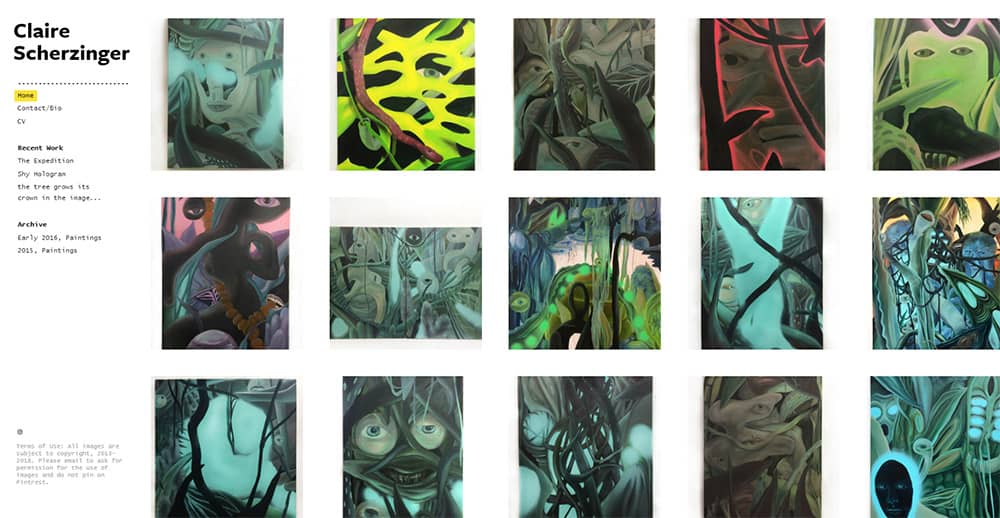
The design above is from Claire Scherzinger’s portfolio and it’s a nice example of simplicity in action.
Clear thumbnails, easy to access contact info, plus the images work through a visual slideshow(even on mobile).
If you’re an artist unsure of what to do with your site then just go minimalist. It’s a safe and reasonable option.
Granted I do like to see art portfolios with a little spice to them. And you can find plenty of tips on artist portfolios if you dig around. The problem is executing a fancy design while keeping the site usable.
The portfolio of Steve Lowtwait is a brilliant example of spicy design work.
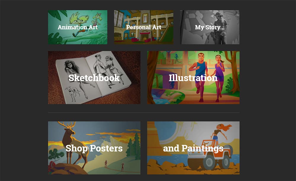
Brilliant typography, very strong writing, clean grid-style layout, everything you’d want in a portfolio. Plus you can still browse through his work easily.
If this is a direction you like it’s certainly viable to try on your own.
Look at other sites like Steve’s and jot down the things you like most. Think about how you can add those to your site without sacrificing usability.
Digital Designers
If you do professional work as a designer(or hope to one day) then you should have no worries about your portfolio.
There are thousands of design portfolio sites online that you can study, pick apart, and re-combine elements together to get your own. But with designers I typically find custom layouts that veer away from minimalism.
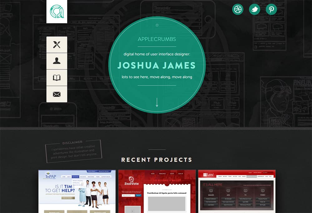
The homepage of Joshua James is a very nice example.
It uses a dark background with a fantastic pattern that’s easy to look at. Doesn’t distract from the page but still adds some texture.
You don’t need to go crazy with icons and patterns and custom type.
But I do think designers should really try to break outside the minimalist mindset. Your design portfolio site is the perfect work sample to showcase what you can do.
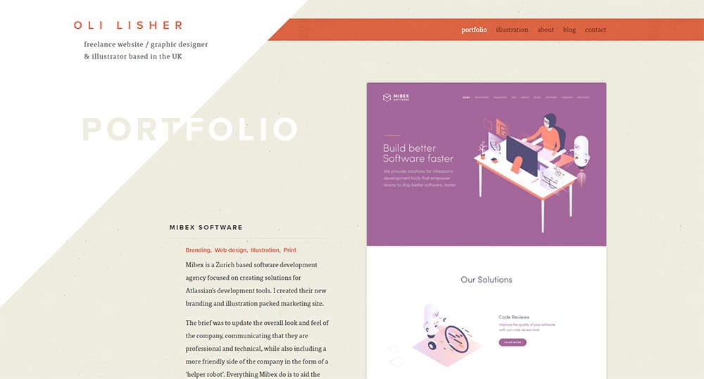
Here’s another slick design from Oli Lisher. Again this isn’t too crazy but it’s definitely unique.
The navigation menu stands out so it’s easy to find at a glance. The pages are clearly marked and there’s a seemingly never-ending list of portfolio items right on the homepage.
Yet none of this feels boring or cliché. It looks like the work of a professional designer.
And if that’s your goal then your portfolio should convey that. My biggest recommendation is to just search Google and look for more ideas. Write down the aspects you like and ignore the styles you hate.
From there you can sketch some wireframes and plan out your perfect design.
Writers
Writing portfolios are some of the hardest to design because the work isn’t visual.
You can add photos of websites you’ve written for, or maybe covers for books you’ve published. But none of that conveys your writing style.
For writers I suggest designing a site that stands out & feels memorable. Something that’s branded so clients remember your page and know how to find you.
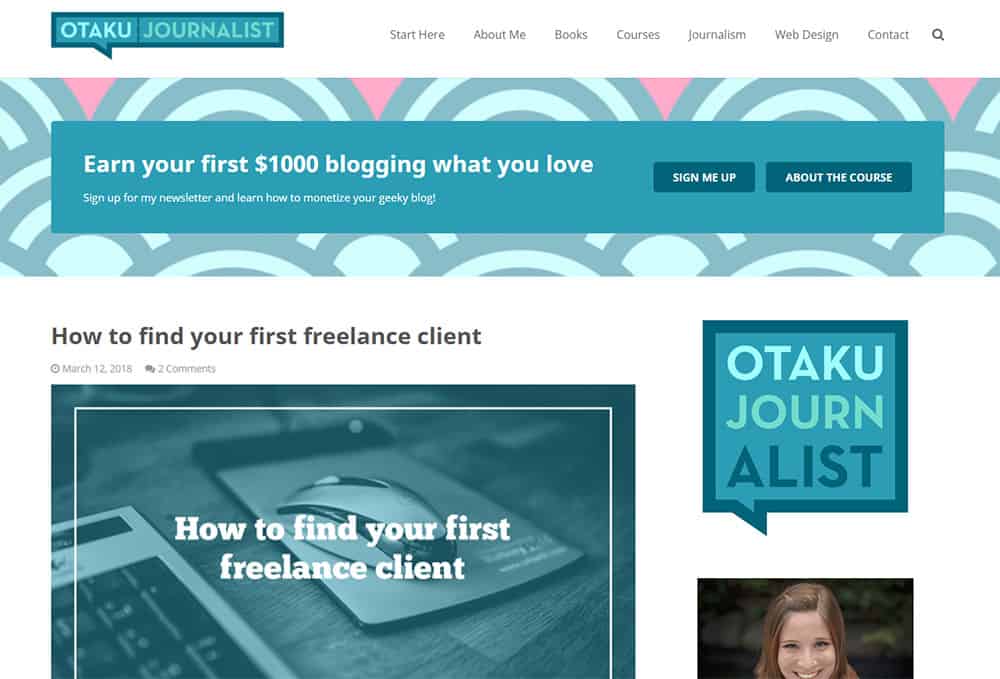
The writing portfolio for Lauren Orsini is cleverly branded as Otaku Journalist because of her writing specialty. This is super easy to remember and the logo really stands out.
She uses a blog on her site which is definitely a good idea if you want to land writing gigs.
This way your blog is both a source of content marketing and a sample of your writing work. Although I do recommend adding a specific page to the site just for your main writing samples.
Let’s look at another example from Keri Lynn Engel.
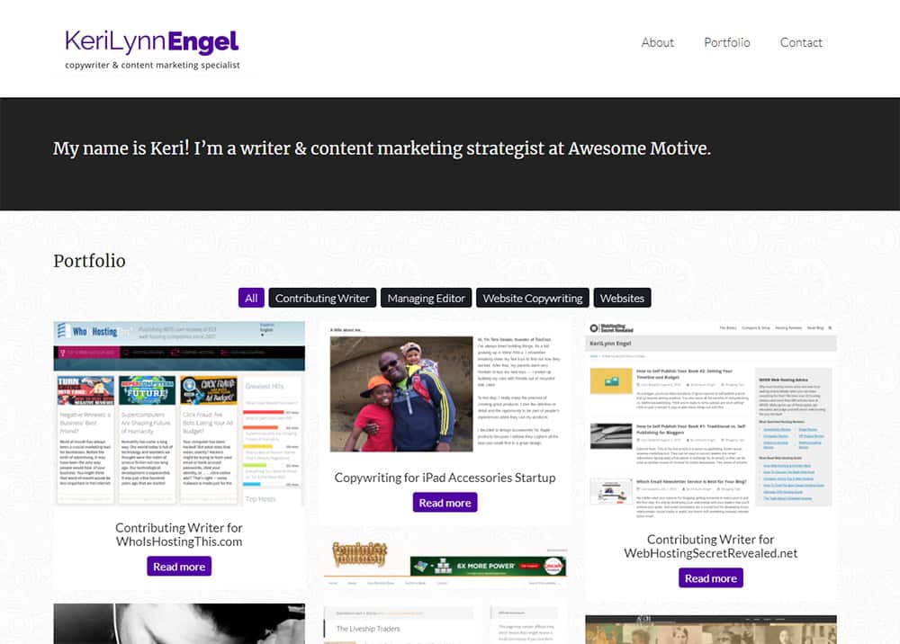
Her page is very basic and the homepage even uses thumbnails to grab attention. They don’t show off the writing, but rather the sites Keri has written for.
Visuals grab attention faster than words so if possible try to pair your writing with some visuals. It won’t be the easiest thing to do if you’re a technical writer but it’s a lot easier for anyone who writes for blogs, websites, or ebooks.
Also one more point: if your work doesn’t have visuals consider adding photos of yourself!
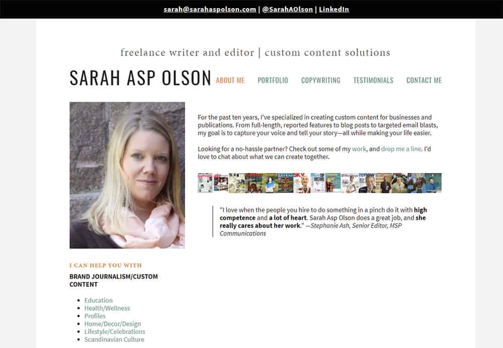
Sarah Asp Olson does this on her writing portfolio and I think it works very well.
Clients don’t hire writers, they hire people. It’s the same across every industry.
People want to know that you’re a real person behind the computer and a small portrait really goes a long way.
Coders
If you write code for a living(or want to) then you may not really “need” a portfolio website.
But I personally think it’s a huge benefit and it’ll give you an edge over others who don’t have an online presence. You can use your portfolio to write tutorials, share tips, or just list projects you’ve built.
Chris Pederick follows that technique on his site to a tee. Right from the homepage you get a sample of what he does and what kinds of projects he’s worked on.
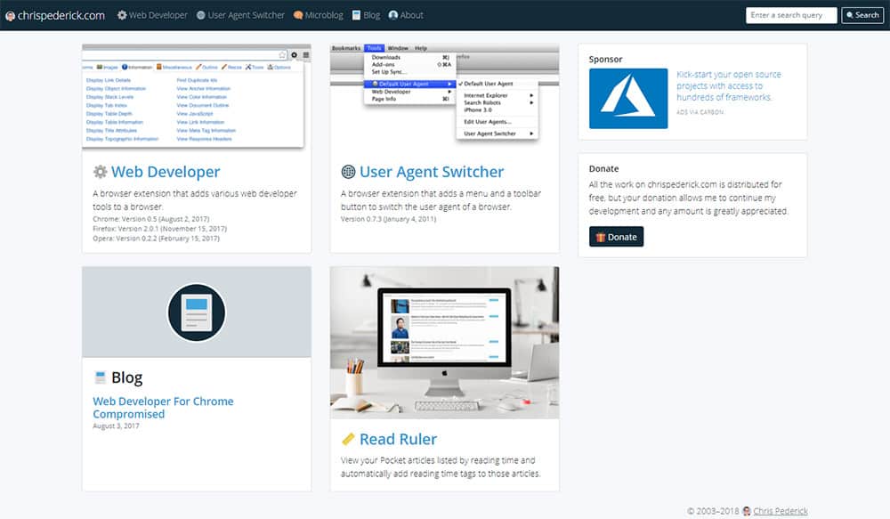
Coding is very much like writing because neither one is easy to look at. These are not visual mediums so you have to design your portfolio in a way that it encourages visuals.
These can be logos for companies you’ve worked for, screenshots of code, or even screens from personal projects you’ve built.
Or you can add some stylish page graphics & animations like the portfolio of Matthew Williams.
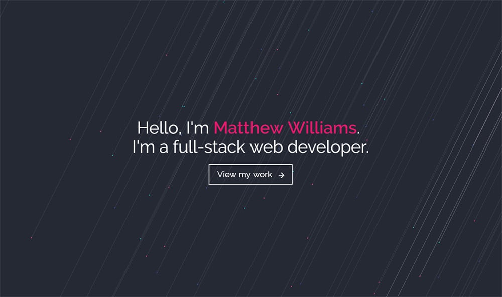
This has a brilliant color palette and some incredible page animations when you scroll down.
If you do a search online you can find lots of free iconsets to use in your design. This is great for developers who don’t know their way around Photoshop or Illustrator.
Coders will probably want to follow a mix of techniques borrowing from writer portfolios and graphic designer portfolios.
It’s best if you can design a page that’s full of enticing graphics, logo/branding icons, typography, relevant colors… all while clearly showing off your project work with links to GitHub too!
Designing Your Perfect Site
Each type of portfolio targets a different audience. The people looking to hire coders are rarely the same people looking to hire a family photographer.
If you study what others are doing while following the tips above you can design a site that matches perfectly with your target audience.
The great thing about design is that you rarely have to change it very much. If you craft a brilliant portfolio design from the start you can likely run it online without many tweaks for 5-10 years or more.
The toughest part is getting started and I hope this guide can help you take that first step.

