
Last Updated on February 21, 2024
The term “above the fold” originated from the world of print. It’s usually where the top stories are placed in newspapers and played a crucial role in grabbing readers attention.
Web design adopted this concept to describe the upper portion of a web page. It is the very first thing your website visitors see when the page loads.
Therefore, this portion of the site getting the most action should come as a surprise. Whatever is above the fold impacts your visitor’s next decisions.
You need to place your most vital content in this area if you want to see a bump in your traffic. It’s also important to focus on usability rather than trying to be strict on what this fold contains.
These are just some ideas on how you should approach designing your site’s above the fold section. If you want more, below are five of the best practices to increase your site’s subscribers and conversions!
Five things you need to observe on your above the fold website
1. Killer offer
The key to having good content above the fold is to provide an irresistible offer.
By the way:
Never confuse and mislead your viewers with information on this page. Whatever is in here should be found within your website.
One of the main reasons why businesses get ignored is because of a weak page with no apparent value stated.
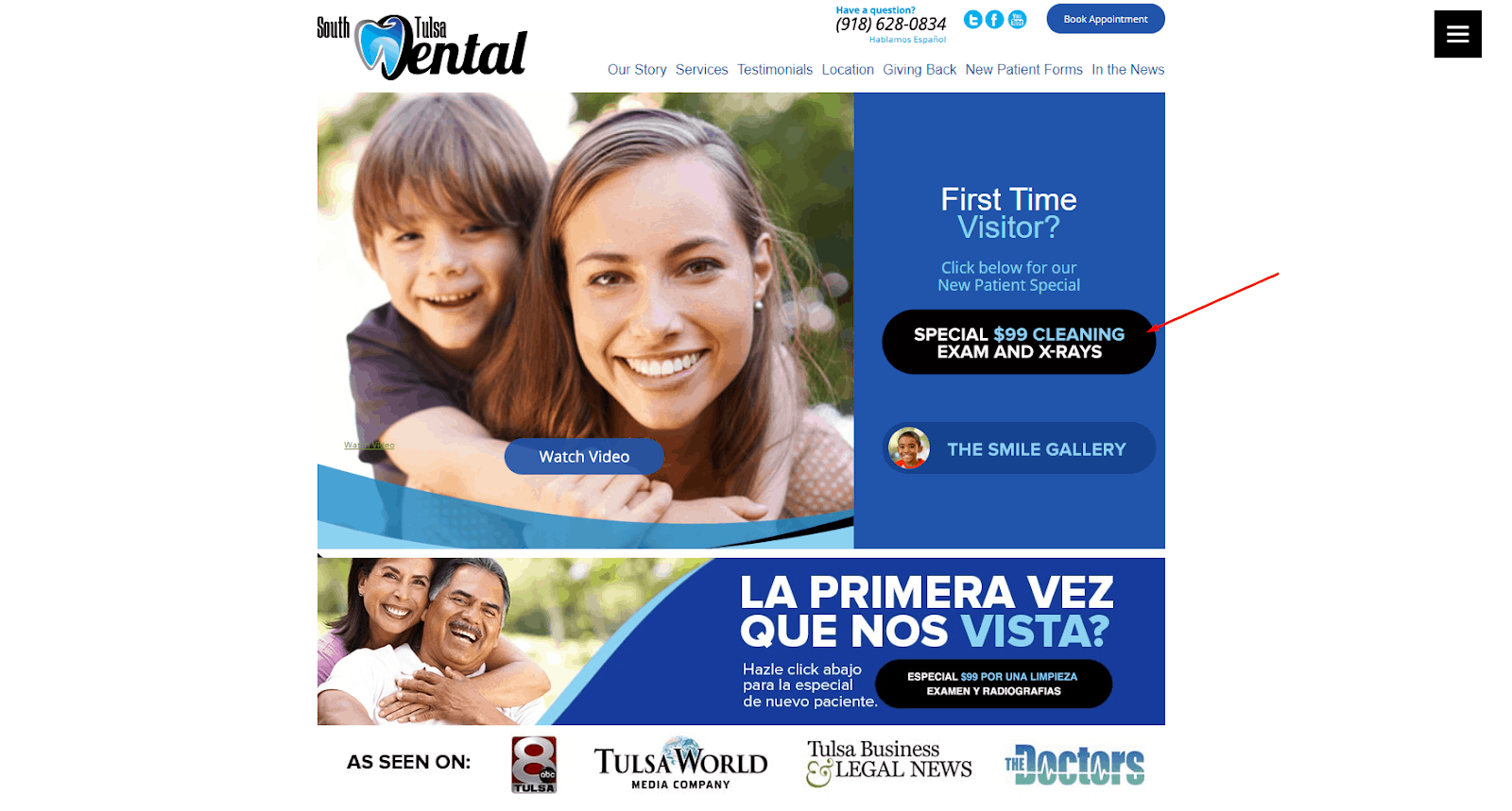
A good example of a killer offer is the homepage of South Tulsa Dental shows a button that offers two services for a price of one. Especially in the dental industry where the service costs are high, this offer is a breath of fresh air.
Therefore, what’s above the fold on your site makes a difference in user behavior.
2. Explainer copy
The above the fold section of your site must be sweet and simple. While its nature offers a way to creativity, it also presents difficulties.
In other words:
The brevity required for above the fold makes explain what you’re offering much harder.
As much as you want your visitors to know everything about you on that fold, never cram everything in there!
A brief explainer should be able to answer your visitors’ questions and tell first-timers what’s your product is about.
People are more inclined to read short phrases.
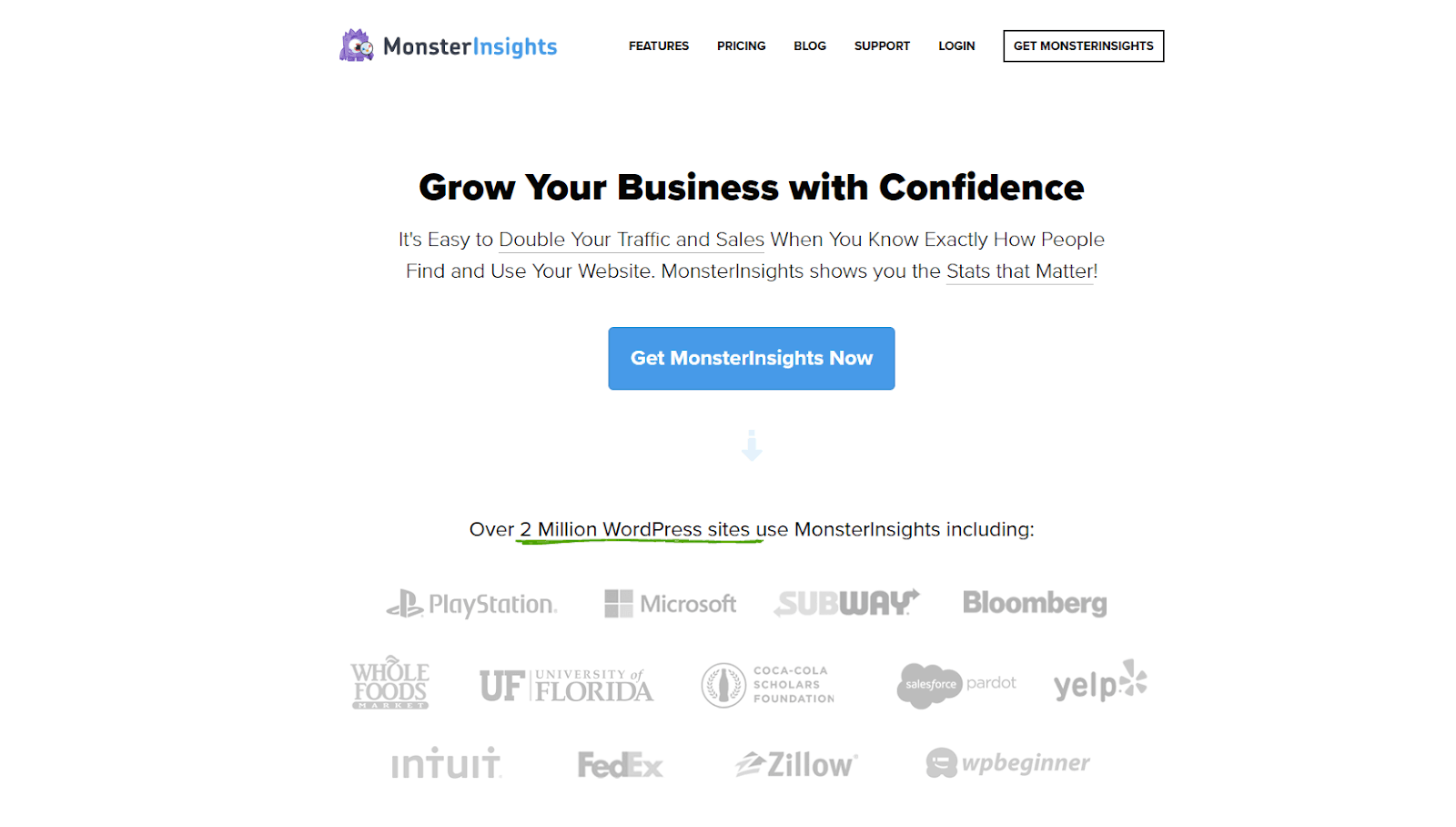
Here’s one example of a short explainer copy from MonsterInsights. In just two sentences, they’ve already explained that their service aims to double traffic and sales. No nonsense, just a concise introduction of who they are.
3. Unique selling proposition
It’s essential to include your USP in this fold. This is how you instantly show your visitors the benefits of what you have. It also gives them that extra nudge to explore your site further.
While your above the fold content is viewed more often, it doesn’t necessarily mean that all the details and calls-to-action should be in there. False-bottom is also not always necessary for getting them to scroll past the top content.
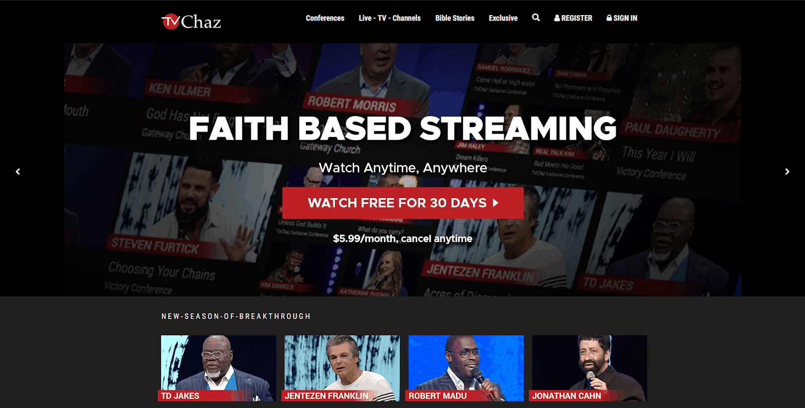
Here’s the above the fold content of TVChaz. In a glance, they’ve already established who they are with huge bold letters, and what they can offer you.
In short, they’re more than just a streaming service. They only stream “faith-based” content. From the above the fold section alone, you already get an idea of what the site is about!
Allow your visitors to explore your content because as it turns out, visitors are still willing to scroll as long as there is something to scroll for.
So, make sure that navigating your website is straightforward and intuitive.
4. Clear and straightforward CTA
A call-to-action button is the most essential element you need to have on your above the fold content.

Here’s a sample from the homepage of GotchSEO’s free mini-course. Notice the dark background, white texts, and a red button that’s calling for a click?
That button is tough to miss!
Interestingly, Boston Globe’s experiment on putting the CTA above the fold and below the fold have no significant difference.
This just tells us that your above the fold content isn’t just about the CTA placement. It could be a combination of elements such as button, web copy, font, and more!.
But that would only be proven by an actual test you do yourself.
If you pique your visitors’ interests, it’s highly likely that they will do more actions on your site.
5. Beautiful, hi-res images
Nothing more off-putting than a pixelated image displayed on the front pages of websites.
Above the fold designs are as crucial as its content.
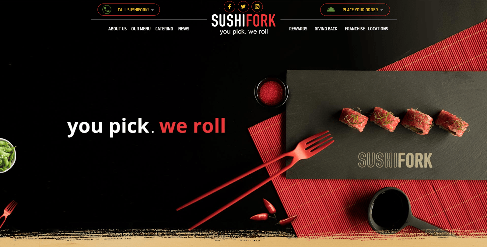
See how SushiFork effectively displays its crystal clear, mouth-watering images of sushi. Who can say no to that?
A handy free stock photos provider is there to help. Make sure you pick one that isn’t overused to differentiate yourself above the others.
Even better, take an original photo yourself! After all, it’s your business we’re talking about.
Bonus: Clear benefits
It’s easy to lose sight of what makes your business special. You have to manage different aspects of your business at the same time, which is no easy feat.
However, by clearly stating what customers will get from your business, you immediately pull them back into your sales funnels and make it easier for you to convert them into sales.
Take this locksmith website for instance:
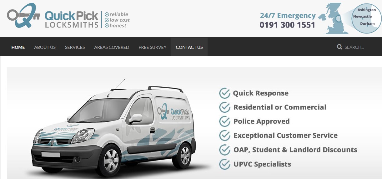 There are six benefits that make the website better than its competitors. For instance, if you’re a student, then the discount offered to people like you will grab your attention.
Or if you’re looking to get something done fast, then the quick response will appeal to your needs.
It’s really simple if you think about it:
Point out the benefits of your business and the customers will follow!
Conclusion
In conclusion, do not take this fold lightly on your website design.
Provide answers and make it easier for your visitors to access information within your website.
And if you are still starting out, test out which combination of these five practices are more effective in getting clicks and conversions.