Last Updated on February 21, 2024
How do you think people feel when it’s time to give that annual report again? You’ll probably hear groans and moans all around, depending on their performance.
Regardless of how people performed however, there is no stopping the fact that beautifully-designed annual reports can change the way people react to them. A few gasps and wows would be a welcome change, don’t you think?
As for you, the designer, it’s up to you to be the game changer. Annual reports don’t have to be all black, white, and boring. Sometimes, it also pays to show exactly what you’re here for through your annual report design – to liven things up.
How to Create Better-Looking Annual Reports
Steer clear from the usual boring layout associated with annual reports. Here are a few tried-and-tested tips that would help you create killer annual reports:
Experiment on a different format.
People think that when you see one annual report, then you’ve seen ‘em all. It’s going to be the same booklet filled to the brim with numbers that just start to blur into each other the longer you look at them. But all that could change, as long as you believe that annual reports can be creative, too.
Try creating an entire website for the annual report, or develop an app for it. These formats are definitely way more accessible than thick booklets, and you can do so much more with it design-wise. Scroll down to see examples of this.
Create a storyline.
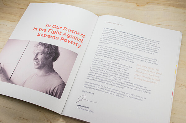
Nuru International Annual Report by Gabriel Schut
Every great piece of design always stems from an interesting story. This is exactly how you should start your annual report.
Make it more than just a series of pages filled with numbers. You can create an overview of everything that happened the past year, a timeline of what challenges were met and what solutions were given.
Make it a graphic presentation of the past year’s triumphs and lessons, with an endnote that emphasizes the company’s expectations for the next year.
You can even start right from the beginning. Phillips did just that in 2013, starting the annual report with the company’s proud history and connected it with what’s happening in the present.
Make it a visual experience.
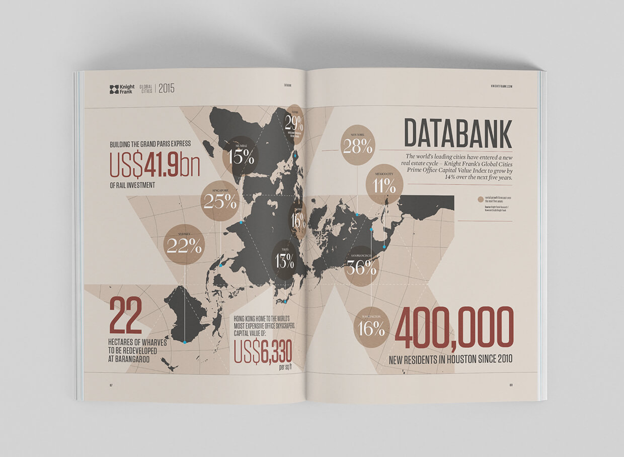
Global Cities Report by The Design Surgey
What makes annual reports boring? It’s all that black print against the plain white background, and reading it could be associated with your high school teacher droning on and on about numbers and formulas with half the class sleeping and the other half daydreaming.
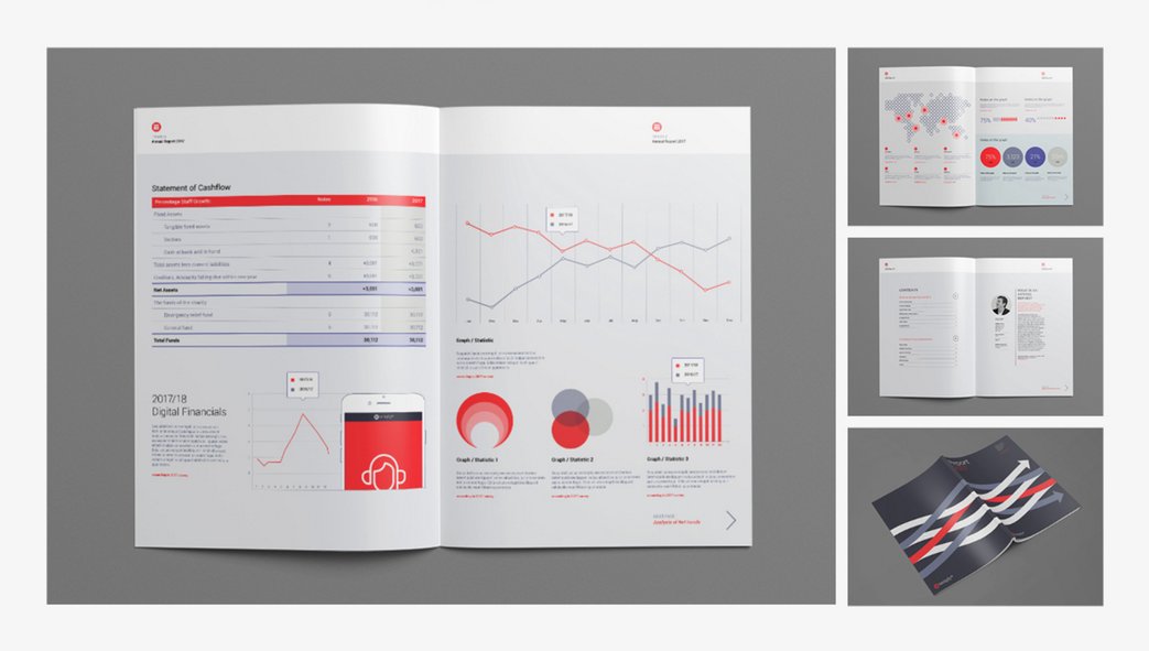
Well, guess what. As a designer, you can actually change that entire experience. See all those numbers? That’s an awesome opportunity for you to create eye-catching graphs and colorful charts. Use mind-blowing images as your background, adding more texture to the annual report’s pages than what people have always been used to. Imagine a trendy magazine, but with the company’s old boring digits. All of a sudden, you’ll find everybody enjoying as they flip through its pages.
Be bold with your typography.
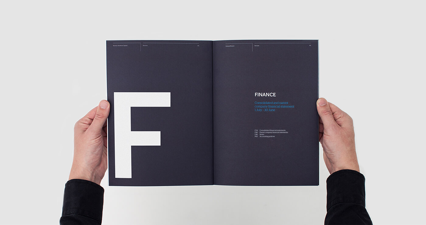
NAC Annual Report by Ineo Designlab
Let’s say you just can’t squeeze those visuals in. That’s okay, all is not lost. Times like these, you need to make do with what you’ve got. And what you’ve got is a whole lot of letters.
Find ways to make your titles, headers, and other elements stand out. And no, you shouldn’t stay within your comfort zone. Think oversized letters that cover almost entire pages. Think bright colors for words and phrases you want to highlight the most. The riskier it is, the better.
Make the most out of the space you have.
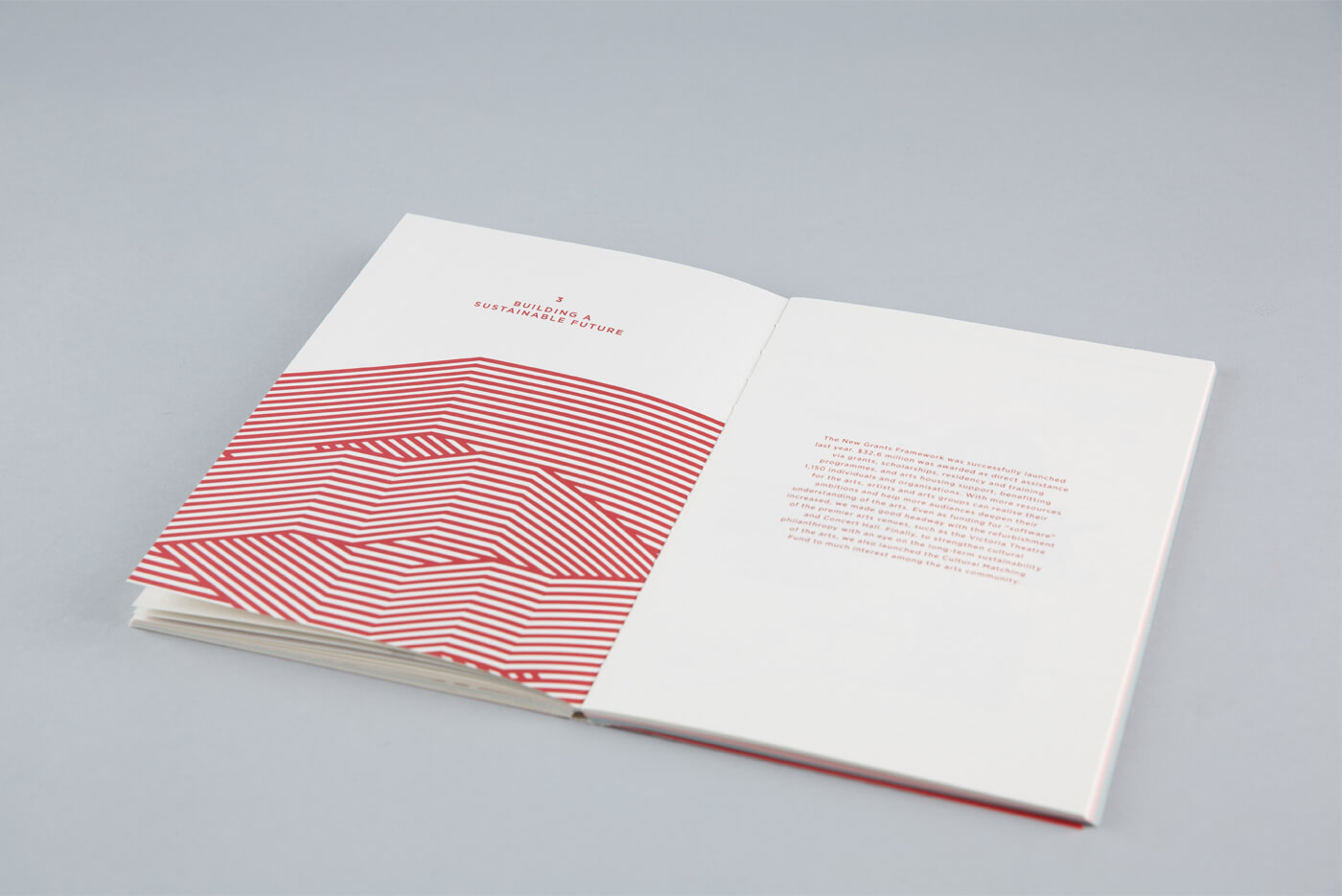
National Arts Council by Bureau
Imagine all that information stuffed into a few pages of a single booklet. That can be overwhelming, especially for those who keep seeing the same report year after year after year. Because of this, it’s wiser to add more space to each page.
Go beyond your comfort zone. Feeling like the margin you just set seems to be too big? That’s not a problem. The less text you have per page, the better.
Remember that if you pour out too much info on a single page, people are going to be nauseated with information overload halfway through it. So make it easier for them to process each piece of information by discussing one point at a time – probably one topic for each page, or maybe even for each spread.
As for all the space left over, take advantage of that space by using full background images, or by adding some graphic pieces.
Break each thought down.
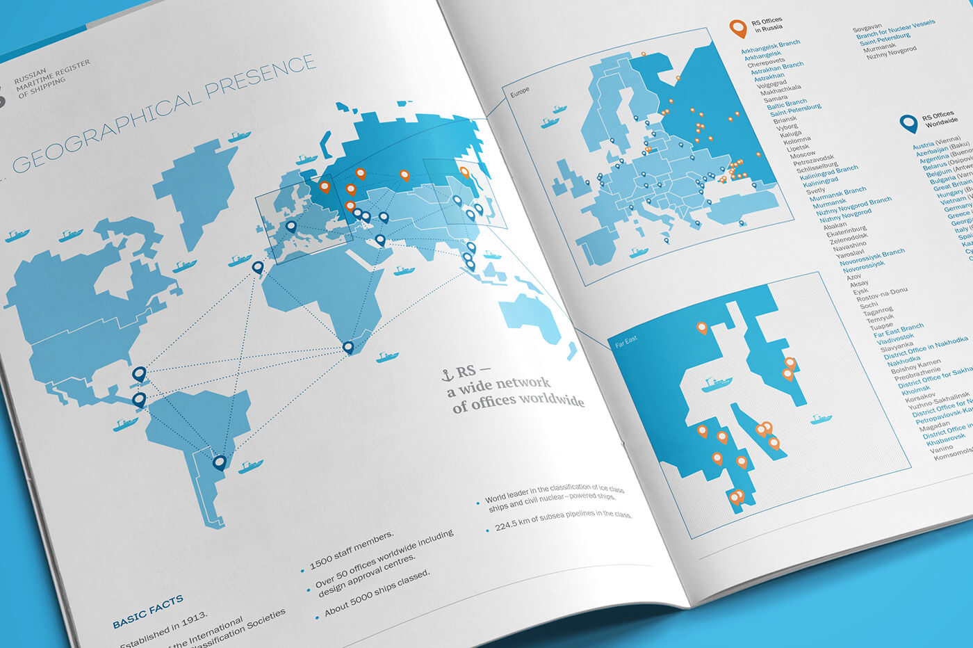
Annual Report for RS Russia by Artem Lukichev & Nadezhda Polomoshnova
Don’t give your audience a long, endless narrative. Wouldn’t you be bored yourself if you have to go through that?
Instead of pouring out all the information in one go, divide the information into different sections. Put just the right amount of text on each section, allow readers to digest what it means, then when they’re ready, they can easily move to the next page and move onto the next batch.
Make the most out of the cover.
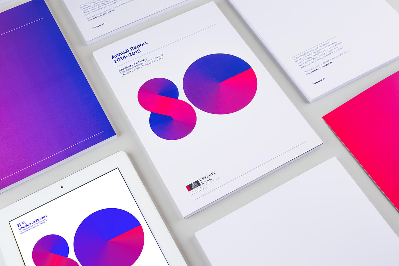
So your boss doesn’t want all those extras inside the annual report booklet. That’s okay. You still have one page left to go crazy on – the booklet cover.
For those who are not comfortable taking design risks inside the booklet, the cover page could be the area for you. Make the cover as appealing as possible, applying every technique you can think of that would make it pop out.
Design has always been quick to evolve, which means that for you to create a positive stir with your annual report, then you’re going to have to move with the motions as well.
A Glimpse at the Best
Looking for inspiration for your next annual report?
A few companies have taken the first advice given above, coming up with online annual reports instead of the traditional ones printed out in booklet form. And guess what? They made quite a bang with what they came up with.
Here are a few annual reports that you can mistake as works of art.
1. Designer News Statistics of 2015
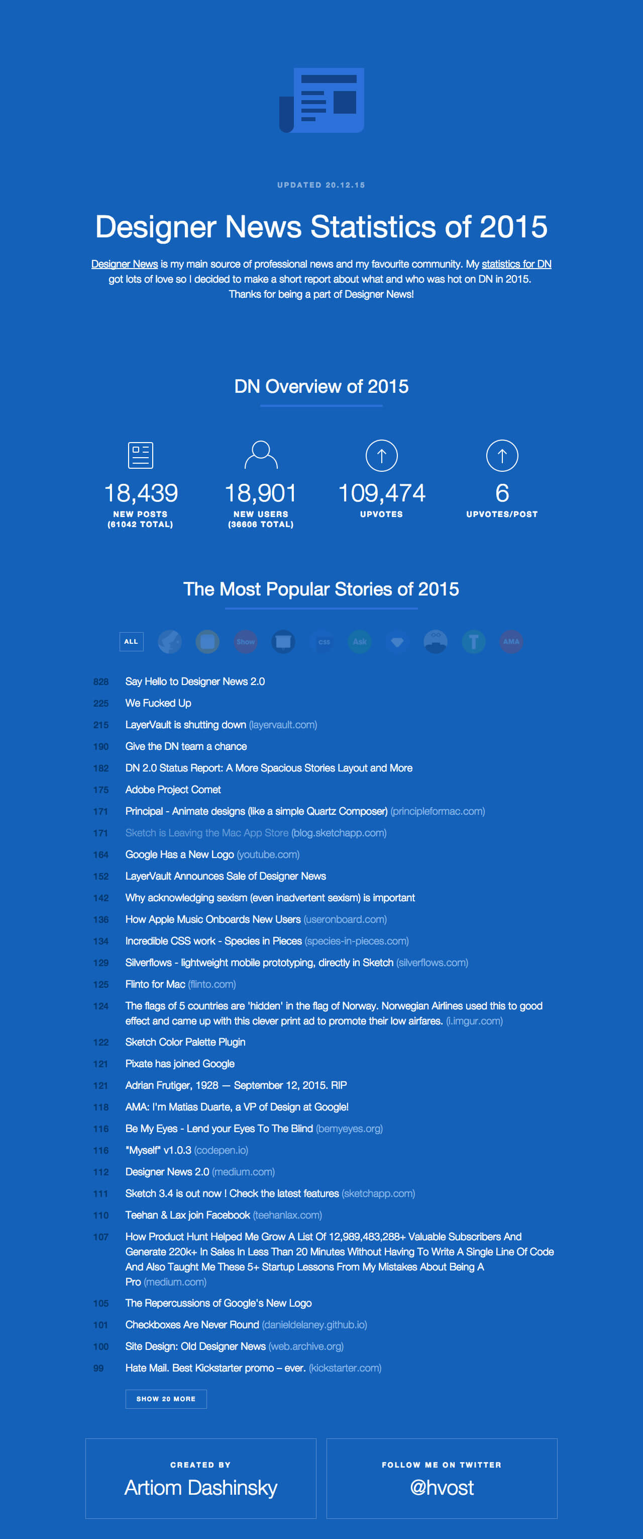
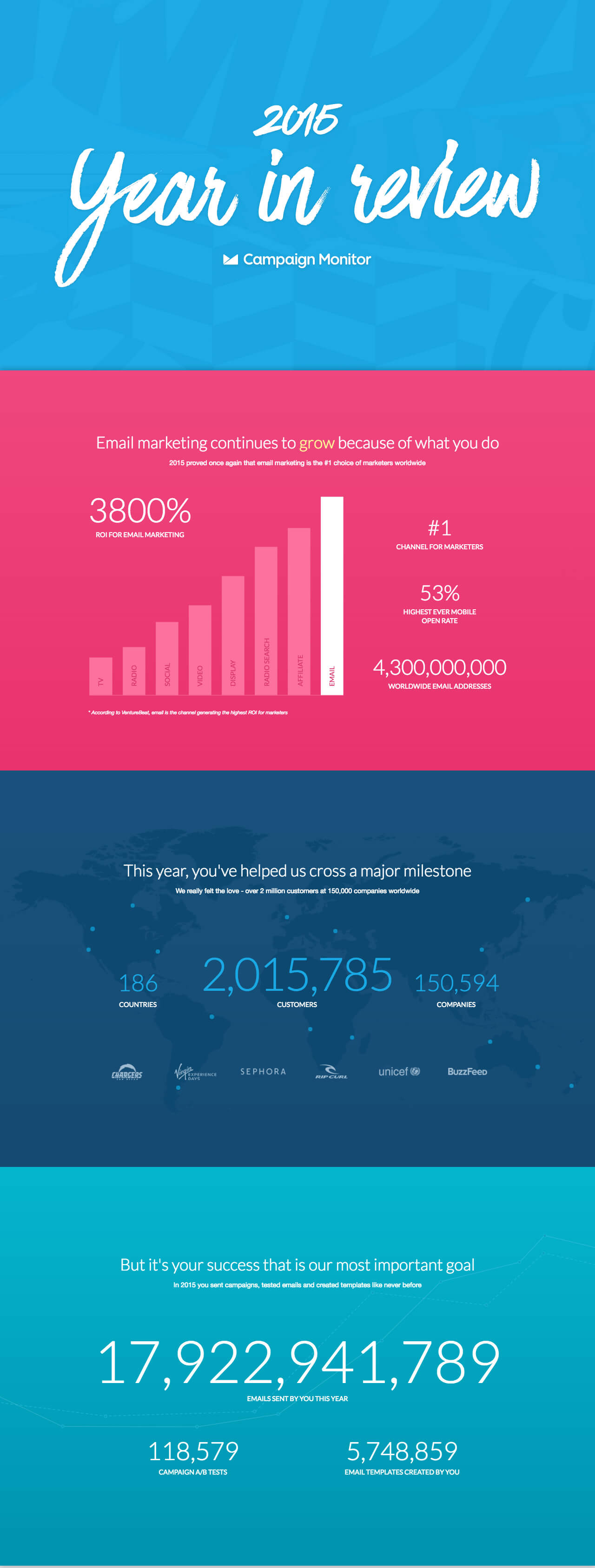
2. Campaign Monitor 2015 Year in Review
3. Spotify Year in Music 2015
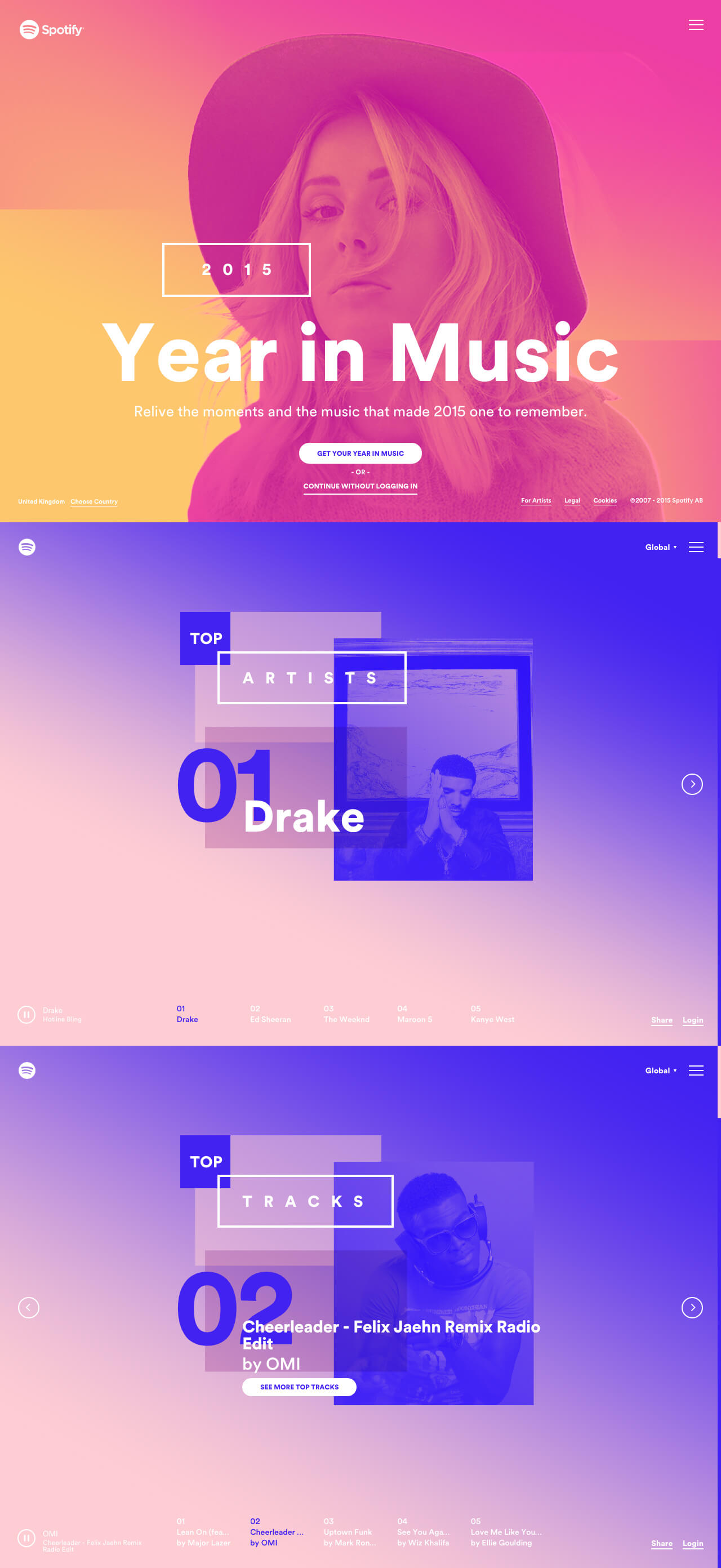
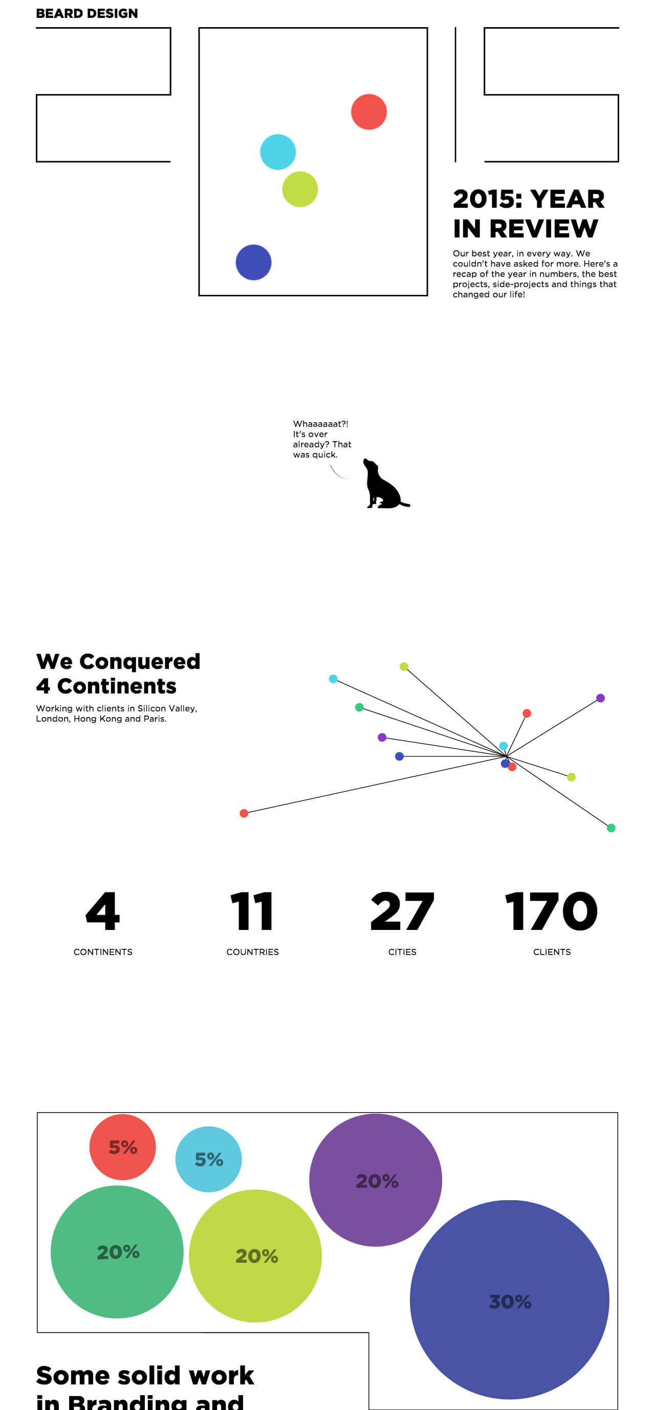
4. Beard Design 2015 Year in Review
5. MailChimp 2015 Annual Report
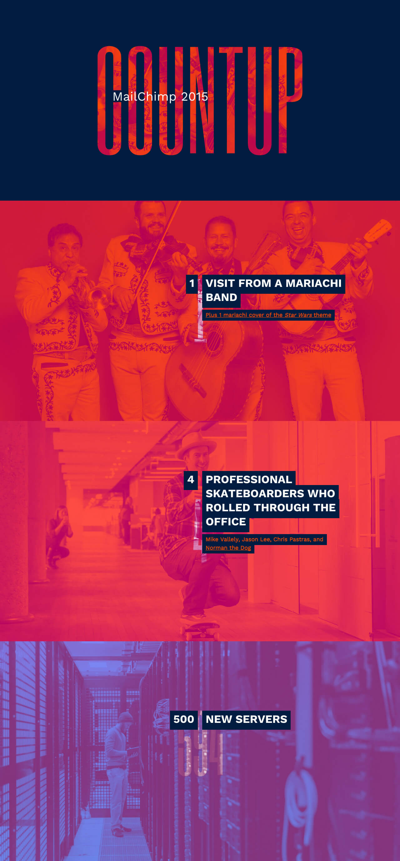
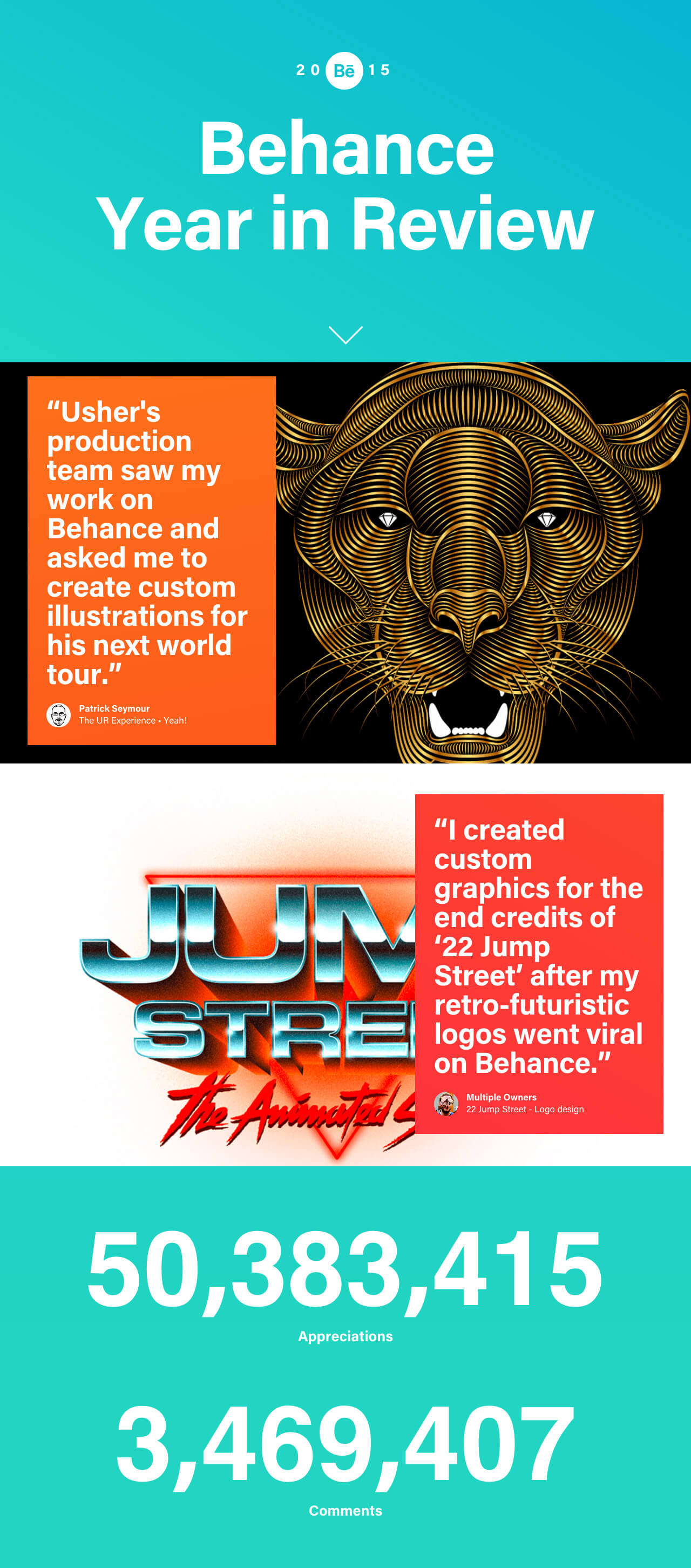
6. Behance 2015 Year in Review
7. 2015 Report by Essen International
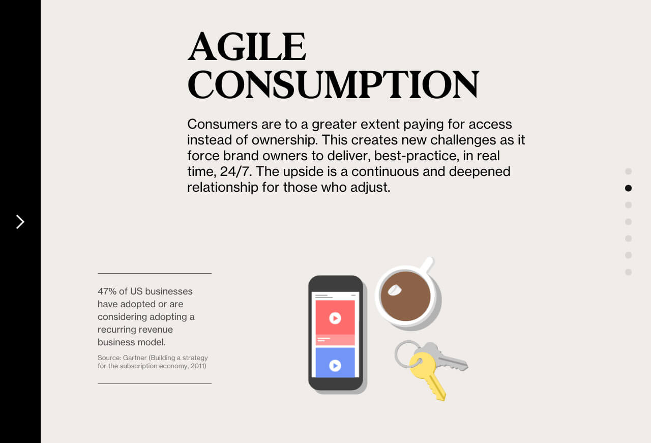
8. Creative Market Annual Report 2015
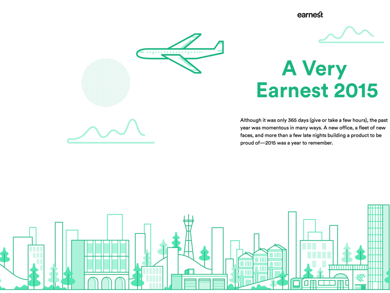
9. Earnest – 2015 in Review
11. Atomic Year in product Design
16. Muzil 2015
22. The Letterboxd Year in Review
23. Dribbble 2015 Year in Review
25. Condenast 2015
For more creative annual report designs, check out Yearinreview.co. It’s a collection of 2015 Year in Review pages from around the world. Enjoy!


