
Last Updated on March 3, 2024
Previously, financial, insurance and banking website designs were looked boring, dull and blurred – Templates over templates, no interesting images, videos and in short useless to scroll.
But today’s designing parameters establish its roots in the market.
Designers break their shell to create financial website design which is unique and relevant to your interest.
Nowadays, they adopt professional, concise and clean formatting.
Technology brings effective characteristics and these designing features are struggling to take part in creative thinking.
Here is a list of pragmatic attributes client look into a financial advisor website.
- 24/7 access
- Color scheme
- Call to action
- GIF
- Responsive design etc
A financial design makes sense without any glitter look because it’s more conservative, as they deal with money.
Customers want clear cut information which can easily approachable.
In this, you want everything well organized in a systematic way.
Suppose you want to apply for a loan and you’re not getting login button, this shows how much you take care of your words.
A big NO to flashing graphics, a matter of money is serious and people want some seriousness in a site before investing some bucks.
The idea of good looking website design will be clearer to you by moving forward in this article.
Let’s discuss 7 samples of financial web designing to grab user attention.
Edgewood capital advisor
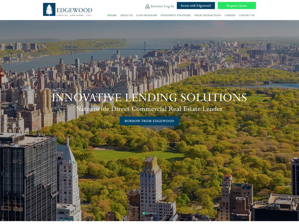
Highlights
- Images
- Content
This shows phenomenal finance website templates and a pair of images to create a most alluring design.
Simple and clear text is used to tell the story/services of the business.
The color scheme is brilliant to attract the audience at their first look.
Yes, in this, the whole investment concept is wrapped up in short and exactly the way you desire for your brand.
Usually, you look for simple and to the point information from the source along with attractive images to make your vision more clear and same you’ll get here.
Ashland partners
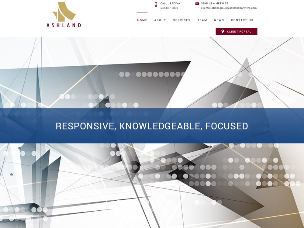
Highlights
- Text and images
- Informative content
- Responsive design
The Ashland partner website is a perfect combination of text with images.
The creative idea is engaged to capture the user’s mind.
The vast plus informative detail is passed to each portion and the most interesting thing of this design is, for your convenient contact number and email address is visible at the top of the website.
Kiplinger
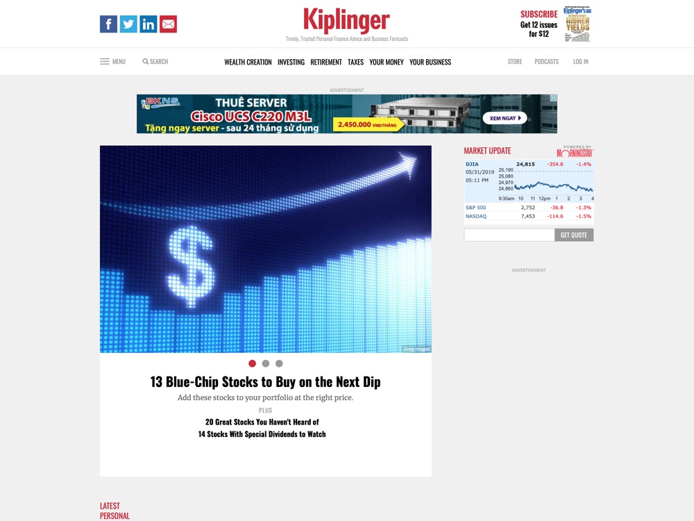
Highlights
- Typography
- Color scheme
The written content exists only when it is readable, understandable and appealing when displayed.
Typography is a correct sequence of words.
It is applied to arrangement, numbers, style and appearance of the process.
In Kiplinger site, typographic choices utilise so well that you can frequently look into it.
Its sad but truth, typography mistakes lead to a big error that’s not good in any way. Crowded letters, lines, not scaling proportionally, irregular spacing and mismatching fonts are the normal mistakes of designing.
The relevant color scheme is employed on a website to make the services link accessible.
Forbes Money
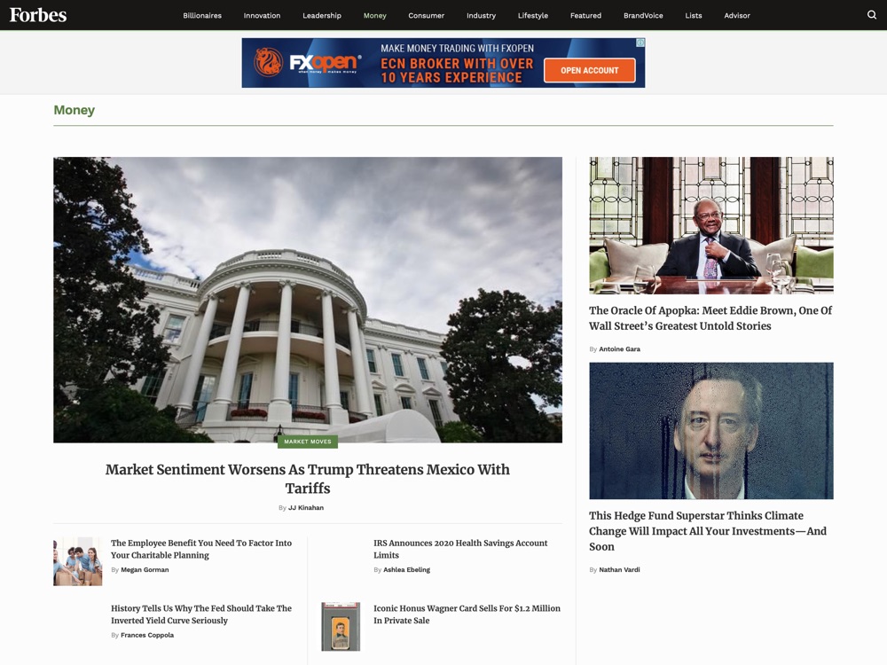
Highlights
- Photography and artwork
- Text
The artwork and photography of Forbes Money are really impressive.
Generally speaking, lower resolution images or graphics tend to look blurry and fake but the high-resolution pictures are more convenient to reflect a clear image to viewers.
If the image quality is poor, rest will have no value in the eye of a user.
The perfect artwork is originated in Forbes Money designing.
Beautiful captions are written to describe the services.
An image with text is just WOW!!
Linden Investment Consultants
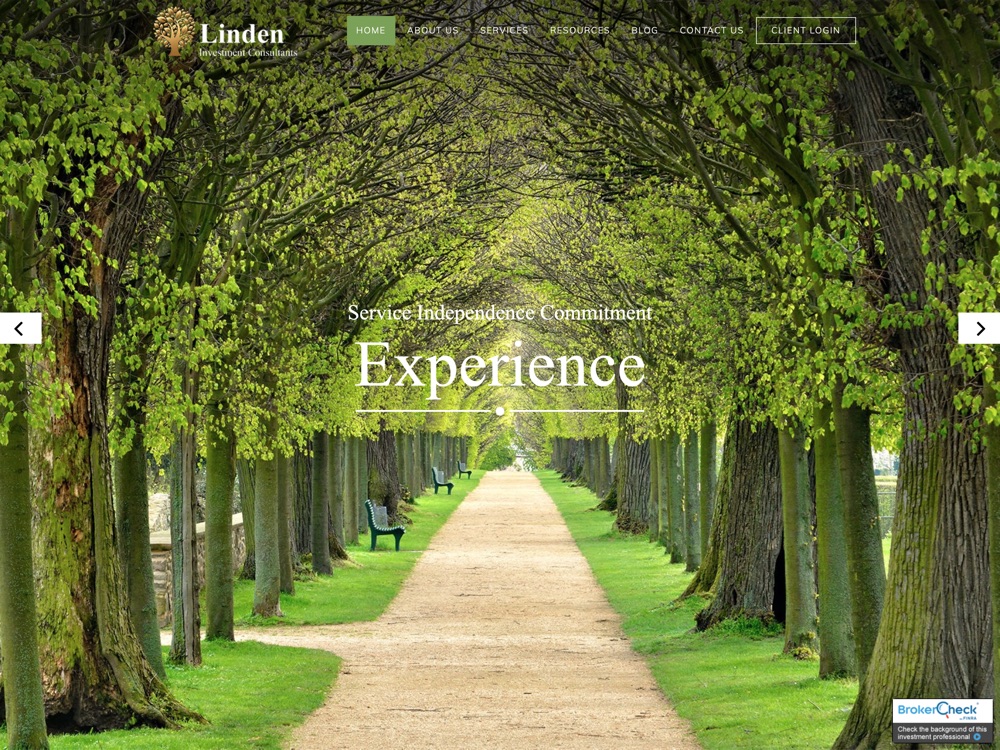
Highlights
- Fixed top navigation bar
- Color pattern
This website template has a fixed top navigation bar which allows a user to switch to any page of the website.
No need to enter URL or log in details to scroll for your choice.
With ease, you can access the core functionality of the website.
And in fixed navigation bars, browsing a website becomes far easier.
This site has a quick navigation design which impresses the customers.
Additionally, an amazing color scheme is applied to engage users.
A natural looking pattern attracts visitors more easily.
Peak Brokerage
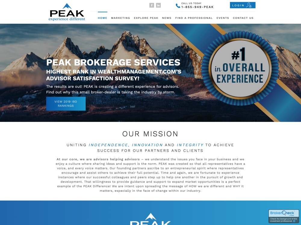
Highlights
- Contrast
- Layout
An expert designer has implemented their true skills in contrasting scheme of Peak Brokerage.
The common types of contrast are thick vs. Thin, dark vs. Light, smooth vs. Rough etc.
Pure white and black is evergreen contrasting in the designing.
But you don’t have to adhere to the same pattern, something unique and elegant for the website especially for the financial site is important.
Play with colors, its an easiest way to control user’s interest.
Similar to this design, use content in a darker shade over a lighter background. It’s the best combination so far.
Use killer words in the headings and make sure headings and subheadings have a difference in their appearance as you can see in Peak Brokerage website.
Follow adequate layout pattern.
Northridge
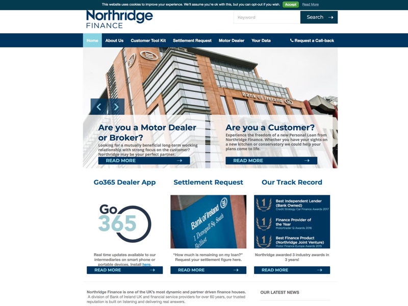
Highlights
- Brandmark
A logo is a topmost priority of the business.
You can’t represent your business everywhere with full name, it doesn’t look sophisticated. In fact, it seems boring to read the same text again and again.
A symbol is more reliable to replace the company name. It’s not like brandmark can be applicable at any place because a logo can be feasible at some portions of a site.
A creative design is analysed through brand mark.
Look at the Northridge logo; it looks so classy like some magician creates it with their magical powers.
A financial planner website design with a portfolio is an excellent thing to showcase your capabilities in front of the audience.
In the nutshell, while choosing any financial web designing agency, read out the above features carefully.
Before starting any work, you must be aware of the pros and cons of it.
Read out the tips, get to know where to focus for a breathtaking designing.
Getting into designing is like learning a new language!!