Last Updated on February 22, 2024
It’s the start of the 2012-13 NBA season, which means that we’ll get to see our favorite teams and players duke it out for another crack at championship glory.
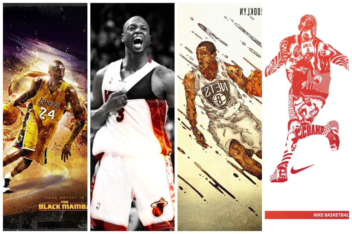
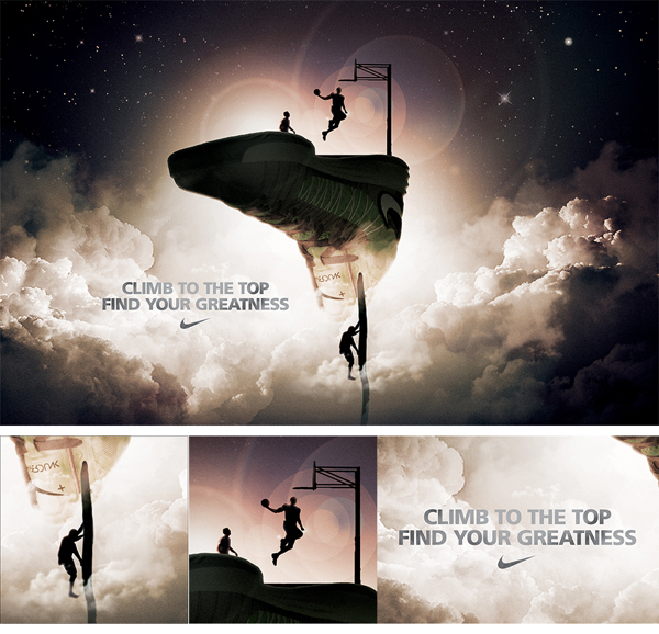
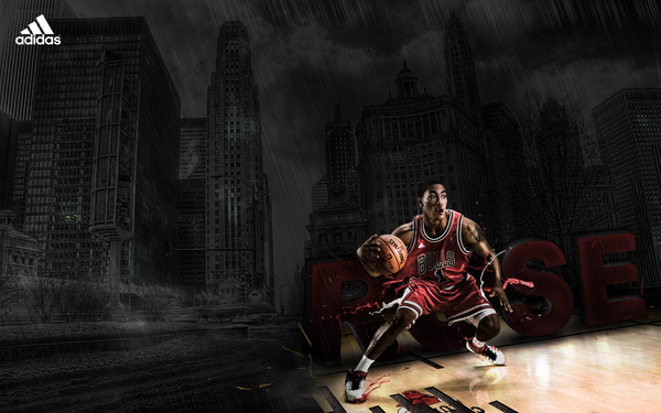
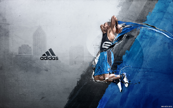
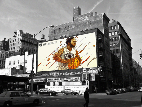
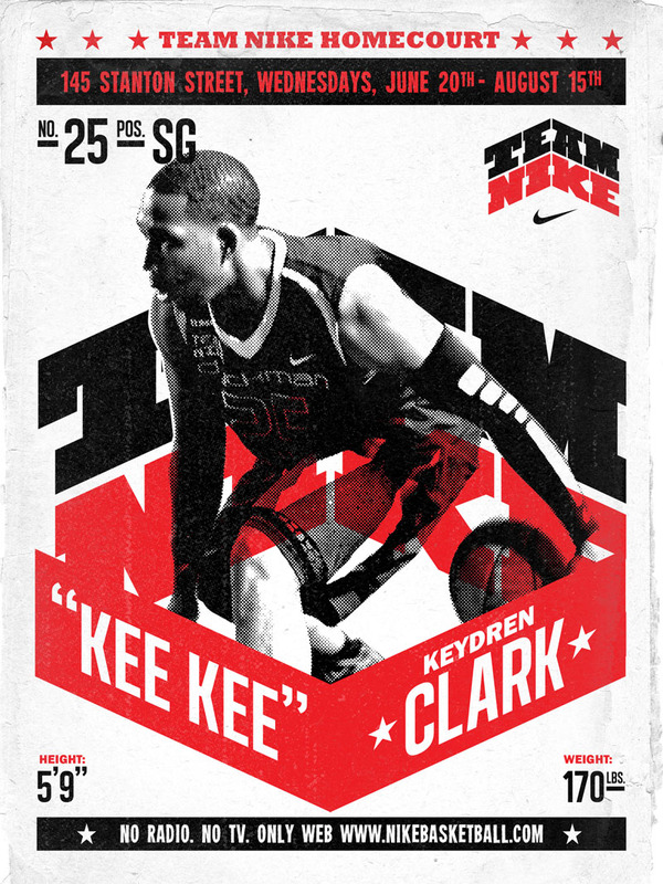
To prepare us for the 82-game grind, the NBA and its sponsors have released ads in different media. Whether you love the game or not, these ads perfectly capture the excitement and energy that takes place on the court.
From a designer’s point of view, basketball ad campaigns are a great source of inspiration because of the tedious design work put into them.
The challenge is to restrain yourself from overdesigning the ad. This is also to ensure that your target audience will be able to understand your ad’s message.
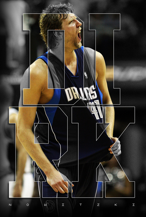
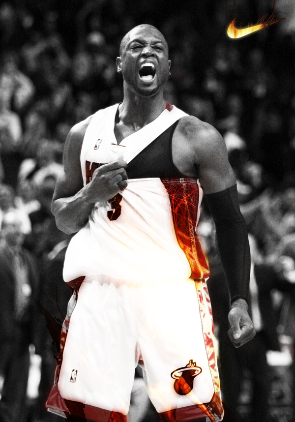
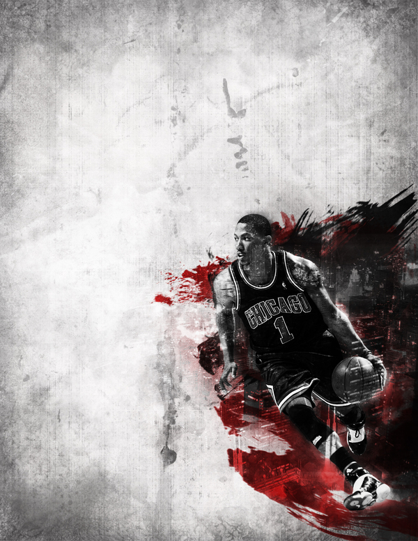
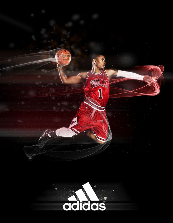
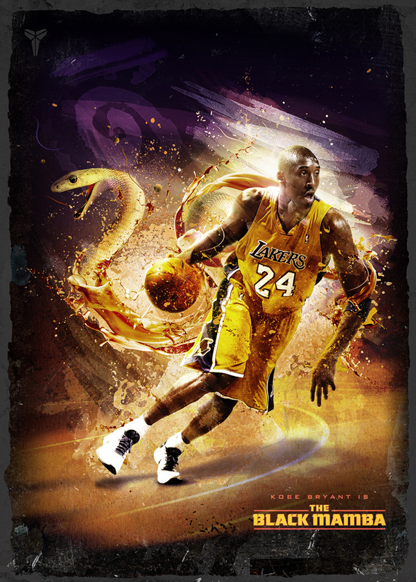
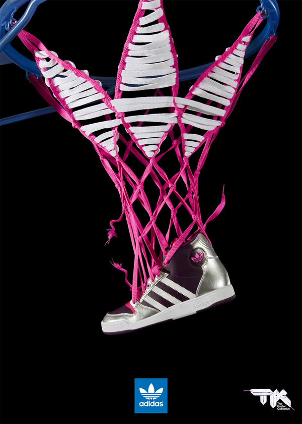
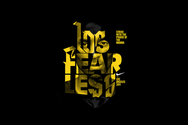
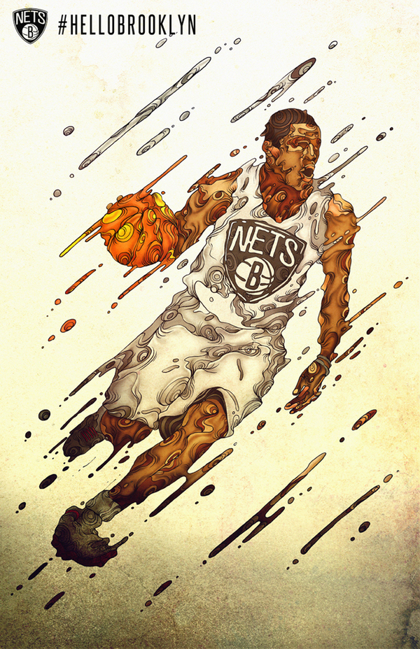
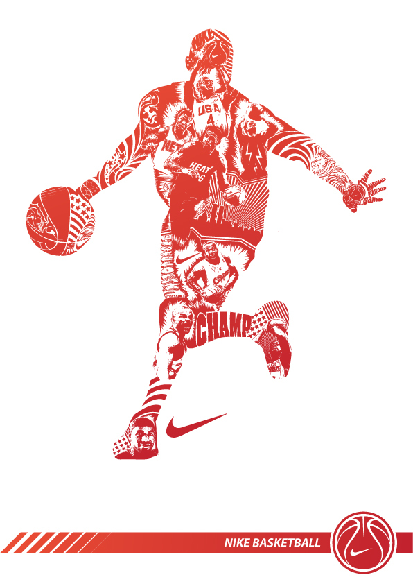
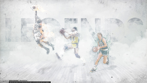
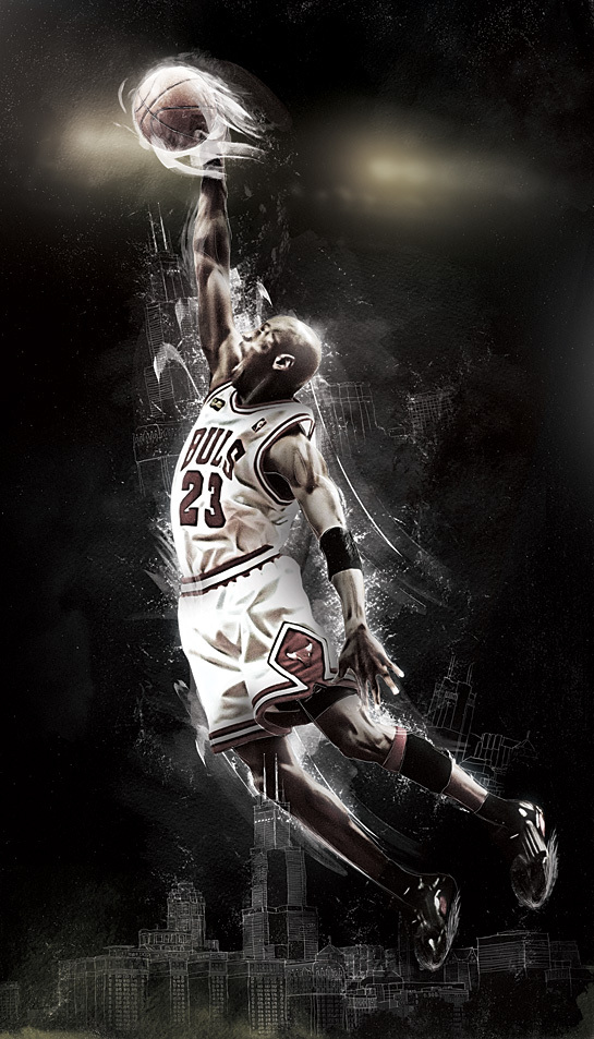
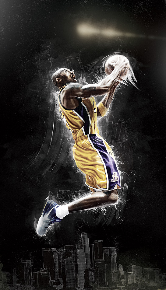
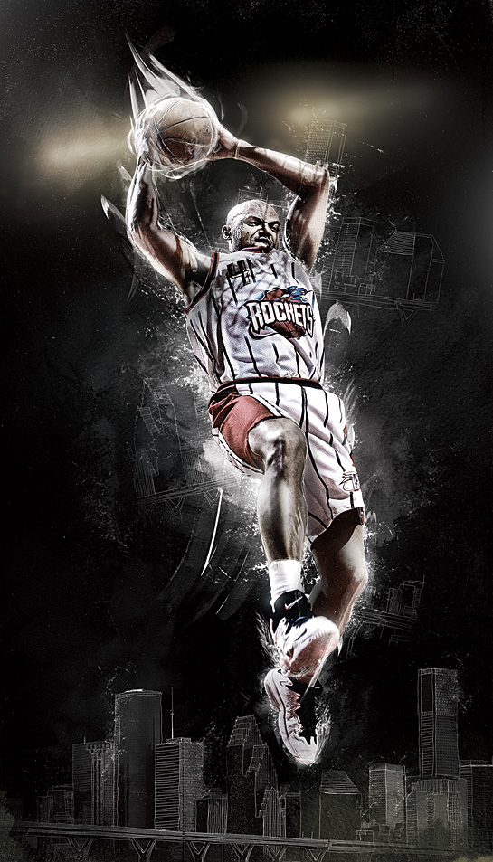
Below is a collection of existing ads that succeed in grabbing attention and selling the brand at the same time. This also includes some basketball-inspired projects from graphic designers. Hope you enjoy these slam-dunk basketball adverts!

Takeaways
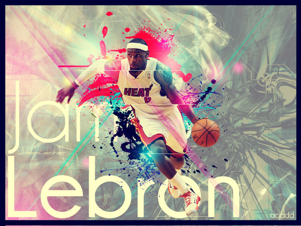
If you’re planning to make a similar basketball photomanipulation project, here are some of the things you should consider:
- Photo. The images you choose are important in creating a fiery basketball ad. Include shots where the basketball players are in action or showing strong emotions. These are more powerful than photos of them intentionally striking a pose. Remember that big body and face movements account to more drama and strength. Photos of ballers screaming, jumping, and shooting are the ones that are often used because they demand attention.
- Color. Black and red dominate most basketball ads because these colors are associated with masculinity and strength. However, you can also explore other colors that exude energy and adrenaline such as yellow or orange. If you want to be experimental, adding a touch of pink and other ‘girly’ colors will come off as an unexpected twist. Remember to keep the colors bold and strong to keep things spunky.
- Effects. The photo alone won’t make an attention-grabbing ad if not added with post-process techniques. There are countless of drawing and text effects you can try. But don’t overdo it. Minimal enhancements like brush strokes are great in adding oomph to moving images. For the typography design, simple is also better. Use one to two font types that compliment the ad’s overall look and play with the text placement.
Have you done similar projects? Just comment below and don’t hesitate to share your graphic design tricks to make a heartstopping basketball ad!

