Last Updated on March 6, 2024
Color selection is a stage in a design process that requires both smart thinking and gut feeling. In today’s digital era, you can have as many colors and color combinations as you like.
The human eye can see millions of different colors at once. As a designer, your responsibility is to choose a combination of two or three colors that complement each other AND work best for your project.
This can be a daunting task. Color selection, in most cases, is subjective, and, often, scientific. You can’t choose colors just because you like them. This applies especially if you’re designing for a client.
The ideal color selections go above personal preference because colors can influence emotions, mood and thoughts. The color palette you pick will have a great impact not just on the design aspect, but also on how viewers will respond to your work.
As a designer, your challenge is to balance the complex roles that color represents to produce an efficient and visually appealing design. You can only do this if you have knowledge on how color theory works. Standard color theory can be a big help in understanding which colors may work efficiently together (or not) and what kind of impact the combinations can bring into your design.
The Color Wheel
One of the basics of color theory is understanding the color wheel. You may already have an idea what a color wheel is, and you’ve likely seen it in school before. The traditional color wheel consists of 12 colors:
Primary or Base Colors: Red, Yellow and Blue
Secondary Colors: Orange, Green and Violet
Tertiary Colors: Red-Orange, Yellow-Orange, Yellow-Green, Blue-Green, Blue-Violet and Red-Violet
With the addition of indigo, the primary and secondary colors make up the colors of the rainbow or the visible spectrum of light.
The color wheel is a simple yet effective visual aid to understand the relationship of colors with each other. This method of color comprehension is divided into two categories: subtractive model and additive model. Subtractive model entails the combination colored pigments (ex. paints or inks).
The standard color wheel as well as the CMYK color system used for printing fall under this category. Additive model entails the combination colored light (ex. the colors you see on TV). This model uses a distinct set of base colors, the RGB (red, green and blue).
Color in Design
Incorporating colors to a design requires a lot more than deciding on two or three hues and blending them in equal parts into the layout. Productively implementing color to a design project involves balance – and the more colors you incorporate, the trickier it gets to create balance.
A simple way of thinking about this concept is by breaking your color selections into principal and accent colors. The principal color will be the most prominent and most used hue in the design. The accent color/s will balance out and accentuate the dominant color.
Focusing on how these colors connect with each other will enable you to tweak an ideal palette suitable for your project. The interaction of the colors involves the amount – or lack – of contrast, the ease of legibility when text is added, how the more distinct hues make the rest of the colors look when they’re beside each other, the kind of mood the combination gives off, and so on.
A principle for implementing the fundamental three-color palette in design is the 60-30-10 rule. This method is commonly applied to interior design, but can also be efficiently used for print and website tasks.
The rule suggests that 60% of the palette is made up of the principal color in the design; 30% and 10% will be divided into two accent colors.
A great analogy for this rule is a man’s suit: 60% is the color of the jacket and the pants; 30% is the color of the shirt, and 10% is for the color of the tie. The output is a well-blended, balanced and polished look.
An alternate way to keep a balanced color palette is by using shades (darker version) and tints (lighter version) of the color. Doing this will enable you to broaden your color combinations without overpowering your design with an array of colors.
Color Psychology
Color is everywhere. Even if you fail to notice it, colors greatly influence your mood. They also play a significant role in your day-to-day lives.
Think about the stop sign on the road today or the color combination of what you wore to the office or even the assigned color you set for your phone notifications.
Color is even used in idioms: you “see red” when you’re angry or “feel blue” when you’re sad. There’s a psychology behind colors. It explains how they have a unique connection to what you think and feel.
The tricky part in color psychology is the reality that not everyone sees, feels or experiences color in the same manner.
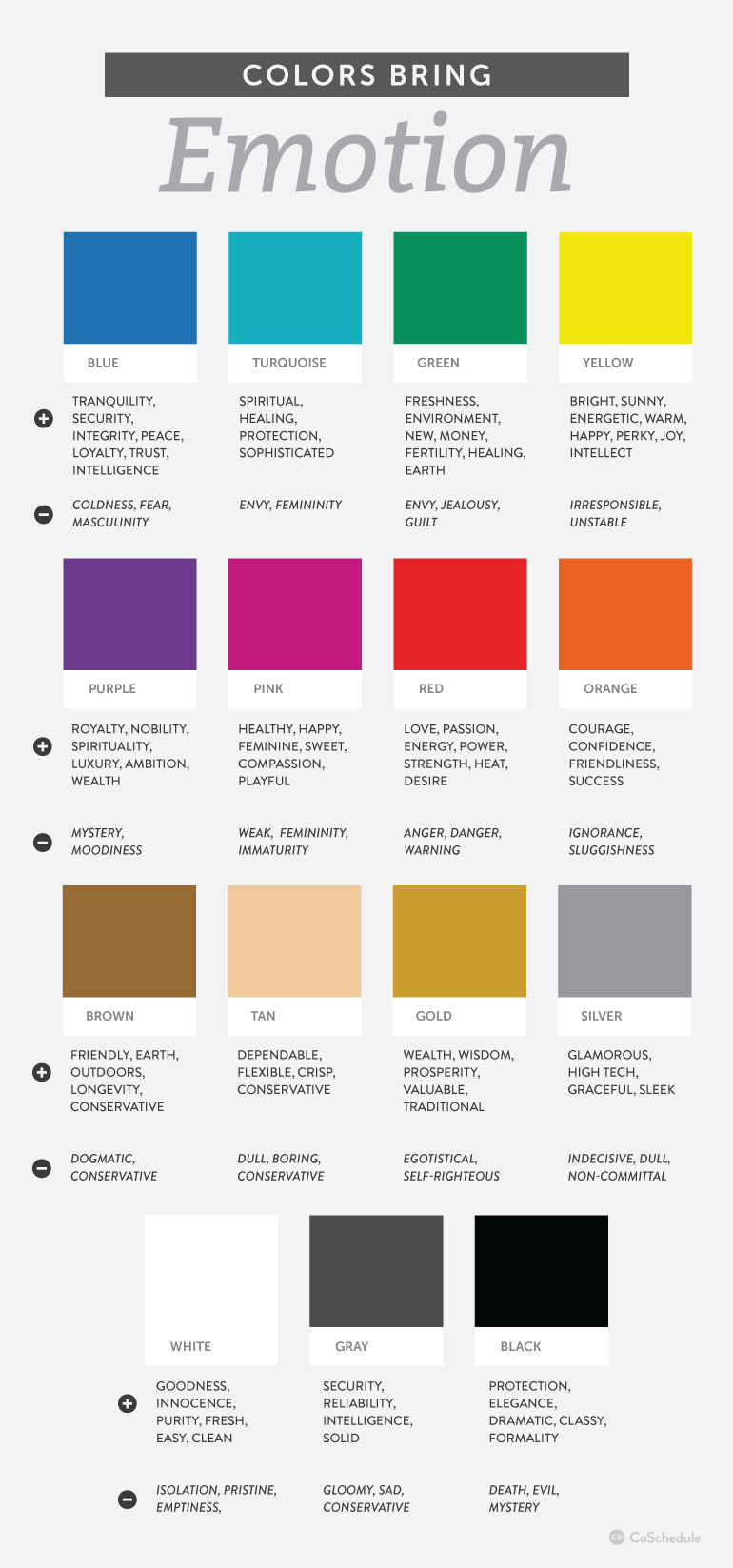
Many things influence the symbolism and significance we associate with colors – culture and society being two of the major influencers. The good news is that most colors have a universal meaning.
Red
Universal Meaning: The color red can express a variety of imageries and ideas based on its context. Since the color of fire is dominantly red, the color can either represent warmth or danger. Red is also the color of blood, so it is often associated with life, love and, at times, violence.
Varied Symbolisms: Red signifies good fortune and success in some cultures. It’s often the color of revolution and political movements around the world.
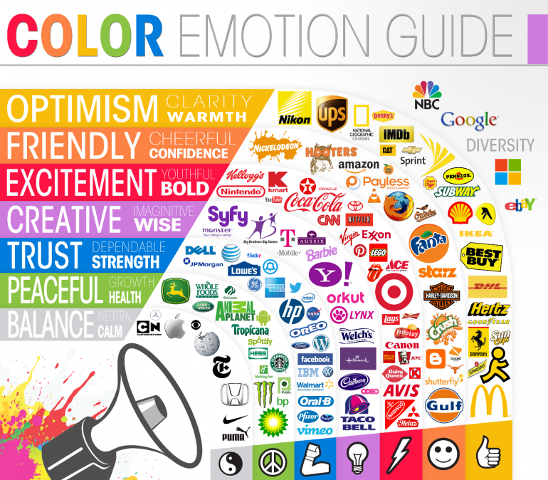
Color Branding: Red conveys power, trust, and confidence. It’s one of the highly visible branding colors for most industries and niches.
Orange
Universal Meaning: Orange is the combination of red and yellow. As such, it can also be associated with fire, and thus represents warmth. It has a cheerful vibe that expresses energy and optimism. Orange is commonly associated with the autumn season.
Varied Symbolisms: Saffron, a bright yellow-orange spice, is regarded as sacred in India. Orange is the color of love in Japan.
Color Branding: Orange generally implies youthfulness and ingenuity.
Yellow
Universal Meaning: Yellow is associated with happiness and friendliness since it’s the color of sunshine. It also represents spring. In some context, yellow means caution. In the medical world, yellow is often related with quarantine and disease.
Varied Symbolisms: Yellow is the color of high rank or royalty in some Eastern and Asian countries. It’s the color of mourning in some parts of Africa and Latin America.
Color Branding: Bright yellow is the color to attract viewers. However, it can be disturbing if it’s too bright or if it’s combined with a wrong color.
Green
Universal Meaning: Green is the color of nature. It’s associated with growth, life, healthy and everything organic. Dark green symbolizes wealth and stability.
Varied Symbolisms: Green is a sacred color in some Islamic countries. It’s also the color most associated with Ireland.
Color Branding: Green is effective when branding a product or service that has something to do with health, sustainability, and the environment.
Blue
Universal Meaning: Blue is the color of the sea and the sky, so it’s often associated with calmness, tranquility and peace. In some context, blue is also related with sadness.
Varied Symbolisms: Blue is traditionally used to represent protection against evil things in the Middle East. In most cultures, it’s the color most associated with heaven, spirituality, and immortality.
Color Branding: Blue is one of the most versatile branding colors. It’s often used to express security, dependability and trust. Corporate brand colors frequently use blue (or a shade of it) since it also communicates professionalism.
Black
Universal Meaning: Like the color red, black is a complex hue. On one end, it represents luxury, power, and class. On the other, it symbolizes death, evil, and bad luck. In clothing, black typically conveys formality or sorrow.
Varied Symbolisms: Black is a masculine color in some parts of Asia and Latin America. It represents rebirth in Egypt. Black is associated with magic and superstition in many cultures.
Color Branding: Black is, arguably, the most used branding color that it’s virtually a neutral hue. But in many instances and with the right context, the color can still convey the value it presents.
White
Universal Meaning: White represents purity, innocence and goodness. In some context, it also means sterile and clean.
Varied Symbolisms: White is the color of mourning in China. It also signifies peace or a sign of surrender in most parts of the world.
Color Branding: White typically conveys simplicity, cleanliness, and minimalism.
Color Palette Tools
Color palette generators can help you a lot in determining which color combination is best for your project design. Here are 40 of the best color scheme makers today:
Material UI Colors
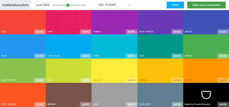
Material UI Colors is one of the apps built by Panda Network for designers, developers and small business owners. The app is a color palette for material design. The website offers a copy-paste feature for an easier color-matching process.
Flat UI Colors
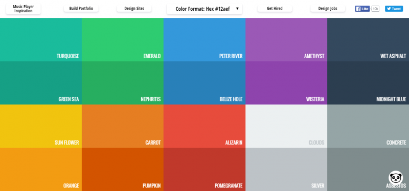
Flat UI Colors is a color palette app specially designed for flat UI themes. The website offers hundreds of flat colors to use for professional design projects. The codes of each color are available via a copy-paste feature.
Coolors
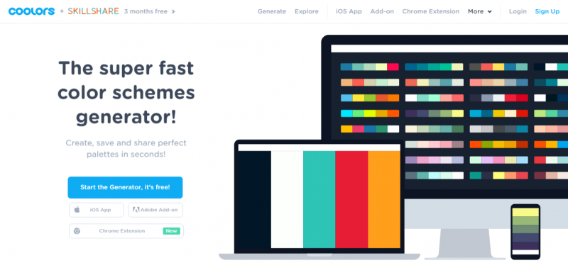
Coolors is a fast and simple color scheme generator. The site lets users create, save and share palettes in seconds. Coolors is available as an iOS app, an Adobe add-on or a Chrome extension.
Color Hunt
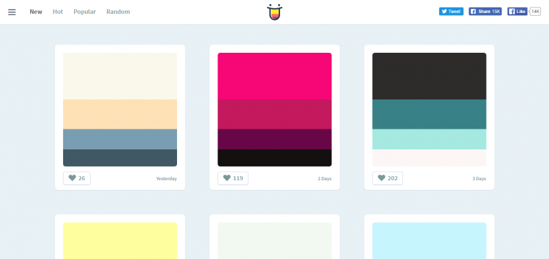
Color Hunt is a color palette social platform. The site features a curated collection of colors made by the app’s users. Each color creation is reviewed and handpicked, so the top creations are displayed on the site’s homepage.
Adobe Color CC
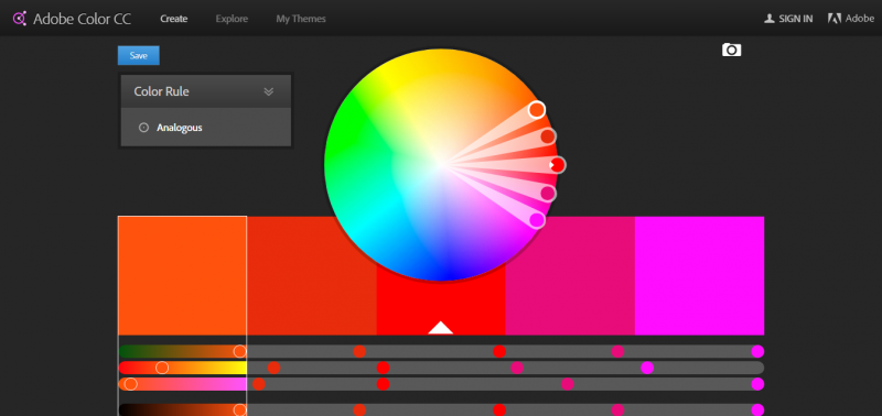
Color CC is Adobe’s color palette generator. It lets users create color schemes using its color wheel. It also provides thousands of color combinations curated and created by the Kuler community.
Color Farm
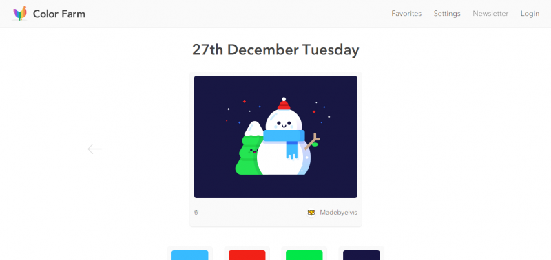
Color Farm, with its colorful chicken logo, is a unique color scheme maker. It features JotForm 4.0, the simplest way to build an online form. The site provides daily color inspiration via the Dribble shots.
Color Claim
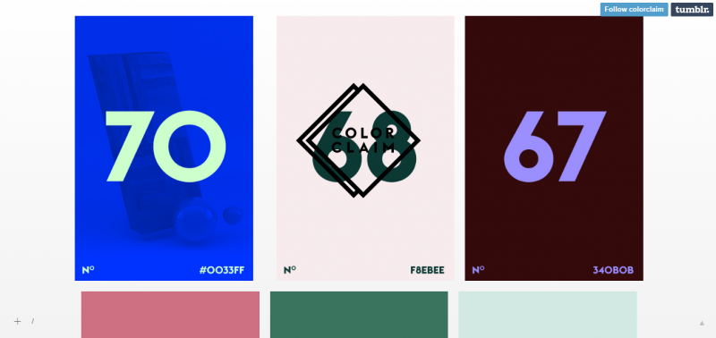
Color Claim is a color inspiration. The Tumblr-hosted color generator is packed with the site owner’s favorite color combinations and codes. Most of the color palettes on the site are subtle with one main color and one accent shade.
Colours Neil Orange Peel
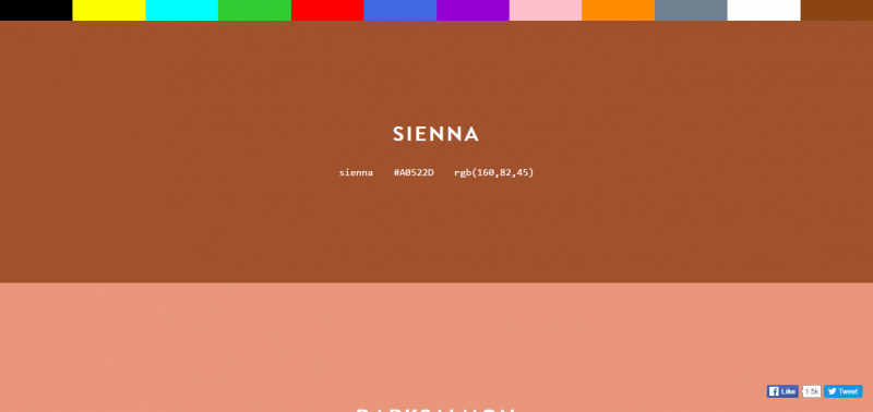
Colours is a color palette generator by Neil Orange Peel. The site features 12 primary colors with a variety of color combinations under each shade. It provides a simple copy-paste hex code function.
Sporting Hues
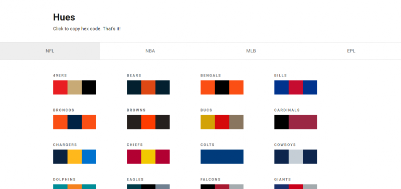
Sporting Hues is a color combination program that mainly focuses on sports colors. The color schemes are divided into categories: NFL, NBA, MLB and EPL.
RGBto
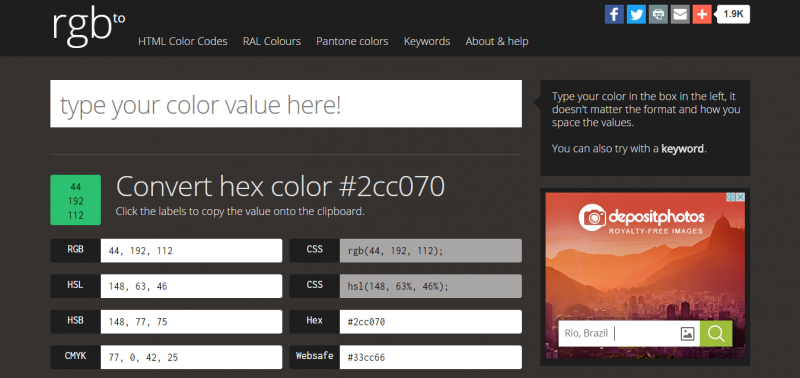
RGBto is a color palette service that is split into three tabs: HTML color codes, RAL colours and Pantone colors. Users can use the site’s search button to get the hex code of whatever color or color combination they want. They may also use keywords for an easier search.
Colorrrs
Colorrrs is a cool color palette generator intended for professional color design and marketing. Users can browse hundreds of colors and color combinations using their keyboard’s spacebar. The site also features an RGB converter.
Color Picker
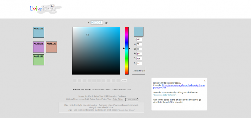
Color Picker is a color palette tool that lets users create, save and use their color creations. The site’s homepage displays different featured colors with their hex codes every day.
Colordot
Colordot is a color palette app designed by HailPixel and available online and on iOS. The website version lets users move their mouse back and forth for hue, up and down for lightness and scroll for saturation. The mobile version allows users to pick colors with a swipe and grab a color via the phone’s camera.
Color Wheel

Color Wheel is one of the top features of Adobe Color CC. The program provides assistance to InDesign users to create color combinations for themes. The Wheel can also translate colors to four different formats – CMYK, RGB, HEX and Lab.
0to255
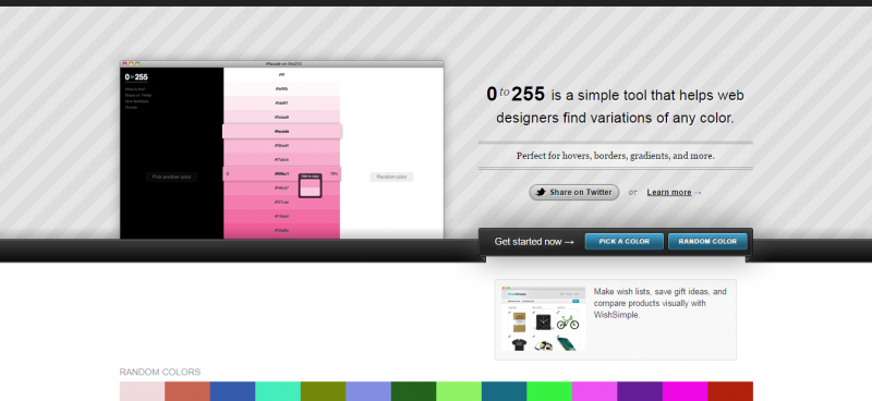
0to255 is a simple yet ingenious color palette tool that lets designers find variations and combinations of color they want. The app is particularly useful for finding the right color or color combinations for hovers, borders and gradients.
COLOURlovers
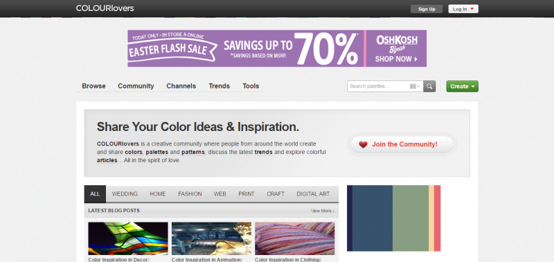
COLOURlovers is a website that features a variety of color palette products and services. It’s a color-centric community where users can share their knowledge and love of colors as well as their color creations. Color patterns, designs and trends are also highlighted.
Brand Colors
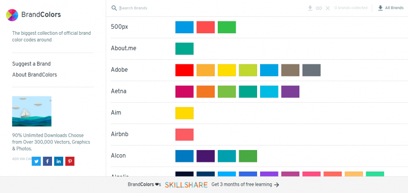
Brand Colors is a website where users can find the color combinations and codes of popular brands. It claims to have the biggest collection of color palettes for official brands worldwide. Users can also suggest a brand and the site will find and provide the correct combinations and codes to match the brand’s colors.
Colllor
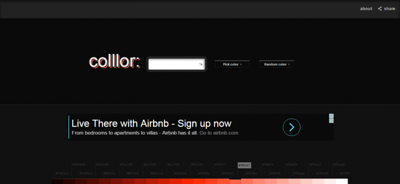
Colllor is a color palette generator that creates consistent color palettes. It offers users different color variations to choose from. It also provides color palette ideas, often highlighting the intrinsic meaning of colors.
Coleure
Coleure is a generator that enables users comprehensive color management. The app lets users mix, compare, test and edit colors to come up with the best color combination for their design. For easy use, the site provides keyboard shortcuts.
LOLColors
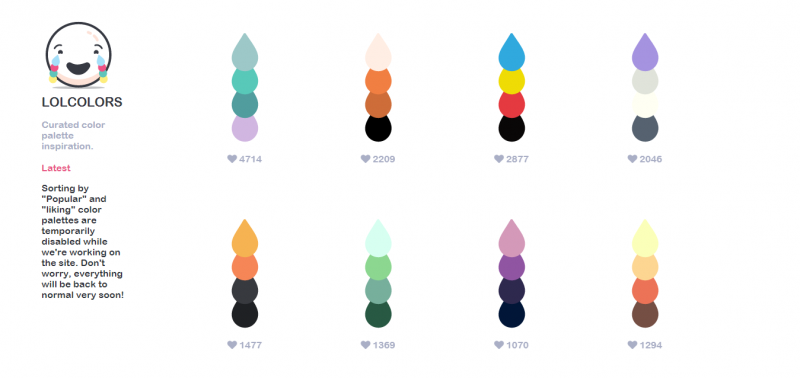
LOLColors by Mackenzie Child is an iOS app for curated color palettes. The app provides color combinations and inspiration for designers. The teardrop-shaped colors feature a copy-paste function for hex codes.
Color Crush
Color Crush is a color palette generator created by the fontflame.com designer. The website provides color combinations and hex codes for amateur and professional designers. The site also features the latest and most popular color combinations aka “crushes.”
Colovely
Colovely is color palette maker designed by nofach.com. With the use of a spacebar, users can browse through hundreds of color combinations and their codes. The site offers a simple clipboard copy-paste feature.
ColorDrop
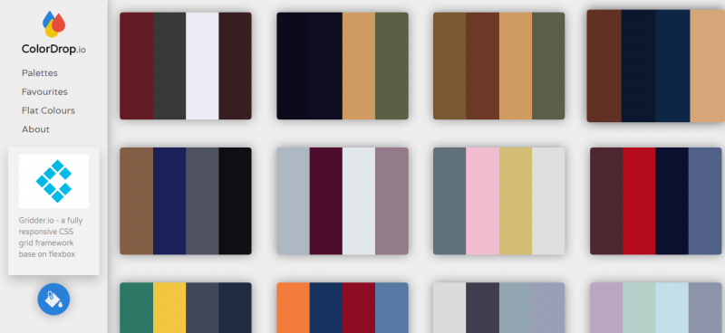
ColorDrop is a web-based color palette app. The site offers hundreds of different color combinations. For easy navigation, users can browse the app’s “Favourites” and “Flat Colors.”
Paletton
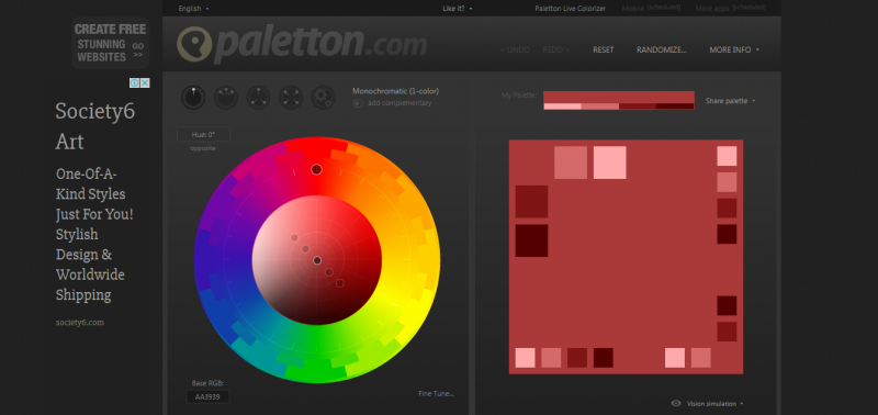
Paletton is a color scheme maker created to help designers create color combinations apt for websites. The app is designed by Peter Stanicek. It is associated with Patentton’s Colorpedia – an extensive source of information about colors.
Color Trends + Palettes
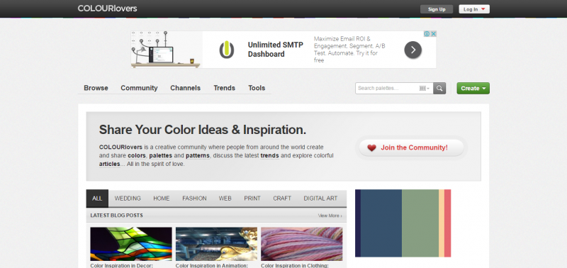
Color Trends + Palettes is a feature of Colourlovers. It’s the section where the community can talk about “hot” colors and the new color combinations mainly in fashion, design and travel.
Colrd
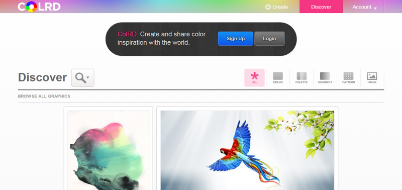
Colrd is a color scheme generator that lets users create and share color inspiration to everyone. The site features images and graphics with their corresponding color combination and code. It’s a mix of art and design inspiration for novice and pro designers.
ColorSchemer
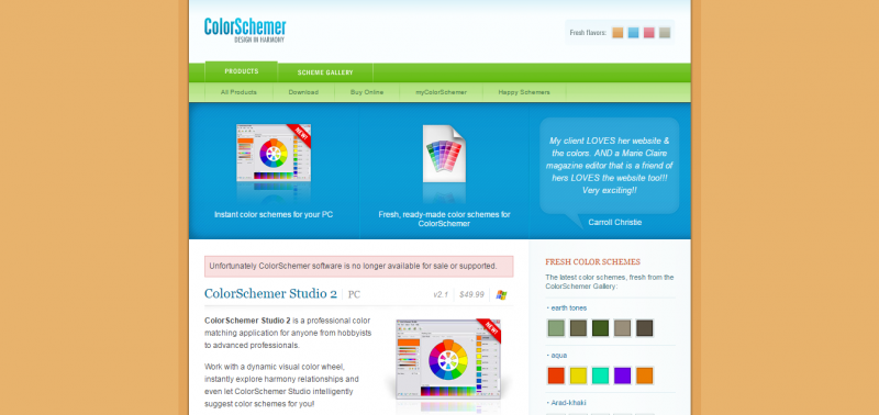
ColorSchemer is a website that features various color-related programs and services. The featured products are mainly available on iOS devices. The site also offers different versions of ColorSchemer for PC and Mac.
Color Safe
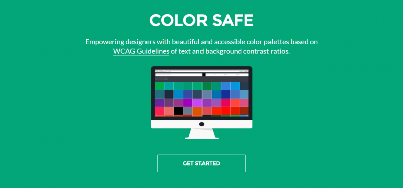
Color Safe is a website that generates color palettes. It differs from other color scheme makers since it sets up both canvas and text. Users can type in a background color and the program will provide the best fonts to complement the given hue.
Material Palette
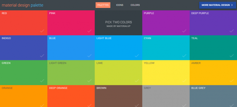
Material Palette is a user-friendly color, icon and palette generator. It lets users choose two colors from which the program will provide its corresponding color combinations: from dark and light primary colors to accent and divider colors.
Design Seeds
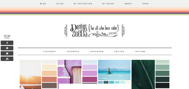
Design Seeds is primarily a color blog where viewers can get inspired with its featured colored sketches and pictures. Each photo is broken-down by shade and hue. For easy navigation, the blog is divided by collection and by color.
UI Gradients
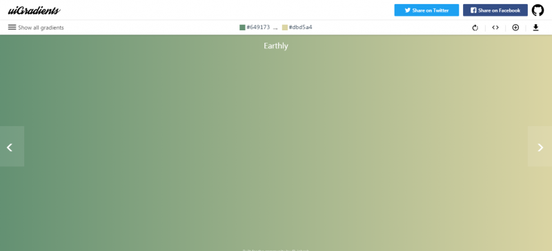
UI Gradients is a color scheme maker specially created for gradients. The two colors that make up the gradient are coded. Users may also add their gradient creation or get the CSS code of a combination.
ColorMunki

ColorMunki is a color tool created for designers and hobbyists to help them make their own colors and color combinations. Since its launched, the site has helped many freelance designers in creating graphic designs for their projects. The site also offers the “Color Knowledge,” a section dedicated to anything and everything about colors.
Pictaculous
Pictaculous is a program that generates color palettes. The site, powered by MailChimp, breaks down the color combinations of an image using encoded serials.
Color Snapper
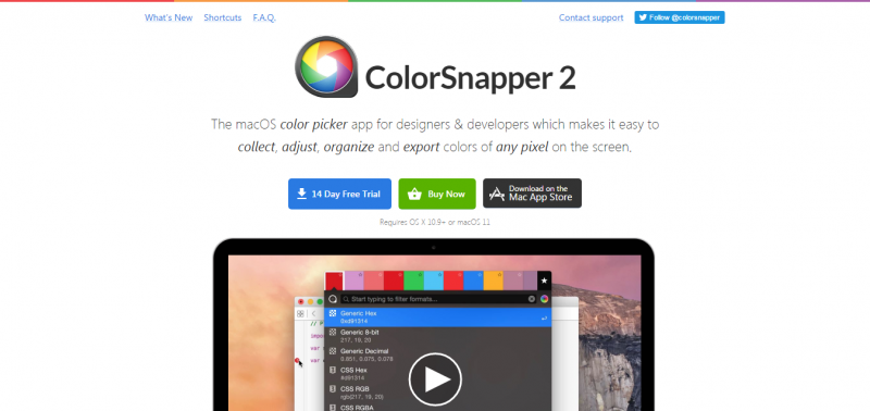
Color Snapper is a color scheme maker created specifically for OS X Yosemite. The app is designed for developers and graphic designers so they can adjust, mix, modify, save and export colors onscreen. The app supports both dark and light color themes.
UnClrd
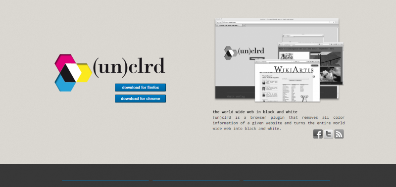
UnClrd is a unique color tool that helps designers see what colorblind people see when the latter look at websites and images popping with colors. It’s a browser plugin that turns colorful sites into black and white. The plugin is available for Chrome and Firefox.
WebGradients
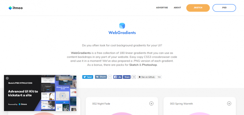
WebGradients is a collection of over 100 linear gradients that users can use as content backgrounds for their website project. The site offers both .JPG and .PNG versions of each gradient. It also provides packs for Sketch and Photoshop.
Sip
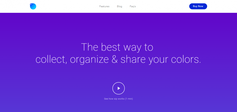
Sip is an extraordinary color palette generator. It is the best program to collect, organize and share colors and color combinations. It has free and paid versions, and is available on SETAPP and for iOS.
The Day’s Color
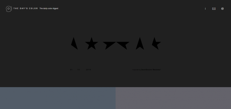
The Day’s Color features different color palettes daily. The site aims to inspire designers using the color combinations seen every day in various arts, music, images, designs and even memories.
Subtle Patterns
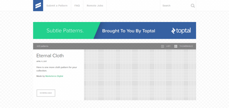
Subtle Patterns by Toptal is a collection of color palettes anyone can use for their websites or design projects for free, as long as proper credits are noted. Users can also create their own pattern themes based on the ones featured on the site.
DeGraeve
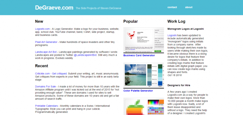
DeGraeve is a website populated with design programs and apps. It features a user-friendly color palette generator. Users can enter the URL of the image they want to breakdown. The site will then provide the photo’s color combinations and codes.

