Last Updated on February 21, 2024
In the simplest of terms, a grid is a layout guideline. They are most often used by designers to align elements vertically, and even horizontally so that the design looks well-manicured due to the alignment.
What is a CSS grid?
A CSS grid is basically a predesigned framework that divides up the screen space so that you can design within the preset columns. They are invisible guides that you use to organize your content to achieve visual cohesion. Layout grids have been around for centuries as they were first used in print design.
They are a time-tested tool that works very well in web design too this is why we have CSS grids. CSS grids differ from that of print design, in that they manipulate HTML elements positions but the idea behind this is still the same: visual cohesion.
One other big advantage they provide is that you do not have to write the basic CSS style of the layout yourself instead you only manipulate the content you input into the framework. As I’ve mentioned before the grid is usually vertical and creates columns. Horizontal alignment is usually up to the designer as height in web design is trickier then it is in print.
Why use a CSS grid?

Well, I have explained why before; you use a grid to achieve visual cohesion within a design. However, I will go into a bit more detail about this now. Let’s use a list!
- Visual cohesion through structure and consistency in layout
- Helps with executing a design
- Saves time in creating the basic CSS mark up of a site’s layout
- Helps in the alignment of elements
- Easier execution of fluid/responsive layout
- Training wheels for new designers and developers
- More often than not, the grids are cross-browser compatible
CSS grids and Responsive Web Design
Today, the best type of grid is one that is fluid or responsive where the grid will respond to the different screen sizes and realign the elements accordingly. The usual case is that when the screen is smaller, like on a phone, the content stacks upon itself in one long line for easier viewing instead of being next to each other like it originally would be on a desktop monitor. Because Responsive Web Design is growing in importance and essence, this is exactly the reason why you should only use a responsive grid as the work is basically done for you.
Awesome grids out there
960 Grid system
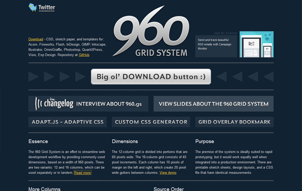
960 Grid System is by far one of the most popular grids out there. It was created to ‘streamline web development workflow by providing commonly used dimensions’. It is based on 12 and 16 column grids that are easy to implement and work with.
978 grid: the simpler CSS grid
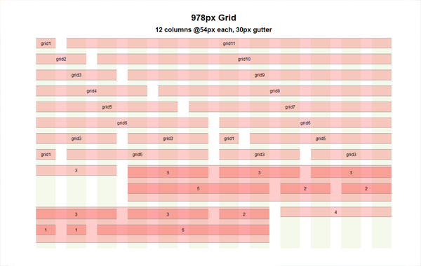
This grid was developed in response to the 960 Grid System’s limitations and constraints. The biggest concern was that the 960 Grid System did not use the margins properly as there should have been bigger gaps between the columns and the two margins at the very ends shouldn’t have been there anyway as they did not provide any value. An additional complaint was that there were too many classes.
So came the 978px Grid where these issues were solved with increased gaps, or gutters, and the number of classes was decreased. It was dubbed a simpler grid because it expanded capabilities while at the same time keeping the grid minimal and therefore allowed for greater creative control and creation.
Less Framework 4
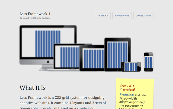
This bad boy is a framework that is based on a fixed-width but adaptive grid where you have four different layouts to work with. What makes this grid special is that it is composed of 68px columns and 24px gutters, and the amount of columns changes to adapt to different screen sizes which results in the creation and adaptation of the four layouts. The layouts change thanks to media queries which detect the screen size of the viewing device and then display the appropriate layout accordingly.
This is a neat and modern way of going about the responsive dilemma designers have to face today.
Foundation 5

If you are looking for an advanced framework that is packed with features and options Foundation 5 is the grid system for you! After all, this framework is “The most advanced responsive front-end framework in the world”. The framework allows for development with Sass, and it also implements new web technology to aid in creating better websites.
On top of all that, the framework works well even in IE8. And of course, this is a flexible grid that is easily adaptable towards all screen sizes, ranging from phones to TVs.
Don’t Overthink It Grids
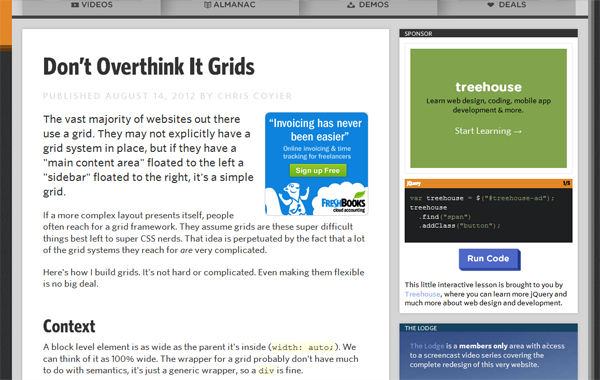
Don’t Overthink It Grids was developed by the wonderful Chris Coyier to create a grid that is simple to use. He believed that many of the grid frameworks out there were complex and unnecessarily so. Therefore, he created a tutorial that showcased how to create a simple grid that a designer or developer can easily implement and utilize.
One% CSS Grid
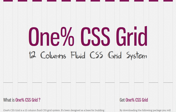
One% is a very cool fluid framework. It is based on a 12 column grid system that is specifically designed for fluid responsive design. The grid is percentage-based which is what gives it the amazing fluid powers to adapt to the various screen sizes out there.
Additionally, because it is percentage-based, you do not have to do any manual resizing or rearranging in order to manipulate anything in order to adapt – it is done for you automatically! What makes things even better One% has two different types of grids for you to choose from.
Conclusion
As you see there are many frameworks for you to choose from if you want to use one. I strongly suggest using them since they are great time-saving tools. I think you should also be mindful of that, of course, not every project is right for one particular framework.
Therefore, it is important to familiarize yourself with a couple so that you pick the best framework for your project needs.

