
Last Updated on February 21, 2024
In the beginning, e-commerce sites offered massive discounts to lure in customers. Once they achieved the desired traffic, they move on to sell the same products at their original prices. Low prices and discounts are great ways to attract clientele, but you also need to keep an eye on that profit margin.
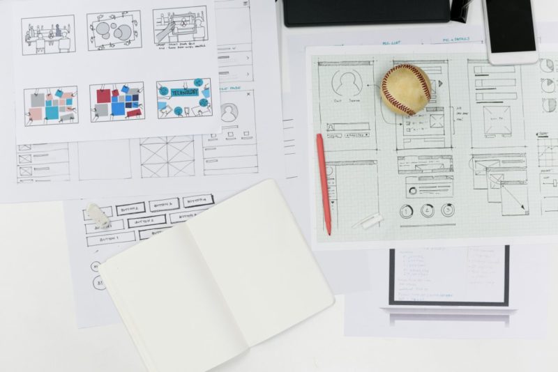
Yet people are willing to trust and continue shopping from their favorite sites. Operating an eCommerce business is no easy feat, which is why you must be proactive about critical elements like the UI/UX design of your platform.
Since your website showcases the brand image of your company, it becomes crucial to pay heed to this front. To maintain a steady build-up of your image, you need to upgrade your website’s user interface and consequently provide a better customer experience.
Follow this guide to learn how and why design and layout are detrimental to the success of your online store.
Simple Webpage Navigation
It is necessary to add various specifications on web pages and products so that a person can sort them out and take the shortest path to reach what they are seeking. You need to determine whether a person can reach their target in under three-four clicks.
If a person finds it challenging to seek and locate a specific product, they might abandon your site and add up to that frustrating “bounce rate” statistic. Whether they find what they need or not – this needs to happen within a reasonable number of clicks and actions.
To best tackle this aspect, you can focus on creating an intuitive site layout that makes it very easy for visitors to reach what they expect to find. It is best to make it clear if you have what they need and avoid labeling them as an empty lead.
Simple usually means clean, but the importance of good navigation is concentrated more on the ease of access than the design ingenuity. In other words, it doesn’t matter if a lot of people think your design is impeccable; it matters most if this factor contributed to the overall conversion rate.
Website Scannability
People generally don’t spend too much time and effort in paying immense attention to the contents of a webpage. They like to skim through the site and see if something catches their attention.
However, this doesn’t imply that you can compromise on using generic information. It would be better if the website is informative and provides an added value to the visitor.
Using the appropriate text formatting and images size will further assist you in improving the overall scannability of the platform. A fresh layout brings design elements and text content into a seamless merger where the right message comes out loud and clear.
Accessible Search Bar
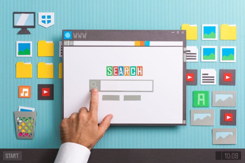
A website’s worst nightmare would be when people stop using it altogether. This predicament quickly becomes a reality without a valid website search capability. An inbuilt website search functionality very important, especially if your shop features different products that can be attributed to multiple categories simultaneously.
The search bar helps reduce ambiguity and enables visitors to take a shortcut, as an extra option.
The right search bar should always include a pre-suggestion to aid the customer better. An internal autocomplete function will prevent your customers from jumping from one webpage to another while looking for a specific item. A well-articulated search bar enables website browsers to get to the desired results without wasting time.
Easy Checkout Process
It’s always better to ensure and assist the customer in checking multiple times before finalizing an order. In other words, the shopping cart content should always be available for reaching from various angles and during different stages of the checkout process.
A great UX/UI and layout comes into play here, and mastering a clean checkout path becomes a work of art. You must get a clear idea of how your shoppers behave and then make the whole shopping experience match their immediate expectations and habits.
Alongside this, you must also be proactive about the payment gateway process. It must be secure, but at the same time, not tiring or off-putting. It is also advisable to include as many payment options as possible and make sure you explain the reason behind what in the customers’ mind may appear as a bothersome detail.
Add Photos and Video

According to professionals, putting pictures and video of the product can be beneficial in the long run. Try adding different angles and models endorsing your product so that people can consider all the details before determining if it’s for them or not. It’s best to do this before the purchase, instead of risking to reveal something essential post-sales and get a bad review as a result.
You can utilize illustrations, icons, hero banners, and mascots. Using various descriptive graphics and photos that complement your brand is best practice. Create a comprehensible overview of your product line so that potential customers can make an informed decision upon assessing all available angles.
Using media intelligently is difficult because it can easily overpower crucial elements like menus, page identity, access to a feedback form, etc. In heroic and desperate attempts to get more attention, the difference between the two can turn into a blurry boundary. Visuals are doing their job when they enhance user experience and are informative, rather than distracting.
Live Chat and Feedback
You can encourage visitors to share their experiences with you so that you can make a note for future reference. Initial feedback from online customers is a way you can communicate with people and help them transition from normal visitors into clients.
A few positive comments attached to a product can do miracles. More people are bound to consider purchasing a product that has been rated by others. People like validation, and as customers, being validated by their peers goes a long way with product value.
Through the live chat, you can resolve any immediate issues that a customer may be experiencing. Just remember the last time you were frustrated about something, and how different things would be if you have gotten immediate assistance or advice.
Chat is the real-time connection you must have with your visitors to better understand their thought processes and values.
Speed Optimization

People won’t hang around your site if it takes them more than 4 seconds to see your page content. There is a multitude of plans for counteraction – compress images, optimize databases, minify CSS and JavaScript, build a Progressive Web Application (PWA), or use a caching plugin.
The website’s loading time is an essential parameter for excellent user experience, along with your site’s search engine rank. So, speed optimization must be your priority when it comes to securing a superb search page index, along with providing your users with a seamless browsing experience.
Page loading speed is so crucial for conversion and retention that your website will suffer search results penalty, even with a superior text and keyword optimization in place.
Compatibility with Mobile Devices
Many websites have either been rejected or became obsolete due to their incompatibility with the mobiles. Sites that are too heavy for the limited capacity of cellular devices quickly leave the competition. Make sure that your webpage doesn’t require massive processing – this includes media as well as all running scripts and complimentary files.
Skipping mobile optimization will cut the chances of you reaching the ever-increasing mobile device audience. Mobile users’ experience should be enhanced so that most devices can load your webpage within a split-second. Only then can you expect that customers will visit again and again and that your website will stay high on SERPs.
CTAs are Important

Call to action is the finishing move that comes as a culmination of all the other aspects we mentioned before. Lightning page speed, optimized content, and media – all efforts invested in those factors can become obsolete without the proper guidance towards a follow-up action by the visitor.
CTAs give direction to customers according to your wishes and plan of action. For example, a message button like “Register Now” would be best if presented with vibrant colors that catch the readers’ attention.
However, you must be mindful when being creative with CTAs. They should be catchy but not too promotional. Be concise and clear while including CTAs in your content as they should deliver their motive without confusing a reader.
Keep them only when necessary, as they come as the endpoint of a sensitive process, starting from the initial page load.
These tips should be of immense help when you’re scouring ways to enhance your eCommerce business website.