Last Updated on February 21, 2024
Emails are the best way to connect with your customer. It is a direct marketing channel, one that never fails. A lot of people claim that email marketing is dead but, that’s not true!
This is the only channel that will never die, given how people use emails via phones and another medium. They regularly check their emails, in fact, more often than their messages and other communication channels. Marketers believe that the email connection helps build the first point of contact with the person, as they are way more successful than other tools (Mckinsey & Company).
However, the design of the email helps improve your engagement and conversion. You must plan your email in a way that they appear stylish, appealing, and enticing to the end-users.
Here, we will talk about 25 email design templates and what sets them apart.
#1 Color Block Style

Color blocking emails are pretty appealing and enticing. There is one bold color blocking another sober color to give out a contrasting appeal. The color that appears muted in this palette will give out a strong, unique, and sophisticated look to the email. Combine it with the brand’s message, and your design becomes engaging.
#2 Attract with Colors
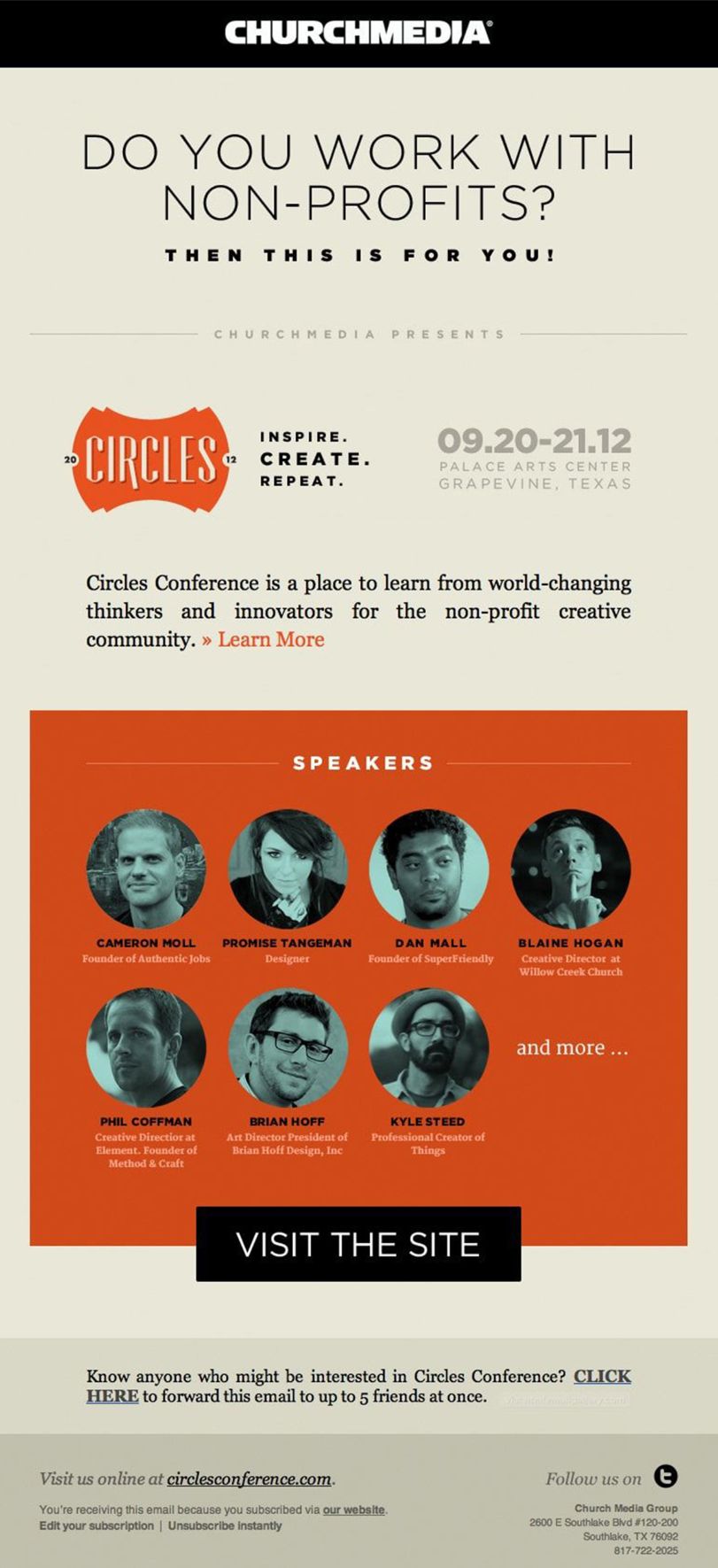
An email that is colorful in the right way can attract attention. You should use a good mix of the right colors from the palette and combine it with a strong CTA and message. As a result, the email will stand out and grab eyeballs.
#3 Animated Emails
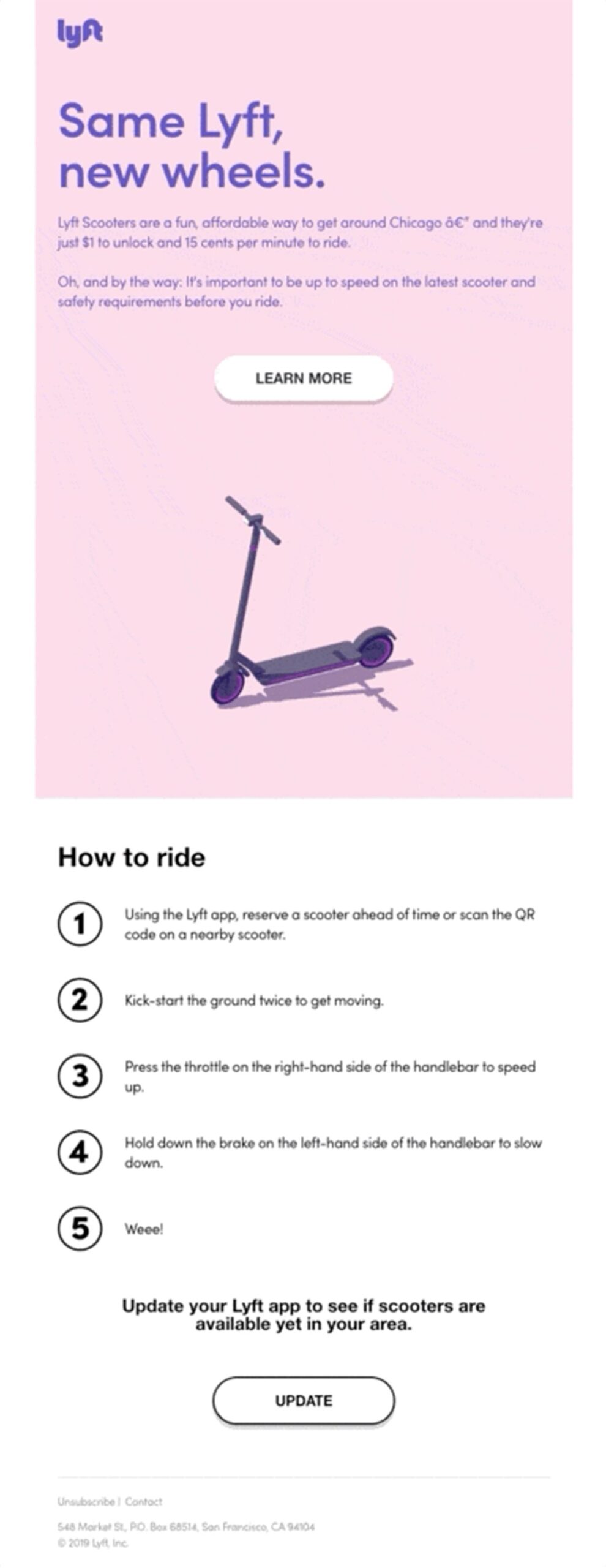
As a marketer, you would have noticed that people do open emails that include some kind of animation. In the email by Lyft, they have animated the scooter, and it is connected to the email. The animation grabs the attention and helps you direct the people to the CTA and convert.
#4 Content Emails

Precise and concise content-based emails that are excellent from a design perspective can do wonders in increasing the engagement. In the above email, the content shines despite being a design-oriented and color-themed email.
The reason being, the content is to the point, and effective. You can use simple colors as shown in the email and select a hierarchy to follow in the email design.
#5 Simple Emails

The design, as well as the content and colors, are pretty simple. There is a good amount of whitespace and the block-based design makes it attractive.
#6 Connect with the Brand
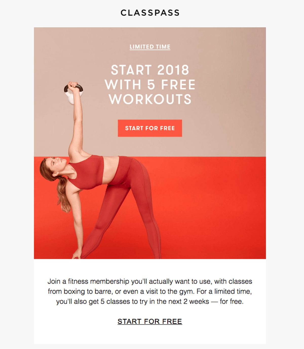
The email must have a certain connection with the brand it represents. As a result, use signature elements and consistent brand colors to create the right connections and immediate recognition.
#7 The Minimalist Design

The design should be simple, minimal, and have no distracting elements out of its view. This will help attract attention towards CTA. Make sure no element used in the design overpowers the other elements.
This design by Hush Puppies showcases how a minimalist email can be effective and get people to take the action.
#8 Contrast Emails

When you design contrast emails, you should not only concentrate on the design and colors, but also the fonts of the emails. You should use contrasting fonts to deliver the message. As shown in the email by ChurchMedia, the fonts for headlines and the content are contrasting, creating an effective email design.
#9 Maintain the Balance

When designing the emails, you ought to maintain a balance between the white and negative space just like this email by Plae. It shows how to use contrasting elements and neat design to manage the space and balance it out well.
#10 Keep it Legible

When you are using too much content in a single email, you need to make sure it is readable and legible. This email by AO shows how you should design an email with too many elements so that people don’t lose interest and engage with the content.
#11 Design with Shapes
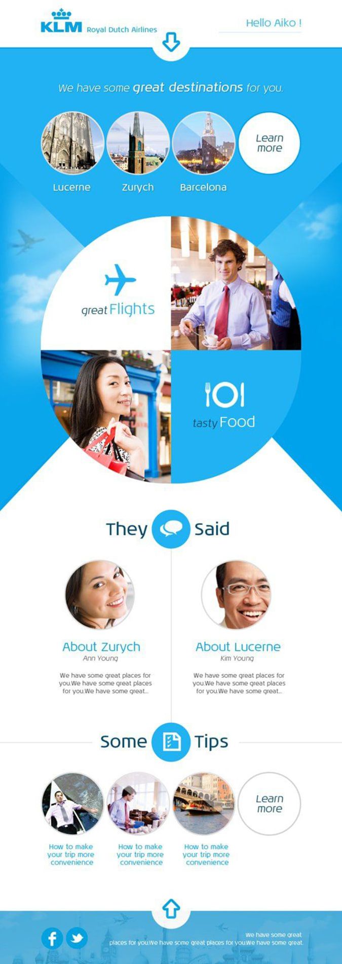
There are email designs that incorporate shapes to showcase a particular feature. This will help highlight your email’s main points and get the desired attention.
This email by KLM Royal Dutch Airlines is the perfect example of the same. They used circles to talk about their featured destinations.
#12 Make it Interesting and Functional
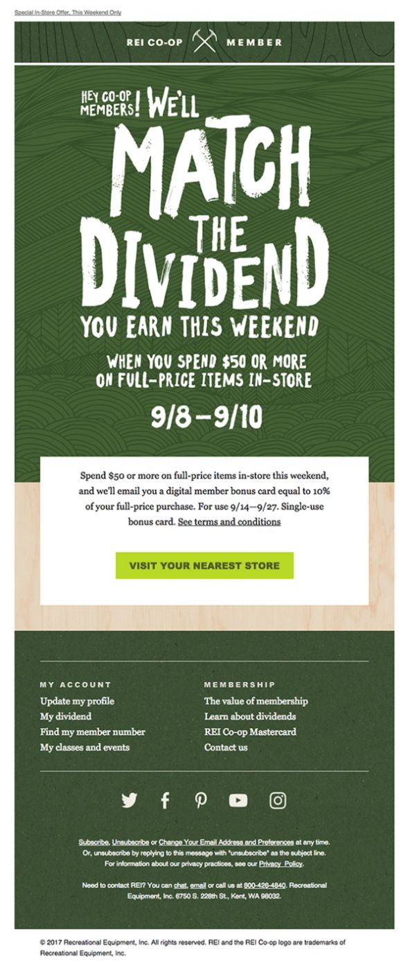
When you are designing an email, while you want to make it appear fun and engaging, you should always keep up with the functional demands expressed by the email. This email by Rei Co-op showcases how you can use a good number of elements to make it impressive and functional.
#13 Create a Theme-based Email

When you use a theme for the email, you will see that the theme helps you make the message stand out amidst competition, and helps you get the most out of the email. This email by Winsor and Newton is a theme-based email and helps the users connect with the main message of the email.
#14 Seamless Designs

When you want to translate your efforts of ideating an email into seamlessness, then you need to create the designs perfectly. This toilet training email by Bubs Warehouse is the perfect example of how a design narrative looks like. It flows seamlessly and keeps the reader tuned to the email.
#15 Visualize the Idea

Your email is generally based on a central idea you have defined. You should be able to visualize the idea and create an aesthetic email to convert better. The central idea here is to convey what new things have been added to the menu, which has been visually done through a beautifully designed email.
#16 Logical Flow
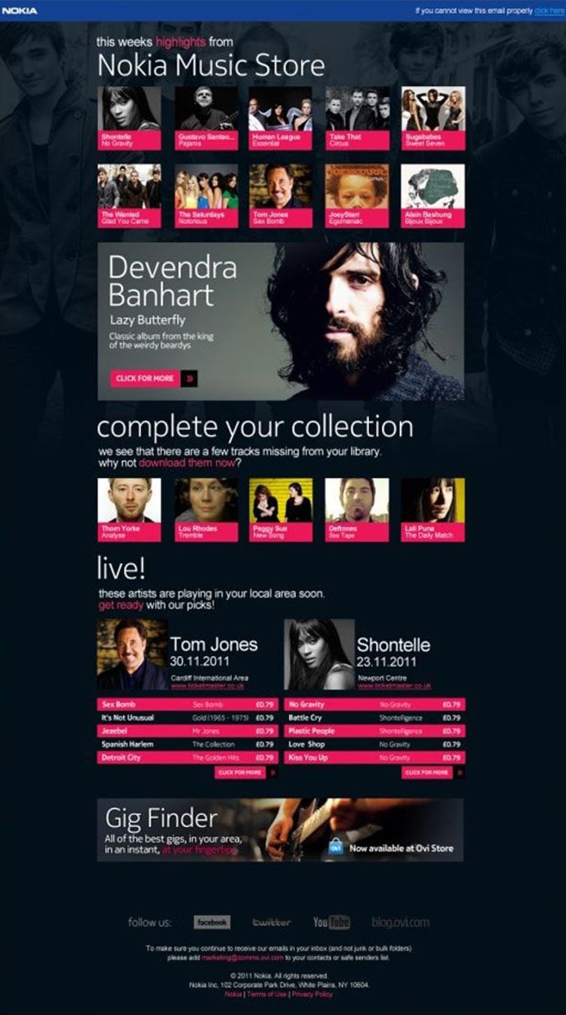
The email design should allow for a logical flow of the content so that the user doesn’t feel a disconnect with the email at any point. This email from Nokia regarding the Nokia music store has excellent linking combined with sharp background and well-defined colors that make way for engagement.
#17 Strong Tone
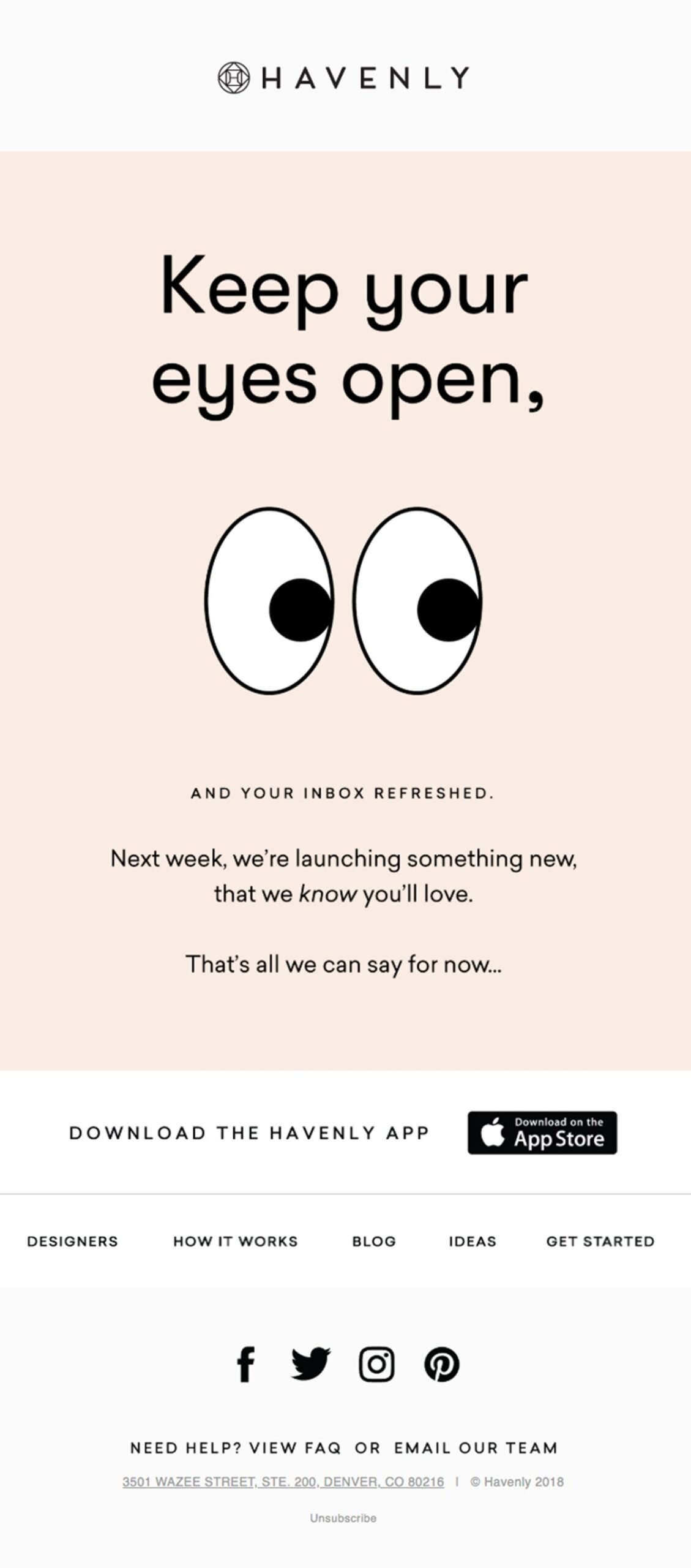
The emails should be designed in a way that they have a strong tone and convincing personality of their own. This email by Havenly grabs your eyeballs with the tone and the voice immediately. It piques the interest of the subscribers and makes them stay on the email longer.
#18 The tidy design
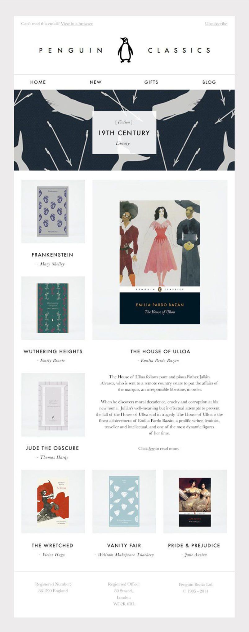
When you design an email, keep it as neat and tidy as possible. The more organized your email appears, the greater will be the engagement. The email by Penguin classics is a perfect example of how the email should be organized and defined for ease of use.
#19 Dash of Color
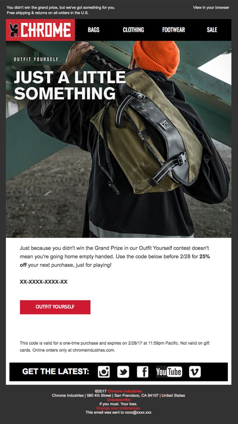
When designing a simple email, don’t forget to add a hint of color that will help impress the users. You need to define the use of color before you add them to the email.
#20 Thoughtful Designs
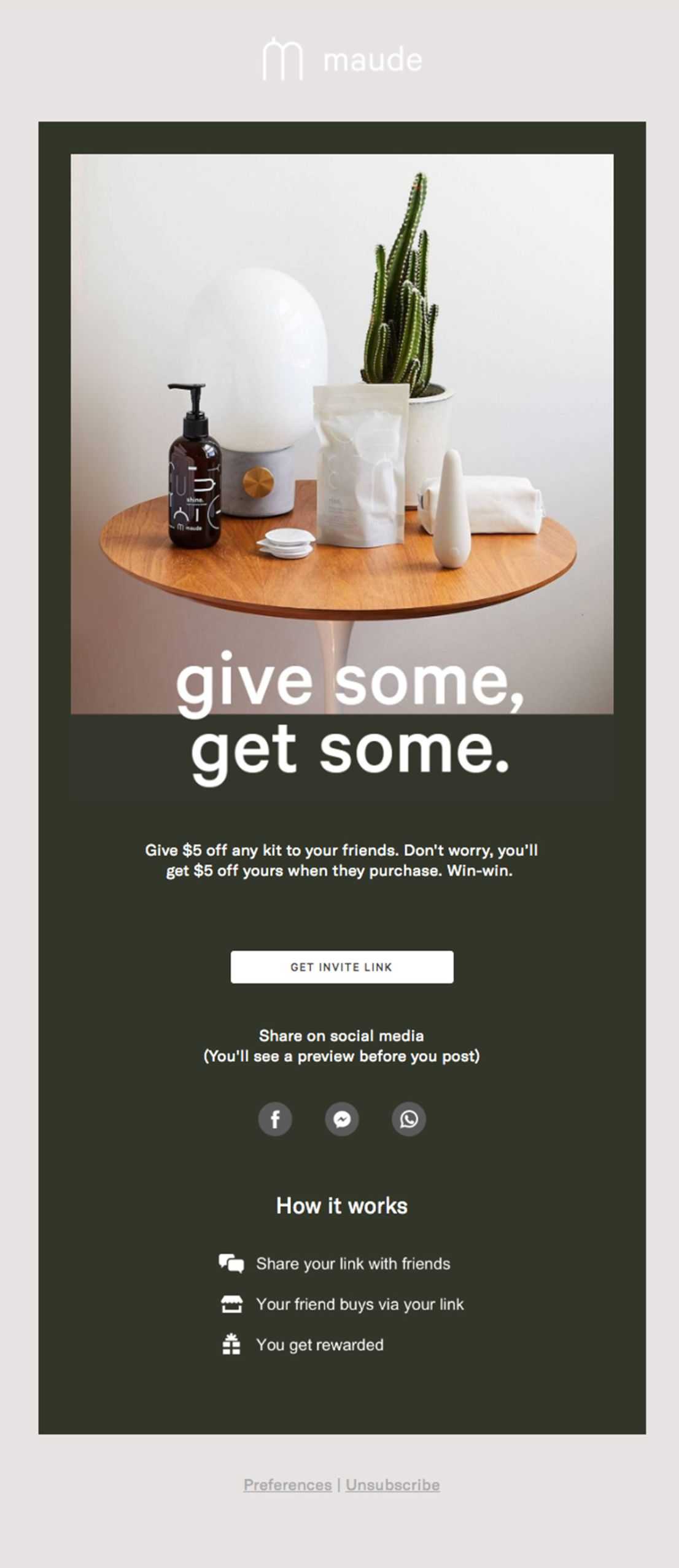
You must design your email after thinking through all the elements-fonts, whitespace, and colors. Plan your email according to the needs of the audience and their preferences.
#21 Monochrome Designs
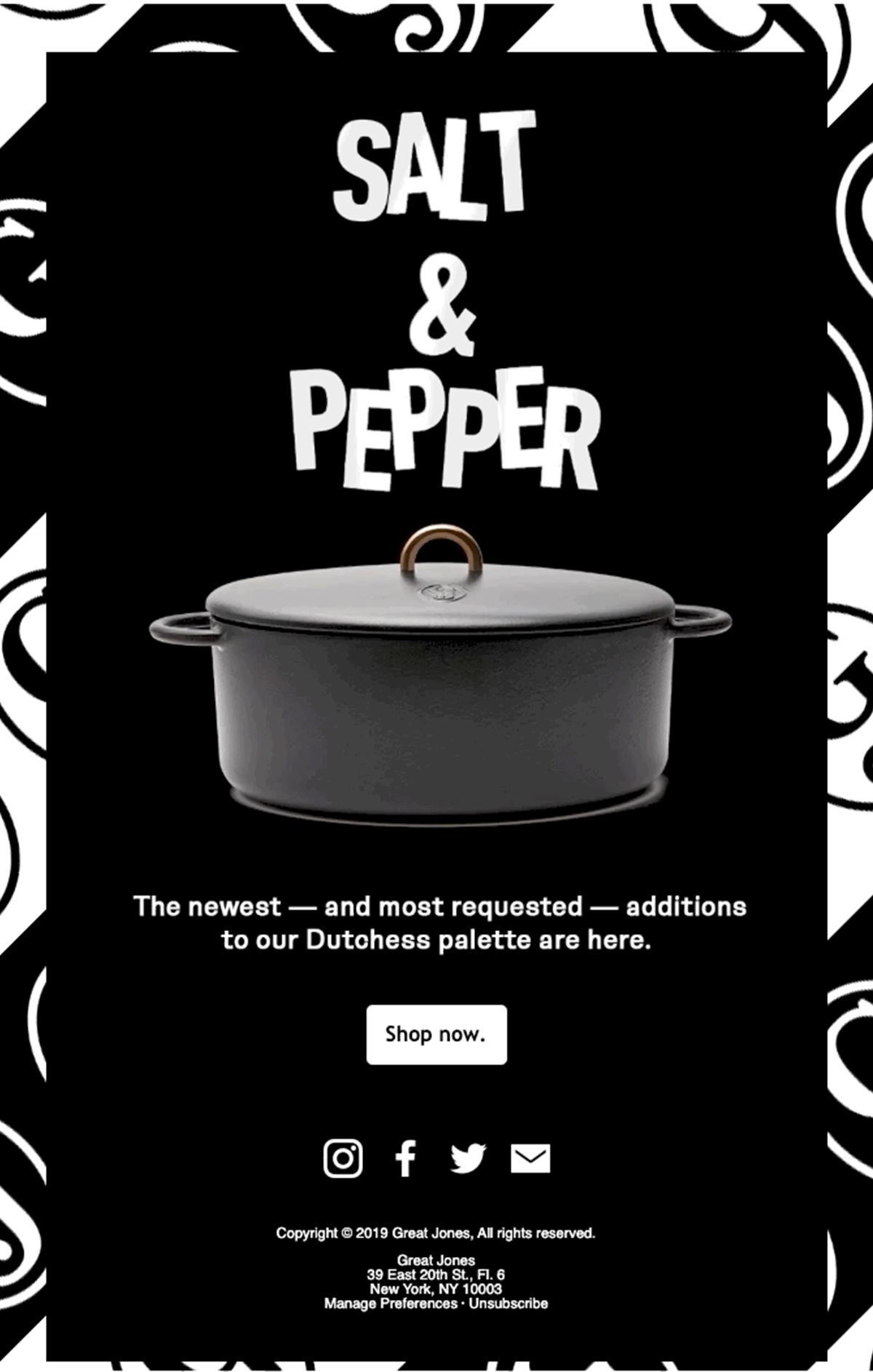
When you don’t want to think color but you do want to attract attention, then you should fill in the designs with monochrome colors. The black/white pallet will surely help you create a sleek and sophisticated email. It would be a great idea to showcase premium products.
#22 Balance Images with Content
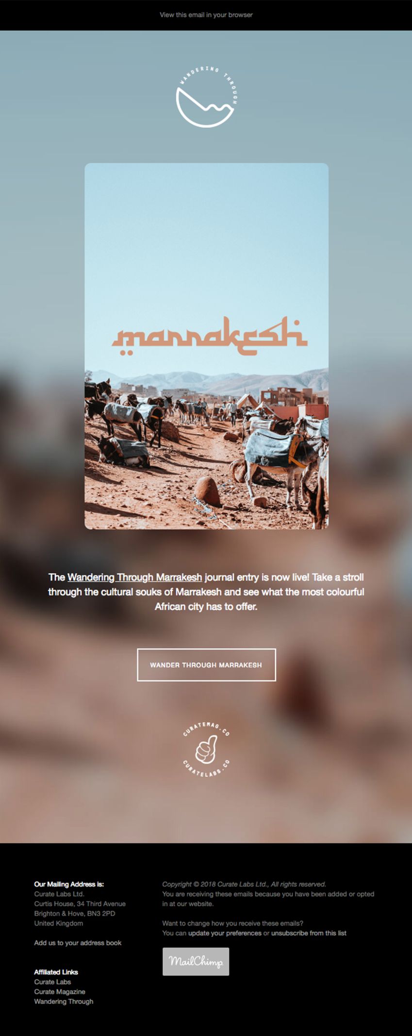
It is important to create a good balance between the content and the images to create a desirable and inspiring email design for your audience. 80-20 text to image ratio is generally considered to be optimum for inbox placement.
#23 Create a Horizontal Divide

It is important to divide your frame in a way that the design appears aesthetic and inspiring to the eyes. The below is an excellent business email template example of the same. You can take inspiration from this email to create your email design.
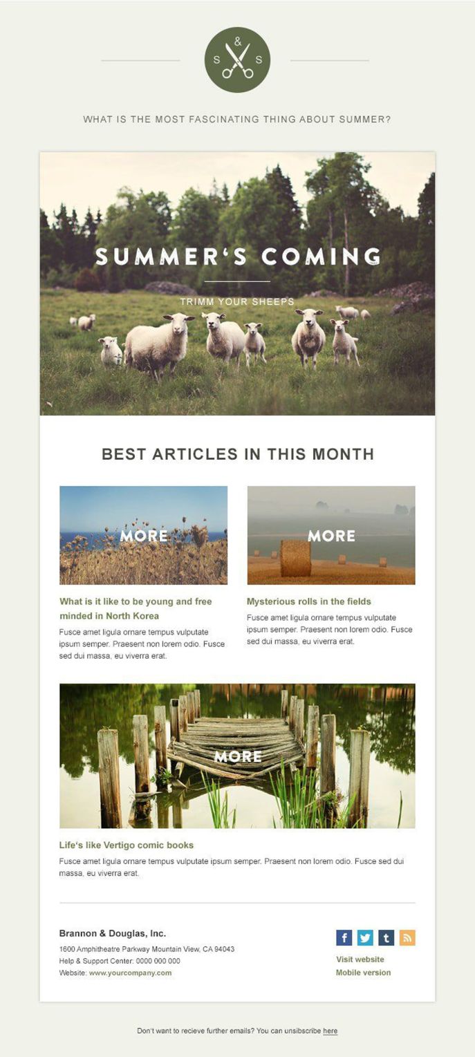
#24 Rustic Designs

These are favorites as they help create awe-inspiring and nicely designed emails for the users. They appear akin to handcrafted email designs that draw your attention towards the message immediately.
#25 Design with AMP
AMP technology will help you create a dynamic, webpage like experience in the email. You can add accordions, carousels, and sliders in the email that will help the user to take action from the email itself without the need to be redirected to the landing page.
The AMP email by EmailMonks (rebranded as Email Uplers) is the perfect example of AMP elements like an accordion, subscription form, contact form, and slider.
Summing Up
These design tips should help you create an effective email that will entice the users and increase conversions for you. You should plan your custom email designs well so that you can draw it up easily. Make sure you have an idea or a central theme for the email, as it will make your designs communicative, defined, and easy to understand.

