Last Updated on February 24, 2024
To design is to put together elements in a visually attractive layout. Building the layout is one of the most challenging aspects to learn, understand, and master. Most designers overlook and set aside using grids on their work to keep the design elements aligned. But, by doing so, they miss out on seeing what grids do best – keeping the design balanced.
Grids keep elements in check. They help designers utilize and maximize space in an organized manner. The end result is a visual design that catches the eye and appeals to the interest of the viewers.
Using a grid system in the beginning of the project will help you keep tabs on how the objects will appear. The system will also show how their positions on the canvas can help you achieve your design goals.
Grid lines will organically guide you into placing objects the first time on screen properly. Grid lines pinpoint where something should be placed, and not merely suggest where it could be placed.
Grid lines can be perceived as small aspects of the design process, but they help get big results. Grids serve as the building blocks of any design. It is the starting line.
What is a Grid System?
Every design, every project begins with a blank space, canvas, or wall. As a designer, the worst thing that could happen is for you to face this blank space not knowing how and where to begin. The general concept sits in your brain, but putting it on canvas can sometimes be difficult. That is until you start with a canvas of grids.
A grid system involves measurements you can use to align objects on a canvas. The grid will dictate the size of one object in relation to the others. It is a designer’s tool in aligning elements in a format, which makes it a great starting point for any design project.
There are no restrictions or standards set as to how you can use your grid effectively. The main objective of a grid is to help you shape the final design to reality. You can work on any grid system that suits your style.
A grid is mathematical so it is precise and easy to manipulate in codes. Do it manually or use design applications like Photoshop or Illustrator. Editing manual grids take time, especially when you change its size mid-design. Coded or automated grids are more flexible. Their size can be edited in a matter of minutes making it easier to adjust the design scale.
It may seem like a mundane step, but a grid system works. Artists and designers should never perceive it as a step to skip without realizing its value and power.
How Grid Systems Started
Grids were first used to help align words in written books. Printers used grids in typesetting to keep the body and headings well-formatted and scaled. The industrial revolution opened up to bigger demands for published and printed media, which opened doors for advertising. The grids, which divide a space into usable modules or segments, have grown into very useful tools in assessing the costs involved in advertising. A bigger space on the media is more expensive, but more visible.
The 1950s saw the need for a more systematic approach in organizing information on printed media. Grid design started with people like Karl Gerstner and Joseph Muller-Brockmann, who built the foundation for grids in design. Although their work was useful in the past, current designs find it too restricted and not flexible enough for present-day design structures.
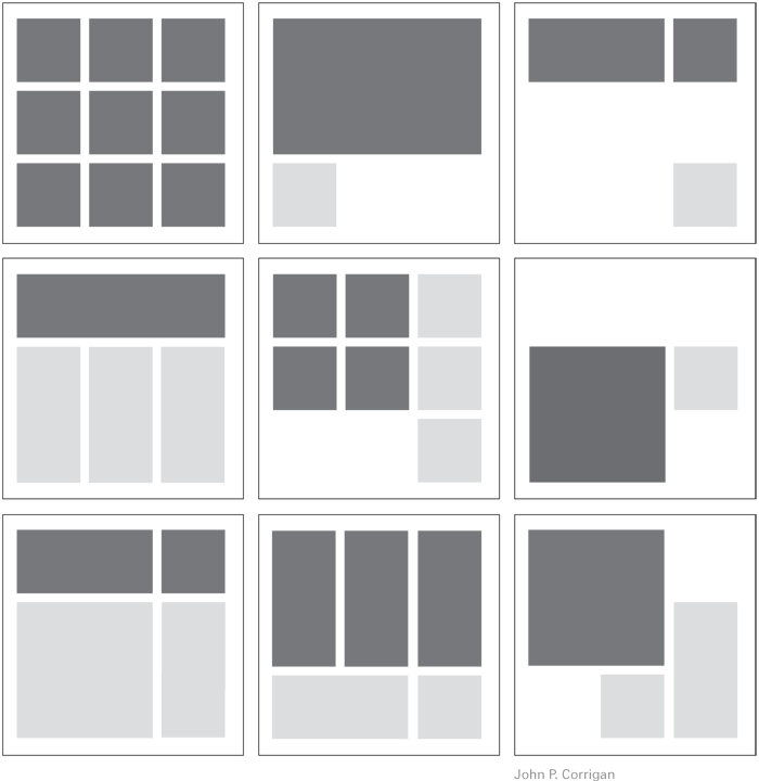
The Four Types of Grids
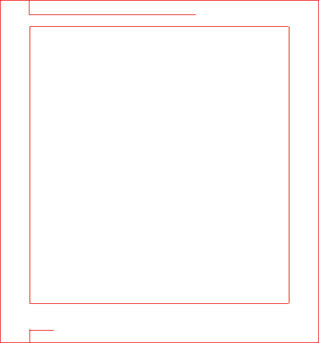
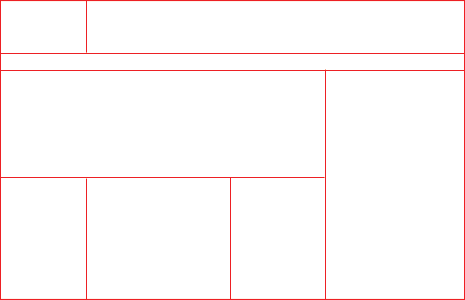
Manuscript – The manuscript grid is the simplest and most basic type of grid. It uses a rectangle to set the margins on a page.
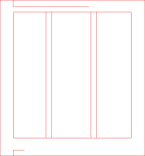
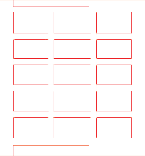
Column – A column grid is used to make columns on a page.
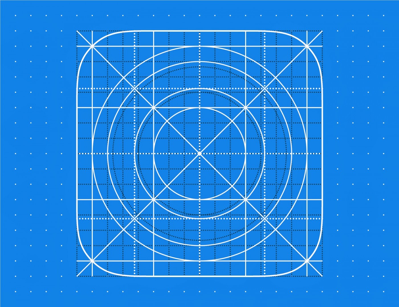
Modular – Modular grids use X and Y for rows and columns.
Hierarchical – Hierarchical grids use modules of different measurements or sizes.
The Top 10 Ways a Grid Works
For a graphic designer, grids are a necessity. A few lines placed on a blank canvas do a lot to improve the design. Grids also keep the design clean and well-structured.
Here are top reasons why grids should be a necessity for every artist or designer:
Organize Contents
Grid lines have been around for ages for one basic reason – they keep things aligned. They organize the design on a canvas. Grid lines make sure that elements are in order and objects are in place for both aesthetic and functional reasons. Aligning the elements (types, images, and graphics) result in a final design that will clearly get its message across.
Faster Turnover of Final Design
The technological age requires faster output and more efficient methods to ensure things are done quickly with precision. Grid systems allow you to move along on a blank space (and not be trapped in it). The grids serve as a template, a guide to properly place, size or scale objects needed to complete a design. Throwing the elements randomly is possible. However, this entails a lot of work placing and replacing the objects, adjusting and readjusting their sizes before getting to the final design. In this age of instant information, the faster you deliver quality work, the better it is for business.
Types Work with Grids
Types and grids are elements of a design that work together. An effective grid system will allow for type layouts to be placed neatly. The whole design will be more organized with text and types appearing to be more readable.
Baseline grids are horizontal lines that serve as guides for types (ex. the lines in your notebook). They make a design’s body more legible. The baseline grid ensures that the text and all types are aligned and formatted correctly.
While you might get away with not lining types up, your audience will instinctively feel that something is not right about the design. The natural tendency is to reject clutter or mess. Keeping types aligned makes for an uncluttered overall look, which encourages more appreciation from the viewers.
Easier Collaboration
Sometimes, designing involves several people. Projects that need the inputs of more than one designer could be stressful and frustrating if there is no system in place. Misunderstanding and miscommunication among the group can easily wreck the project.
Since grids offer a system that keep designs in place, structured, and well-formatted, using the same system will be a tremendous help for any project collaboration. The grid system will act as the guide that will help everyone on where to put the elements of the project. An effective and solid grid system works with any designer. It doesn’t matter if you took over someone else’s initial work or vice versa – the grid system will work like a map for easy navigation. The grid will tell you or the new guy where to put an object accordingly.
The grid system, owing to its mathematical nature, makes it easier for collaborators to work faster. After all, they no longer need in-depth consultation or clarification regarding measurements with the others. The grid will tell them what format is required. All questions about format or sizing can be answered by the grid.
For a project with multiple designers, it is important though to have a grid that is simple and functional. It must suit the final design. There’s no need for if the project just requires three for the final design. When you take over a design or collaborate with someone else, use the grids in place. Make adjustments if necessary, but never disregard them or the other designer’s efforts.
Keeping it Balanced
Symmetry has always been the key to good design. Grids help achieve symmetry with precise columns. Grids are there to divide the space into useful segments that will guide you in placing all the objects properly. Using grids will help you balance objects with no one of them overpowering the others. Balance and symmetry work because grids keep things in order.
Cohesive Multipage Designs
Having different people working on a single project is one thing. Having many pages on a single project is a whole new ballgame. Grids are saviors for multipage designs. A strong and efficient grid will work on all pages and in any layout. This makes it easier for you or your co-designer to come up with a cohesive design regardless of how many pages the project requires.
Multipage means different structures and different compositions. Four-column grids make things work even with such challenges. Grids keep objects in line and structure objects so they still appear clean and consistent. Each page will have its own function in the entire project and they will function as with grids in place.
Style guides and educational manuals are samples of multipage layouts. They are clean, organized, and well-aligned.
Visually-Enhanced Design
It is natural to assume that grid designs divide a page into equal parts for equal placements of elements. However, designs often also involve hierarchy. A grid is flexible enough to allow hierarchy and to speed up the process. Designing will be easier as well.
Hierarchy and grids work to develop a final design that is visually enhanced.
Clean Layouts
As mentioned, viewers who’ll look at the design have that natural tendency to get affected by clutter or mess. If you think you can get away with just placing objects randomly, you’re mistaken. Grids are tools that are there because designs should not be cluttered. Arguing about the flexibility of the arts and freedom of expression shouldn’t be your guide in designing. That’s the job of the grid system.
Margins are helpful. Going for tighter margins can produce a more tensed design, but open margins help get a clean and concise look. Grids are all about margins that can make your design look spotless and free from clutter.
Aside from margins, gutters should also be in place. These are the adjustable spaces between the columns in the grid. They should stay consistent in size it throughout the entire project to keep things sharp and clean.
Pleasing to the Eye
What is your design objective? You can have a multitude of goals, but the bottom line is for people to get it, right? It is also for appreciation.
A design will be more appreciated if it is visually pleasing, an eye candy of sorts and a piece worth talking about with others.
Artists and designers have a relationship with grids for the very reason that they aim for a visually stunning final output. The grid lines also make a design more compelling.
Take the rule of thirds concept for instance. It is a concept used in photography which theorizes that the design must be divided into a series of horizontals and verticals. The intersections of these lines are focal points that dictate where to place your objects for a more pleasant outcome. Photographers use it every time to intentionally let their objects sit on these focal points.
The rule of thirds in a printed output works with the grid lines in place. Give this a go in your next design and see your elements appear more pleasing as you achieve everything grids promise to give – a clean, organized, and structured look.
Those horizontals and verticals are hand tools in keeping things pleasing to the eye.
Added Impact when Breaking the Rule
Yes, we are all about sticking to the grid to produce a beautiful design. However, sometimes, breaking the rules is what the project calls for. Deliberately ignoring the grid could work for added impact. If you would like to bring the eye to something on your canvas, focus it on that object by defying the grid. This deliberate move will give your design a whole new perspective. That “glitch” would prove interesting to your audience. Since the rest of the objects are in line except that one thing, your audience will be drawn to it.
Breaking the grid will keep it interesting. However, you can only do this right if you know the rules in the first place.
With all these things raised for the love of the design grid, it is still up to you to see its beauty and usefulness. If you are new at this or if you have just converted into being a grid fan, you may have realized just how helpful these lines can be once you get to know them more.
Resources
Books
100 Design Principles for Using Grids – This book outlines the basic layout/grid guidelines and rules including choosing a typeface, striving for rhythm and balance with type, combining typefaces, using special characters and kerning and legibility.
Basics Design 07: Grids – Through detailed investigation of the principles behind grid design, this book informs and advances your understanding of this key design component, allowing you to devise grids with ease and precision for any situation.
Grid Systems in Graphic Design – A visual communication manual for Graphic Designers, Typographers and Three Dimensional Designers.
Making and Breaking the Grid – A great book by Timothy Samara that covers grid theory and usage.
Apps & Tools
Guideguide.me – A Photoshop extension that makes working with guides painless.
Gridlover.net – Establish a typographic system with modular scale & vertical rhythm.
Gridulator.com – Easily make and download pixel grids.
Thegoldengrid.com – A complete grid system for super fast wireframing and visual design.
Gridzzly – Make your own grid paper.
Dotted Paper – Premium handmade gridbooks.
Jeet – Jeet allows you to express your page grid the same way a human would describe it.