Last Updated on March 6, 2024
It all started with your basic blues, yellows and reds.
Eventually, you discovered that the rainbow also has the vibrant colors of orange, green, indigo and violet.
You discovered the awesome world of Crayola and were introduced to colors whose names you had a hard time spelling out, like periwinkle or turquoise blue.
And now that you have entered the amazing world of digital design, the list of colors gets even longer and better.
This is one piece of solid proof that color really does play a huge role when it comes to design. With design as a channel for communication, it just isn’t possible to limit yourself to a short list of basic hues anymore. Today, the more nitpicky you are in terms of color, the clearer your message becomes and the more effective your approach is.
Understanding The Basics
The human eye has the ability to recognize millions of different hues, with each hue invoking a certain reaction or emotion. Blue, for example, is often seen as a color of dependability and strength, while yellow is seen to be a representation of fun and optimism.
Because of this, color has also become one of the major factors that influence buying decisions. This is what makes it an important aspect of branding.
According to a study entitled Impact of Color in Marketing, 90% of snap judgments made by consumers were based on color. Through this research, they also found out that these decisions were dependent mostly on how appropriate the chosen colors are for each product – if the color fits the product, then people will buy it.
The Color Wheel

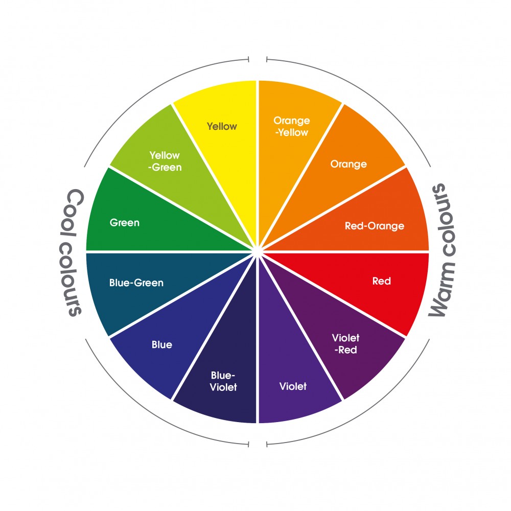
There are 12 colors within the color wheel. From the very top moving in a clockwise direction, you have:
- Yellow
- Yellow-Orange
- Orange
- Red-Orange
- Red
- Red-Violet
- Violet
- Blue-Violet
- Blue
- Blue-Green
- Green
- Yellow-Green
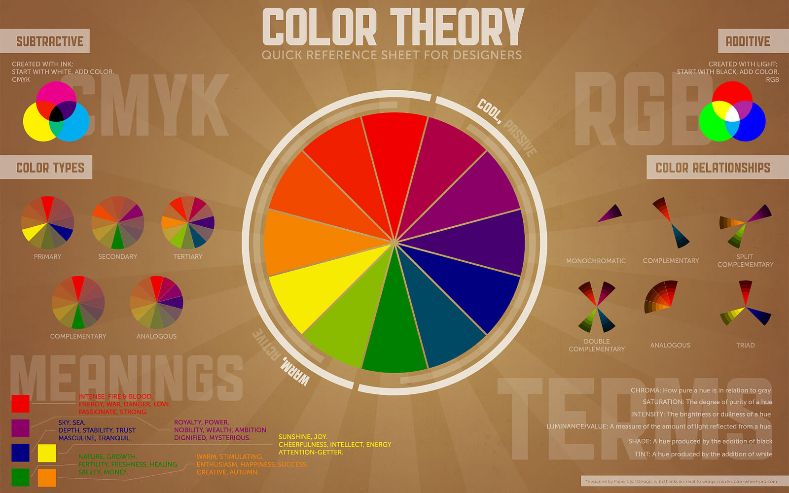
Look at the wheel above. If you draw a triangle through it, see how yellow is right on top, with blue and red on two bottom corners? Those are your primary colors.
Now mix yellow with red and you have orange, which is found right between those two. Mix red and blue and you have violet, mix blue and yellow and you have green.
All the remaining colors in between would be a mix of the color before and after them.
Some Basic Terms
When dealing with color, you will definitely come across a few terms. Although some use a lot of these terms interchangeably, as a designer (or when speaking to designers), you need nothing less than precision and accuracy. This means that you need to understand how these terms work and how they will affect your branding.
- Hue can be seen as a synonym of the word ‘color’. It usually points out to any color within the color wheel.
- This is a hue lightened with the color white.
- This is a hue dulled by adding the color gray.
- This is a hue darkened by adding black.
- This is a term used to describe how dark or light a color is.
- This is a term used to describe how pure or intense a color is. Basically, the nearer a color is to gray, the more ‘desaturated’ the color is as well.
Be careful when using these terms, especially when it comes to tint, tone and shade. These can make your designs come out differently from how it’s supposed to look like in your vision.
Meeting The Color Families

You think you’re the only one with families?
Colors have them, too!
Color families work well together, and are, more or less, around the same color spectrum, which makes them related.
Warm Colors
Think about the leaves every fall, or the blaze of a fire. Think about sunrises and sunsets. That’s exactly what warm colors are all about. They speak of energy and passion.
Warm colors range from red to yellow, with orange in between. Red and yellow are both primary colors, while orange is a secondary color.
Red
Red is a very complex color. It can symbolize love and passion, but it also symbolizes war and violence. It is the color of both the devil and cupid. It is the color of anger, and also warns people of danger.
Of course, you also have to consider what different cultures think about colors. It could be the color for good luck and happiness in China, but move to South Africa and you’ll learn that in that region, it becomes the color of mourning.
Because of the strong emotions related to the color red, it can also be one of your most powerful allies when it comes to branding. Careful though, because this amount of power in a single color can sometimes become overwhelming.
To make the most out of red, use it as an accent color. You can use some of its darker shades if you want to portray power and elegance, and move towards brighter hues if you’re hoping to portray energy.
Orange
What’s great about the color orange is the fact that it also represents energy, but not in an overpowering way. It is more earthy, something that connotes movement and change (as in the changing of seasons, like spring, summer or fall).
Orange is also a great color for health. It is friendly and inviting, and is a great color to use if you’re trying to catch the immediate attention of your audience.
Yellow
Yellow can represent brightness, sunshine and happiness. It is also a color that symbolizes hope, but can also be used to give out a warning against danger.
Yellow is the color of cowards in Western cultures, but in Japan, it actually symbolizes the exact opposite – courage. In India, yellow is a color commonly used for business. In Egypt however, it is a color that represents mourning.
These warm colors stand as great representations of strong emotions, and can be just the hues you need to give spark to your branding.
Cool Colors
In direct contrast to warm colors, cool colors are definitely calmer and more subdued. They are perfect for brands that want to exude a more relaxed feel.
Unlike the warm spectrum, there is only one primary color in the group of cool colors – the color blue. Green is a secondary color formed when blue is mixed with yellow and purple is formed when blue and red are combined.
Blue
When you say that you’re feeling blue, this means that you are feeling down or sad. However, this is not the only emotion that it portrays.
Generally, blue is used to show responsibility, as well as calmness. When made a little lighter, it becomes refreshing and peaceful. When darker, it becomes a symbol of strength and reliability. Dark blue is actually a common color used for corporate websites, as this color, especially when partnered up with white, gives the brand a more professional feel.
Green
Green is the color of nature, so it’s not surprising that it is often used to represent growth and abundance. Be careful when using this though, as green is also a color associated with jealousy, as well as lack of experience.
One attribute that green has taken from the color blue is its calming effect. At the same time, it also blends in some of the energy that it takes from yellow. Put that calm and energy in a single color, and you have perfect balance and harmony, a hue that gives off the feeling of stability and wealth.
Usually, olive greens are the ones associated with nature. Make that brighter though, and you can give off that vibrant aura. As for darker shades of green, they are the perfect colors to use if you’re hoping to give off an air of affluence.
Purple
Purple may be related to royalty, but it’s not always about being all fancy and fabulous. It is also a color that is associated with creativity, as well as romance.
The cool color spectrum definitely has its own strengths as well, especially for designs that are looking for a more relaxed but strong façade.
Neutral Colors

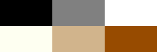
If you think neutral colors bring nothing to the table but options as backdrops, think again. Although they are often used to complement brighter and more powerful hues, neutral colors can still be used on their own. And most of the time, letting them stand alone can help you come up with a sophisticated look.
White
White obviously goes well with any color, and is the perfect neutral hue to use if you need something to give your main colors a larger voice. It is something seen as immaculate, a symbol of things clean and pure.
Because of its simplicity, you’ll see that white is always used in minimalist designs. It is also a great color to use for seasons like winter and summer.
Ivory and Cream
Ivory and cream are a little bit of brown mixed into white. They are great for designs that are looking for warmth and sophistication without being too overwhelming or bright.
Beige and Tan
Beige and tan are browner than ivory and cream, but still has a little bit of white. Of course, it takes on the dull and conservative effect that brown has, so it is often used to tone down other colors around it.
Brown
Brown is natural and earthy, and is often associated with reliability, steadfastness, and dependability. It can also remind your audience of the earth, of stone, or of wood. Commonly used as a background, it makes designs a little more wholesome. It is also perfect for designs that use stone and wood textures.
Gray
Gray is found on the cooler end of the neutral spectrum. Although it could be somewhat depressing when used on its own, it can also be used to add sophistication to any design. Depending on what you need, you can use lighter shades of gray to replace white, and darker versions of it to replace black.
Black
Death, evil and mystery – these are the things that people are reminded of when they see the color black. But when it comes to design, it also adds a hint of elegance, power, and formality.
It can actually be used in so many ways. It’s great for conservative designs, but it can also have that modern edge. It all depends on what colors will be used with it.
Neutrals definitely aren’t just colors that you can easily shove to the side regardless of how grand, trendy, and modern you want your designs to be. They have such a wide array of uses that they will always be needed no matter what kind of look you want for your branding.
Understanding Color Harmony

When you talk about colors, you will also have to think about how to mix and match them. And when it comes to mixing and matching, the way you harmonize your colors can make or break the deal.
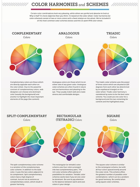
Here are six common ways for you to mix and match colors. This is called Color Harmony.
- Monochromatic. Uses a single color in different tints, tones or shades. For example, you can use light blue, dark blue, a bright blue, and a somewhat duller blue.
- Analogous. When colors are analogous, it means that they are found right beside each other on the color wheel. Because of the flexibility that this approach offers, it is also one of the easiest to use.
- Complementary. When two colors are complementary, it means that they are exact opposites on the color wheel. Some examples are yellow and violet, or blue and orange. Their harmony is dramatic because of the great contrast they show. But this also makes it a little risky to use in designing and branding.
- Split-Complementary. This could be any color on the wheel, plus the two colors or either side of its complementary color. This approach usually works out well because it has the same contrast offered by complementary colors minus the huge drama.
- Triadic. These are any three colors that are equally spaced on the color wheel.
- Tetradic or Double Complementary. This basically puts two complementary pairs together. Yes, it’s twice the drama and can catch anybody’s eyes in an instant. But this also makes it twice as hard to use.
Considering the huge number of ways in which you can put different colors together, there are also as much ways for you to make your brand stand out.
All in all, the success (or failure) of any brand is greatly affected by the color choice. One wrong move, and you miss the opportunity of a lifetime. But choose the right color pair or trio, and you can bring yor brand to greater heights.
Resources
Books:
Color Inspirations – More than 3,000 innovative color palette ideas.
Interaction of Color – A handbook and teaching aid for artists, instructors, and students, this influential book presents Albers’s singular explanation of complex color theory principles.
Color Works – Right ways of applying color in branding, wayfinding, information design, digital environments and pretty much everywhere else.
ROY G. BIV – An exceedingly surprising book about color.
Color Fundamentals – A graphic style manual for understanding how color affects design.
Secret Language of Color – Science, nature, history, culture, beauty of red, orange, yellow, green, blue, and violet.
Pantone: The Twentieth Century in Color – Rich visual tour of 100 transformative years.
Color Design Workbook – A real world guide to using color in Graphic Design.
Apps & Tools:
This handy new color palette tool, created by Bold Web Design, an Adelaide, South Australian based web design agency, lists the fortune 500 brands, including their primary and secondary colors. It’s a whole lot of fun to view the top brands in their categories, and provides inspiration to designers.
Color Hunt – Curated collection of beautiful colors, updated daily.
Coolors – Super fast color schemes generator for cool designers.
PLTTS – Easily find a matching color palette.
Adobe Color CC – Generate color palettes from photos on your iPhone.
Flat UI Colors – Great colors for your flat designs.
Colorful Gradients – Gradients automatically created by a computer. 48 times daily.
Colorkit – A productivity tool for color management for designers. (For Adobe Photoshop)
Color Palette Generator – Enter the URL of an image and find its color palette.
Colorfavs – Create a palette from any photo.
Brand Colors – Official color codes for the world’s biggest brands.
Skala Color (Mac) – An extraordinary color picker for designers and developers.
ColorZilla – An eyedropper for your browser.
Color – A minimal swatch picker
Color Palette Manager – Create, manage, and share palettes.
