
Last Updated on March 3, 2024
Every so often, presentations get a bad rap for valid reasons. We’ve all been there, sitting through long-winded speeches and boring PowerPoint presentations – which completely destabilizes the purpose of visual presentations.
There’s an overabundance of materials out there on how to give a powerful presentation. In today’s cutthroat business environment, knowing how to entertain and encourage the audience has grown into a perennial concern.
If you’re scheduled to give the presentation of a lifetime, here are tips on how to execute the task with flying colors.
1. Timing is everything

If you can pick your own presentation schedule, make it around 10:30 in the morning. The midmorning timetable is convenient for people who are alert both in the morning and in the afternoon. If possible, avoid setting your presentation right after lunch or late in the afternoon, particularly within the last couple of hours of the workday. You don’t want the challenge of an audience struggling against the mid-noon energy slump.
Of course, the schedule of your presentation isn’t always up to you. If you’re given a bad time, make an extra effort to rouse your audience with your quick wit and great visuals.
2. Keep it short

Most people have a short attention span. They get easily bored and restless. If you really want your audience to listen to what you have to say, go straight to the point. Avoid adding unnecessary content that can lengthen the program. Besides, it’s likely that your audience will know when you’re feeding them with fluff content. The one thing you don’t want to hear during and after your presentation are complaints about you wasting their time. Keep the presentation on point to make them happy.
3. Add audience participation
It’s challenging to hold the attention of a roomful of people for more than 15 minutes. One solution to avoid boredom is to keep your audience involved. Inject humor to your presentation to earn a laugh and lighten up the mood. Ask questions. Let them participate. As much as possible, add stories or examples they can relate to. If what you’re presenting relates to their own lives, it’ll make them more engaged to your talk.
4. Connect emotionally

If you want your audience to remember your presentation, make an emotional connection. Inject a sentiment to your message to humanize your visual aids. Motivate or encourage them by triggering their feelings. When you use mental pictures and emotions, the people in the room will internalize your message more. What you’re saying will stay in their minds even months after you delivered your presentation.
5. Use visual aids
Studies show that many of us are visual or kinesthetic learners. This means you need to anticipate that some of your audience will understand your point better with visual aids. When what you’re saying is supported by visuals, the audience will have a clearer understanding and mental image of your message.
Visual aids are particularly helpful when you’re presenting data considered boring (ex. statistics). Your audience will appreciate the figures more if your words are enhanced with helpful graphics or illustrations.
One caveat to this rule, though: don’t rely entirely on your visuals. Don’t just read the slides. Instead, speak according to what your audience sees. Your goal is for them to focus on your message, not on your graphics.
These five guidelines are time-tested. Follow them diligently and you’re on your way to designing a powerful presentation.
The Visual Factor

Visual aids are necessary during a presentation. The photographs and graphics give remarkable support to your speech. Designing visual aids for a presentation is easy to do. Those who present crummy visuals are either too lazy to make great charts or too complacent to even try making simple ones.
A visual aid is a communication tool that can help drive your point. It’s an important element in making a presentation so you need to learn and understand how visual communication works. One good reason for this is because your audience will subconsciously judge you and your brand based on the speech and visual appeal of your presentation.
So, what is the difference between a powerful presentation and a poor one? The answer is the combination of content and design. While your speech may be impeccable, the pictures you show can vastly strengthen or weaken your message.
Whether you choose Microsoft PowerPoint, iOS Keynote, or any other demonstration app, here are tips on how you can design a presentation that will knock your audience’s socks off.
Create a story line

You need to create a storyline when you’re designing visuals for your presentation. That’s the very first step you need to accomplish way before sitting in front of your presentation software. When you create a storyline, gather support for your slides. These include case studies, illustrations, props, statistics, and analogies.
Avoid using built-in themes
The presentation templates make your job easier. The problem with built-in themes is they are generic. Even if you choose a great font, the workflow will still be almost identical to a plethora of presentations out there. And honestly, that sucks.
What you want is to stand out from the crowd. And using built-in themes won’t help your design become one of a kind. Granted that some of PowerPoint and most Keynote themes are awesome, there’s still a big possibility that one or more persons in your audience have already seen the template you chose.
Custom themes are a lot better than normal templates. Yes, you need to exert more effort in designing them, but it will be worth your while. A custom design makes a much stronger statement, and if you’re encouraging your audience to invest on something, a stronger message is what you need.
Use high-quality photos
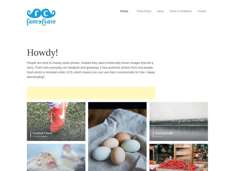
Screenshot of Fancycrave.com
Photography is the single best way to make your presentation look more sophisticated and well-thought of. On the flip side, it’s also the single best way to make it lame and lazy. To achieve the former option, you need to use high-quality photos as visual aids.
The “model with an exaggerated facial expression on white background” look is tolerable, but it is overdone. It also looks like a cheap stock image or a flat-out cliché. Steer clear from these types of photos. Also, avoid pictures that look awkward or creepy. Keep this in mind: no image is better than a bad image. After all, visual aids are not exclusive to photographs.
Finding high-quality photos for free can be a challenge. But if you search through the web or comb through a reputable stock image agency, you’re bound to come across a good photo that fits your slide and costs nothing. You can also browse Flickr Search, and look for high-resolution photographs that only require attribution. Looking for the right ones can be time-consuming, but for your presentation to work, the task is worthy of your time.
Prioritize solid color backgrounds

If you can’t find great photos to use for your slides, then don’t push it. You don’t always need photos to design a compelling presentation. Instead, use a strong palette of solid colors as the slide background.
The key here is to be very meticulous about your color choice. If you choose something too bright or too pulsating, it can blow the audience’s eyes out. It can also negate the sense of professionalism you’re aiming for. Also, it’s important to use contrast in your secondary colors.
Stay consistent
It’s important to make the look and feel of the slides consistent. It’s disappointing and confusing to the audience if your slides look like they’ve been hastily thrown together. The images, colors, background, fonts, logo placement, and layout frame of each slide must follow the same style guide.
That being said, they must be interesting on their own. Think about them as a family. They all look alike, but they’re not identical. To stay consistent on every slide, use the same title font, frame, and background throughout the design.
Using consistent fonts is also important. Make one great slide, then save the template. Use the layout repeatedly. The consistency will help the audience pick up elements of your design without you directly highlighting them.
Check your readability
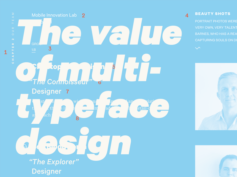
The value of multi typeface design by Bethany Heck
You must always know how readable and legible the font and font size are in your visuals. The secret to this is simple: use solid colors. By utilizing a solid color bar behind the text, you increase the readability of the slide by leaps and bounds. The solid bar also enhances the visual appeal of the slides.
Add a call-to-action
Close the slide with a design interesting and powerful enough to leave the audience with a good impression. Think of what you want them to remember. Add a call-to-action that will direct them on what they should do.
If your presentation is designed to be posted and shared online, add hyperlinks or share buttons for viewers to easily click through.
Use one image per slide
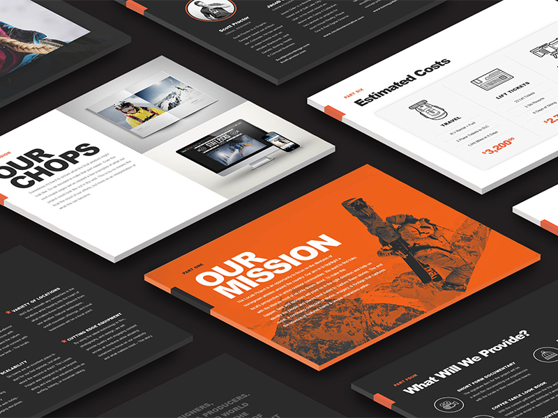
Presentation Design by Scott Proctor
This is not a rule set in stone because there will always be exceptions, especially when presenting or comparing two products. However, if two or more photos are unnecessary, stick with just one. Don’t get carried away with too many images on a single slide. Think about this: it’s a visual presentation, not a photo album. Use one powerful image with simple (or no) text to drive your point.
Create a persuasive cover
Your banner or title slide is basically your calling card for the whole presentation. It should be compelling enough to grab the attention of everyone while you convey your message. It must persuade and give your audience a reason to click through your slides.
Choose the right typography
Amateur or non-designers usually stress out when deciding on the correct typeface for a presentation. The agitation is rather valid. The right font can make or break a piece of visual art. Typography is a major element in the world of design. It can set the stage for what you’re trying to impart to your audience. If you fail to choose the right one, it can easily turn into a distraction.
Keep in mind that typefaces have moods and characters. They can effortlessly communicate a point in time and a frame of mind. Rather than checking your font list to find “something cool,” think of the core message of your production. For instance, if you’re to discuss current events, old style serif fonts are your best bet. These typefaces have a formal and professional feel on them. Alternatively, if you’re to present fashion, sans-serif fonts are your top bet. They have this modern, crisp, and clean feel on them.
When choosing the right fonts for your visuals, take time to examine and learn about your choices. You should, more or less, know how to differentiate a boring font from a safe one. If you’re hesitant to try new typefaces, browse through the standard-looking fonts. Use them to guarantee that your visuals remain inside the realm of professional and clean.
Size fonts correctly
It’s more likely that you’re designing your visuals on a laptop, and that’s a very different scale from the presentation screen. When you size your presentation fonts, the text must be large enough to be seen and read by the person at the back end of the room.
Keep it simple

When it comes to presentation, most of the time, less is more. Slides must be straight to the point and easy to read. As much as possible, use visuals instead of text. If text is necessary, make them sharp and keep them to a minimum. Also, avoid using more than three bullets or numbered points.
Share it
SlideShare is the best avenue to post and share presentations online to increase the slide’s visibility. Regardless if it’s for a website, a blog post, or a short tutorial, uploading the slides on SlideShare will increase the lifespan of your presentation.
Convert your presentation to a PDF file so you can share it to SlideShare. Add a powerful title and description. Categorize your presentation correctly and add relevant tags.
From there, you can share your slides on various social media platforms such as Facebook, Twitter, Pinterest, Google+, and LinkedIn. You can also share the slides through email or embed it in a blog post.
In any presentation, it’s important to keep your audience interested with your verbal and visual elements. Keep your audience visually engaged with a well-designed, powerful presentation.