Last Updated on February 26, 2024
TIME has its Person of the Year, ESPN has its ESPY’s, and the Nobel Prize folks sometimes have as many as 49 awards (and big checks!) to dole out each year.
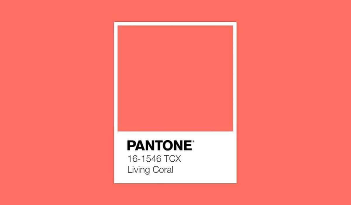
However, if you’re interested in design, fashion, art, or even marketing and advertising, then there’s a relatively lesser-known annual award that likely reigns supreme in your world: the Pantone Color of the Year. And for 2019, the glorious honor goes to (drum roll, please) living coral.
Taking over from 2018’s color of the year ultra violet, according to Pantone living coral is “an animating and life-affirming coral hue with a golden undertone that energizes and enlivens with a softer edge.” That’s quite a lofty description; but then again, for sign companies like Landmark Sign USA, for instance, the importance of color cannot be underestimated when it comes to conveying the right message, to the right people, in the right way.
So that you’re ahead of the color curve in the year ahead — or if you just want something interesting to chat about at parties that has nothing to do with politics — then here are some interesting and inspiring facts about coral:
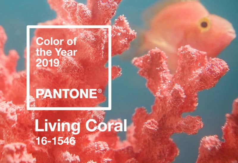
- In the natural world, coral is a calcium-carbonate skeleton that is formed by tiny undersea polyp that cluster together to form reefs. However, naturally-occurring coral is not always orangish-pink loving coral edition. Sometimes it’s gold, pink, or even black.
- Coral was first harvested by the ancient Egyptians. The Romans also wore coral to ward off evil, and people in the Victorian era carved coral into elegant cameo portraits (“say cheese…for the next hour!”)
- Hippies — not the ones you see today wearing designer jeans and toting $400 smartphones, but the folks on those grainy PBS documentaries — played a pivotal role in elevating raw coral into the mainstream design world. Peace out!
- Coral was widely used by the 19th century Impressionists; especially Gaugin, Cézanne and Monet. I guess coral made a really big impression on them. Get it? (Sorry, that won’t happen again.)
- Coral as a color used by artists and in various designs almost never happened. It took the introduction of cadmium yellow in 1840 and cadmium red in 1910 to make coral a chemically-stable color, that could be transported and affordably used across the world.
The Final Word
It goes without saying — and in fact, Pantone will be the first to admit — that picking the color of the year isn’t just a numbers game based on sales, votes or “likes”. There is a social and arguably even a political element as well.
With this in mind, I think it’s fair to say that no matter who we are, we could all use a little (or maybe a lot) of color in our world that is “animating and life-affirming”, and that “energizes and enlivens with a softer edge”. Don’t you agree?