Last Updated on February 26, 2024
When you want to create a strong brand, then you can’t underestimate the significance of a premium and well-designed company logo.
After all, it sits at the core of your entire branding strategy- it’s the public face of your brand, a visual masterpiece that aims at attracting new customers and making the existing ones proud to be a part of it.
It’s what that makes your brand stand out from others in the space.
There are many companies that understand the importance of a good company logo. However, they still make common mistakes that can cost them dearly.
If you want to design a unique, impressive, and powerful company logo, then be sure to not make the following mistakes.
1. Making the Logo Yourself
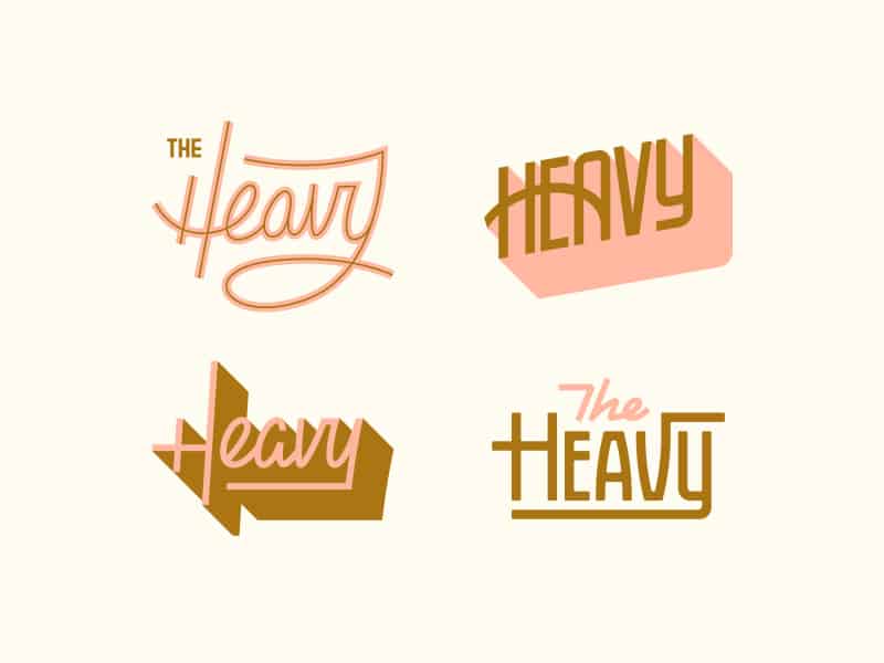
Source: The Heavy by Chaz Russo
It’s not uncommon for the people to entertain thoughts like “I think I can create a logo myself. After all, how hard it could be?”. Truth is, it’s never a good idea to create your own company logo unless you have a background in graphics design/arts, etc.
On the surface, a company logo may look simple and easy enough. However, a lot of thought goes into creating the perfect company logo, one that truly encapsulates the mission statement of a company, it’s ideologies, target demographic, and many important details.
If the only reason why you feel like designing your own logo is because you don’t have a big budget for it, then know that there are better ways of creating company logos. There are specialized software that can help you design a premium company logo for a nominal price. All you have to do is provide a few details about the kind of logo you want, and the software will do the rest for you.
2. Overlooking Fonts and Colors
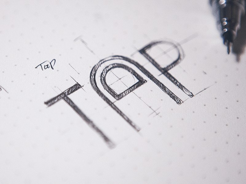
Source: Tap by Eddie Lobanovskiy
How do you pick the right colors and fonts for your company logo? Pick the ones you personally love the most, right? Wrong!
You can’t let your personal interests and preferences influence your decision when you pick the fonts and colors for your company logo. This is because these two things alone can make a big difference to how effective your logo ends up becoming.
Different types of fonts and colors have different effects. Thus, you want to pick those that get the results you want. For instance, if you want to create a brand that reflects royalty then you would want to go with colors like violet or black.
Similarly, you would want the fonts to look neat and bold. On the other hand, if yours is a company that supports environmentalism then naturally you would want to go with the shades of green.
Colors can be incredibly powerful, In fact, you can use the psychology of color to increase website conversions too!
Lastly, not only you should pick the right color palette and fonts, you must choose ones that are unique and creative. For this, you can always look at the different types of excellent calligraphy fonts for inspiration.
3. Thinking Within the “Box”
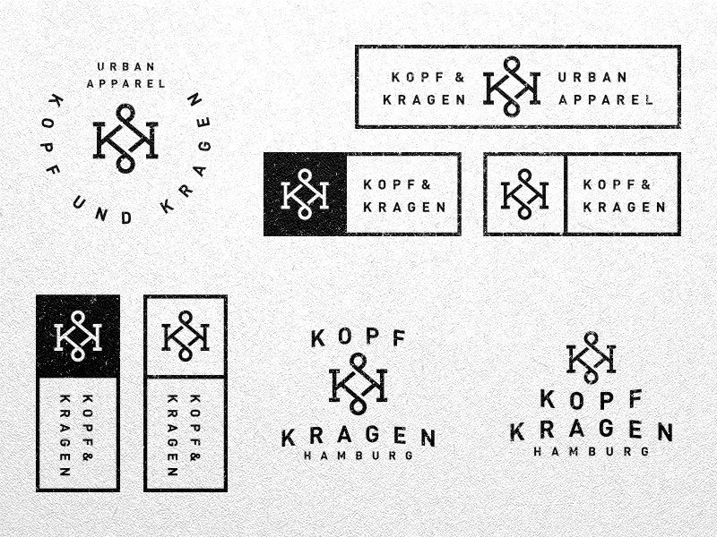
Source: Kopf und Kragen by Jonas
A great logo design is always unique and appealing. There are thousands of brands in the world and if your logo doesn’t stand out, how will your brand?
It’s alright to take inspiration from other famous logos, but in the end, yours shouldn’t even come close to looking like them. In other words, you must think outside the box. Here is a helpful tip- if the logo looks too obvious and direct, then maybe you need to start over.
4. Trying to Tell Too Much
![]()
Source: Logo Collection by Vadim Carazan
When entrepreneurs are passionate about their products and the brand itself, it’s natural for them to have a number of thoughts and ideas on the same. In fact, there is nothing wrong about sharing your beliefs, your goals as a new company, and all things that make your services/products better than your competitors in a blog, interview, etc. However, when it comes to your company logo, you can’t put all of it in it.
One of the core principles of a great company logo is that it’s simple. So, if you are trying to convey “too much” with your logo, then it can end up looking complicated and won’t click with your target audience.
5. Limited Application

Source: Austin by Steve Wolf
When you are designing your company logo, then it’s important to keep its application in mind. So, even if it looks great on your computer screen, it should also look equally good on a massive billboard or a small pen. This is because you will be using your company logo everywhere, as it’s the key to branding.
A good way of checking your logo’s adaptability is to resize it on the desktop itself in various forms. You can stretch it out or narrow it down, scale up and scale down. This should tell you how good or bad it looks when it changes its shape and size.
Your company logo is your brand’s identity. So, don’t rush creating yours and don’t settle until you have created a logo that not looks beautiful and attractive but also reflects your company’s mission statement.