Last Updated on February 21, 2024
The saying ‘less is more’, is something of a rule to live by in today’s society. Designers take note – a minimalistic approach now overrules the flashy gaudiness of yesteryear.
Today we find even the most simple of ideas the most endearing, and it’s becoming a noticeable trend among consumers who favor clutter-free packaging, dressed-down products, and no-fuss marketing, over which product is the shiniest, and which has the most colorful label.
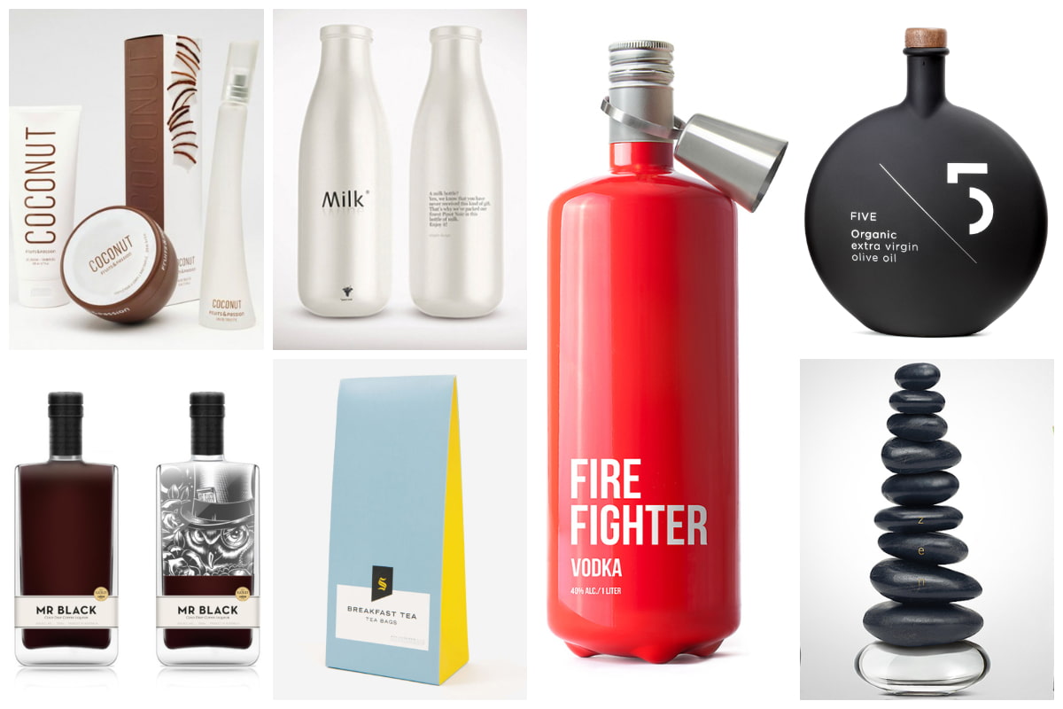
Take a look at these amazing examples of simplistic packaging. They’ve turned down the loud, and obnoxious look and created products you’ll want to buy – even if it is just for the packaging.
Mr Black
![1-620x641[1]](http://inspirationfeeed.files.wordpress.com/2014/04/1-620x6411.jpg)
MR BLACK is a cold drip coffee liqueur from Australia that is truly in a league of its own. This award-winning product is a perfect pick thanks to its packaging. While the liqueur itself is world-renowned – if it comes in a bottle this gorgeous, do we really care what’s inside?
X-Pen
![x_pen_feature06[1]](http://inspirationfeeed.files.wordpress.com/2014/04/x_pen_feature061.jpg)
The X-Pen may be a pen, but it isn’t just any old pen – which is immediately noticeable by its sleek, stylish design. This felt tip pen is crafted out of machined 6061 aircraft grade aluminium, and its creators (a group of designers who are clearly worth their weight in gold) say it is meant to embody the ‘passion, creativity, and hard work that goes into design’. Well, we would certainly agree.
One-handed First Aid Kit by Gabriele Meldaikyte
![firstaidkit_3-620x350[1]](http://inspirationfeeed.files.wordpress.com/2014/04/firstaidkit_3-620x3501.jpg)
This One-handed First Aid Kit may be everything you’ve ever dreamed of if you’re wounded and in need of a one handed assist – but it’s hard to look past its genius, simplistic design. Cute, classic, and containing all the bells and whistles a first aid kit should without bragging about it. And the packaging is so simple that you can access it with one hand. Priceless.
Undercover Pinot Noir by Ampro
![5[1]](http://inspirationfeeed.files.wordpress.com/2014/04/51.jpg)
Undercover Pinot Noir – the brainchild of design firm Ampro Design, was a self-promotion that allowed them to sneakily gift clients a bottle of fine pinot noir. This adorable ‘milk’ bottle is certainly a think-outside-the-box champion when it comes to simplifying packaging.
Apparently their main objective was to stand out from the crowd amongst the other gifts that their clients received over the winter holiday season. Mission accomplished!
Fire Fighter Vodka by Timur Salikhov
![lovely-package-firefighter-vodka-1[1]](http://inspirationfeeed.files.wordpress.com/2014/04/lovely-package-firefighter-vodka-11.jpg)
We all love a product that says what it means, and means what it says. Well, Fire Fighter Vodka does just that. Use it in case of a party. It’s a big, red fire extinguisher, filled with thirst quenching Russian vodka. Pure class.
5 Olive Oil by Designers United
![FIVE-OrganicZ-01[1]](http://inspirationfeeed.files.wordpress.com/2014/04/five-organicz-011.jpg)
Clean and simple. 5 Olive Oil -Pure & Powerful Greek Extra Virgin Olive Oil. This new premium quality Greek extra virgin olive oil plays on its name – where 5 stands for quintessence in olive oil, it also stands for the five principles of stunningly minimal packaging. Keep. It. Simple. Fresh. Crisp and Clean.
Mel de Cal Milio – Simply Beautiful Spanish Honey
![947020384121_quAB8okH_l[1]](http://inspirationfeeed.files.wordpress.com/2014/04/947020384121_quab8okh_l1.jpg)
Mel de Cal Milio – Simply Beautiful Spanish Honey. And might we add simply beautiful packaging too? Simple and a little bit sultry, with a lovely play on the origin of the honey with the design of the label.
Zen Perfume by Good Creative Marketing PR (Russian)

Zen Perfume -scents that are inspired by nature. Ah, we see what you’ve done here – and we love it. Delicate products of Mother Nature are seamlessly incorporated into each perfume bottle design, so you are literally one with nature when using these perfumes. These also make for beautiful ornaments even after the scent is gone. Nature for keeps.
Pluto by Bang & Olufsen
![Pluto003_750[1]](http://inspirationfeeed.files.wordpress.com/2014/04/pluto003_7501.jpg)
This minimal package design for skincare brand, Pluto by Bang & Olufsen is a brilliant reflection of everything that’s within the bottle. Simple, sleek skincare.
Selfridges Tea by Noreen Khan and Lewis Moberly
![selfridges2[1]](http://inspirationfeeed.files.wordpress.com/2014/04/selfridges21.jpg)
Selfridges Tea is a cheerful celebration of minimalistic packaging. Colourful, yet not overpowering, these gorgeous paper bags are a treat fit for any tea party.
The Secret Keepers by Vasilis Papadopoulos and Thanasis Tsampoukas
![secret+(1)[1]](http://inspirationfeeed.files.wordpress.com/2014/04/secret11.jpg)
The Secret Keepers are ‘one of the finest harvesters’ of virgin olive oil, green olives and honey, and their packaging says just as much as the actual product. ‘The Secret Keepers’ are self-proclaimed keepers of hidden secrets of tradition. The minimalistic design of their packaging is perhaps, one of their best kept.
Inspiron and Vostro by Mucho
![f6155b47c015691dc3b7db809174cca5[1]](http://inspirationfeeed.files.wordpress.com/2014/04/f6155b47c015691dc3b7db809174cca51.jpg)
The packaging redesigns for Dell’s Inspiron and Vostro reflect an environmentally conscious organisation, whilst still being at the forefront of communications technology. Simple, bold graphics, and minimal detail make this upcycled packaging something worth noting.
PURO Premium Water by Filippos Protogeridis
![a8b270b969798cfa85e1bbad186fa71f[1]](http://inspirationfeeed.files.wordpress.com/2014/04/a8b270b969798cfa85e1bbad186fa71f1.jpg)
PURO Premium Water looks as fresh as it tastes. The bottle has a simplistic design, and the only added detail to its otherwise sleek physique, is the addition of the cork bung (for the Still Water) and the granite bung (for the Sparkling).
PANACEA by Alexey Malina
![592252818871fdc3d6145e1727294871[1]](http://inspirationfeeed.files.wordpress.com/2014/04/592252818871fdc3d6145e17272948711.jpg)
The name Panacea is the name for ‘universal remedy’ and thus the album imagery was visualized as a ‘pill’. While the concept behind naming your album after a pill is complex – the aesthetic of a tiny piano encased in pill form is rather endearing.
Pure, white, and light. While this New Zealand vodka ticks all the boxes when it comes to great taste, purity, and quality, so does its packaging. Vodka jelly in a unique sealant packaging? Manly tool meets feminine bottle – this is a great party trick for entertaining a crowd.
Harmonian by Mousegraphics
![277[1]](http://inspirationfeeed.files.wordpress.com/2014/04/2771.jpg)
Harmonian food products have hit the nail on the head with their radically simple packaging. Flour, pasta, oil, and herb infusions are bundled up in boxes, with the design based on the Triticum Dicoccum variety of wheat seeds.
The seed is one of the earliest domesticated crops in the ancient world, and the use of tem in showcasing each Harmonium product reminds us of the versatile nature of not only the seed itself, but the product inside.
Copenhagen
![Carlsberg-Copenhagen-02[1]](http://inspirationfeeed.files.wordpress.com/2014/04/carlsberg-copenhagen-021.jpg)
Copenhagen is the name of Carlsberg’s new beer, although you wouldn’t guess that by looking at its sleek and sexy design. Simplicity reigns here, and they’ve succeeded in targeting a new generation of beer drinkers who love the total package of design, taste, and quality.
Harry Brompton by Cartils
![lovely-package-harry-bromptons-1[1]](http://inspirationfeeed.files.wordpress.com/2014/04/lovely-package-harry-bromptons-11.jpg)
Harry Brompton’s premium alcoholic ice tea has a classic and old fashioned look about it, but at the same time it’s dominating the market as a the next big thing in lifestyle beverages.
Jealous Sweets by B&B studio

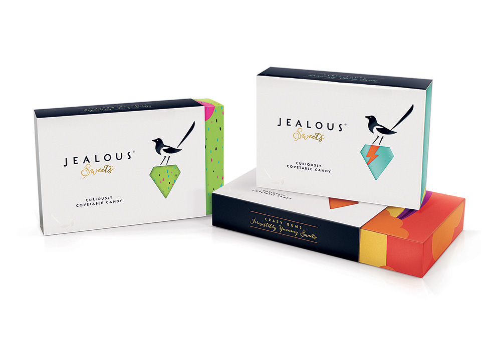
Simple, elegant and stunning – Jealous Sweets have that ‘much too good for children’ appeal, which is perfect for these high end sweeties that are the ultimate gift for grown-ups. Detailed luxury boxes, glossing, embossing, and foil blocking – simply, sweet.
Restored Water by Morgan Sterns
![restored_2-bottles[1]](http://inspirationfeeed.files.wordpress.com/2014/04/restored_2-bottles1.jpg)
Restored water was ‘strongly influenced by the process of taking highly treated wastewater that would have previously been discharged into the Pacific Ocean and purifying it using a three-step advanced treatment process.’ The clean cut glass bottles mixed with the rustic charm of the wooden box is a great combination of elegance, old and new.
Fruits & Passion by lg2boutique
![lovely-package-fruits-and-passion1-e1339883857323[1]](http://inspirationfeeed.files.wordpress.com/2014/04/lovely-package-fruits-and-passion1-e13398838573231.jpg)
Recently, Fruits & Passion introduced a new range of packaging to portray their new CHERRY, BAMBOO and COCONUT products. While the use of white space, colourful and bold type that jumps off the packaging is incredible, the playful use of the coconut shape, bamboo texture, and boldness of the cherry creates a fresh, zesty energy – which is a perfect reflection of the brand.
Provenance by Jog Limited
![lovely-package-provenance1-e1333778754374[1]](http://inspirationfeeed.files.wordpress.com/2014/04/lovely-package-provenance1-e13337787543741.jpg)
Provenance high-quality home ware products are made from recycled, reclaimed and renewable materials, so it is fitting that their packaging reflects as much. Each product has a story to tell, with the packaging using a ‘this is now’ and ‘this was’ approach to explaining the recyclability of each. For example, ‘this bottle was once a part of a building’ to the reverse ‘this is now an antipasti platter set’ on the front.”
Heineken Icone Pure by ORA-ÏTO
![heineken1[1]](http://inspirationfeeed.files.wordpress.com/2014/04/heineken11.jpg)
100% sustainable aluminum bottles, and a chic new look for one of world’s most renowned beers? Meet the the Icone Pure by Heineken. This unique bottle is pure white with a green dotted inscription and still features the iconic green logo of Heineken on the front and back.

