Last Updated on February 28, 2024
The mobile UX covers the users’ observations and sentiments before they interact with your mobile, during the interaction and after it. They could be doing it through an app or a browser by making use of a mobile device which may range from phones that fall in the low-end bracket to high-end tablets.
Creating user experiences for mobiles which please users makes us rethink about what we have pre-decided as far as desktop designs go.
The matter becomes more complex by considerations that are mobile-specific and which are inherently connected to small screens, huge variations in features of devices and restrictions in both connectivity and usage and the ever changing context of mobiles.
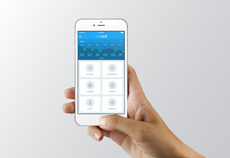
Breaking up the components of mobiles UX gives us a framework to build and evaluate best mobile experiences. These elements include context, functionality, content and marketing, user input and others.
The significance of these components will alter depending on the kind of device and the respective interface. In this article we will describe these elements and elaborate on them with chosen guidelines.
How To Improve Mobile User Experience

Functionality
This deals with features and tools that help users to accomplish their goals and complete their tasks.
Instructions
- Prioritize and offer basic elements from other avenues which have notable significance in a mobile location. For airlines, this will include statuses of flights and check-ins.
- Offer appropriate mobile functionality (image recognition and barcode scanning, for example), and improve functionality by using the mobile devices’ facilities to engage and thrill users.
- Make sure that the basic features and the content are optimized for mobiles: the shop locator, for example, must show the closest stores in relation to the device’s location.
- Incorporate features which are applicable to the business class. For retail sites and apps, these would comprise order status, product search and shopping cart.
- Offer essential facilities in all channels. If some function is not offered on the mobile, then send users to the proper channel.
Information Structure

This deals with the arrangement of the functionality as well as the content into a rational structure to assist users to complete tasks and get information. This comprises search, navigation and labeling.
Instructions
- Give links to the chief features as well as to the content on your landing page and prioritize it to suit needs of users.
- Allow users to steer to the key functionality and content by using the least number of key presses or taps.
- The navigation requirements of touch screen as well as non-touch screen must be catered to.
- Provide navigational tips so that users know their position, how they can return or skip back to the beginning.
- Links and navigation items must have clear, concise and descriptive labels. This is more important on small mobile devices.
Content
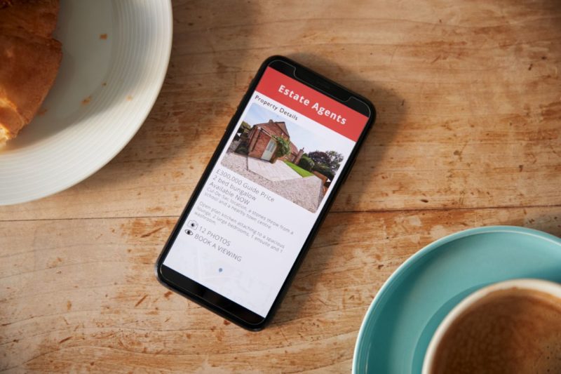
This is the different types of stuff in varied formats, like images, text and video which give the users information.
Instructions
- Give users a suitable and eclectic content mix, like information about products and social content; support and instructional content as well as marketing content.
- Make use of varied media when it helps users’ tasks in a mobile environment, increases content value or encourages the website’s goals.
- Always let the user have control over different media content by refraining from auto-start sound/video; allow the user to give a miss or halt such content; and be mindful of the bandwidth it uses.
- Ensure that your content is appropriate for mobiles. Copy must aim at shorter spans of attention. Optimize media and images for the mobile.
- Make sure that the basic content is provided in a format that is supported on the object device.
Design

The design’s components comprise visual presentation, the mobile’s interactive experience which includes layout, graphic design and branding.
Instructions
- Design must aim for glanceability and fast scanning. Glanceability is how easily and quickly the visuals convey information.
- Make visuals consistent with other touch points and other experiences like web, mobile, print app and real world, by using color, personality and typography.
- Keeps the visual flow going. Guide your users from the most essential design element to other components to assist them finish their tasks.
- Mull over portrait as well as landscape presentations in the design.
Users Input

This pertains to the effort needed to enter data. The latter must be minimized on mobiles and not need both hands to use.
Instructions
- Registration forms must have minimum required fields.
- Show default values where it is possible. It could be the user’s last item or the most frequently chosen one.
- Offer different input mechanisms that are based on the capabilities of the device, where it’s possible.
- Use suitable input apparatus and show the suitable keyboard so that users don’t have to navigate the screens on their keyboard to enter data.
- Consider spell-check, auto-completion and prediction technology to lessen the effort needed to input data and lessen errors. Disable features like CAPTCHA where it is inappropriate.
Mobile Framework

A mobile can be used anywhere, anytime. The mobile framework is about the settings and usage circumstances: anything that has an effect on user-interface interaction, which is particularly essential for mobiles because the context can alter rapidly and constantly.
Instructions
- Use features as well as capabilities of the device to foresee and support the user’s context.
- Make provisions for alterations in context based on the time when the user is utilizing the app. Navfree GPS involuntarily changes from day to night and shows depleted-glare maps to help safer driving at night.
- Use location to identify where the user is and to display relevant nearby content and offers.
- Control information that users have supplied. Give respect to their settings and preferences.
Usability Factor

This measures the content and information architecture, design and all other elements that work together to help users achieve their goals.
Instructions
- Make the user know clearly what can be chosen, swiped or tapped particularly on touch screen devices. One of the huge findings of Nielsen Norman Group’s usability studies of the iPad was users’ ignorance of what was tappable or touchable.
- Use conventions and designs to lessen the users’ learning curve and to make the experience more spontaneous.
- Make sure of usability in all types of conditions, which include daylight glare, changed viewing angle and orientation.
- Don’t bank on technology that is not supported universally by the audience’s devices. This includes JavaScript, Java, cookies, frames, Flash, auto-refreshing and pop-ups.
Should be Trustworthy

This relates to the degree of trust, confidence and ease when users make use of a mobile website. A 2011 study stated that security and privacy are the two top concerns of users of Smartphones.
Instructions
- Don’t use/collect personal info like location/ contact list from mobiles without the clear consent of users.
- Make it simple for users to have control over their personal information; allow them to decide against targeted advertising.
- State precisely your business’s practices and show them contextually.
- Show policies properly on mobile devices; offer a summary and choice to email whole policy.
Getting Feedback
This deals with the processes to attract user’s attention and display essential information.
Instructions
- Keep to the least the amount of alerts the app can show and make sure that every alert gives crucial information and choices that are useful.
- Keep alerts short and clear and explain what the reason for the alert was.
- Make notifications brief but informative which do not interfere with what the user is doing.
- Put feedback as well as confirmation on the screen without halting the users’ workflow.
Options

This deals with the options, services and products that are available to help the user utilize the website.
Instructions
- Make it simple for users to get help and back options. They usually seek help in the website’s footer and in the app’s toolbar/tab bar.
- Offer many ways to get help. This includes relevant options in a mobile context like self-serve FAQs and live support through click-to-call.
- Provide a brief tutorial and quick introduction using the app at launch time.
- When you introduce a new or singular functionality, provide contextual assistance and tips to help users initially.
- Provide help videos where necessary, but give all control to the users.
Social

This relates to features and content that generates a sense of social involvement that encourages user interaction and facilitates sharing on well-known social networks.
Instructions
- Make and maintain an existence on social networks like Facebook and local services. These will show up in search results and on location-wise social media services. Besides the name of your business, include your address, URL, phone number and operating hours.
- Now you must integrate your site’s mobile experience with your social presence by displaying your current activity and offer a simple way to like you/follow on these social networks.
- Incorporate features of your social networking in the mobile experience so that users can easily connect with their social networks. This could be as easy as using APIs to facilitate bookmarking, social sharing, liking, tagging and commenting.
- Request users to create content that features your product, brand or service from their devices and offer incentives in return.
- Provide offers that can go viral or be shared. American Express, for example, presently offers discounts and savings to users who integrate their profiles on well-known social networks.
Marketing

By marketing I mean the methodology of a user to find a website/app and the factors that support repeated usage.
Instructions
- Ensure findability. This can be done by optimizing for mobile discovery and search like keeping URLs short. If you have a distinct mobile website, adopt URL naming standards like m.site.com or mobile.site.com.
- Quick response or QR codes must lead to a landing page that’s mobile-optimized and not a traditional page which needs zooming or to the homepage, from where users have to dig out information.
- Email campaigns must include a connection to see the message in a format that’s mobile-friendly, which links to the related offer page that’s formatted for mobiles.
- Promote your mobile app in other channels where it is possible.
- Induce users to rate your app/share it on social networking sites after usage, but allow them to postpone/stop these prompts.
Summing Up
Mobile UX is still in its infancy but its developing fast. Opportunities exist for improvement. I have presented a general idea of the basic elements of the mobile UX, and some guidelines that will help you get started.
If you focus on these elements, you’ll be able to create a great user experience for your users. I hope you have liked this post. I’m looking forward to your comments on it!