
Last Updated on February 25, 2024
Described by the Time as the oldest in the history of brand logos, Stella Artois first used its logo in 1366 and has maintained its loyalty to the brand image to the present day. However, the truest definition of a logo presents the curious evolution of logos dating back to the historical period – when early people scribbled symbols on the cave walls with pointy rocks – to becoming powerful brand identities in today’s world.
Logos are all about communicating through a visual language that doesn’t necessarily require a verbal explanation. In fact, running a business without a contemporary logo design is impossible. How has the evolutionary stance changed the way we look at logos?
2,000,000 – 3300 BCE: Stone Age In Focus
As mentioned before, logos are driven by the power of symbols, which is what forms their foundation. The people belonging to the prehistoric ages used symbols as well as graphic representation of objects and living beings as a means to express their relationship with their surroundings. As man proceeded from Stone Age to the Bronze Age, the semantics of symbolism were magnified under the light of intelligence.
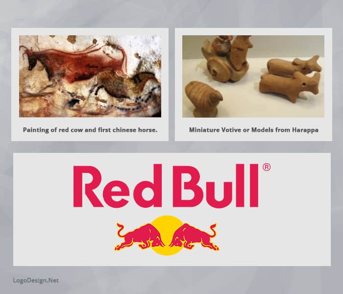
For instance, the Lascaux cave painting of a bull, the Indus Valley Civilization painted jar with an image of a bull, and today’s Red Bull logo share a striking similarity, even though distanced via time, geography, and the intention of communication. For centuries, the symbolic language has been identified and used to a greater extent as time passes by and the domain of logo design keeps expanding.
3200 BCE: Egyptians Introduce The Hieroglyphs
During the Later Bronze Age, the Egyptians used hieroglyphs, primarily a sign and symbol language, which contained about 900 characters and was considered a mature system of communication.
Through these specific symbols and illustrations, the ancient Egyptians continued to deliver their ideas that have become the landmark of the Egyptian historical landscape. The signs used in this formal system of language have the power to describe abstract objects and ideas that gain a meaning until they’re invested into.
For instance, the Egyptians used the symbol of Ankh, which means life and is considered a variation of the Christian Cross in its appearance and figurative meaning.

Image: Pixabay
Apart from the appearance of the symbols and alphabets in the hieroglyphic language, the Egyptians also used the grid in their designs for maintaining accuracy, uniformity, and a balanced proportion in the overall big picture.
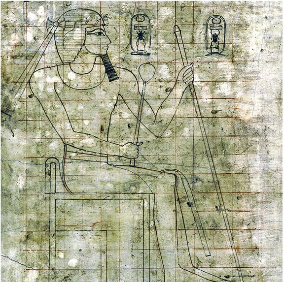
Image: rogerburrowsimages.com
It’s also reported that during the same period, the Chinese Calligraphy started developing in the Oriental region and the profound idea of using powerful emblems or vaguely-termed-designs as a communicative language started emerging. From culture to culture, the use of symbols in multiple ways varied with their integration, which leads us to the time when symbolism became an instrument of identification.
1200 – 1600s: Symbols Become Identities
Skipping forth in time, there came a moment in history when the ancient civilization used visual language as a sign of establishing identities. Two main developments appeared during these periods: the heraldic crests and the symbolic signage.
Heraldry: The System Of Identification
Heraldry is a system of identification for personal and family lineage in the form of the inherited coat of arms. During the 13th century, this practice became a common ritual among the kings and the knights who took pride in being identified with colors and symbols particular to their ancestral line. For instance, Jeanne d’Arc was prided with a specific coat of arms granted from Charles VII of France.
The family received arms and nobility to their names. The arms, however, were: Azure a sword per pale argent hilted or between a crown in chief and two fleurs-de-lys of the last. Down below is an image of the coat of arm of Joan of Arc, which has retained its significance to date.
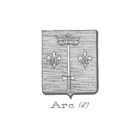
Image: heraldica.org
The coat of arms particular to the noblemen severed several purposes. The primary one was to distinguish between friends and foes during the war, the result, however, was the same. The elements used in the heraldic crests evolved into having meanings of their own and leading the people to recognize their preferred symbols.
Signs And Boards Go Public
Apart from the blue blood members, a large section of the commoner’s society was illiterate. But since the population kept growing, people moved to cities to adapt to a modern trade as compared to the previous agrarian ways.
Commodification rose to a greater degree – the reason for which the barbers started using red and white striped poles and the pharmacies used crosses as a sign of health and medication – and gave rise to the birth of signage.
In fact, King Richard II of England passed a mandatory law for ale brewers to hang a sign outside their business so that their quality should be kept intact as ale was a usual replacement of water. After this legislation, the use of signs became a commonplace practice and spread to other types of businesses throughout the Middle Ages.
Elements from the Royal coat of arms and images of animals were considered favorite during the medieval times. For example, the signboard from The White Hart Pub represents a mature white stag with a chained gold crown around the neck. The figure was derived from the personal coat of arms of Richard II and became an appreciated identity of the brewery.
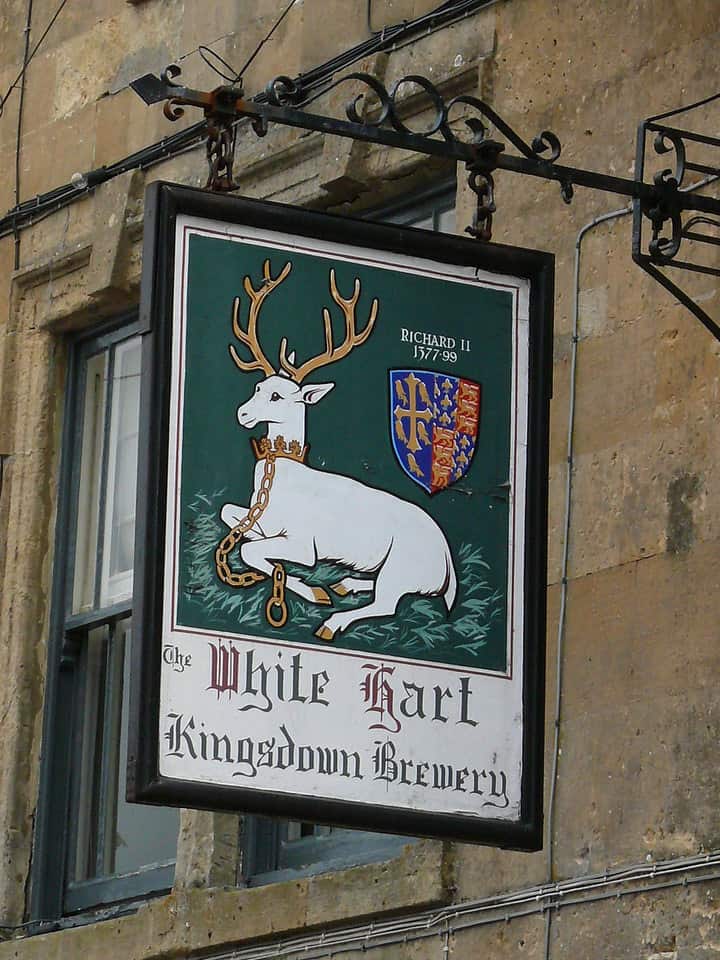
Image: malsfotofile.smugmug.com
The Printer’s Marks
By the 15th Century, printers and publishers came in line to include their so-called ‘Printer’s Marks’ at the beginning or the end of their publication. The first printer of books in English, William Caxton, included his printer’s mark at the end of his publications, with the mark being the first initials of the first and last name bordered with embellishments. During the course of his career, the distinctive W and C with the stylized borders provided the printer’s mark a unique identity to this day.

Image: nypl.org
By the time printing prevailed, newspapers came into being during the 1600s. The advent of newspaper and magazines became the birthplace of advertisements by the late 17th and early 18th century.
1700 – 1800s: The Age Of Advertisements And Corporate Branding
Apart from the motive to promote businesses, the hidden purpose of advertisements was to make the audience familiar with a certain company and its products. The first ad appeared in 1704, from John B. Dunham, a piano manufacturing company.
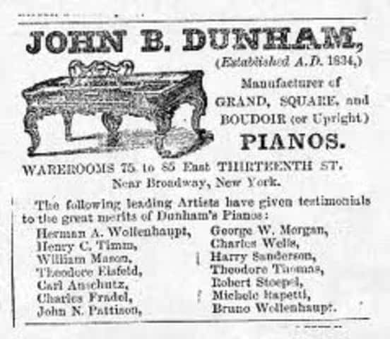
Image: timetoast.com
Designing For Corporate Identity Begins
The businesses then found a new method to present themselves to a broader audience. At that point, corporate branding started taking its early steps and became the advanced method of promoting business. By the early 1800s, various companies started promoting their business using a proper branding approach.
They used a consistent and uniform design system to project a complete image of their brand in order to achieve their corporate goals. Cadbury maintained a streamlined approach towards using the company’s name as a trademark of its identity in 1824.
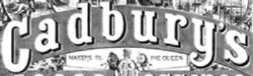
Image: logos.wikia.com
When the Victorian Era started, numerous artists were brought forth to use design elements and typefaces followed by ornate embellishments, outlines, and borders. The Arts and Crafts Movement was yet another process that refined the art of using logos and served as a bridge between the Victorian designs and the modern ones.
Industrial Revolution And Chromolithography
By the time the Industrial Revolution was brought about, the 1840 US population witnessed the black and white prints start using the language of color – also known as chromolithography. Prints with colors became ubiquitous and naturally gave branding a creative boost and another powerful element to experiment with.
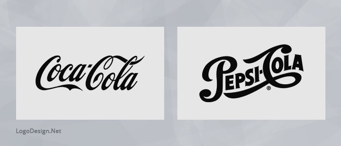
Then the wheel of history took another turn and the common people were allowed to be familiar with the brand names of Coca-Cola and Pepsi-Cola for the first time. In other words, the logos used a set of multiple visual elements to project an overall image of a company. The development of such brands cemented a foundation using logos and have sustained their iconic brand presence till date today.
1900s: The Logo Dimension Expands
By 1905, the Cadbury Brothers commissioned the very first logo as a part of their branding strategy to compete with others in the industry. The new logo presented an image of a cocoa tree with the company’s name intertwined at the roots. By the time it was registered in 1911, the logo appeared on everything from presentation boxes to catalogs and promotional items.
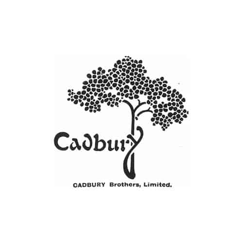
Image: nocookie.net
The logo was modernistic, which was in direct contrast to the previous century of heavy design. The rise of modern design freed the logos from the chains of tradition and the designers approached towards using geometrical shapes and clean types instead of hand-drawn illustrations.
German Expressionism Takes Over The Design Field
During that period, German Expressionism became one of the modern art movements. It is usually known for the abstract ideas with respect to the artist’s mindset as well as the generation he was brought up in and contains multifaceted social and political ideas.
It expresses the emotional and spiritual connection to the world in the form of minimalistic, geometric shapes, figures and even sacred symbols in the black and white format – Think Volkswagen logo that was developed during the expressionist era. It might give you a clear idea of how the German Expressionism went on to be expressed in the dynamic automobile industry.
Retro and Pre-Modern Touch To The Usual Logo Design
![]()
By the 1950s, the world witnessed another wave of modernism in the form of retro logos and types, which were unique to this era. The leading beverage brands changed their idiosyncratic logos to reds, whites, and blues as per color psychology in order to set their pace with the modern fashion trends. Tech companies, such as Canon and IBM stepped in the logo design lane and touched up their logos to add the depth and clarity of purpose.
It was now only a matter of decades that logo designs were evolving rapidly instead of evolving over the centuries. Though modern, retro in design was introduced as a means to bridge the nostalgic gap – with an ironic disposition. The new bit about the retro style was that it employed old styles for the new designs.
Take the Walmart logo from the 60s. The type in the center seems to be belonging from the Old West era and typically presents the image of a mom and pop shop from the past.

Image: metv.com
Or the Target logo that had more rings of orange-peach shade and an inclined cursive font in the center of the dartboard logo.
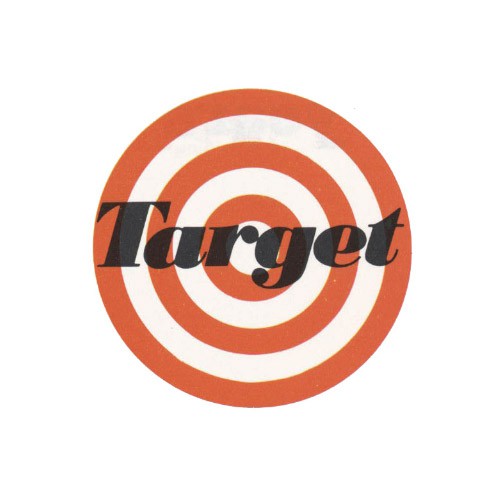
Image: target.com
Also, not to mention the birth of the iconic banner logo ‘I heart NY’ – designed by Milton Glaser in 1977 – that rose to a sensation. The main theme was to promote the marketing campaign for the New York State Department of Commerce, but instead became a landmark frozen in time.
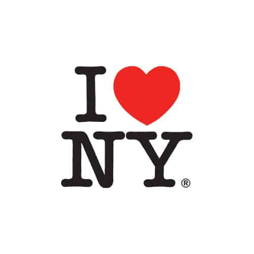
Image: logoworks.com
Modernism Becomes Mainstream
As the second half of the 20th century begun, modernism became the new theme and the focus of logo design went on to surpass the goal of marketing. It was now a matter of brand communication as well as influence on the consumers. Logo design went from a promotional buzz to become a creative and thoughtful process, realizing which the companies started putting an effort into their minimalistic logos.
Coming forth was an era that brought the ultimate logo design reform in the form of digital technology. Computer-aided drawing (CAD) technology was developed and demanded the shift of logo design from print to the digital platform as a part of the innovative evolutionary process. The example of the first ever music channel platform ‘Music Television’ aka ‘MTV’ hit the spotlight when it appeared with an animated logo design.
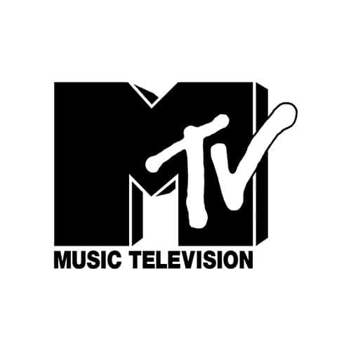
Image: wikipedia.org
The originality of this logo marked a period of transition that gave a new meaning to the identity of corporate branding. Though the transition of the logo from a static medium to a dynamic one occurred as a stern challenge, MTV went past the taboo of logo design rules and adapted to the moving technology where its motion was regulated, maintained, and sustained within the station of its stance.
However, such an iconographic logo became a vessel for constructing graphic identities for brands in the corporate culture and set free the logos from the fixed form of expression. As for the evolution, it was one of the major ones occurring in the 20th century.
2000s: Innovation Is The New Logo Design Language
Nike. Apple. McDonald’s. Shell. Pepsi. Google. For all these brands, the logo design has been elevated from the old-school branding to developing a brand that epitomizes high-quality production with the tendency to project a market for successful customers.
Corporations In The Brand Era
Brands like Pepsi and Coca-Cola have now transformed to become more than just a beverage company. These have embraced the idea of the 21st century as the brand era where they represent the concept of quality delivered to consumers. Take a look at the Coca-Cola FIFA World Cup 2018 marketing campaign.
Taking advantage of the occasion kept intact with consumer psychology, the campaign was set up to merge the origin of soccer with beverage consumption. The poster for 2018 FIFA World Cup demonstrated excited fans consuming Coca-Cola beverage with a tagline ‘Taste Every Minute’ to prioritize the hype around the event.

Image: marketingmag.com
Within the context that Coca-Cola used its brand name, the logo performed as a standalone identity, free of the constraints of the product life.
Brands today, when delivering a branded landscape to the prodigals, create a language that is pitched at innovation to define the brand’s identity as a working corporation. At the point where technology is constantly transforming, the need to constantly adapt and become flexible remains a unique and particular challenge brands have to face.
What Happens Next?
Now that the evolutionary process of logo design keeps on getting fast-paced and short-spanned, the notion of a brand can be applied to every business that has a marketing line, strategies, and a defining logo. In the post-brand age we live today, it’s evident that brands have emerged from the logical conditions of the brand strategy.
People are getting tattoos of their favorite brands and celebrities like Oprah Winfrey and Kylie Jenner have grown out from the TV screen to developing personal brands. Tech and lifestyle brands have integrated their identities within the lifestyle choices of their consumers, where the individual considers the brand a necessary part of his life. Is this how far can brands go or is there anything more?
For brands of today, responding to the consumer interest means more than just putting the product on exhibit. Using innovative tech, such as logo design tool for startups, virtual reality and nanotechnology, and much more, brand identities will deviate from the usual means of their presentation and might even go beyond the spatiotemporal constraints. Who knows?
Evolution Of Logo Design Summed Up
It’s surprising to see the use of symbolic language evolving into a logo as a unified substance of consumer satisfaction and brand development. Like human evolution, the logos have come a long way in terms of their conception, idealization, and personification; they will continue to expand to greater lengths that exist only in the minds.
The future of brands remains yet will never cease to exist. For logo designers, designing a logo isn’t enough; it should constitute the notion of building a powerful brand presence that takes into account every challenge it is coming across.
Since we humans heavily rely on the visuals, we have the power to orient the direction of logo design. The aim of visual language had always been to deliver transparent information and it is hoped that it shall do so effortlessly in the upcoming times of challenges and uncertainty.