Last Updated on February 25, 2024
With the rise in digital communications and the widespread use of tablets and smartphones, mobile internet is gaining momentum as the preferred way to access the web. Since 2010, mobile usage has increased 500 percent year-to-year with average smartphone usage tripling in that same time. And just over 10 percent of all web page visits are made from a mobile internet connection via smartphone or tablet. Mobile is growing exponentially – it’s even forecasted to surpass desktop internet usage as early as 2015.
With such an emphasis on mobile browsing, there’s no doubt that “responsive design” is at the forefront of every web professional’s mind.
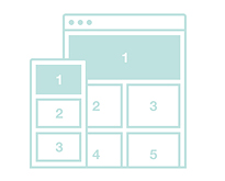
Responsive web design—or “RWD”—ensures your site is visually appealing no matter what kind of environment it confronts. Through CSS media queries, site layouts are rendered depending on what kind of browser is detected whether on desktop, smartphone or tablet. Responsive design is important because it provides the end user with the best possible website experience without the need to squint, pinch, zoom, or exit the site due to a poor experience when accessed via mobile. In other words, responsive design is intelligent because it allows websites to adapt to different environments on-the-fly while providing the best possible visual experience for the end user.
Give your website visitors an easy, productive mobile experience and gain the rewards with increased pageviews, leads, and conversions.
Here’s how.
[heading color=”black”]Plugins for Responsive Design[/heading]

Instantly transform your Wordpress based site into responsive design without the typical development costs associated with creating a separate mobile site. These plugins solve common problems associated with mobile browsing such as navigation, photo gallery or video.
1. WordPress Responsive Mobile Pack
The WordPress Responsive Mobile Pack is a toolkit packed with responsive essentials including a “mobile switcher” that automatically suggests desktop or mobile presentation, custom color variations, image rescaling, mobile ad resizing, and a wide selection of mobile themes.
2. WP Fluid Images
For basic informational websites, you may only need the WP Fluid Images plugin – an essential tool that removes height and width attributes from graphics placed on pages or posts. It replaces CSS image attributes with fluid percentages instead, allowing for a visually suitable experience whether your site is accessed via mobile or desktop.
3. FitVids jQuery Plugin
Like images, videos can also cause problems due to typical CSS styles that don’t jive with mobile. Videos often result in stifled bandwidth, pinching, zooming or exiting the website entirely. FitVids jQuery plugin solves the issue by resizing videos into fluid form, eliminating the cumbersome experience ordinarily associated with video on mobile.
4. WP Mobile Detect
The WP Mobile Detect plugin solves common problems associated with large files such as photo galleries, chat functions, streaming, graphics and audio that can choke when accessed on smartphones or tablets. Now you can prevent large files from loading on mobile with the use of an easy shortcode.
5. Responsive Select Menu
Navigation and menus can be visually challenging on a mobile device, but the Responsive Select Menu plugin resolves the issue by turning them into a select box instead. The plugin converts WordPress 3.0 menus into responsive select boxes, taking up less real estate on pages without space to spare. It’s easier for the user and works automatically – no extra PHP code is necessary.
Check out our previous articles:
- WordPress Secrets that Enterprise CMS Vendors Don’t Want you to Know
- Do You Have Enough Bandwidth on Your WordPress Host?
- Free WordPress Themes Released in Summer 2012
- How To Add Google Analytics to WordPress Multisite
- Increase Social Media Traffic – 7 Free WordPress Plugins
We hope you enjoyed this article! Please don’t forget to subscribe to our RSS-feed or follow Inspirationfeed on Twitter, Google+, and Facebook! If you enjoyed the following article we humbly ask you to comment, and help us spread the word!