Last Updated on February 23, 2024
Typography online has grown leaps and bounds over the years. Gone are the days when you had to choose between an ordinary-looking and an unsuitable-to-the-design font.
But, although the methods relating to typography design have come a long way, font selection remains a challenging aspect in every design project.
To help you navigate your way to typography, here are the things you need to learn about fonts: their categories, the font selection process, their uses, and the typography tools you can use to enhance your work.
Font Categories

There are tons of fonts available online, including a few “crazy” ones that are almost uncategorized. But there are four fundamental, omnipresent categories every typographer or typeface designer must be familiar with. They are often used in font pairings.
- Serif – Serif fonts are those with “little feet” attached to the ends of the letters. They generally have a serious or conventional look.
- Sans-Serif – Sans-Serif, which translates to “without serif,” are fonts that don’t have lines attached to the ends of the letters. As such, they generally have a streamlined and contemporary look.
- Script – Script fonts are the equivalent of cursive handwriting styles with connecting letters. They generally have an elegant, hand-drawn look.
- Display – Display or decorative fonts are the ones that “scream” to get the attention the audience. They usually have a unique and a more-than-practical look.
Font or Typeface
A lot of people confuse fonts as typeface and vice versa. Technically, the two terms don’t mean the same thing. However, they are typically used interchangeably without sacrificing the message of the context today.
To clarify, the typeface is the design – it is what you see. On the other hand, the font is how the design is presented – it is what you use.
Typeface + Style + Size = Font
For example, Times New Roman – as is – is a typeface; 12-point Times New Roman Bold is a font. Another example, 10-point Calibri Italic and 48-point Calibri Bold are two different fonts, but the same typeface.
Importance of Font Choices

For most designers, choosing the right font for a design project is much like choosing the right outfit to wear to an event. The clothes you wear say something about several aspects of your life: your personality, your style, your age (or the age you want to project), your social and economic background, and the impression you wish to convey to the public.
Different situations and events call for different outfits. But one thing remains the same: there is always a level of appropriateness to think about.
What your choice of attire does for you has the same purpose as your font selection. More than the overall design of a web or graphic project, it’s the typography that receives the first at-a-glance impression.
It’ the part of the design that viewers see – and judge- on the get-go. As such, your font choices must be appropriate, relevant and purposeful.
Your choice of fonts typically sets the tone for the overall look of the design. Needless to say, it’s a significant factor in influencing how people will perceive your work or brand. Bad font choices often distract viewers from the message of the design.
Font Selection Process
The Basics
Your primary objective when choosing a font is to make sure it is suitable for the design project. It must accurately convey the message or purpose of your design.
Before you search for the possible typefaces to use, it’s smart to have an idea on how you want viewers to look at or interpret your design. This way, you can save time and resources as you already know the style you want to use.
It’s important that the font you pick presents the same mood or “personality” as your brand. This is critical because if the font doesn’t complement or boost the message of your design, it will create a visual disconnect instead.
The audience is also an important factor you need to consider. This is especially important if your market involves very specific demographics. The font you choose should resonate with them.
Font Appropriateness

Suitability is a vital element to consider during font selection. The font you choose must work where you intend to use it. It must be practical in the context of your design.
Among the most common blunders novice typographers make is using the wrong font category. Some make incorrect choices between body and display typefaces.
The former is used in the body of the context – ex. magazine text, book text, newspaper text, web content. The fonts for the body copy must always be readable and easy on the eyes. It’s imperative that the style of the typeface doesn’t distract the readers.
The latter, on the other hand, is a typeface rarely appropriate for reading at length. Display fonts are the types that scream, “Hey! Look at me!” Used correctly, they can make a huge positive impact; otherwise, they will reduce the design to something amateurish.
Font Versatility
Every web or graphic designer has a list of go-to typefaces, often referred to as “workhorse”. These can be used anytime for any design project. These are usually neutral fonts that can easily and seamlessly fit a design.
Workhorse typefaces are typically a combination of Serif and Sans-Serif fonts that are versatile they can be used pretty much anywhere. Having a workhorse enables you to assign various styles using a single typeface to different aspects of your design to create general cohesive look.
Font Readability
If your design requires typography, it’s likely your it has something vital to communicate. This means readability is a factor you should never overlook.
If people have to squint their eyes just to read your message, you failed an important aspect in the design. Apart from visual assessment, here are the elements you need to check to ensure a readable font:
Size
The point size should fit the context of the design. For example, the font size of a business card is different from the font size of an announcement poster. The same thing goes for designing graphics seen on desktops and viewed on handheld devices.
Spacing
Making the proper spacing adjustment results to a favorable impact on readability. In general, substantial spacing enhances the legibility of a text. However, if the space is tight, experiment on various combinations, and then make an informed decision to make the text easy to read. Lots of online typography tools let users adjust letter spacing so use one to ensure you get the correct space adjustment.
X-height
X-height is the “tallness” of the lowercase letters of a font. To ensure legibility, the x-height should be generous, but not to the extent it’s close to the height of the capital letters.
Font Pairings

Font pairings or font combinations play a significant role in every design project that requires typography. The great thing about this aspect is the vast amount of resources online that make the process a less challenging task.
Some tools offer ready-made font combinations. There are also websites that can look up for the best font/s to pair with a starter font. But, even with these resources, it’s important that you learn the basics of font pairings.
Pair complementary fonts.
Every font created has a certain mood or characteristic. When combining fonts, make sure the moods of each font complement one another. If your design needs a display typeface as a starter font, make sure its supplementing font is neutral.
Complementing fonts may also mean finding a shared quality. This means finding something in common with two pointedly different fonts that could work well together.
The shared quality can be their height or their basic structure. Sometimes, the quality is subtle. But when the two fonts are combined, everything fits right.
At times, finding two complementary fonts can turn into a technical process. But more often than not, it’s also a mix of a trial-and-error approach using your knowledge about “font psychology.”
Avoid using too many fonts.
A basic typography rule is to keep things simple. If you use several fonts in one design, the combination can create a visual disconnect that can leave a negative impression on your design or brand.
Also, an excessive number of fonts will defeat the purpose of adding typography in the first place. The audience won’t receive the message of your design because they’ll be distracted with the jumble of typefaces used.
Now, if a project requires the use of several fonts, make sure they all balance each other out whether they are a perfect match-and-match, a seamless mix-and-match, or both.
Present a visual hierarchy.
Each font from the pairing must have their own relevance in the design’s overall look and feel. The fonts must be different enough that they result in some form of visual hierarchy. The most tried-and-tested “trick” is to combine one Serif font and one Sans-Serif font.
This is particularly important for fonts used in body copy. The size, height, and spacing of fonts play important roles on how the audience looks at the page and read its content.
The same thing goes for font pairings. In general, the headline must present a striking look. Depending on the design concept, it can be a traditional or decorative typeface. Alternatively, the body must be legible across the board.
It’s also important that you choose the right complementing fonts for other textual factors like the image caption, the byline, and the quoted line.
Use fonts created by the same designer.
Typographers often have a “signature look” that help font users identify their creations. This look is typically a recognizable aesthetic that has a certain structure, resulting to logical and easier font pairings.
If you’re unable to find two complementing fonts from one designer that fit your design, check out “font super-families” instead. These are font families that have both a Serif and Sans-Serif typeface specifically designed to balance each other.
Typography Tools
The internet is the best place to find typography tools and resources. In fact, most designers these days have their go-to tools to ensure their font choices work well with the overall design of the project.
Here are 30 of the best typography resources to help you ace the font aspect of your work.
Typegenuis
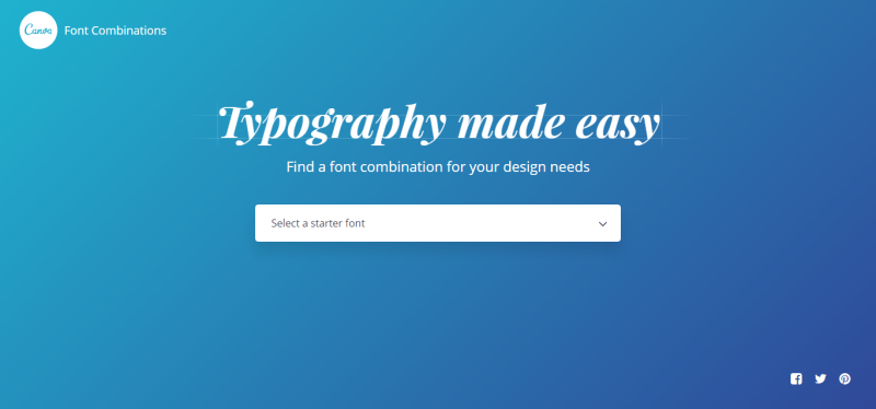
Typegenius is a subset of Canva.com. It lets users find the best font combination to fit any design project. The process starts with the selection of a starter font. Once the typeface is selected, the site will present the fonts that complement starter font best. A display text appears for easy comparison.
WordMark.it
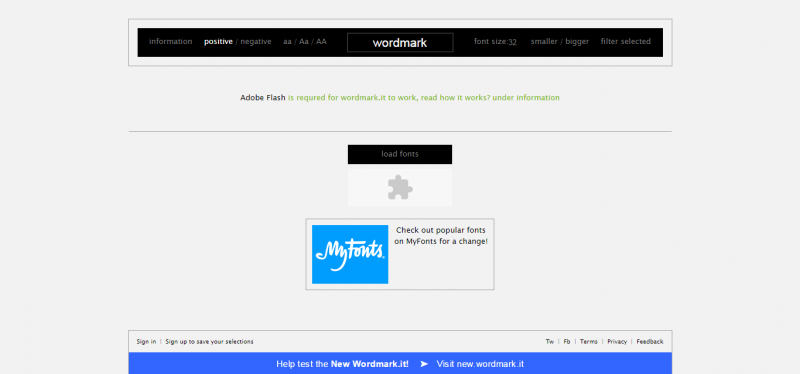
WordMark.it provides users with a font selection process that displays previews of the text using the fonts installed on the user’s computer. To use the program without trouble, Flash plugin must be installed. JavaScript must also be enabled. The program also works on Apple flagship products even without Flash.
Font Squirrel
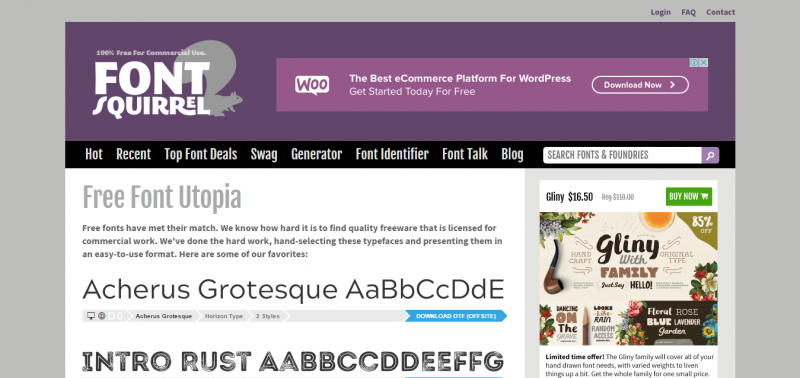
Font Squirrel is an excellent resource of typefaces categorized for easy search. The site offers fonts under classifications (ex. Sans Serif, Hand-drawn, Monospaced) and tags (ex. Headings, Oblique, Heavy). Fonts are also presented under two primary filters: licenses and family size. All fonts from the website are 100% free for commercial use.
TypeWolf
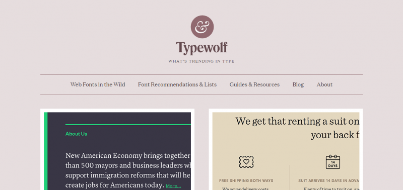
TypeWolf is a curated typeface website that helps users find and identify the best fonts to use for a web design. The site is one of the go-to online resources for everything related to typography. It’s also an independent resource that offers fonts from all type of foundries.
Abstract Fonts
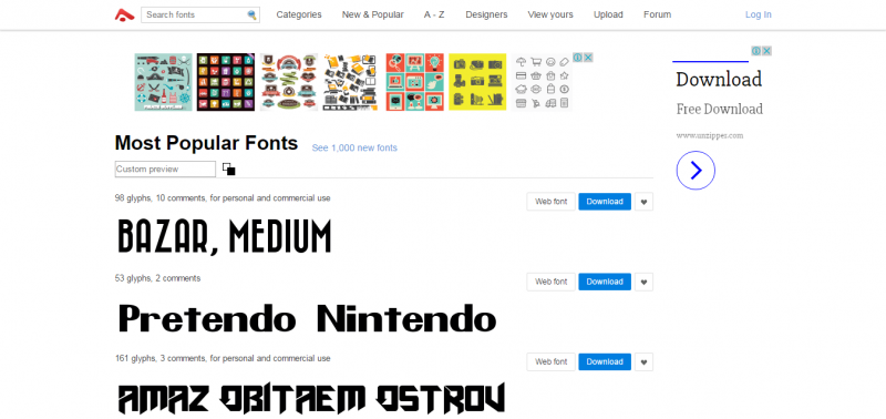
Abstract Fonts offers over thousands of downloadable typefaces for commercial and personal use. For hassle-free search, fonts are searchable by category, alphabetic arrangement, and designer. The site also has a forum where additional font details are posted.
Font Flame
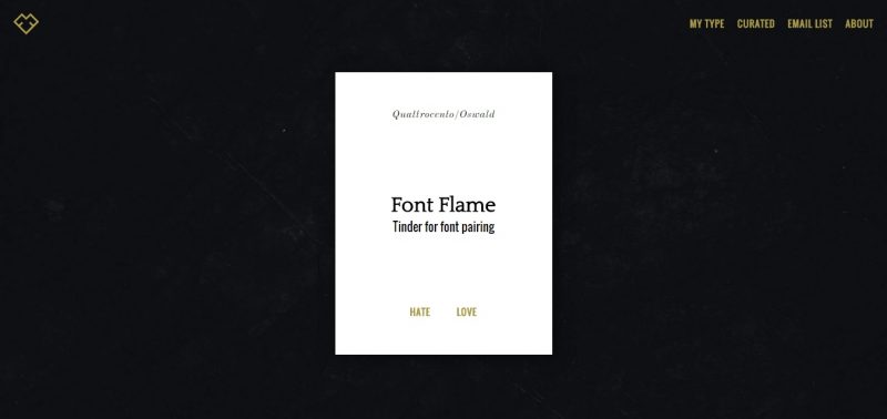
Font Flame is a unique, curated resource of typefaces that lets users choose if they “love” or “hate” a font combination displayed onscreen. It implements a Tinder-like process for a fun and simple font pairing.
Google Fonts
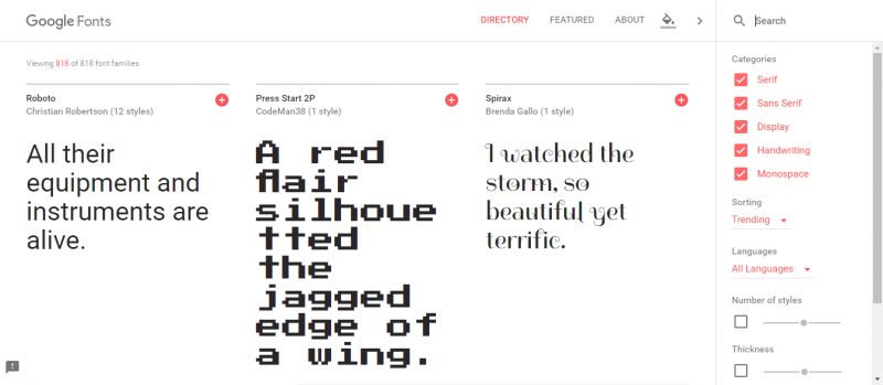
Google Fonts aims to make every web design more beautiful and intuitive through great typography. The site offers a vast selection of open source designer web fonts. Its extensive directory comprises of individual type designers and foundries with relevant details about typefaces as well as stats about their usage and demographics.
Typekit
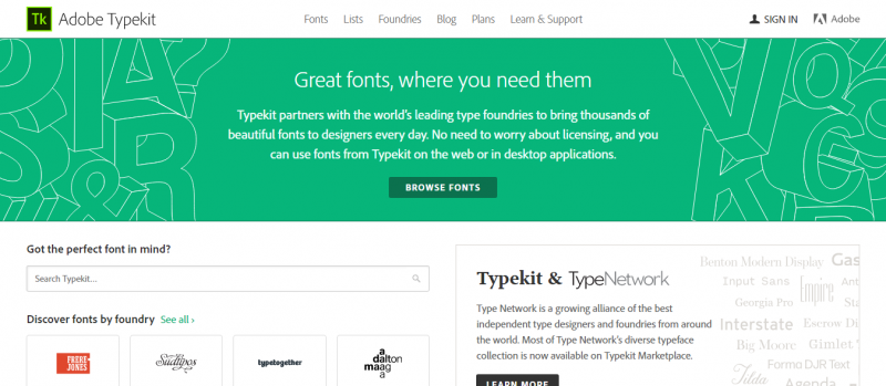
Typekit is a user-friendly resource of the best fonts on the web. It partners with the leading type foundries all over the world to bring in thousands of typefaces to designers daily. All downloadable fonts from the site are available for commercial and personal use.
Type Anything
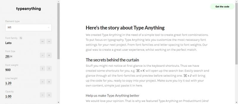
Type Anything is a simple tool designed to help users create great font pairings. The program lets users customize the most appropriate font settings that complement their design project. For easy font pairings, Type Anything also provides keyboard shortcuts.
Type Nugget
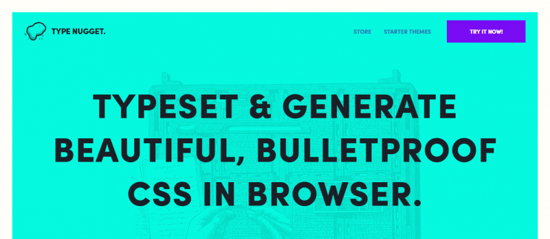
Type Nugget is a fully-responsive typesetting resource that provides users control over the best font pairings online. With its smooth and sleek user interface, the site generates compatible and accessible nuggets of CSS. The selection process and application can be easily carried out without any coding experience.
Modular Scale
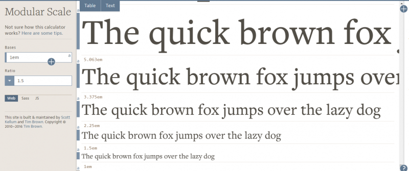
Modular Scale is user-friendly typography tool that generates measurements that can be used for typesetting, like sizing and spacing body text and headings. Output from the site is available to copy and paste, and with Sass or JavaScript plugins.
Typecast
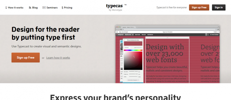
Typecast is an advanced online tool designed to create visual and semantic designs. Users can use the program to check web fonts for readability, visual appearance, and rendering. The site also lets designers handily share a working prototype of their design.
Fontic
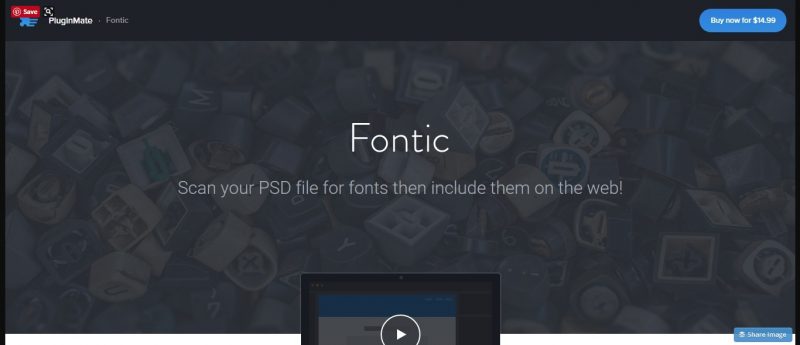
Fontic is an online typography tool that is primarily used for PSD files. The program scans PSD for fonts with just a single click. Users can choose fonts and get their corresponding codes directly from Photoshop.
FontReach
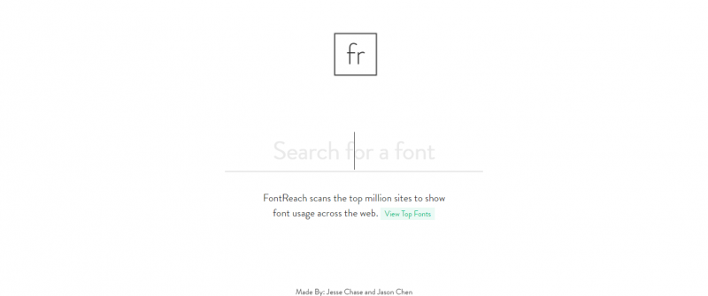
FontReach is an online typography resource that scans thousands of websites to deliver font usage across the web. The site also lists the top fonts used online along with relevant information about each typeface.
Font In Use
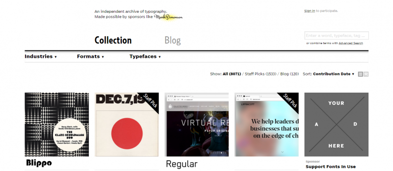
Font In Use is a great online resource for typography. The site is a public archive of typesetting categorized by fonts, format, and industry. The team behind the program documents and assess graphic design aiming to improve users’ literacy and appreciation of typography.
RightFontApp
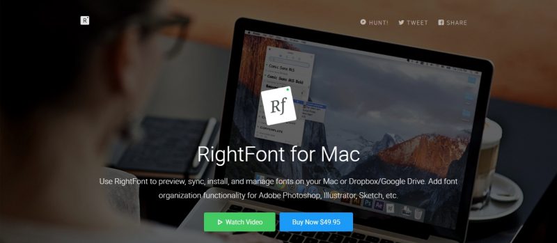
RightFont is a lightweight font app for Mac. The program lets users preview, sync, download and manage fonts on their Mac, Dropbox or Google Drive. It also provides easy font management functionality for primarily for Photoshop, Illustrator, and Sketch.
Typ.io
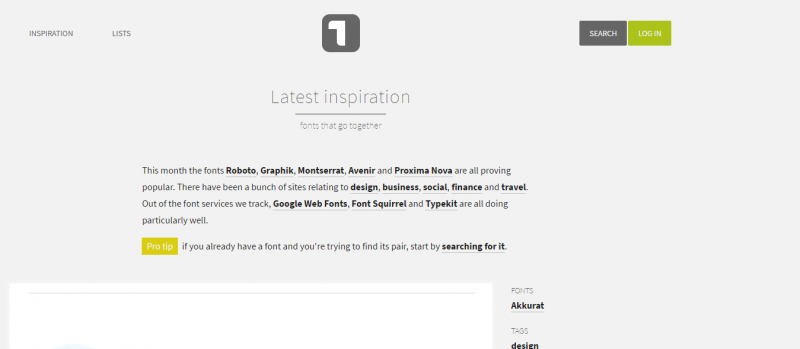
Typ.io provides designers the latest inspirations for font pairings. For easy search, all combinations are searchable by category and keyword tags. The site also displays sample websites with the corresponding typefaces used on the design.
Type Sample
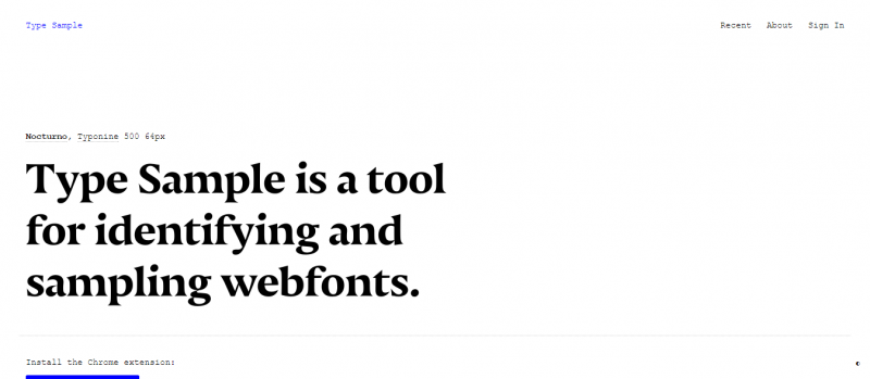
Type Sample is a typography tool that identifies web fonts using a bookmarklet. Users can save up to three samples of font for free. For unlimited samples, users are required to pay a small amount ($5) a year.
Font Pair
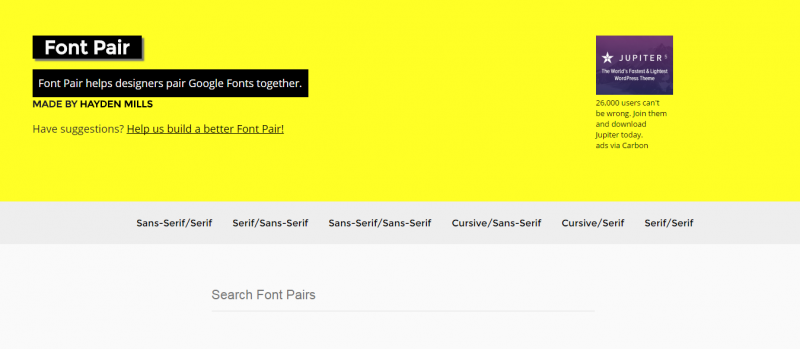
Font Pair aids designers to amalgamate Google Fonts seamlessly. The site divides the possible pairings into six categories: Sans-Serif/Serif, Serif/Sans-Serif, Sans-Serif/Sans-Serif, Cursive/Sans-Serif, Cursive/Serif and Serif/Serif.
Type Detail
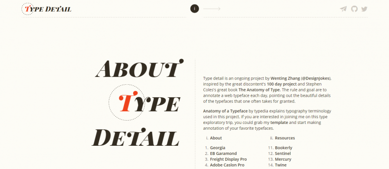
Type Detail is an excellent resource for everything a designer needs to know about a particular web typeface. The site features one font a day, listing all its relevant and unique details. The program also lists the reasons why certain fonts are perfect for certain web designs.
Font Shop
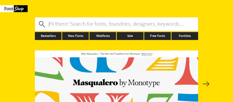
Font Shop, as the name implies, is a cross between an e-commerce site and online directory of typography. The site also provides font news and updates. It’s a great resource for people who want to get custom fonts or be a font designer.
Prototypo
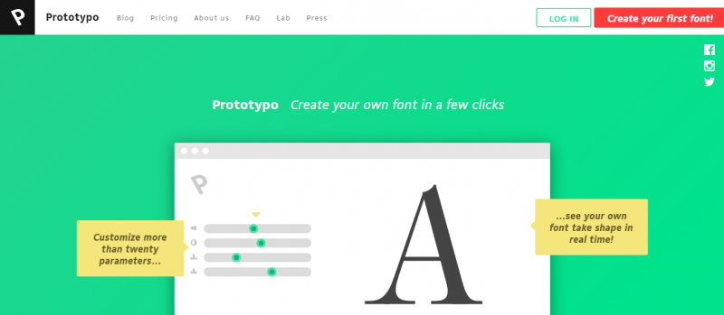
Prototypo lets designers create their own fonts in just a few clicks. The real-time software helps users generate customized fonts fast and easy without the need for drawing or coding skills. All Prototypo-created fonts can be used on web design and other web-based applications.
Font Fit
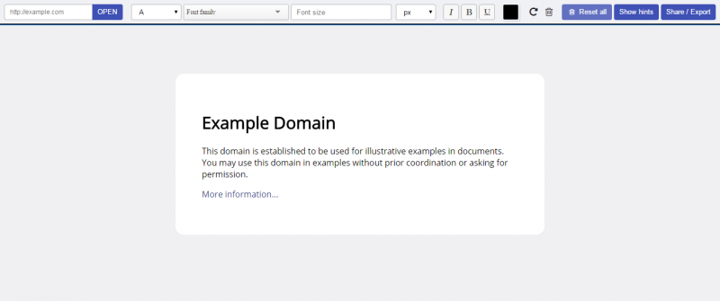
Font Fit is an advanced online source of typography that lets users find the right font or font pairings to fit their design project. The site boosts an extensive library of typefaces split per classifications for a faster and easier font search. It also helps users determine the appropriate size of fonts to fit the design accurately.
My Fonts
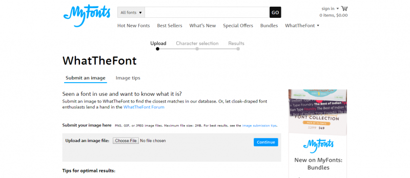
My Fonts’ What the Font is a unique typography search tool. The program lets users upload a sample image of an unknown font, and the site’s database will present the possible font matches in seconds. If its extensive directory is unable to produce results, users can go the website forum for possible answers.
Font Awesome
Font Awesome is a font and CSS toolkit. It provides designers scalable vector icons that are easy to customize. Anything that can be carried out via CSS applies to the program.
Download Free Fonts
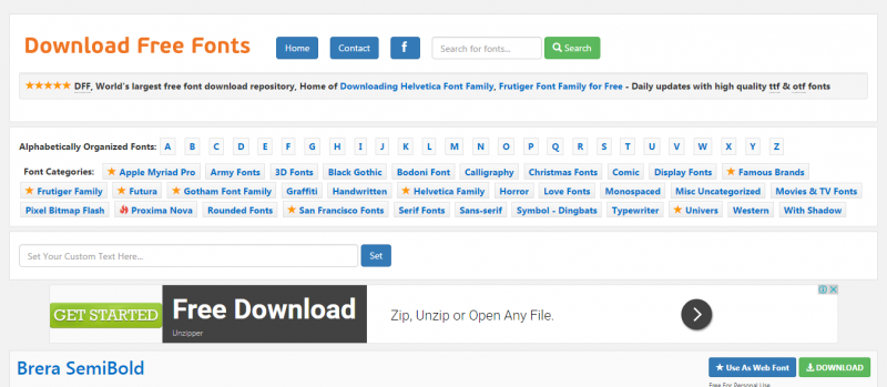
Download Free Fonts, as the name suggests, is a website that lets users download fonts without charge. It’s one of the largest font depositories online. For easy search, all fonts are categorized alphabetically.
The League of Movable Type
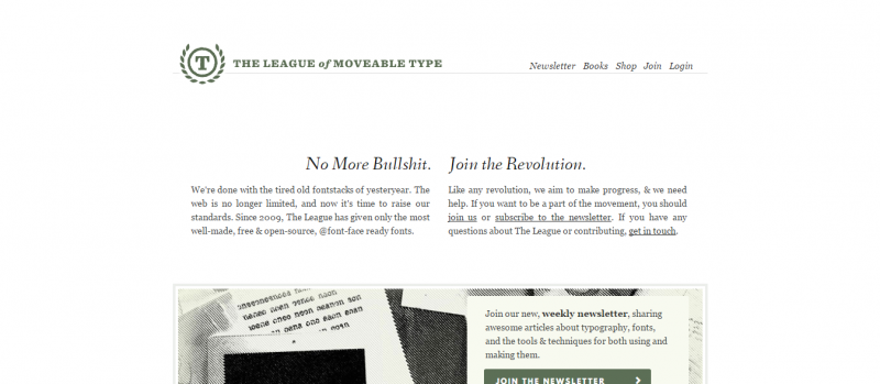
The League of Movable Type is a well-curated resource of the best movable fonts online. Since 2009, the team behind the program, aka The League, has successfully launched several well-made, free and open-source fonts.
Lost Type
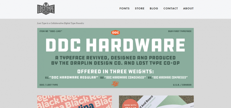
Lost Type is a unique typography resource that implements a Pay-What-You-Want type foundry. The site offers a beautiful collection of 50+ font faces from designers around the globe. The full 100% payment from a sale goes directly to the font designer.
Type Novel
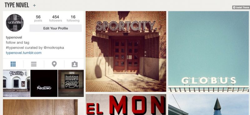
Type Novel is a Tumblr-powered resource of unique fonts found online. The site features images with cool and often unpopular fonts.
Free Faces
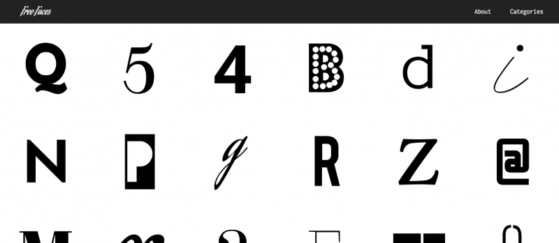
Free Faces is a website that offers free fonts seen on different sites. It acts as a directory of fonts designers can check for commercial or personal use. For easy search, fonts are split into six categories: Sans, Serif, Cursive, Slab, Mono, and Display.
It’s always best to check the license of the font before you download and use it. This is a practice you must do, even for purchased fonts, to protect yourself (or your client) from legal troubles.

