Last Updated on February 25, 2024
Through my various musical activities, I have recently been through the rigmarole of deciding upon artwork for a debut album, and a few singles too. Even if the days of digital downloading, when a 300×300 pixel thumbnail is the way the majority of people experience the artwork, this stuff matters. Depending on who you’re talking to in the music business, image is either everything or nothing, and album art is a huge part of this. Being a brand, or a band, comes down to what you transmit to the consumer or audience, and so artwork’s relevance cannot be underestimated.
In the absence of sonic evidence by which to judge music, most people will make an assumption based upon what they can see, projecting the attributes of the art to your band – a fact which was particular important in the days before internet streaming, when the record store still reigned supreme. A means of identification, a sales tool, a dialogue with your fans, a statement of intent – there is much more to the process that a pretty picture.
An image that has the potential to become an icon will immediately register with the viewers conscious. You only have to see some newspaper lettering or the colors neon pink and yellow side by side to think of The Sex Pistols’ debut ‘Never Mind The Bollocks’.
Sometimes it doesn’t matter – take The Beatles’ 1967 ‘Magical Mystery Tour.’ Dreadful cover, but the band did alright. Only a year earlier however Apple insisted that they alter the image on the sleeve of ‘Yesterday and Today’, after the squeaky clean Beatles being surrounded by raw meat caused outrage. The cover says something about the music and the band, even if it is not wholly accurate.
Matching the music is important if you want to appeal to the ‘right’ audience. Swapping the covers of say an Anthrax album with those of a Britney Spears CD could lead to a whole host of problems. Jazz comes in smoky packaging images, metal bands do death icons, indie bands cast a different perspective on every day scenarios and boy bands are associated with shots of them standing looking shiny.
There are also the mundane factors and practicalities. If you can’t work out who a CD is by when you’re standing in store you’re unlikely to purchase it. Similarly the frustration caused by trying to find a record that is poorly titled on your shelf is likely to lead to you never listening to it. Stand out typography that is not intrusive will go a long way towards reaching the information serving objective.
As with most hugely important subjects, like say, life, there is no handbook or set of instructions as to what makes a good piece of album art. Everyone from The Clash, The Guardian and the NME have published lists of both best and worst album covers of all time, but it’s not that easy to see what distinguishes the two lists.
Dan from It’s All Happening believes that emotion is the key: ‘The best album covers are those that strike you, and the reason they do that is because they illicit some kind of emotion, whether that’s interest, a smile, or shock.’
The below are some examples of bands who got it right.
Oasis – (What’s The Story) Morning Glory? (1995)

A simple shot of slightly fuzzy London DJ Sean Rowley and album producer Owen Morris walking down Berwick Street in Soho, it inspired a generation and fitted into the band’s ethos: they make music for people like you.
Sonic Youth – Goo (1990)

A hand drawn comic allows the band to make a statement in an understated way.
Radiohead – In Rainbows (2007)

In some ways you could argue that it’s not art at all – just the album’s name repeated over a splodge. Exactly – you know who it is, you know that they are an ever changing entity, and that what is contained within will be hard to grasp, but still somehow feel right.
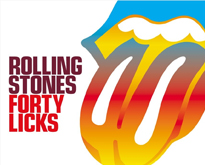
The Rolling Stones – Forty Licks (2002)

All institutions and brands need a logo, and this simple, exciting, immediate image became theirs. It even featured on Topshop t-shirts…
New Order – Power, Corruption & Lies (1993)

Could anything seem to be less fitting such a seething anarchistic title than a reproduction of the painting ‘A Basket of Roses’ by French artist Henri Fantin-Latour, usually found in the National Gallery’s permanent collection. The UK release, with no text on the cover used a bold grid of colours that could be decoded by referring to a key on the reverse, to spell out the band name and album title.
Check out our previous articles!
- Dan Cretu Transforms Food into Playful Everyday Objects
- Paradoxical Art Sculptures By Nancy Fouts
- Paper Birds by Diana Beltran Herrera
- 20 Excellent Abstract Illustrations by Russ Mills
- Fascinating Factual Illustrations by Marcelo Gallegos
We hope you enjoyed this showcase! Please don’t forget to subscribe to our RSS-feed or follow Inspirationfeed on Twitter, Google+, and Facebook! If you enjoyed the following article we humbly ask you to comment, and help us spread the word!