Last Updated on February 29, 2024
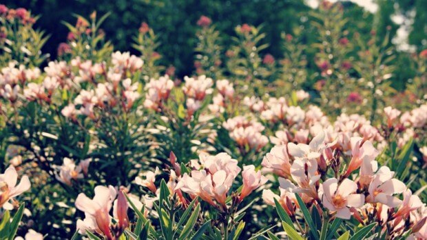
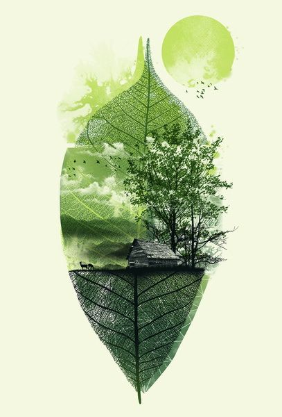
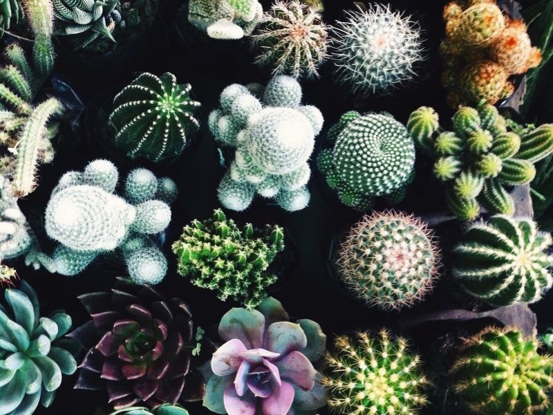
Mother Nature is actually pretty awesome. She has given us color, texture, line, form, shape, balance and patterns. And from all of these come human art forms like drawing, painting, sculpture, ceramics, mosaics, architecture, and graphics. And nature is ambiguous too. Many parts of it are elegant, tasteful and dignified (think trees, clouds, star constellations); others are wonderfully symmetrical (think the human body, leaves, starfish), and some are incredibly brash and ugly in color and/or design (think warthog, star-nosed mole and peacock shrimp). So, as artists emulate nature in their works, they have an array of elements to consider. Web designers are artists too, and if they look to nature for web design inspiration, and engage their right brains, they have a lot to work with. Here is what can be taken from nature as design is created.
Consistency
Consistency relates to the concepts of harmony and unity. As designers consider what they see in nature, they need to find ways to translate that into inspiring web design. Backgrounds and foregrounds must complement one another. Some recent really stunning designs have infographics and forms sitting within boxes that bleed into the background design and provide a visual appeal that is truly artistic.
Unity in nature is either conceptual (e.g., a common theme of the same plants in the same types of environments) or visual unity (e.g., tree trunk and leaf colors, and textures of clouds). In web design, unity means that the purpose of the site must be complemented by the types of designs used. If a site features classical music for example, it may have visual components that relate to that type of music. If, on the other hand, more contemporary and varied music is the subject of a site, unity will require quite a different visual.
Balance
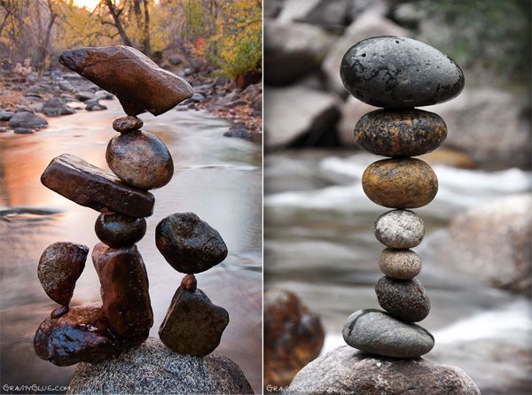
Think of ecosystems, in which there is a continuous balance of life forms, if left undisturbed. Web pages, too, must have balance. A page that achieves a good balance of text, graphics, media and white space is appealing, as opposed to a page that is filled with text, for example, and little else. Once a page is finished, exit out and come back later to look at it afresh. What is your first impression? Is there too much of one thing? Find the balance and you engage the visitors. A common mistake is to destroy balance by just focusing on what you think will grab immediate attention rather than coming up with engaging web page design through balance.
Contrast
Contrast in colors, shapes, and sizes can be quite stunning. If one lies on the ground in the summer and looks up to the sky, s/he will see green leaves of symmetrical shape against a flat blue sky, with puffy clouds of all shapes. Modern web design inspiration can take much from the contrasts in nature that make our world interesting. Translating these contrasts of colors, shapes, sizes, and textures to web design elements will achieve that same interest.
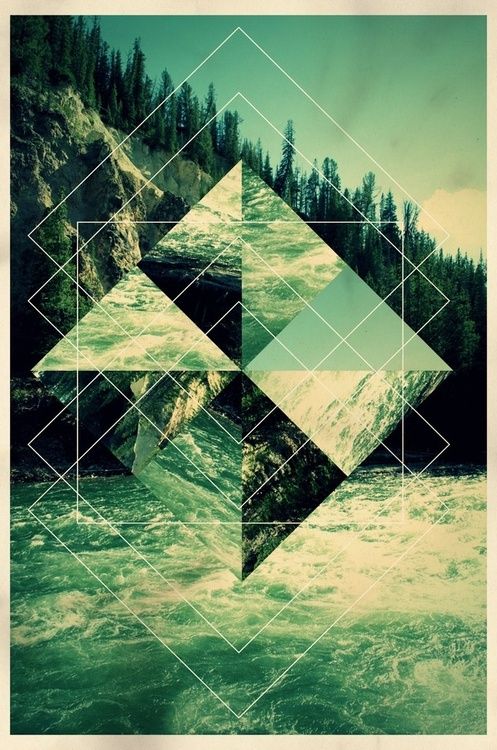
Proportion
Nature gives us pretty definite proportions and mathematicians have reduced these to a couple of principles like the Golden Ratio and the Fibonacci Sequence. The Golden Ratio is the manner in which things tend to form in specific proportions, and web designs that honor these proportions appear to be far more pleasing to the human eye than those that do not. When you form a grid for placement of elements, be certain that the more important elements are larger in proportion to those less important on your page, because the visitor will focus on the larger first and longer. Likewise the Fibonacci sequence is seen as another form of proportion. While this sequence in nature is often seen as spirals, in web design it simply means that the more important elements will be larger than the less significant ones.
Simplicity
Nature does have a simplicity of design. A flower, for example, has a stem, a center portion, and petals. A tree has a trunk, branches, and leaves. Star constellations are simple designs, as is the solar system. Take the hint! As a web designer, begin with the simple, then overlay more complexity. When visitors can still see the original simplicity, they find the page attractive.
Order
We all understand that there is order in the universe. Planets do not trade places; the Sun does not suddenly rise in the west; and all life forms have cycles that do not change. This gives us all a sense of comfort as things flow logically through the hours, days and seasons. And so must any web design. If things seem illogical to a visitor, s/he experiences discomfort, and that discomfort will cause an exit from the site. Ensure that your content and elements flow logically one to the next.
Textures
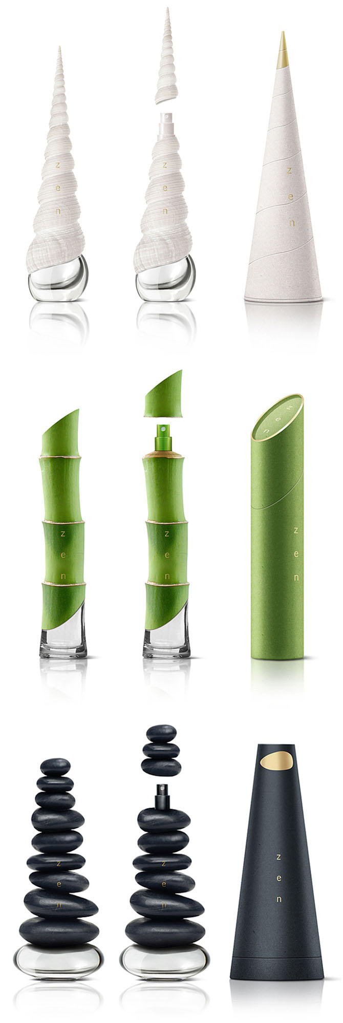
Texture adds interest, and nature is full of them. While we cannot feel textures on web pages, we can certainly see them. Consider, for example, the very different looks of background textures that look like leather, stones, wood, and so forth. These textures add to the overall ìthemeî of the design and should always relate to the purpose of the page or site. For example, a Western-themed restaurant website will most likely have leather or aged wood elements; a site that sells sophisticated womenís clothing will use completely different textures. Consider the subject of the page or site and consider the target market as you make decisions about texture.
Motion
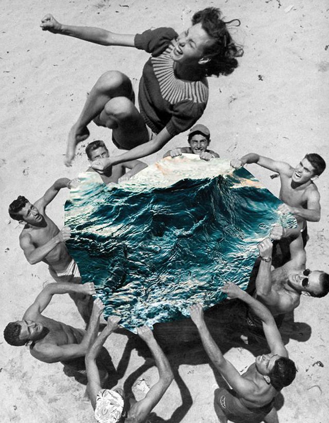
Obviously, nature is always in motion and, as long as that motion does not involve tornadoes, hurricanes, and other horrible events, we like it. Visitors to web pages will like it too, as long as it does not become too much of a distraction. You achieve motion through animation, of course, and moderate use of this technique can be wonderfully effective. You can also give the illusion of motion, however, through the media you choose to incorporate. Stills of ocean waves will provide a feel of motion, for example, and these illusions can be quite impactful.
Variety
Nature, of course, gives us unbelievable variety of animals, plants, fruits, land forms, and so forth. It what makes our environment interesting, exciting, and pleasurable. Your task is to give your visitor those same feelings through the use of variety. Experiment with different fonts and colors; try combining real life scenes with drawings and geometric shapes superimposed; repeat the same image or shape in different sizes, hues, or colors.
Interdependence of elements
Nature is interdependence. Everything on this planet is in a symbiotic relationship with every other thing. This should be translated to web design. Every page and every site has a purpose, and that purpose drives the theme. If, for example, a site features high-end jewelry, the site is really selling a lifestyle as much as it is promoting its pieces. Colors should reflect the muted tones that appeal to a more sophisticated audience; cars should be in silvers and blacks. Clothing, whether on live models or drawn figures, must be extremely stylish and sophisticated. Backgrounds are muted and simplistic. All of the elements are interdependent to provide an overall environment.
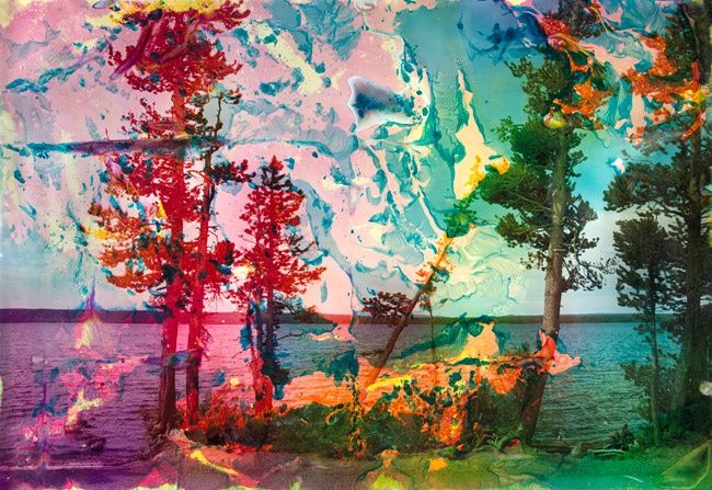
Emotions
Nature gives us emotions and moods via weather and color. And websites should foster certain emotions and moods as well. There is a huge difference between the mood of a funeral home website and that of a video game retailer! You create emotions and moods via content, of course, but the psychological impact of color is huge. Red, for example, connotes energy and strength; blue, intelligence and calm; yellow, optimism and creativity; green harmony; orange warmth and physical comfort; black, sophistication and glamor. Choose your color wisely for the impact you want, but, if your site has an international audience, be aware that colors evoke different emotions in non-western cultures, and you really want to avoid cultural issues in web design.