Last Updated on February 26, 2024
Pairing fonts? Yes, in design, knowing which fonts work well together is a very important step in creating a work that is visually appealing. Typography or the arrangement of typefaces and the matching and pairing of types is something that most people struggle with. It is difficult to know what will work well with each other. But by following a few simple rules, you will be matching and pairing fonts like a professional.
First it is important to know the different styles you may come across and what they look like. There are the Serif fonts. These fonts have a decorative finish on the ends of the letters. A common serif font would be TIMES NEW ROMAN. Notice the bars and dips at the ends of the letters. The next family of fonts would be the San Serif fonts. These letters are geometric in shape and are easy to read. An example of this type of font would be Tahoma or Calibri.
Then there are the Script fonts. This font family scrolls or is curly in nature and tends to connect or link their letters together much like cursive writing does. Script fonts would be fonts that are similar in nature to Brush Script Standard or Edwardian Script.
Another font family would be the Slab Serif. This font family has noticeable thick slabs on the letters as opposed to the serifs that have bars and dips. Fonts found in this family would be fonts resembling Chaparpal or Modern No 20. Notice their slab tops and bottoms. There are many other families of fonts, but these are the most common.
There are a few concepts to keep in mind when matching fonts. The first is the hierarchy of your project. This is the order in how you will read your text and how the similarity in fonts or contrast will create a balance for the viewer. The second consideration should be the x-height of fonts in order to determine their compatibility. This is an imaginary line that runs across the top and bottom of letters, excluding the extenders on letters like t, l, p, d, and q that go past that line.
Letters of different font families that have x-height compatibility would have letters that all fit within the parameters of the x-height lines. The next concept is that less is more. Generally, to keep things flowing and not to over clutter you will want to only mix two different fonts together with 3 different fonts being the most you use in one design. Finally it is important to remember that you want your fonts to be legible. In order to get your idea across you need to be able to read it.
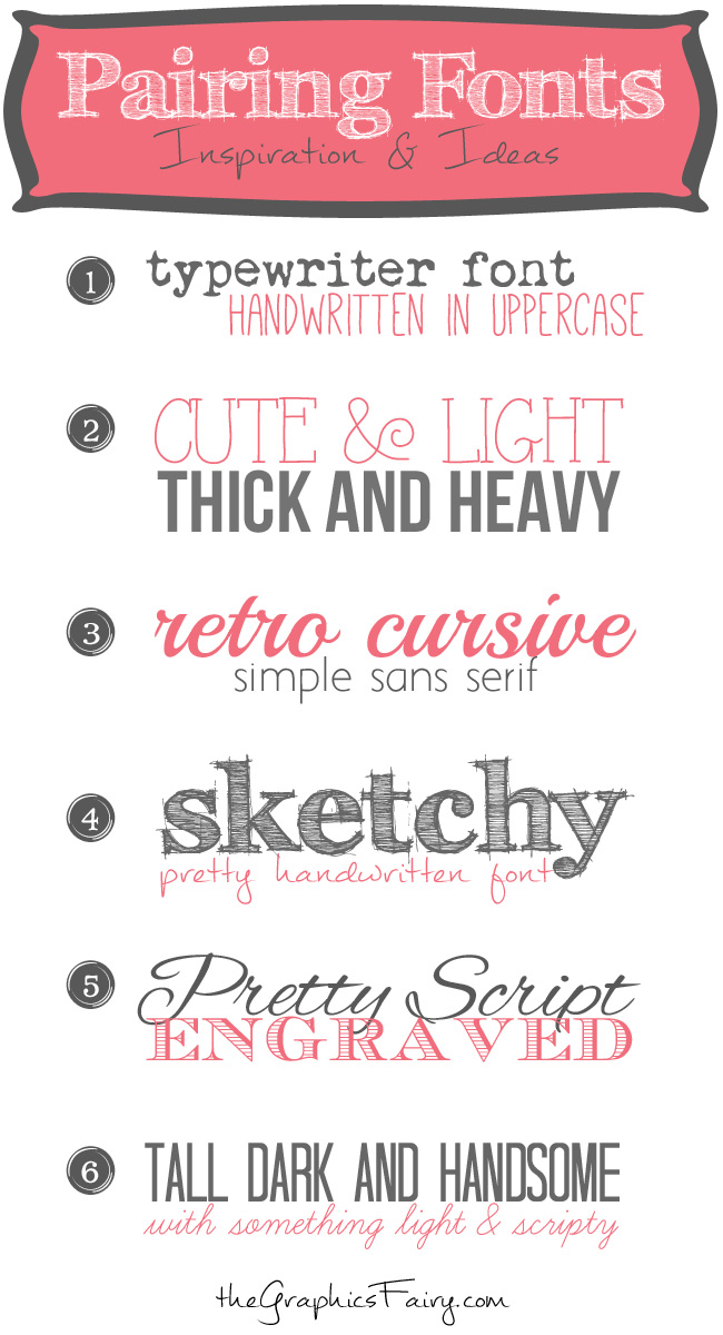
Now that you have some general rules to follow let’s take a look at some concepts that will bring all these guidelines into place and create some awesome projects. Here are some ideas to create a match made in heaven!
Heavy & Light or Bold & Fine
These pairs remind us that opposites attract when creating a balance. Heavy fonts and light fonts attract the eye with big and bold and draw it in further with light and fine. The contrast creates a look that is very appealing.
Match Your Font to Your Tone
What are your words saying? Make your font reflect the imagery you are trying to convey with your words. The closer your words match your fonts, the greater impact you will make. Notice the movies reminds you of movie poster text and the music is light and airy like open music notes. Finally the lights reminds you of neon signs. Next the sugar is swirly like you would imagine sweets to be and spice is heavier with a little edge.
Be Different
Don’t be afraid to show some creativity and think outside the box! Mixing and matching fonts should be fun. Don’t be afraid to experiment! Layer your fonts, overlap them, and add signs and symbols. Creativity is the way to go! The “Go for It” is blockish and heavy, giving it contrast but italicized to create the same feel as the “be creative.” Overlap is just that the word copy and pasted over the top in a lighter color to give the feel of having depth.
Combine Old and New
Combining old or retro feels with trendy modern fonts is a way to combine old and new for a nice combination. They tend to complement each other well.
Create Contrast with the Same Font
Contrast can be created with the same font by changing size, using bold letter or using italics. This method is used when uniformity is desired and contrast is needed. See how the same font can change in feeling by simply changing the size and weight of the text.
With this knowledge, the tips and tricks, and a little daring you should be able to match and pair fonts like an expert!