Last Updated on February 25, 2024
Logo designing principles stay consistent for most fields. Fashion industry is no exception to that! The more simple your logo design is, higher its effectiveness is. The importance of logo in fashion industry is higher than the other fields, as people are very much brand conscious. Only if they like a particular brand, its appeal, its reputation and its logo; they will opt for that specific brand. We can safely say that logo designing is one of the critical aspects of brand establishment in the fashion industry. It is the chief marketing tool for an organization.
As we have seen the importance of Logo design in fashion industry, it has become imperative to create a good logo for establishing the brand and improving its profit by marketing it well! Logo designing is that small trick which can reap huge rewards for a fashion company, if executed properly. It is very important to create the perfect logo design, if the company wants to collect the gigantic rewards that will follow.
Take any top brands that exist today in the fashion industry. Each of them have their own unique logo; which is most importantly, very simple and without any complexities. If you make the design too complex, it will be difficult for people to associate with your apparel as they will find your logo too difficult to remember! Try keeping it simple as that will keep you in the minds of your customers.
There are various aspects of logo designing when it comes to the fashion industry. Let us consider some of the best brands in the business and what helped them to establish themselves in the fashion industry.
Spykar Jeans


Spykar Jeans has now established itself as one of the funkiest fashion brands around! The logo of Spykar carries a lasting image in the minds of the customers all over. It is a mixture of text and image, but what the company has managed to get right is the balance, without going overboard. The logo is very easy to remember and is very simple, which is the critical thing! The background colour of black and the predominant white colour in the foreground; helps to give out a loud message.
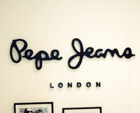
Pepe Jeans


Not many fashion brands would have a logo as simple as that of Pepe Jeans! The logo is an all text one, with no images inscribed. The designers have managed to get it right on the spot as they have possibly designed one of the best feasible designs. It’s simple, elegant, easy to remember and most of all; classy! The style quotient is added by the striking font feature. Not often would you see a white background with a black font colour, but it establishes a very simple image of the brand.
Allen Solly


Allen Solly brand’s logo is the perfect combination of simplicity with grace. The logo not only displays the great legacy that the brand has carried with itself, it also depicts the location of the brand. How many logos convey as much information as Allen Solly does; while remaining perfectly simple at the same time? It is an ideal combination of great designing ability with intelligent thinking. The colours used in the logo design process are more neutral and convey a calmer approach.
Flying Machine


Flying Machine has designed its logo based on its theme. The flying wings on the logo convey the theme of the brand. Yet, the designers have paid enough attention to keep the logo design process simple. Only the initials of the two words feature in the image part, which cuts it out as a striking design in the very first look. It has been made a bit stylish and elegant, going with the contemporary look of the brand. Text part is also added at the bottom which is kept simple and makes the viewer get associated with the brand. It is important to note how colour adds that striking ability. Red is a more attractive and flashy colour, something which easily goes with brand’s fiery approach.
As we have seen in these illustrations, logo designing is completely dependent on your company’s target audience. If the audience to be targeted is contemporary and a more casual fashion style is adopted by your company, employing a flashy design may be apt. If the company caters more towards formal wear and has a great tradition associated with itself, it is better to keep it elegant and graceful. It is critical to understand that whatever image you may wish to convey, it is important to keep the logo down to its basics. As all the successful brands have proved, a simple logo is the best way to connect with your target audience. Always remember; in the fashion industry, keeping it simple is the best way to keep it stylish.
Did you enjoy this article? Do you agree with this perspective? We would love to hear your thoughts, so don’t be shy and comment below! Please don’t forget to subscribe to the RSS-feed and follow Inspirationfeed on Twitter+Facebook! If you enjoyed the following article we humbly ask you to comment, and help us spread the word!