Last Updated on March 1, 2024
Probably one of the banes of sign designers in the US is the need for a number of signs to be compliant with ADA standards. It is a bane for some because such rules require that these signs follow certain color combinations, should use particular fonts, should have required elements on them and should have characters in sizes that are proportional to the size of the sign. In short, there are a lot of rules that need to be followed, and missing one or two of these can easily mean fines and penalties for the establishment using such signs.
Of course, if you were to think in terms of compliance only, there are signs that have all the much needed elements required of ADA signage readily available to those who need them. It is when business owners request for specially customized signs that are also ADA compliant where the problems may begin. What some sign designers find rather frustrating with custom ADA signs is that all of these rules can actually translate to signs that are not as attractive or as stunning as they might want it to be.
This is when a compromise needs to be reached. Sign designers can actually create nice looking signs that are ADA compliant, as long as the customer is willing to compromise a bit with certain design elements that need to be integrated into such signs. It is the job of the sign designer to help a client understand why certain fonts, color combinations and character sizes cannot be used on their signs. They should also present their clients with options that are still as appealing as the design they want, but are compliant with the rules set by the ADA for these signs.
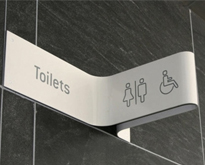
Now, you may be wondering what these requirements are, and why it is important for establishments to comply with such requirements. In a nutshell, the elements that need to be integrated into some of the signs used by businesses are added in to aid people with disabilities. Some of these elements include tactile letters, Braille translations of what these signs are saying, and pictograms that are universally recognized.
Aside from these, ADA compliant signs also need to follow a contrast percentage of 70%, with either the background of the sign or the message on the sign being lighter or darker by 70%. Fonts on these signs need to be sans serif and should not be intricate or elaborate. The characters on these signs also need to be in sizes that are easy to read at their mounting height, which means, the higher the sign is mounted, the bigger the characters on it should be.
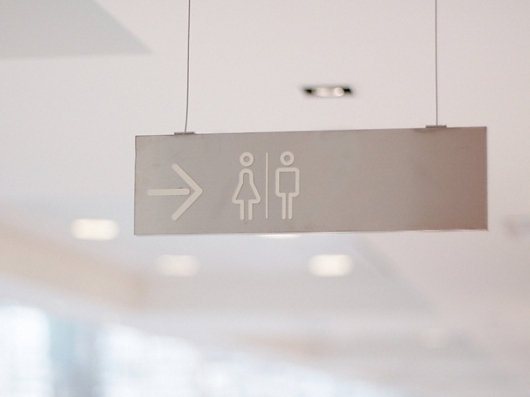
Not all signs need to comply with ADA signage rules and regulations however. Some of the signs that should follow these rules include signs that are used on permanent rooms (like kitchens and bathrooms), informational signage (room number signs, and floor signs) and directional signs. The rules that govern each sign type usually varies as well, with signs that are posted within reach of human hands needing to have tactile letters and Braille on them, and overhead signs needing only to follow color contrast, character size and sign finish rules. Temporary signs, building directories and parking signs do not need to follow any of these stipulations.
These are just a few of the considerations that need to be followed when signs are required to be compliant with ADA rules. The reason why such signs need to comply with such standards is because of the ADA, which is short for Americans with Disabilities Act. This is a law that sees to it that everyone is given the same rights, including those who have disabilities. The rules covering signage is just one of many that help ensure that people with disabilities are given the same opportunities as everyone when it comes to living a normal life in the US.
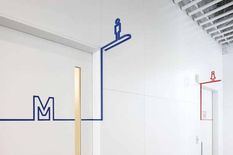
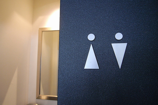
Inspiration


![FOD-METROPOL_5[1]](http://inspirationfeeed.files.wordpress.com/2013/06/fod-metropol_51.jpg)