Last Updated on February 22, 2024
You’ve worked hard to get the proper balance between art, words, and hardcore data. As far as you’re concerned, it’s a very good infographic and ready to take on the world, but that might be an overestimation on your part.
Like a parent, it can be difficult – nearly impossible – to distinguish between the good and the bad with one of your creations. A second pair of eyes is always helpful, although sometimes the problem lies with the foundation of your infographic. One wrong element can weaken your presentation. A good infographic is not only engaging, but it is factual and designed well enough that it has a good chance of going viral, and that’s what you want, especially if you own a business.
Here are seven mistakes to avoid while creating your masterpiece.
It’s too busy
Granted, people have come to rely on infographics for a skillful blend of nice design and good content, but you can go overboard with your presentation. An infographic that’s too dense, or provides too many charts and graphs might take the attention away from the data you’re trying to present. Find a happy medium where the contents blend together well like a soup. Passion for the work’s one thing, but knowing how to put that passion into context and give just enough info is the best practice.

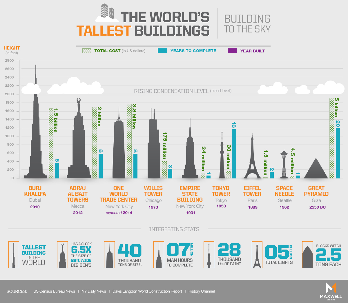
In their infographic Building to the Sky, shown above, Maxwell Systems stuck to the basics and produced a simple chart with silhouettes of buildings to show their relative heights, and bar graphs to show their cost and time to complete. The result is a satisfyingly flat and colorful chart about some of the most ambitious architectural projects in history.
Your research is questionable
Don’t fall into this common pitfall: “Well, it looks great,” you say. “Who’s going to worry about fact checking?” Lots of publications will. Conversely, even if your info comes from a reliable source, but doesn’t go deep enough into the material, you’re still in trouble. Your infographic has to contain factual components, true, but also information that either hasn’t been covered before or perhaps even not enough. Bottom line: What’s on the inside of your infographic really does count.
For their project United States of Search, a study of the use of search engines in the USA, WebpageFX made sure to be transparent about their sources, listing them on their own page and even linking to each dataset. They also explain how some of the data that they collected internally was harvested. Now that’s good research!
Bad graphics
The design of your infographic is likely to be the first thing the reader sees. As such, good graphics tend to support the content, whereas poor graphics will likely have the opposite effect. Stay away from anything that’s going to take attention away from the info within the graphic. Additionally, don’t mix different styles. Try to keep it as streamlined as possible. Readers prefer attractive images that complement what they’re reading.
Gate to Garage kept things chill in their infographic Pick a Mood, about decorating rooms with a “mood” or design style in mind. The graphic is broken into sections, such as “calm,” “lively,” and “creative,” and groupings of images and color schemes show off the flair of that mood of room. Photographs aren’t always a common part of infographics, which tend to be flat vectors or illustrations, but they can pack a punch when you use them right.
Not original enough
No matter how well planned out and executed your infographic might be, if it’s just like every other infographic out there, you’re not going to stand out. An infographic should speak to your own strengths as a designer, while being transparent. You might have it, but don’t flaunt it too much. The spotlight should be on the content of your infographic and its broad appeal.
In their motion graphic Drugs and the Genetic Code, 12 Keys Rehab sheds light on a new side addiction research – how our genes could predispose us to drug dependence. Addiction infographics have been done time and time again, but this video highlights new research and illustrates it in a new way. Click here to view the video.
Your fonts don’t rock
No, they don’t have to be in motion, but if not carefully chosen, an inappropriate font can kill an otherwise good infographic. Be sure that your font enhances, but doesn’t overshadow or compete with the design. It’s all about balance. Though you might really enjoy that cursive font, it could be the very element that detracts from your infographic. Keep it simple. Use no more than two fonts.
In their infographic Made in the USA, Victor Mouse Traps knew they had a wordy topic on their hands, and without proper fonts, the graphic would be boring at best or a mess at worst. Fortunately, they hit the nail on the head with their clever mixture of fonts, colors, styles, and graphics.
You used the wrong tool
Creative prowess aside, the technical tools you employ can make or break your infographic. Free tools can only take your graphic so far, and even though there are a bunch of them, your best bet is a good designer and a reliable software suite like Adobe. The wrong software can be almost as damaging as the wrong fonts.
In their infographic SuSTAYnable Vacationing, about the staycation trend, CJ Pony Mustang Parts used Adobe Illustrator to create an original graphic that no free tool could match. And later, when they turned it into an animation, they were able to use the high quality original pieces to make something awesome.
Your infographic is a “long and winding road”
It’s nice that you’re really into your subject matter, but you’re going to want to keep it focused. If you can boil your infographic down to a single topic, that’ll help you maintain your readers. In terms of technical specification, your infographic shouldn’t be more than 8000 pixels and 1.5 MB in file size. If it’s longer than that, consider retooling.
First & Awesome is an infographic by Dover Downs. They clearly love their home state, and they want to share the awesomeness that is Delaware with anyone who will look. But instead of gushing on forever, they make their point in just over 3500 pixels.
To ensure that your infographic has the best chance at finding its intended audience, you can either do a ton of research and hope for the best, or you can hire a contractor to design it. The choice is yours. Keep in mind that originality, a good eye for data, and persistence could actually prevent your infographic from landing in someone’s trash bin.

