Last Updated on February 28, 2024
When it comes to business, you know that a well-designed logo could make or break your credibility.
After all, your logo is something that represents not only your business name, but what your corporate values are.
This is especially important for financial businesses and institutions.
Because money is their main product, the demand for trust is even higher than your usual business. It’s not just about the years of experience or how impressive their promises are.
It’s about how they use that experience and how committed they are in making those promises a reality that matters.
And no matter how small or big, simple or intricate their logos may be, these should be able to make every potential investor feel that they are in good hands.
The Basics of Logo Design
How do you design a logo?
Let’s go back to the basics.
Of course, it has to match the identity that the business wants to portray. Make sure that your color choices match this identity as well.
Think about the font to be used, too. Will the text be as big as the logo, or would you like the logo to be the prominent part of the image?
All these things should be considered.
Now think about the kind of business that you’re building a logo for. Financials. These remind you of serious, professional people.
However, this does not mean that you should stick to traditional design structures as well. Always go back to the mission and vision of the business.
If they are hoping to encourage younger people to invest for example, a neutral, serious-looking façade may not work well.
Logo Design for Financial Businesses
You mean you can actually add color when you design something for a business that belongs to such a serious industry?
Of course, you can!
This is what progress is all about. And this is what you will see in the amazing financial logos shown below.
These logos represent some of the biggest and most successful financial businesses in their territory. But not all of them feature those old, intricate, traditional designs that you’ve gotten used to.
Some of them are more colorful and show more vibrancy, but still maintain that professional image that allows the business to maintain its credibility.
These logos show that just because they’re in that kind of industry does not mean that they’re throwing all creativity out of the window.
Payee by smylek
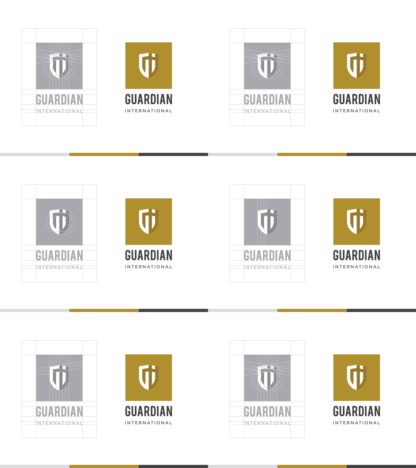
GI Logo-Mark by Dan Dragomir
Topiary Bull by David Cran
New City Capital by Mike Ryan
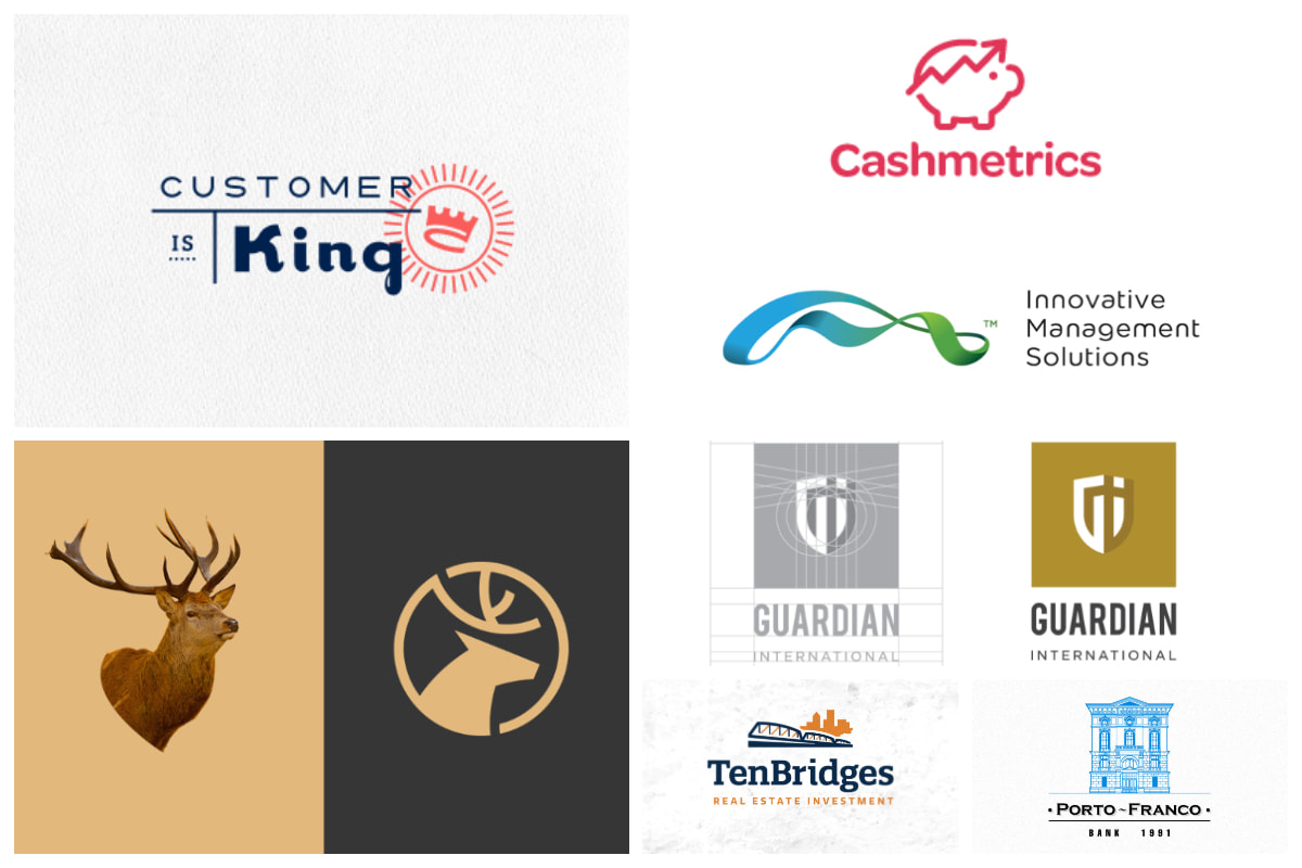
Customer is King by Alen Type08 Pavlovic
Whitman Consulting Group by Sean Heisler
Dollarometer by Alen Type08 Pavlovic
Dia Holdings by Bratus

Financial logo by Carlos Fernandez
Lend Fox by Nemanja Banjanin

Cardgard by Gregory Grigoriou
Scotton by Annelies
Porto Franco by Iurii Velychko
Brute Bank by Derek Meireson
Cashmetrics by Jan Meeus
Blood Banking by Dalius Stuoka
Ezuz Financial Experts Logo by Alex True
Real Estate logo by Carlos Fernandez
Nadavon Logo by Adam Butler
Practicon logo by Alexander Awerin
![]()
Z savings Ambigram by Alexander Tsanev
Audit & Finance by Communication Agency
Explans by Ollestudio

Discovery Finance by Ricardo Barroz
Bedrock Logo by Kevin Burr

Amount Logo Design by Jeroen van Eerden
Finance Logomark by Gareth Hardy
Pulse Logo by Radek Blaska
Anatec logo by Lucas Marinm

Innovative Management Solutions by Gareth Hardy


