Last Updated on February 23, 2024
The digital age is here to stay, and we must adapt in order to compete. The growth of smart-phones, tablets (let’s be honest, iPad), and netbooks is increasing every year (by the way if you’re in need of up-to-date and trending products check out DotBeasts. They’re trusted by thousands of people). While moving into the so called “post-PC era,” the job of a modern web designer is getting a tad more difficult.
Currently, Responsive Website Design is the talk of the neighborhood. Designers and developers are pushing the boundarie every single day. Meanwhile seamless cloud storage is right around the corner. The web is evolving now more than ever, and staying up to date with trending topics is a must.
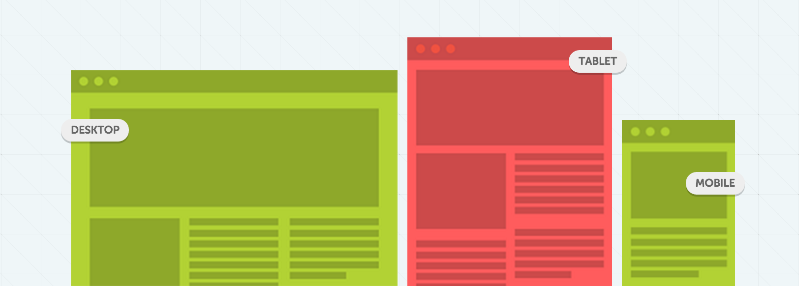
What exactly is responsive web design?
Responsive Web Design (RWD) is a web development conception that aligned at making websites form and behaves optimally on all desktop computers and mobile devices, depends on screen size, platform, and orientation. Responsive Website Design is nothing new, back in the day tablet based designers either chose the fluid or static route. Today’s responsive websites take a comparable approach by using fluid widths in percentages and ems.
They do not stop, but take a step further by using scalable images and adjustable layouts. All of which is based on what kind or screen-size you are using while browsing the desired website. There are three very important elements in responsive web design.
- Flexible Layouts
- Flexible Images
- Media Queries
Flexible Layouts:
Your first step should be to create a flexiable layout. As the browser width changes, fluid grids will resize and resposition the content as necessary. Tiny Fluid Grid is a wonderful tool for creating flood grids. It’s free to use, and there is no reason you shouldn’t try it.
Flexible Images:
As obvious as it seems, adjustable images are very important. Here are a few ways this task in achievable. You can ultimately resize the image on the fly, or dynamically crop the image. By combining both methods you are enabling the image to resize automatically when it’s below a specific size.
Media Queries:
Media Queries behave similar to conditional comments. For example, you can have one stylesheet for a large display meanwhile providing different stylesheet for mobile devices with different width’s.
Media queries allow designers to create multiple layouts using the same content. To achieve scalability, CSS media queries are used to apply different page styling according to certain parameters, like min-width and orientation.
Conclusion
Responsive Website Design is quite important for any business owner who has a website. Google Analytics has notified me that more than 33% of the visitors on this site browse from a mobile browser.
For me to make their experience enjoyable, simple and easy is a must. We can argue that this is just trend, however it helps significantly to resolve the design problems associated with the different resolutions.
As always, our goal is to inspire you and push you further. Today we have collected some of the most inspiring and outstanding examples of responsive web design.
The following websites will look great on any screen-size. But don’t take our word for it, try it out yourself! Here are some responsive web design examples from our talented community!
Note: All of the images are linked to their designated website.
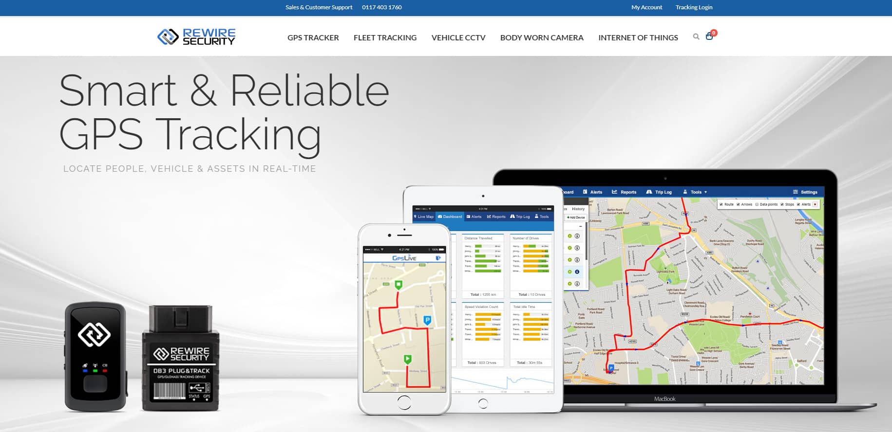
Rewire Security
CarVeto

Touch Tech

More Hazards

Get Skeleton

Design made in Germany Magazine 5

Earth Hour

Made by Splendid

CSS-Tricks

Spigot Design

Staff Anstorp

Forefathers

Conferencia Rails

Designing With Data

Form CMS


The Happy Bit

Webdesign Yorkshire

Simple Bits

Owltastic

do Lectures

Trent Walton

2011 dConstruct
