Last Updated on March 2, 2024
In a mostly digital world, a lot of people feel that layouts are not as important as they used to be when print design was still reigning king. What you may not realize is that the use of layouts could be more crucial now more than ever.
Why Layouts Still Matter
Layouts are the most critical part in print design. Get the layout wrong, and the message you’re trying to send across will not be understood the way you want it to be understood. Improper layout can confuse the audience, and may turn them off completely.
It’s your layout that dictates how effective your content is. Regardless of how relevant the content, if not laid out effectively, the message could be muddled. Readability could be sacrificed. Aesthetics could also become a problem.
But it’s not just the people in print media who should be concerned about layouts. If anything, digital marketers should put top priority status to their content layout as well. This is especially true if you expect your content to appear across different channels.
Just imagine. What works in a web setup will not always be applicable to a mobile environment. And what’s the first thing you tweak when switching from one mode to another? The layout.
Getting Your Layouts Right
Now that we’ve established how important layouts truly are regardless of whether it’s for print or digital media, here are a few tips that could help you make sure your layouts are always effective.
1. Limit your colors.
No matter how extravagant or out of this world you want your centerpiece to be, you still have to think about whether the eyes of your viewers will be okay with it.
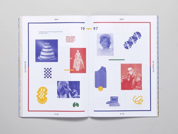
Don’t get me wrong, colors are always fun and exciting. Especially if “vibrant” and “young” are some of the adjectives your editors used, you’ll probably maximize the use of color in every possible way.
But that doesn’t mean you can use every imaginable color and dump it all into one page. The more contrast and combinations you use, the more tiring it is for the eyes. You may catch the attention of readers, but it might not be in a good way.
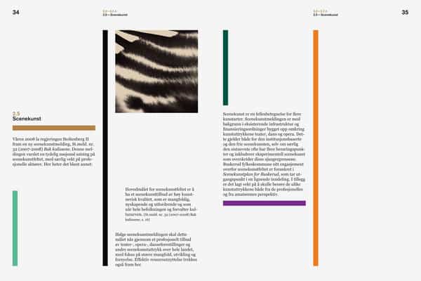
Limit the number of colors you use in a single spread. This way, you can make sure that all text would be readable, and your readers will not get tired easily.
Tire their eyes out too much and they’ll forget about what the next pages have to say. But give their eyes just the right mix of color, and you’ll hold their attention long enough.
2. Limit your elements.
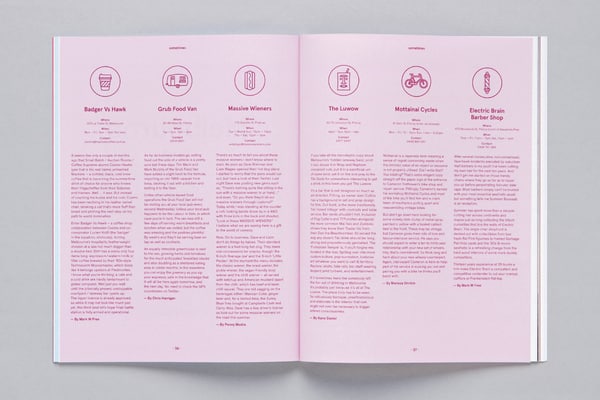
One very noticeable thing about newbie designers is their incessant need to fill up every possible space. Call it excitement or eagerness, but you have to control this urge. It’s the same concept as the use of color. Use too much, and you’ll tire your viewers’ eyes out right away.
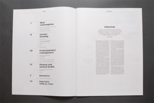
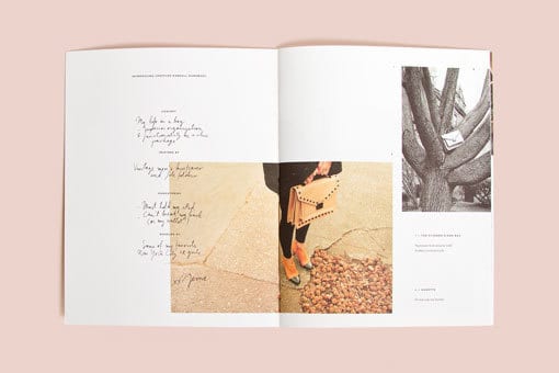
Consider having some white space. Especially when there’s important text to be read, make sure you leave enough space for each of the elements to breathe, while directing the attention of the readers to what counts the most.
3. Limit your fonts.
Here’s another thing that could easily ruin any layout.
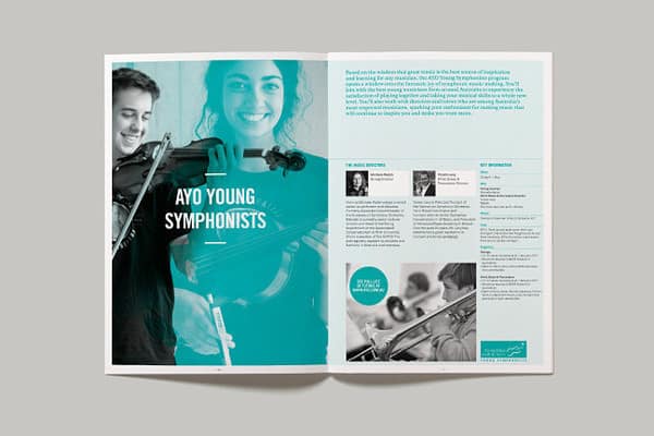
Yes, there are a number of different fonts available for designers to use nowadays. But you don’t need to use them all in one go. The magic number here is 3 – one font for your title, one font for your subheadings, and another one for your text body.
Make sure these fonts complement each other. Just because you used a serif font for the title does not mean you can’t use any sans serif fonts anymore. Just find the right blend, and you’ll be okay.
4. Mind your margins.
This is one thing that a lot of people now forget. Looking at websites, you’ll see that designs go from one end to another most of the time. But when it comes to print, you have to start thinking about margins.
Evidently, the smaller the page, the smaller the margin is as well. You’ll have to widen the margin as the page gets bigger.
What happens if you don’t add margins? Well, in digital design, all you have to worry about is the edge of the screen. But when it comes to print, you have to remember that pages have to be bound together, which means that a portion of the design might end up getting cut off. This will lead to inconsistencies in the final product.
5. Use grids.
Grids are a godsend to designers because they provide solutions for so many problems.
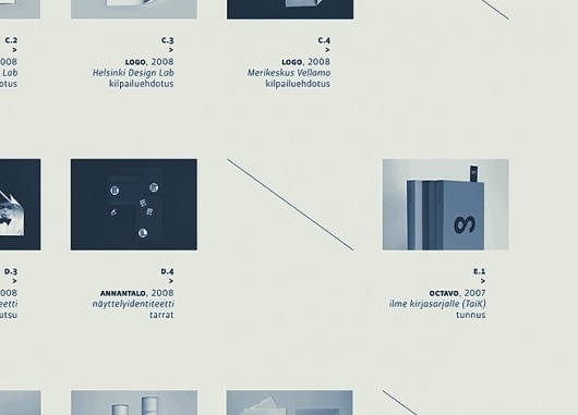
For one thing, grids keep everything in your layout organized. They keep everything in its proper place, and helps keep some elements from overpowering everything else around it.
Grids also improve a designer’s efficiency. With grids laid out on any page, it’s easier to figure out where things should go. Without a proper grid in place, designers would have to figure out where each element could go. But when a grid is present, it’s not a question of where it COULD go, but where it SHOULD go.
Grids are also extremely useful when you have a lot of text on your design. It allows you to align text as needed. Sure, people who have no design background won’t really notice that some of the text are not properly aligned. However, to their naked eye, the design would seem more cluttered.
Yes, all these elements are involved when you’re talking about layout, so it’s not exactly a concept that has become useless.
Great Design Layouts for Inspiration
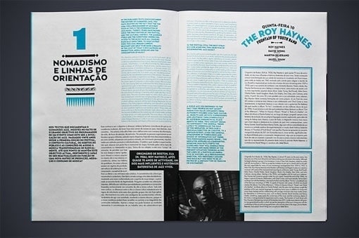
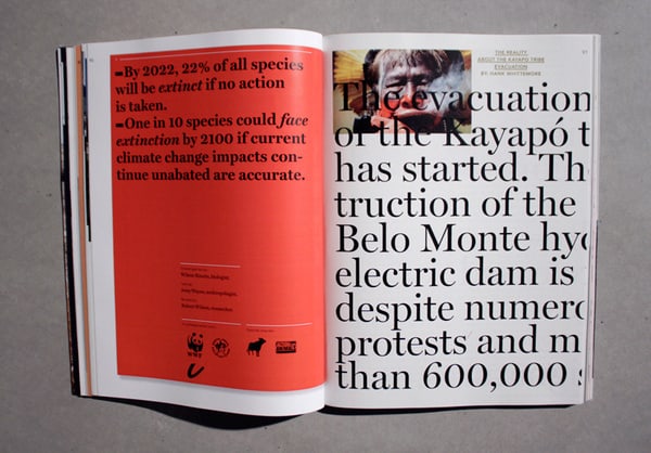
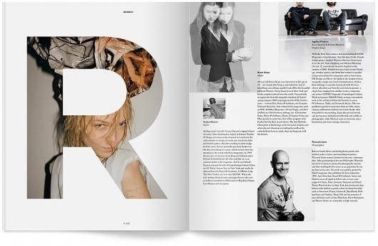
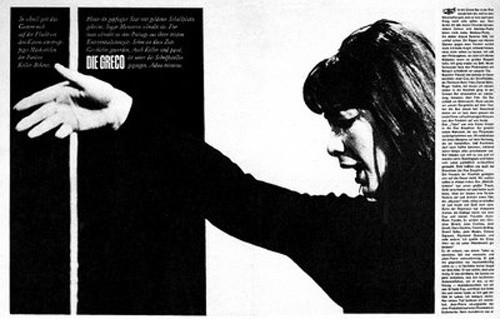
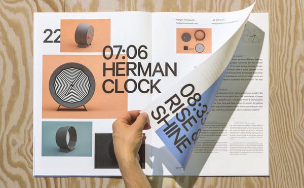
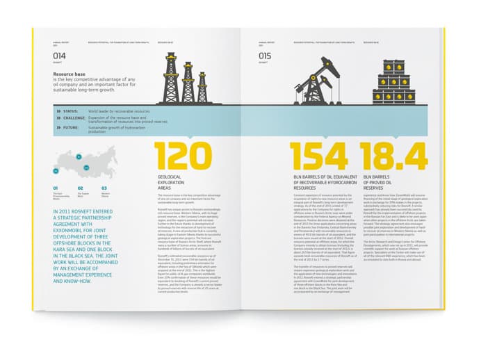
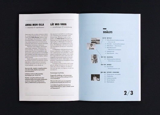
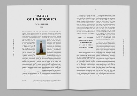
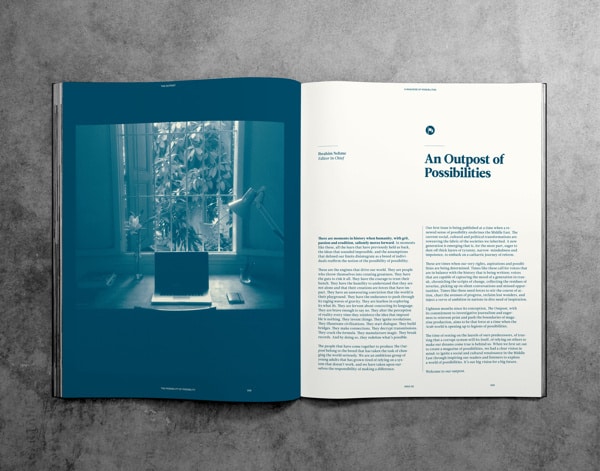
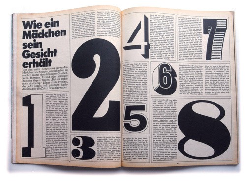
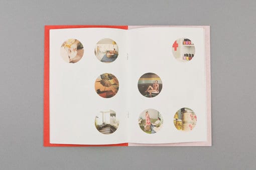
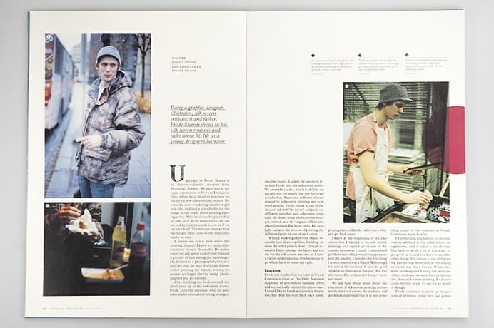
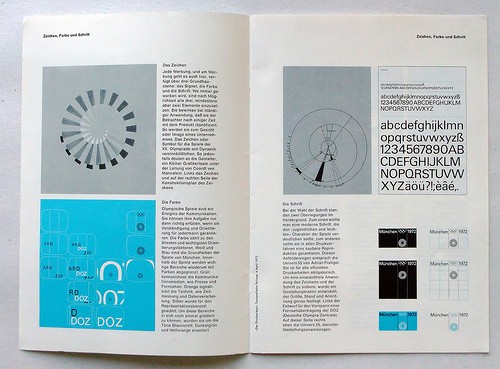
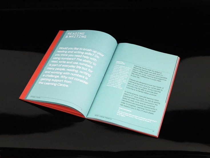
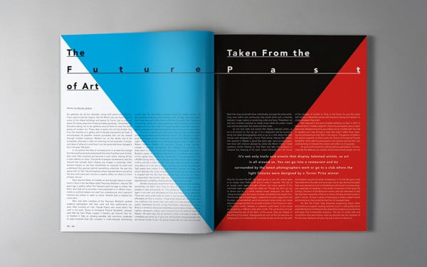
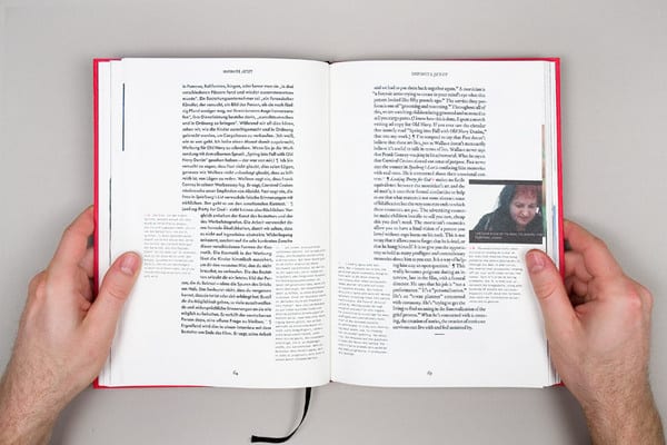
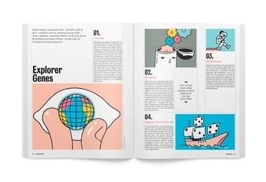
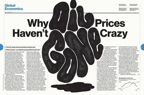
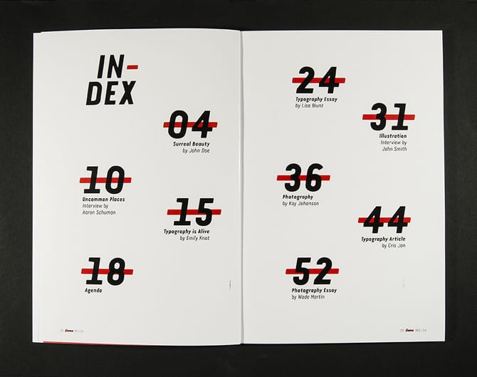
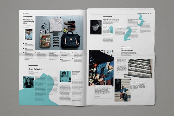
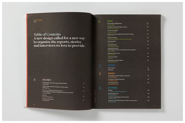
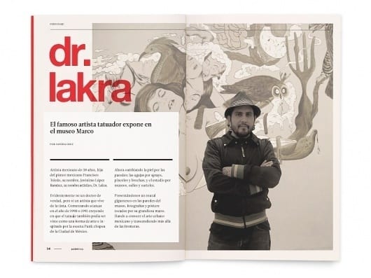
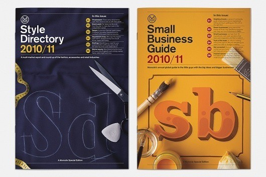
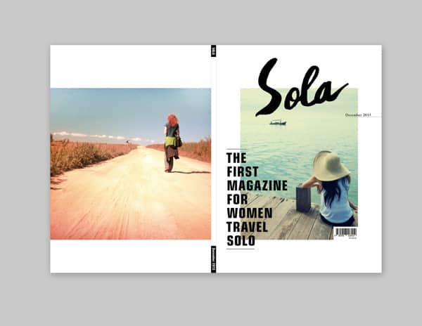
Looking for layout inspiration? Wondering about how you can apply the tips given above to your own work? These layouts can help.
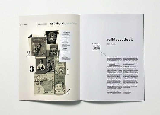
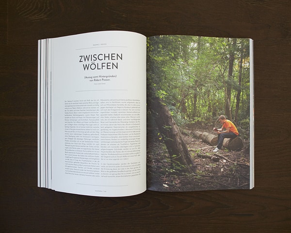
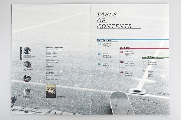
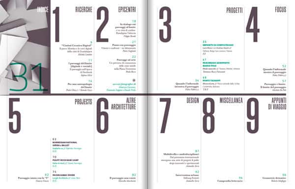
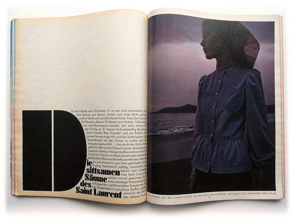
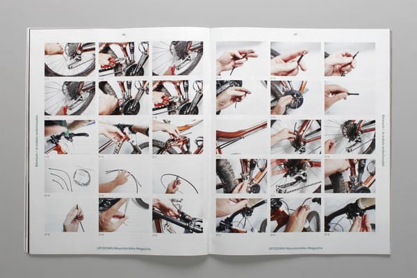
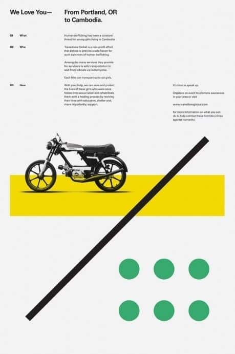
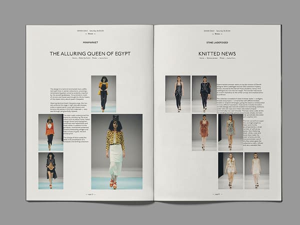
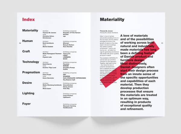
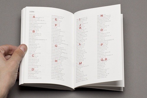
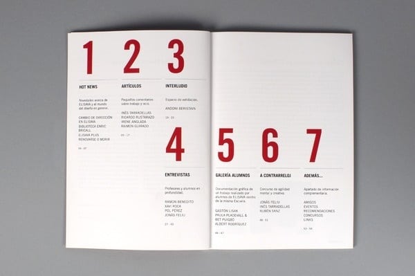
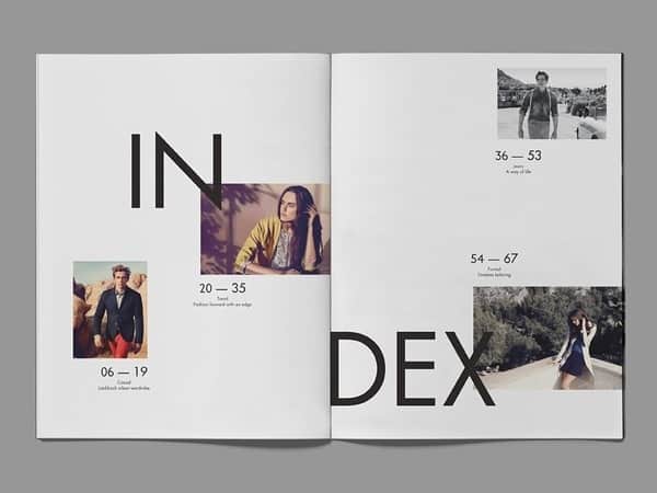
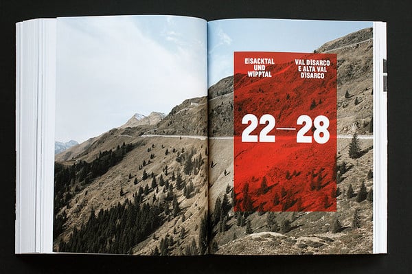
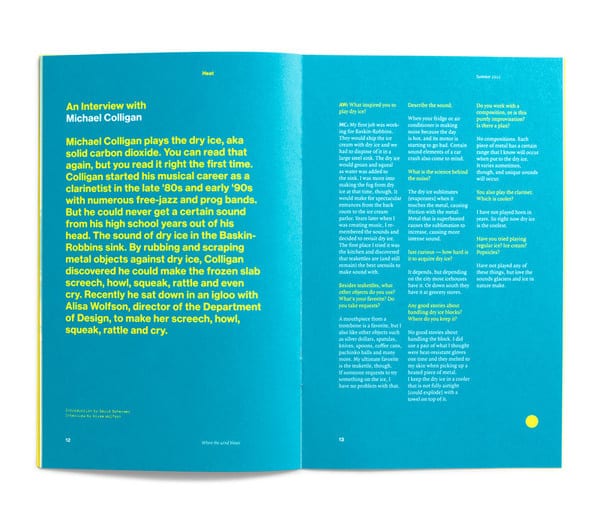
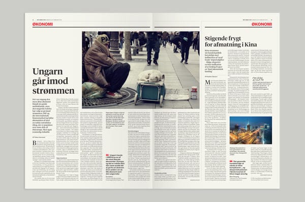
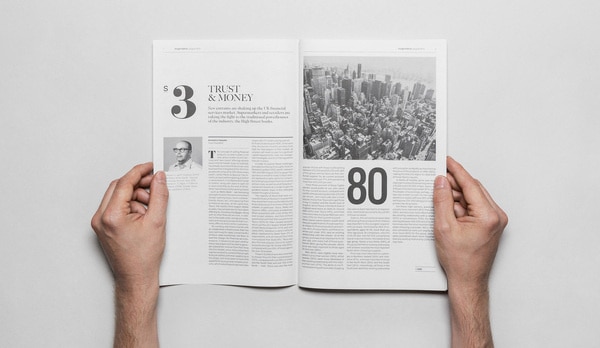
We’ve put together 50 design layouts that perfectly embody how layouts should be done. Some of them are fairly conservative and gear towards the minimalist side of things.
Some of them are more creative and present unique ideas that you rarely see. Regardless of what approach each layout takes, you’re sure to pick up a few best practices that you can apply to your own work.



 >
>
