
Last Updated on March 3, 2024
When you think of typography websites, you might find your mind immediately going to websites that are specifically meant for teaching about fonts. Maybe you imagine design websites that have long tutorials on using or creating typographic characters.
But there is an easier way to go about being inspired. The best way is to look at well-made websites that are created using typography-based designs. Here is a list of 10 amazing sites that do just that.
1. Links LA

Links LA shows what can be done with an incredibly simple, abstract concept. The background image perfectly utilizes the clean look of black and white. But the best part has to be the typography in the center, naming off adjectives describing the site’s mission statement. It all comes across as very modern and sleek – especially with the eclectic mix of fonts used in the wording.
2. Keep It Complicated
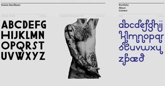
This is the official portfolio site of Icelandic graphic artist and designer Sveinn Þorri Davíðsson (He admits that his name is impossible to pronounce and invites visitors to call him Svenni.). A great deal of his projects are typeface based, which he shows on his main page as the focus of the overall design. It is set to a gray background. But rather than making it look bland or bleak, it seems to better illustrate the solid black of the fonts provided as samples.
3. Brad Frost Web
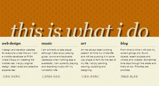
“This is what I do” – a very direct statement that is seen in large letters right on the front page. From there he goes on to provide simple categories under a different font, this time in black. The entire website is entirely font based. Each new page you go to has a main typography focus. It is very clean and basic, which manages to show that you don’t need bells and whistles to create an awesome website design.
4. Finch: Fresh Creative
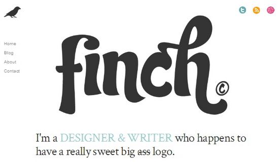
Francisco Inchauste created his website Finch using what is – he says – a “big ass logo.” That logo is a typography representation of the name of his online presence. From there, you have other fonts making an appearance beneath and around it. The typeface itself looks extremely stylish. He is able to show off his creativity in something as simple as a word, and that is what shows real talent.
5. Fruit Imaging
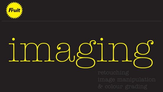
Movement and typography go well together, as seen from the recent increase in kinetic typography videos posted on sites like YouTube and Vimeo. That is a concept utilized for this design to great effect. When you go to the page, the initial header comes up with half of the name in the sunburst logo in the left-hand corner. Then the word “imaging” slides across screen below it, along with the description below.