Last Updated on March 6, 2024
All successful online and offline marketing campaigns start from the mandatory prerequisite of having a good customer database. However, no matter how all-inclusive and well put-together your client base might be, you need to know how to speak to those individuals.
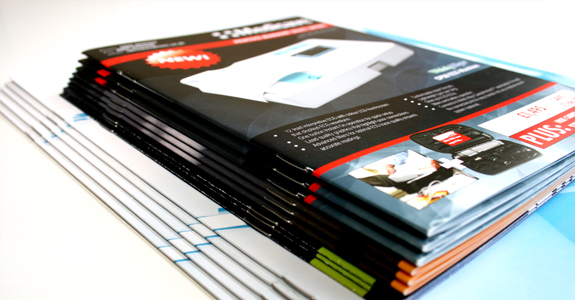
The best, most tested-and-true and effective tool for reaching your potential customers is a good product brochure. Brochures boast the priceless advantage of combining appealing visuals and layout with informative copy text. This having been said, the importance of good brochure design is pivotal, as it can literally make or break your sales campaign.
To come to your aid, we have identified the defining traits of an efficient sales brochure and collected the five most important tips, tricks and troubleshooting techniques, which should allow you to fully capitalize on your customer base.
1. Who Are You Addressing?
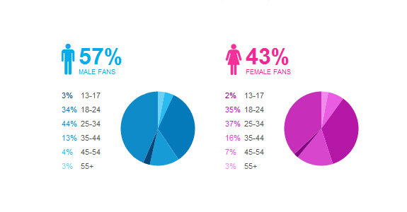
While a good list of names and a solid demographic basis is important, you also need to know how to use it properly. Analyze your customer database by taking into account as many variables as possible. How old are they? Are they mostly male or female? Are they married, do they have children, what are their main interests, what is their average yearly income, what industries are they mostly active in? Good brochure design always starts with a good grasp of sociological research tools.
By knowing all the particularities of your audience, you will know how to best speak to them, in order to maximize the response rate. After all, it goes without saying that a 55 year-old retiree who lives in a rural area won’t respond to the same visual clues as an urban male teenager. Once you’ve identified these specifics, make sure to keep all communication personal. Turn the focus around to your client by replacing ‘I’ and ‘we’ with ‘you’. Everybody loves attention, and attention is definitely something you want to shower your clients with.
2. Copy Text, or When Less Is More

The days of long copy are all but gone in most marketing and advertising channels. This certainly applies to brochure design. Bulky chunks of text, which will prohibit you from employing a modern, streamlined layout, too, are a major visual turn-off.
Eliminate this problem from the get-go by keeping the text concise, jargon-free, understandable for your audience and, most importantly, specific to the particular traits of the company, service or product you are promoting. Remember that no one has enough time in today’s busy day and age. The precious time people have, they will not be willing to waste on your efforts of selling them something.
3. Visual Eye-Catchers
It’s been scientifically proven that the human brain will first respond to visual cues and only then refocus its attention to textual elements. As most brochure design professionals will tell you, relevant images, a coherent color scheme or a provocative illustration will draw in your clients.
It is true that in the case of printed brochures color is comparatively more expensive. However, the return on investment rate is well worth it. Why skimp on an essential element of your sales pitch, when you know that such a decision might make your brochure land straight in the trash, instead of well within the focus of your clients?
4. The KISS Principle

‘KISS’ stands for ‘Keep It Simple, Stupid,’ and while being offensive is not the point here, this piece of advice is really priceless. Yes, you will elicit a strong emotional response from your clients if you use good visuals. However, if the pictures have little or nothing to do with the marketed product, then the brochure design fails. Use the appropriate pictures, keep your information brief, engaging and simple, employ powerful headlines and, most of all, limit your design choices to a cohesive few. In terms of fonts and typefaces, three is a golden number.
Use no more than three different fonts. Good examples are Century Schoolbook, Century Expanded, Georgia, and Palatino. Typefaces should be larger for headings (14 or 16), average for the body text (12) and small for captions (10).
5. The Specifics of Printed Brochures
This last set of tips specifically applies to printed brochures, who may present you with several pitfalls that are not applicable to online brochures. Remember that you can ruin all the hard work that went into you brochure design if the final product has a fold over a picture, is printed in poor quality colors or on cheap paper, or if the copy text contains mistakes.
Always avoid the fold, use a good printer or printing service, and don’t hesitate to work with a proofreader. Perhaps your overall costs will run slightly higher than under other circumstances, but the investment is surely worth it.
We hope you will find the tips above useful. We would love to hear your feedback regarding this article, so please comment below! For more useful articles like this please don’t forget to subscribe to the RSS-feed and follow Inspirationfeed on Twitter + Facebook ! If you enjoyed the following article we humbly ask you to comment, and help us spread the word!

