Last Updated on February 24, 2024
Logos are not forgiving!
They aren’t like blog posts or social media campaigns that rarely stick around for a very long time. Unless the content or the promotions go viral that is. This ephemeral nature of marketing and collateral is generally considered to be a drag. Companies need to keep creating new impressions everyday if they want to stay top of mind.
But logos – they are a different kettle of fish. They are the calling card of a business. They are the very first thing that potential buyers notice about your brand. And with time, they become synonymous with the essence of a company. And that is where the danger lies. Creating a great logo is NOT easy. In fact, re-branding a logo is even more of a risky proposition. There are many essentials to keep in mind and the probability of botching it up is always high.
Logo Fiascos That You Should Take Lessons From:
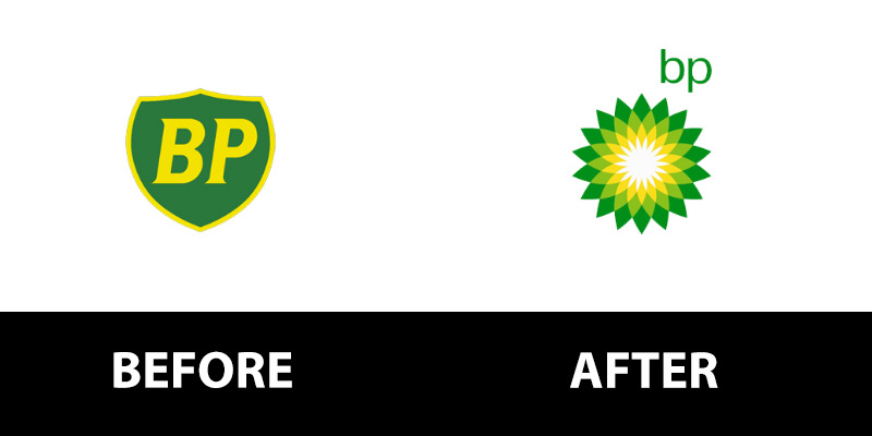
BP had a classic timeless appeal to its logo. The royal form of the shield and the simple B – and – P looked quietly elegant. A just representation of a 70-year-old business! However, in 2000 it came up with the Helios which immediately brought ambiguity to the company.
BP wanted to relate itself with a clean environment and green practices. But the very nature of is work – drilling oil – made the company come across as a hypocrite. Then the tragic Deepwater Horizon marine spill happened and BP completely lost its market respect. The price of this folly? An estimated $211,000,000 for the entire re-branding roll-out.
Lesson: A logo must not create confusion in the buyer’s mind around your business and values. Stay focused and transparent instead of trying to be clever or misleading.
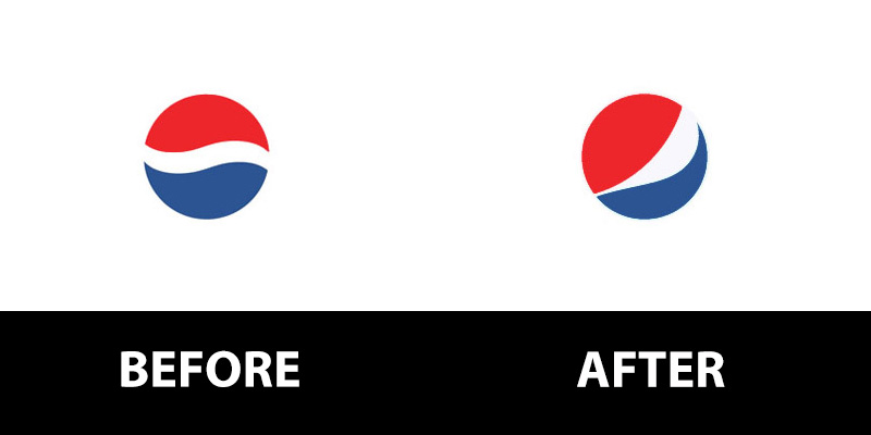
Pepsi has struggled with its branding off and on. But the latest logo change that happened in 2008 benefited only the Arnell Group that charged a cool $1,000,000 for the mediocre job. The change in the width and the inclination of the swirl is supposed to represent a ‘smile’ – quite possibly because Coca Cola is so inextricably intertwined with the notion of happy times.
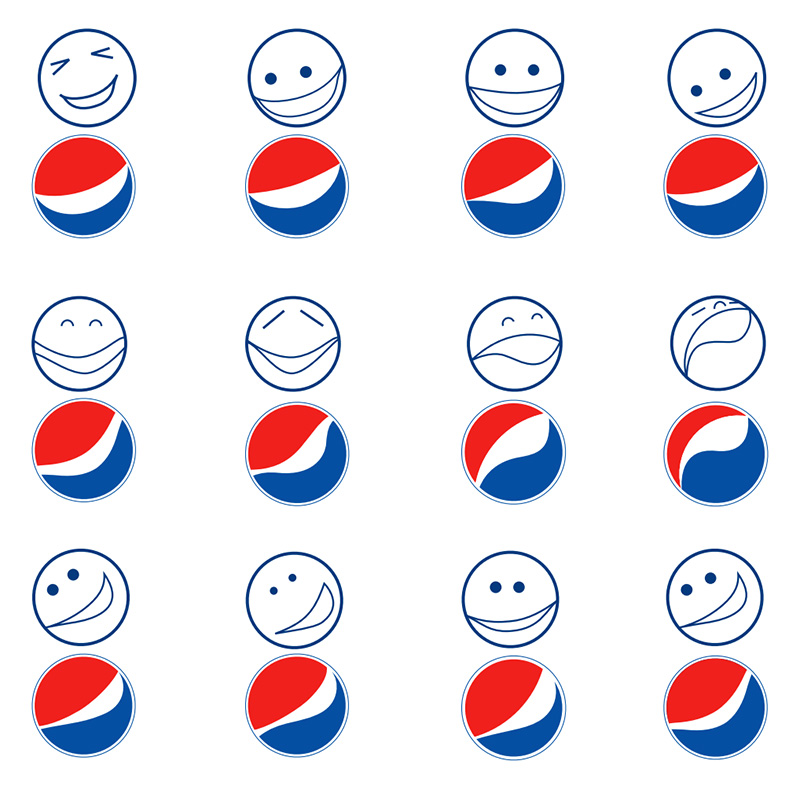
A sample from a case study. See the full 27 page case study here.
But the actual logo fails to convey this sentiment completely. The modification is not noticeable. The whole stacking looks awkward. Amazon also has a play on the ‘smile’ with it’s A to Z angle but the subliminal suggestion makes a lot more sense.
Lesson: Subtlety is good. But if you are looking to use subliminals, they must be strongly embedded in the design and should be related to the brand’s identity instead of looking to occupy your competitor’s space.
What Do Iconic Logos Have in Common?
By now you are hot and bothered about your logo or planned revision to the it right? You know that the slightest mistake can prove costly – literally and figuratively. Fear not, it is time to focus on actionable wisdom to ensure that a logo looks and feels like an extension of your brand, influences your audience with your values and is aesthetically pleasing.
And the best place to start is in marketing history. Coca Cola, IBM, Kellogs, Microsoft, Walt Disney, Mercedes, BMW, Cisco, Ford and Dell are consistently believed to be some of the most expertly branded companies in the world.
Webson has conducted an extensive study of their logos and has found patterns or commonalities between them. And they serve as great guidelines for businesses in terms of the design elements that they can include in their own iterations.
- 90% of the logos do not include the tagline. Even though most of the taglines these brands have are catchy, it is best to leave a logo clean and uncluttered. For every bit you add to your logo, ask yourself ‘Is this really needed?’ ‘What will this addition do to the appeal of my logo?’
- 74% of the logos use a monochromatic palette. I am not counting black and white which are often used to create contrast and enhance elements. In general it is a good practice to stick to one hue instead of going with a gradient or an intermixing! Remember that BP logo? **shudder**
- 74% of the logos are typographic. They use only letters without the inclusion of symbols. Typographic logos are easy to render and you can play with fonts to bring your brand personality to life. If you are a startup and your logo budget is non-existent, you can’t go wrong with typographic logos.
- 40% of the logos have blue in some form or the other. Blue inspires trust. And is a great fit for automobile and tech companies. However, I never stick to only blue. You should map out your dominant company value like ‘responsible’, ‘technically advanced’, ‘optimistic’ or ‘peaceful’ and relate it to the hue that can be used as your major brand color (and obviously the palette of your logo).
This is an easy to scan infographic that makes the value and color association for you.
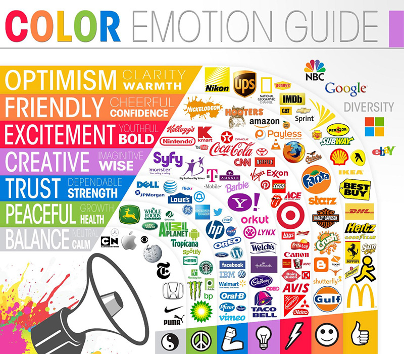
Source: http://www.dailyinfographic.com/logos-a-look-at-the-meaning-in-colors-infographic
- 40% of the logos have a background that is filled with a solid color. Having a filled backdrop gives more stability and support to a brand. Just take a look at the Amazon logo with and without a background and notice which inspires more trust in their competence. I bet it is the first one. Most companies do have both variants and use them in specific collateral and presences.

3 Elements That Make a Stellar Logo:
This is the real gold.
This is what your competitors are most probably not doing and will give you an appreciable edge. Everyone talks about lines and color and fonts – yes they are all important. But the elements I am about to discuss set the masterpieces apart from the run of the mill brands and logos.
1. The Story behind the Brand and the Logo
Story-telling is extremely important. Yet not many businesses try and imbue their logos with their legacy or their brand’s origin. And some think that being clever with white space is story-telling. We will discuss subliminal logo impact in the next section, but to all intents and purposes, subliminal suggestions are NOT brand stories. Some of the companies that get it right are Apple and Lamborghini.
First and foremost, the Apple logo is a unique hue.
It is grey.
It separates itself from the multi-colored pack of wannabes and espouses calm, exclusivity and a certain detachment. It is the Holy Grail of ‘technology meets luxury’ and takes this responsibility very seriously. There are many legends around the meaning of the iconic Apple logo. But there are two that stand out.
The half bitten fruit is supposed to be a tribute to Alan Turing, the father of modern day computers, who took his life by eating a cyanide laced apple because he could no longer bear the shame and the humiliation heaped on him for his lifestyle.
Some also say that the apple stands for the forbidden fruit of Eden. The company united tech with user friendliness and desirability at a time when computing was the domain of the ‘geeks’. It crossed the line! And the logo is a fitting symbol of its tumultuous history and innovative products.
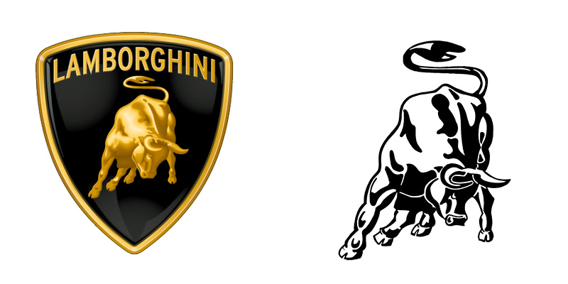
Lamborghini is another premium brand that articulates its story well. The pugnacious bull is not a random choice. The founder Ferruccio Lamborghini was a Taurus and the stance of the animal, with its head dipped is a classic position in tauromachia (bull fighting), Ferruccio’s favorite sport.
A third connotation is the challenge to all other automobile brands who are obsessed with ‘horse power’. The Lamborghini is not that subtle. It packs a raw punch and is the ride of choice for rebels.
Related: Why Is The Lamborghini Logo Powerful? Where the Story Began
How Can You Tell a Story with Your Logo?
Story telling should not be complicated. You do not want to put in a bunch of symbols to create a hodge podge that loses all claim to elegance.
- Decide what is unique about you as a business. Your value proposition is the best place to find this insight.
- You can choose to focus on any of these things – The story of your founding father, the location or the country of your origin, a popular characteristic of the people you serve, your most defining feature or value.
- Once you have identified this central theme, brainstorm ideas on how you would like to incorporate it. Do you want to use a symbol? Is a short tagline your pick (this should be the last resort for sake of having an uncluttered logo)? Would you like to convey something through geometric shapes like the Mitsubishi logo which combines the family crests of the two clans that set the company up?
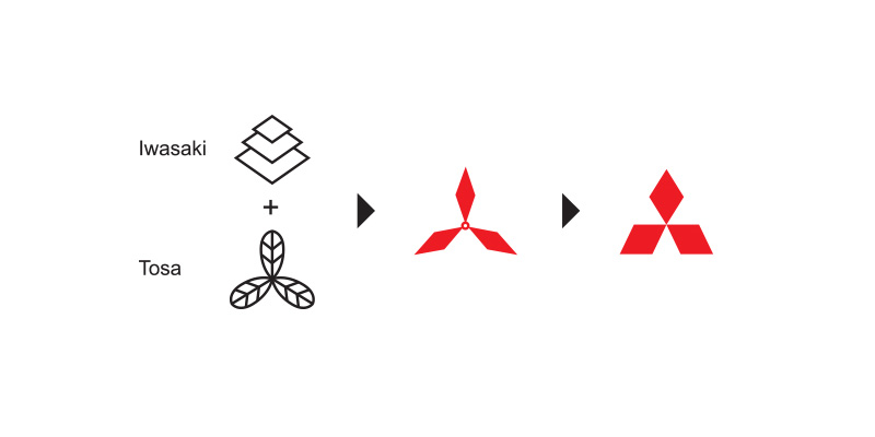
Source: http://www.mitsubishielectric.com/company/about/history/logo/
- Have clear guidelines based on this information and let your designer come up with options. Hiring someone creative and competent is critical because this professional will be able to tell you what is and isn’t possible within the small footprint a logo should ideally occupy.
2. The Clever Use of Subliminal Cues
I would like to reiterate that weaving in the brand story is not the same as using subliminal. The two can be clubbed together but this decision should be approached with caution because the smallest mistake might convey something totally unwarranted and undesirable to buyers.
What is a Subliminal?
It is a slight nudge or cue that is directed at the subconscious mind of your customers. It looks to bypass the 5 obvious senses and goes to work on the psyche of the target audience. Through subliminal design you can slowly condition your clients to associate certain pleasant memories with your brand and create a need to purchase your products.
As you can understand, they are quite popular. But only a handful of businesses execute subliminal designs powerfully. And they include Baskin Robbins, Tostitos and Hershey’s Kisses.
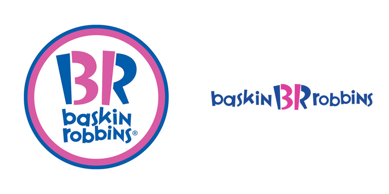
This one is obvious. See how the pink marks out the number 31? Baskin Robbins is famous for its 31 flavors and mind boggling variety of choices.
This Logo is A Great Subliminal Because: It actually achieves a purpose. It reminds people of the 31 flavors and since the company is all about ice creams and huge platters of sundaes, the options available tempt them to try more, experience cravings and the rest of the good stuff.
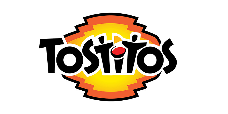
This one is my favorite. The two ‘T’s are the two friends and the ‘I’ serves as the bowl of dip. Look closely, you will make it out.
This Logo is A Great Subliminal Because: It sells an experience. Tostitos is ubiquitous nowadays. Why? Because it promises good times, sharing, bon-homie and a delicious feast! The warm red and yellow palette works great with the theme.
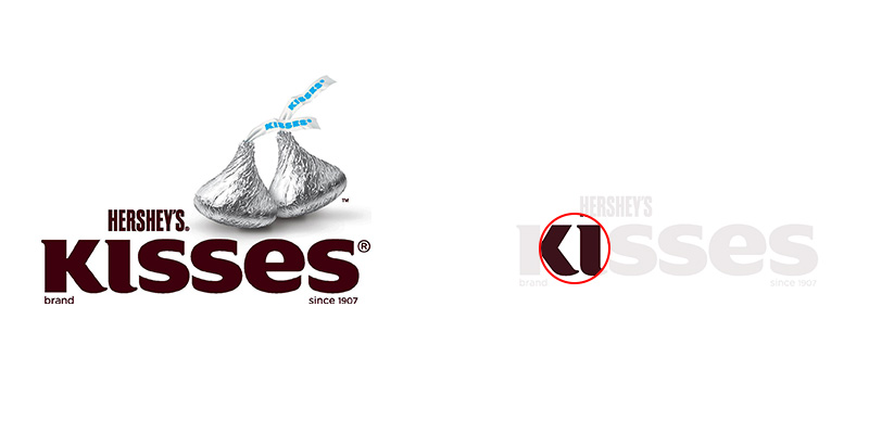
The space between the ‘K’ and the ‘I’ looks just like an actual unit of the kiss.
This Logo is A Great Subliminal Because: It stimulates hunger whispering to the subconscious mind that the kiss is small, compact and a rich brown that just melts in the mouth.
How Can You Use Subliminal in Your Own Logo?
- Subliminal design MUST add value instead of just reinforcing a brand message. Unless it is for the food industry (case in point the Hershey’s Kiss) because hunger is the easiest emotion to influence. And ties to the goal of getting more people to eat a brand’s offerings!
Consider Yoga Australia. The shape of the continent that is formed by the white space the woman’s limbs encloses doesn’t add any urgency to the logo.
People know that the company is based out of Australia. In fact, the brand name is used as a part of the logo. In this case the subtle suggestion is just a clever visual trick. It doesn’t associate the business with anything desirable or give patrons the urge to go start exercising.

A great subliminal should be like Tostitos. It should augment or enhance the brand perception or push people to go take action. If you can get clear on this, your use of subliminals will improve immediately.
- Think of the subliminal as your logo’s call to action. You already know how to incorporate the brand story and through it your value proposition. For the subliminal, try and think of what you would like your buyers to feel or do after they see the logo. Do you want them to remember good times at the beach? Do you want them to start feeling hungry? Do you want them to feel that your brand is exclusive? Jot down this ‘What’.
- Now it’s time for the ‘How’. You can convey subliminal suggestion with white space. The Pittsburgh Zoo does it rather nicely.

Or you can use a symbol with a hidden meaning. BMW, whose logo is a take on propeller blades against a blue sky, highlights its background in aviation. And the fact that the car is the epitome of speed! The automobile giant is one company that scores high with the marriage between story and pertinent subliminal because ‘talking to the winds’ is indeed what its buyers crave and being reminded of this advantage boosts desirability of the vehicles.
- Test, Test, Test. With the logo finalized, go ahead and show it to focus groups. Note their feelings and impressions. And fine tune accordingly.
- Bonus Tip: Include your marketing department and senior executives when designing a logo with subliminal elements. Given their audience and company knowledge, they might be able to lead you to calls to action that really matter. And better ways of bringing them to life.
3. Minimalism – Less is More
I personally am a huge fan of both minimalism design. In short it is the practice of having very few elements in a logo while capitalizing on a palette of (primarily) black and white to make a bold and clear impact. Minimalistic logos when rendered with care and attention catch the eye.
People have an attention of a gold fish nowadays and the very fact that the logo is instantly understandable works in its favor and makes it memorable.
When Can You Use Minimalistic Logos?
Two types of brands use minimalistic logos. Very famous businesses like Gucci that can afford to not add any frills to their presence and still be recognized.
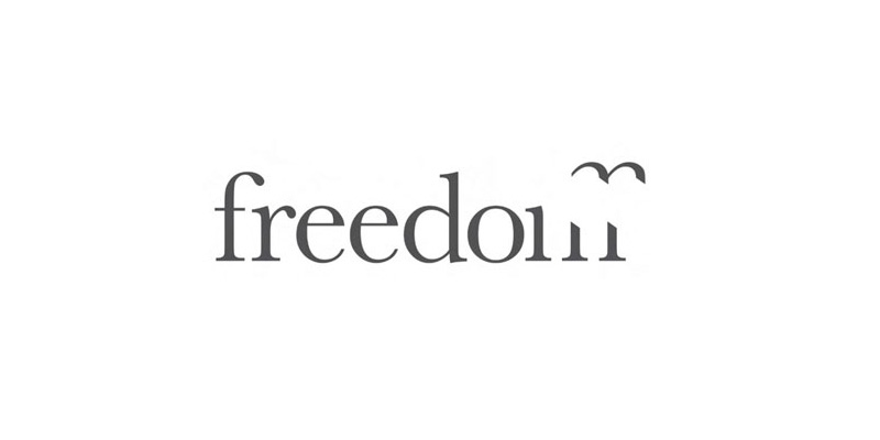
Niche platforms that speak to a very specific segment of buyers or clients. Both Freedom Travel and The Ski Brand fit the bill. One is a business that allows the footloose and fancy free to roam without encumbrances and these individuals immediately identify with the humps of the ‘M’ that seem to take flight.
How Can You Use Minimalism in Your Own Logo?
- Do you serve a burning passion of your buyers? If yes, use a symbol that resonates with this passion and make the design appealing to your target audience.
- Ensure that you use bold strokes. Minimalism hinges on boldness.
- Make sure that you are hitting the right note by running the logo past your existing clients or focus groups.
Is This the End? Are You Guaranteed to Have a Great Logo?
Not really! There is still plenty to share. But if I keep writing, I may just cross the 10,000 mark. Creating a logo that will outlive you is not a ‘done in a day’ affair.
But I do hope that these suggestions, steps and recommendations will help you ascertain where you are coming from, clarify how your logo relates to your company and give you some iconic examples to follow. And that is a better start than any of your competitors. Trust me!

