Last Updated on February 25, 2024
Consumers keep in mind hundreds of brand logos and you should try really hard if you want to stand out and create a memorable logotype which embodies a brand after all.
As always, it’s important to know the latest tendencies in order to create something up-to-date and increasing the brand awareness at the same time.
In this article, we’ll discuss the logo design trends that will prevail in 2018.
What to consider before creating a logo
If you’re reading this article even before you actually have a website/mobile app, we can suggest you read about UX design trends to make your digital solutions efficient and up-to-date.
There are several things that require your attention before proceeding to the logo creation. They’ll help you better understand your needs and demands for the logo design.
Meaning
Every logo is something more than a vector image. It represents the entire brand. Respectively, that image should have some logic behind. What’s more, this logic should be easily understood by consumers. If they can’t describe the logo of a company and associate it with the company’s sphere of activity — it doesn’t affect the brand awareness positively.
Use cases
Remember that logos go beyond the screens of devices. Imagine each possible use case for your logo. T-shirts, billboards, notebooks, stickers etc. Does it look equally awesome on each of those items?
Competitors
Pick logos of your competitors and analyze them. Check out their visual design and logic behind it. Is everything clear? Is there something you would love to change to make them better?
So, review those logos critically and try to figure out their strengths and weaknesses. This will help you consider your company from different angles and come up with new ideas for your brand identity.
Logo design trends
Before we consider trends themselves, you should remember that they are just an addition to the following principles:
- Fit anywhere (printed documents, billboards, clothing etc.);
- Be memorable;
- Mirror a brand.
Surely, a good-looking visual design is great but the logo is senseless for business if it doesn’t follow those principles.
Typography
I bet each of you has seen dozens of typographic logos which are the company’s name. That’s a popular and effective way to create a logo for business as consumers identify brand better if its name is represented on a logo.
However, you can’t just take a typical font like Times New Roman, write your company’s name using it and get the awesome logo. Even though the use of typography for logo design isn’t something new, there are a couple of trends that start gaining popularity nowadays.
Negative space
This technique is used to create a shape or sign from letters. However, the name of the company should stay readable. Of course, this sign should be clearly associated with company’s sphere of activity. Probably, the most famous example of this technique is FedEx’s logo where the letters E and X for an arrow.
Hand-lettering
This is another typography trend which stands for the creation of handwriting effect in logos. It’s worth mentioning that this technique is rather old and gain popularity nowadays than vice versa. Lots of large companies that were founded decades ago use this technique in their logos.
Colorful logos
Bright colors attract more attention of consumers. It’s no surprise that colorful logos become more and more popular nowadays. However, remember that a bright logo isn’t a good fit for all kinds of business.
In case brightness is applicable to your project, think what colors match and identify the brand best of all. Also, it’s a good idea to see how the logo looks like on printed pages to understand whether it’s easy to print and evaluate its visual appeal.
Geometry
Geometric shapes become a popular theme for logo design as they are simple and neat. No wonder that geometric shapes are one of the trends in logo design for 2018.
However, they aren’t perfect despite all the advantages. Geometric logo design isn’t the clear choice for each business as it can’t embody the brand in some cases.
But if this logo design technique fits your project, it’ll help you stand out from other companies and increase the brand awareness.
Logo optimized for social networks
Social networks are a great channel for marketing and businesses can’t neglect it. That’s why logos optimized to fit well over social networks is another trend in 2018.
What does it mean? The logo should look equally well as a profile picture on any social network. It shouldn’t be cropped or zoomed because its identity can be lost.
Monogram and single-letter logos
A single-letter logo means that it consists of one letter (the first one in most cases) taken from the brand’s name. While monograms are the combination of several letters. These two are quite widespread and popular techniques in logo design and they will be used even more in 2018.
Most business owners like the idea of taking the company’s name as a basis for the logo. It will not only look good anywhere from a website to advertising banners but increase brand awareness in some cases.
However, they have a significant drawback. Monogram and single-letter logos are senseless in case consumers can’t associate those letters with a brand. We mean this is a good choice for brands that already have a certain number of loyal customers. In addition, both of these techniques don’t tell much about the company, its sphere of activity, values etc.
Logos beyond computer screens
As we’ve mentioned, the logo should look good anywhere. The logo should adapt to business needs. Think of the future needs of a company to understand where exactly they may require placing the logo. Business cards, notebooks, corporate shirts, some sort of packaging etc.
What to avoid in logo design in 2018?
Okay, we’ve considered the trends for logo design and it’s high time to look at what you should avoid.
Geometric people
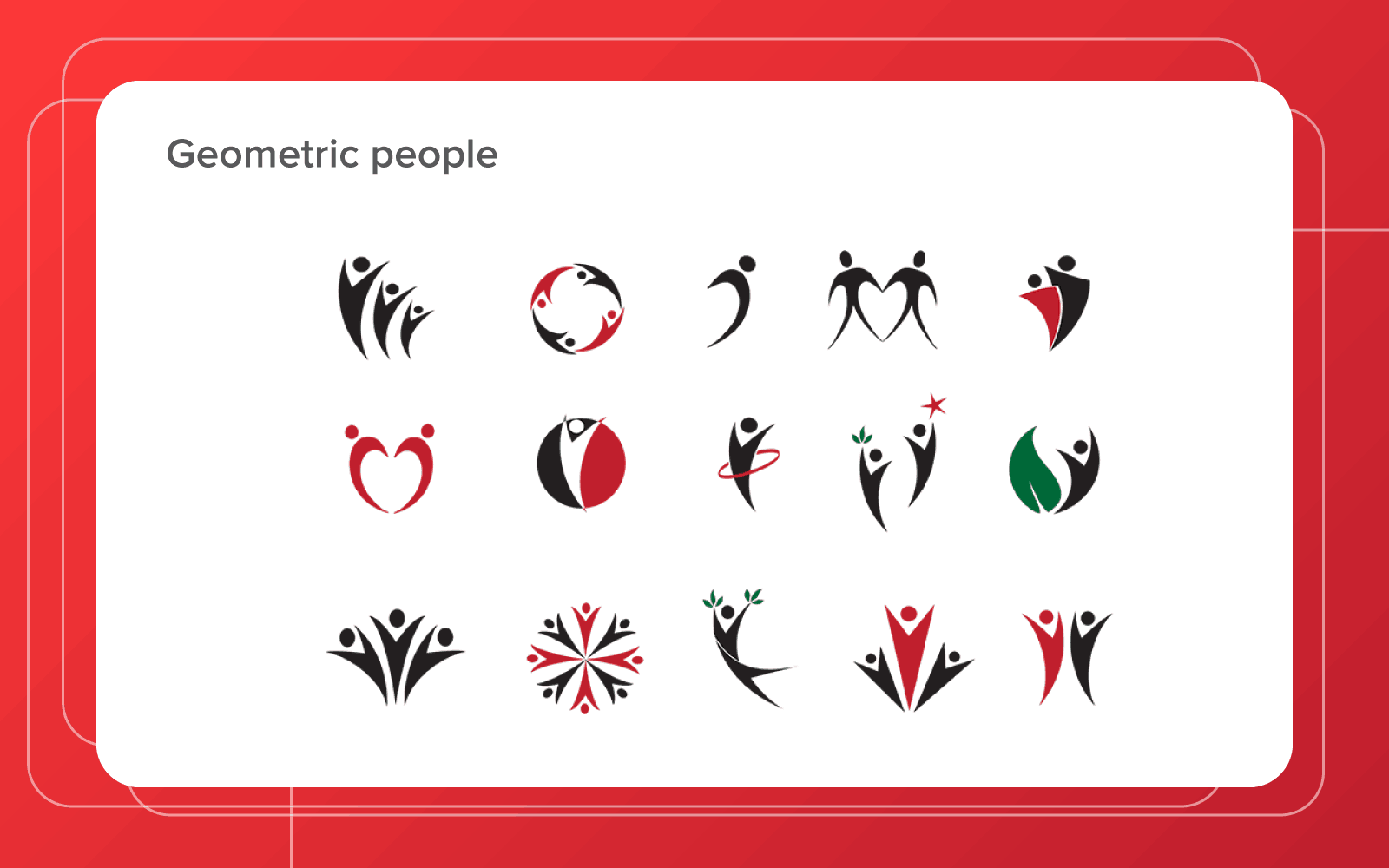
Almost all companies work with people in one or another way. So, it’s a bad idea to use people as a theme for the logo and there are at least two reasons for this.
First. Every business deals with people, be it B2B or B2C companies. Put simply, this type of logo won’t tell consumers the company’s story and, respectively, won’t build brand awareness in their minds.
Second. There are hundreds of thousands of logo variants picturing people. It’s simply impossible to create something unique and memorable.
To sum up we should say that you should not be obsessed with trends. Try to tailor them to the business needs and its identity, not vice versa.

