Last Updated on March 3, 2024
In this article you will learn how to deal with the visual weight, because as you are about to find out, this is crucial in web design. Therefore, in case you have little knowledge about this aspect or if you have never heard about the visual weight, then you should direct your attention to the following paragraphs.
What does this term represent?
Of course that in the beginning you should become acquainted to this term and you should find out more about its significance. As you probably have figured it out by now, some design elements appear heavier and some seem lighter. And this might be seen right from the very first moments, when some objects are bigger than others and they cover more room, while in other circumstances the heavy weight is more difficult to remark, if it relies only on the use of colors.
Also, it is important for you to know that one must become familiar to this, because this notion will help the web designer deal with such things as: visual hierarchy, balance or harmony. Thanks to the visual hierarchy people will notice the most significant items, while the symmetry and balance of your design features, will help at building the right image.
The size in visual weight
It is natural to talk about size when dealing with visual weight. After all, as I have mentioned previously, bigger objects are easier to remark, and this could either affect or improve your work. Your projects will be improved, if you want to make your visitors observe the focal points.
And, it could affect your job, due to the fact that larger objects may harm the balance of your website. However, one should not worry, because there are several solutions. For instance, one could opt for smaller objects placed strategically near the larger one, or another solution would be choosing a heavier shade for the smaller items.
Anyway, larger objects in web design are not a new thing. I believe you all have seen those call to action buttons that direct the visitors and make them observe the things they need. The point is that size matters a lot, as far as visual weight is concerned, and web designers should realize and learn how to deal with this fact.
The proportion of items
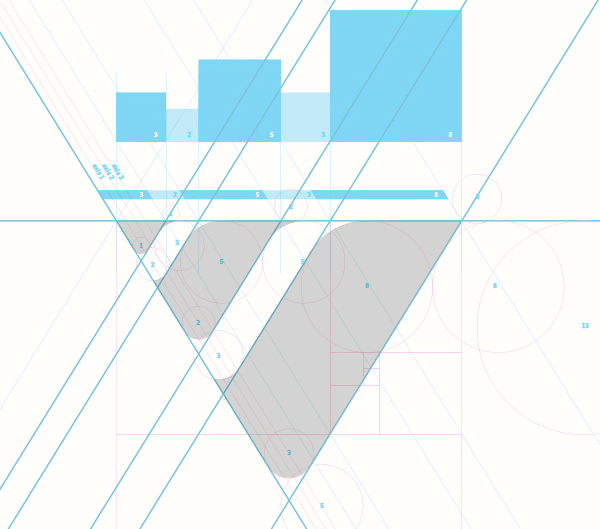
When seeing a compact object people naturally believe that it is heavier than a more dispersed one. And they are true. That’s why it would be a great idea to put the emphasis on various items by arranging them together in a fashionable manner. However, one should not insist too much on this technique because overdoing it could bring damage to your creation. The same goes for your texts, too.
If you would like to accentuate small parts of it, you may do it by writing them in a compact manner (attention – keep in mind to do this for small sections, only). For the rest of your text, it would be best to avoid conceiving it in a crowded manner, otherwise your users will get fatigued and exhausted; and as you well know it, one must protect his or her visitors.
Anyway, if you would prefer not to emphasize certain points through compact features, and if as proportion goes you would rather pick dispersion, then one will succeed in obtaining this effect with the help of the white space. But one should be aware of the fact that even if more white space between the objects will give the impression of lightness, at the same time it also grabs the attention, since it creates a sort of contrast between the existing items.
Complex elements
If you want to master the visual weight of your website and if you would like to have both heavy and light factors, then you should not forget about complexity. More complex textures, patterns or images will compose the list of your heavy elements, while the simpler ones will represent the light features. The combination of such factors will show that there is harmony on your webpage and that the art of visual weight has no secrets for you.
Colors
When it comes to colors, red is the heavier one, which is followed by blue, green, orange, with the list ending with yellow. Anyway, what one should know is that colors depend on their saturation, brightness, darkness and hue, in order to affect the visual weight. Therefore, in the list of heavy colors there are the more saturated and the dark ones, while in the list of light colors one should include the less saturated and the bright shades.
The contrast
Contrast is another term that plays an important role in the visual weight. Apart from the fact that it makes the items that have more contrast between them and the background stand out, it also helps at improving the readability and at creating the visual hierarchy. So, it is definitely something that web designers should not be afraid to use, because this will definitely help them in achieving certain tasks.
Light and dark
If you desire to draw the attention towards certain focal points, then you should choose dark over light, because it helps at making objects more prominent. Also, something that would help you create a more natural design, to which your users will relate and connect, would be placing the darker colors at the bottom and the lighter shades at the top. This way, light items will be placed over the heavy ones, fact that people find normal and conventional.
Conclusion
The conclusion would be that the web designer should not forget to take into consideration the visual weight as well, because thanks to this important matter the webpage looks well organized, fact that will make people visit you again.
Check out our previous articles:
- The Most Innovative Travel Sites
- 20 Fresh Photoshop Tutorials
- Three of the Most Popular Photo Touch Up Tools
- Top 15 Photography Apps for Android Devices
- Mobile Apps For Fundraising–iPhone Technology
We hope you enjoyed this article. Please don’t forget to subscribe to our RSS-feed or follow Inspirationfeed on Twitter, Google+, and Facebook! If you enjoyed the following article we humbly ask you to comment, and help us spread the word!