Last Updated on February 21, 2024
A logo is the very first thing that crosses your mind when you think of a certain company.
A logo helps to remember the brand and convey a complex message with a small symbol.
It uses colors, shapes, and typography to become an identifying images for a company.
Everybody wants to have a logo that grabs attention at once and is easy to remember.
And negative space can help you bring balance to your logo and make it memorable.
Negative space is a space between or around subjects in an image.
You can create a wonderful logo with hidden or dual meaning with clever use of negative space.
In this article we will learn what is negative space, see popular logos that use negative space, and discover the five best tools that can help you create an amazing logo yourself.
What is Negative Space in Logo Design?

In a nutshell, negative space is a part of the logo (or graphic) that is not directly covered in colors or text.
For example, in a photo with a tree against the sky the tree will be positive space, while the sky along with the space between branches and leaves of the tree will be negative space.
If you have a black logo with a symbol on white background, then the white backdrop is negative space.
It gives sense to a positive image and helps your eyes to separate objects in the image.
You may have heard negative space be called white space.
You can find this term not only in graphic design, but also in interior, art, photography, and web design.
Negative space allows a user to focus on key elements of the design.
When it is used smartly, users will not notice blank areas, but instead give full attention to the logo itself.
Popular Examples of Logos Using Negative Space
There are numerous well known logos that use negative space and we will now show you a few examples. Be inspired by these logos and think of how you can implement these tricks in your branding.

The FedEx logo is a classic examples of a logo with negative space that won a lot of design awards. The logo hides an arrow between the letters E and X. It was created by Lindon Leader in 1994.
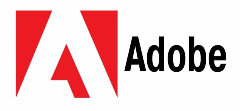
There are countless ways to use a letter in a negative space logo and Adobe did a great job. It derived from the original 1982 logo on a red background and ‘Adobe’ written below in black.
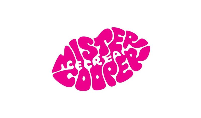
Mr. Cooper is an alcoholic ice cream brand that used typographic lipstick to create a logo. They successfully combined negative and positive space in their logo. The logo could be rubber stamped right on the white paper cups.
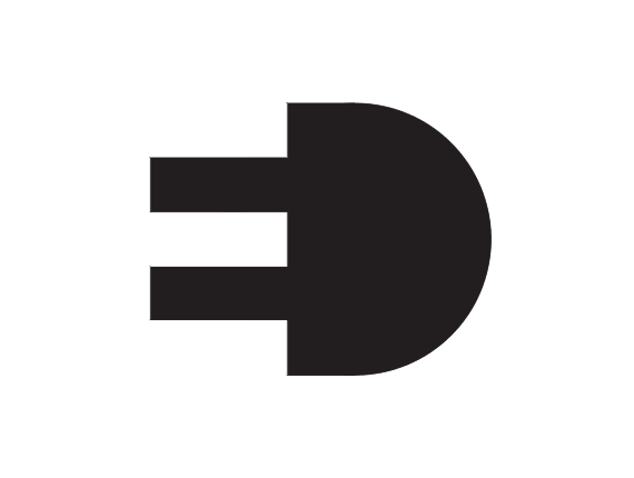
This logo was created by an Italian graphic designer Gianni Bortolotti for the electric supply company ED (Elettro Domestici). The designer simply combined two initials side by side that formed the shape of an electric plug. This logo is a creative combination of function and form.

Sometimes white space is used so cleverly that you don’t even know it’s negative space. Take a look at this WWF (World Wildlife Fund) logo that came from a giant panda that lived in the London zoo in 1961.
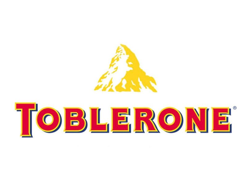
Toblerone is a chocolate brand that hails from the town of Bern in Switzerland. This place was also known as ‘the city of bears’. Can you see a bear that hides in the mountain?
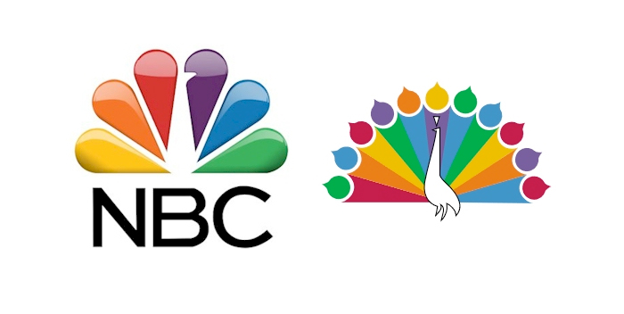
Look at the NBC logo where the white space in the middle creates the silhouette of a peacock. They are proud of what they broadcast.

You can clearly see a heart on the logo of British Heart Foundation. Besides, the lines continue to form a healthy electrocardiogram reading.

An eagle, a national emblem, is a logo for Washington Capitals. Can you spot the blank space under the eagle? It is the silhouette of Washington’s iconic Capitol building.
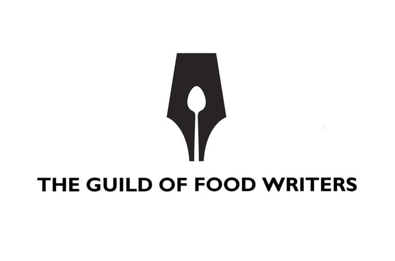
Obviously The Guild of Food Writers writes about food. But can you see a spoon that hides in the logo to create an image of an ink pen nib?
Tips on How to Create a Negative Space Logo
Why is negative space so important? Imagine you come into a room fully packed with various stuff.
There are shelves, books, pillows, boxes, bags, clothes, and many other things in this room.
Will you be able to find the thing you need in all this mess?
Do you really need all this stuff right now?
Here is what users feel when they see a web page, logo, or graphics without negative space.
White space allows users to focus on one thing and the design does not look cluttered.
Here are a few tips you need to follow to create a great negative space logo:

– any logo guideline will tell you that a designer should define a proper amount of negative space around so that users would perceive it correctly;
– remember that negative space is not always equal to white. Negative space could be white or of any other neutral color;
– proper use of negative space can help your business logo be adaptive to different contexts: it looks good on a rubber stamp or a t-shirt;
– go minimalistic. Designers use minimalism to create focal points on the elements they want to highlight;
– there is a rule of proximity in Gestalt psychology. It states that all objects located near each other look similar to the human eye.
You can use this rule while developing a logo and make it more visually appealing: separate text and design elements of the logo to create hierarchy;

– negative space allows you to add hidden meaning to your logo, just like FedEx and NBC did. It lets your clients be more engaged in your branding.
Over to You
The best part about negative space is that it helps you add hidden meaning to your logo and display the style of your company.
We hope these amazing logo examples and makers will help you come up with a fantastic negative space logo of your own.

