Last Updated on March 5, 2024
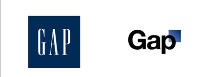
Corporate logo redesign is always a challenging task. Sometimes it’s even controversially undertaking for both the designer and organization involved. A great example of this is the Gap Logo. I think I can speak for everybody when I say that Gaps logo was probably the worst re-design in 2010. Once social media got involved, it spread like a wildfire.
Although many companies re-brand/redesign their logo, sometimes its not the best choice to do that. You already have a mass customer base that recognize your brand already. Changing your appearance drastically can really hurt. However you can always freshen up your appearance and make it modern. A great example of this is Walmart’s new logo.
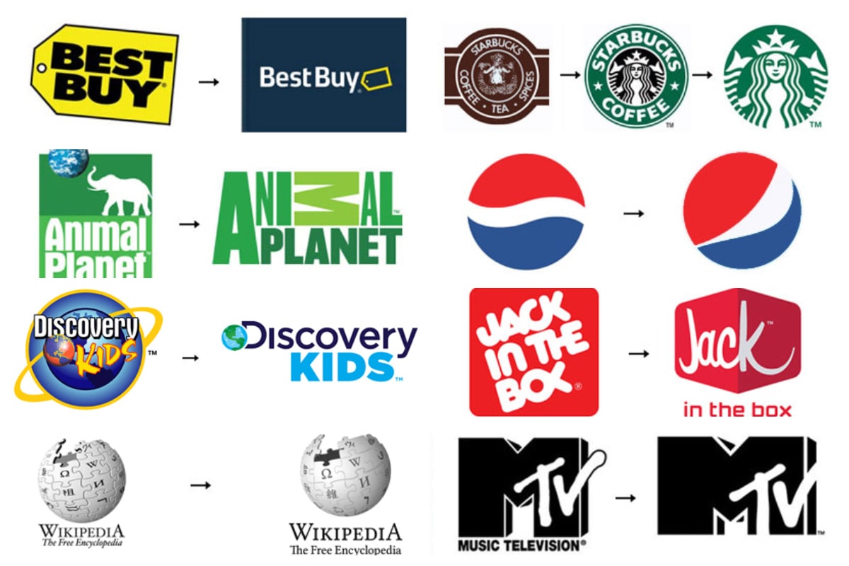
It was a great year, and a year that many companies have re-branded themselves. Many for the better, and a few for the worst. This massive list includes a great variety of different companies that had re-branding performed in 2009-2010. We want you to be the judge and tell us which companies have the worst/best re-branding.
Note: All the logos have been done manually and this process took me two long days. Each image is linked to the brands website.
1. Walmart
2. Xerox
3. Starbucks
4. Ubunto
5. Yellowpages
6. UPS
7. BestBuy
8. Aol
9. Bauschlomb
10. BP
11. CapitalOne
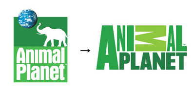
12. AnimalPlanet
13. at&t
14. Cisco
15. Sprint

16. Rhapsody
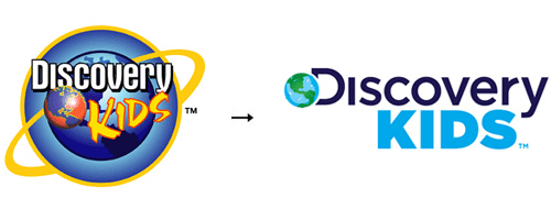
17. Discovery Kids
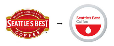
18. Seattles Best Coffee
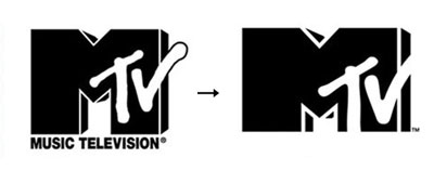
19. Mtv
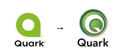
20. Quark
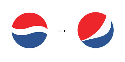
21. Pepsi
22. msn
23. Kraft
24. Google
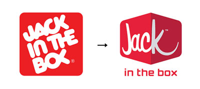
25. Jack in the Box
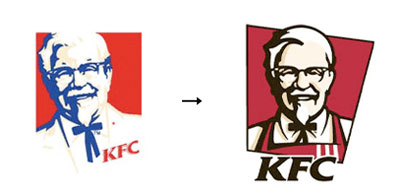
26. KFC
27. Delta
28. GMgoodwrench
29. Gap
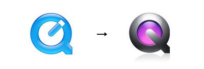
30. Quicktime
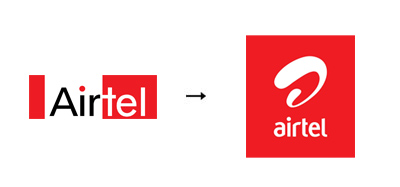
31. Airtel
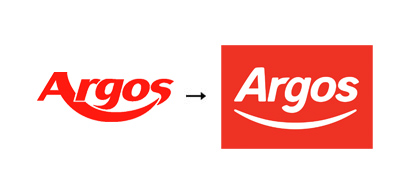
32. Argos
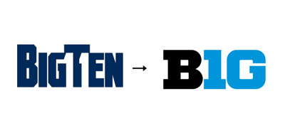
33. Big10
34. Australia Unlimited
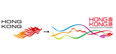
35. HongKong
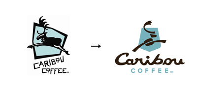
36. Caribon Coffee
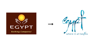
37. Egypt
38. Honecore
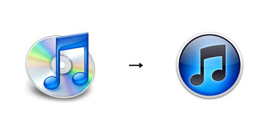
39. iTunes
40. LendingClub
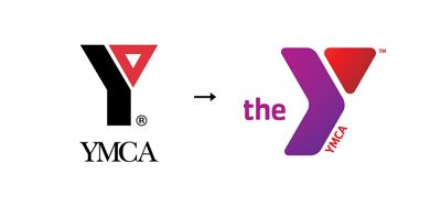
41. YMCA
42. Your Singapore
43. Workopolis

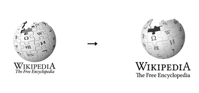
44. Wikipedia
45. Virgin Atlantic
46. Technicolor
47. Survey Monkey
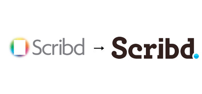
48. Scribd
49. PricewaterhouseCoopers
50. Myspace
51. Library of Congress
52. Griffin
53. Comedy Central
54. Virb
55. Hemtex
56. Belk

57. DivX
58. THQ
59. Symantec

60. Verisign

